How to use Typography in Material-UI React ?
Last Updated :
28 Nov, 2023
Material UI (MUI) is an open-source React component library that is based on the Material Design of Google. MUI provides a collection of robust and customizable component that makes web development easier. Material UI is a great library, making choices for you but letting you make your own choices. All the components can be customized.
Prerequisites:
Typography is an MUI component that standardizes all the categories of text. It maintains consistency with respect to size, font family, color, etc. among all the variants of text like title, subtitle, caption, etc. throughout your application.
syntax:
<Typography color="primary"
            align="center"
            gutterBottom={true}
            variant="h3" component="p">
    h3 default variant but wrapped by p tag.
</Typography>
React MUI Typography:
- General: MUI will not launch the Roboto font by itself. Any fonts used in your program must be loaded by you.
- Roboto Font CDN: The Roboto Font can be added using the following CDN link <link rel=”stylesheet” href=”https://fonts.googleapis.com/css?family=Roboto:300,400,500,700&display=swap”/>
- Install with npm: The Roboto Font can be installed by running the following command in the terminal npm install @fontsource/roboto or by using yarn add @fontsource/roboto to install using yarn.
- Component: Applying a standard set of font weights and sizes to your application is simple with the help of the typography component.
- Theme: The typography theme is a useful tool when we are not able to use the typography Component.
- Changing the semantic element: The variantMapping prop is used by the Typography component to link a UI variation to a semantic element.
- Adding & disabling variants: We can add custom typography varients other than the default typography varients and can also disable the varients if we don’t need them.
- System props: The typography supports all system properties. They can be directly used as a prop on the component.
- Accessibility: For accessible typography, there are a few important things to remember: Color, Font size, Heading hierarchy.
- API: The Typography API’s are:
Steps to create the application:
Step 1: Create React application using the following command.
npx create-react-app mui
Step 2: Move inside the project directory using the following command.
cd mui
Step 3: Install the required MUI modules to add MUI to your project.
npm install @mui/material @emotion/react @emotion/styled
Step 4: Erase the default content of the app.js file.

Tree directory on my local machine after step 4.
Example 1: In this example, we’ll go through all variants of the Typography component in the app.js file as described in the default theme of Material UI.
Javascript
import { Typography } from '@mui/material'
function App() {
return (
<>
<h1 style={{ color: "green" }} >
Geeks for Geeks
</h1>
<h3 >React MUI Typography</h3>
{}
<Typography variant="h2" align="center">
I am h2 default variant.
</Typography>
{}
<Typography variant="h3" color="primary">
I am h3 default variant.
</Typography>
{}
<Typography variant="h5" sx={{ mt: 5 }}>
I am h5 default variant.
</Typography>
{}
<Typography variant="subtitle1">
I am subtitle1 default variant.
</Typography>
{
}
<Typography variant="subtitle2" component="p">
I am subtitle2 default variant.
</Typography>
{}
<Typography variant="body1">
I am body1 default variant.
</Typography>
{
}
<Typography variant="body2">
I am body2 default variant.
</Typography>
{}
<Typography variant="button"
display="block" gutterBottom>
Button text
</Typography>
{}
<Typography variant="caption"
display="block" gutterBottom>
Caption text
</Typography>
{}
<Typography variant="overline"
display="block" gutterBottom>
Overline text
</Typography>
</>
);
}
export default App;
|
Step to run the application: Open the terminal and type the following command.
npm start
Output:

React MUI Typography
Explanation: The output of the above code follows the default theme and hence:
- h2 variant is wrapped by h2 tag.
- h3 variant is wrapped by h3 tag.
- h5 variant is wrapped by h5 tag.
- subtitle1 and subtitle2 are wrapped by h6 tag. But subtitle2 is using the component prop as a one-off customization, hence subtitle2 is wrapped by p tag.
- body1 and body2 are wrapped by p tag.
- button, caption, and overline are wrapped by span tag.
Example 2: In this example, we’ve created a custom theme, and hence mapping of variants changed, so tags wrapping different variants are changed and also font size is customized for each variant.
Javascript
import { Typography, Box } from '@mui/material'
import { createTheme, ThemeProvider } from '@mui/material/styles';
const theme = createTheme({
components: {
MuiTypography: {
defaultProps: {
variantMapping: {
h1: 'h1',
h2: 'h1',
h3: 'h1',
h4: 'h1',
h5: 'h1',
h6: 'h1',
subtitle1: 'h2',
subtitle2: 'h2',
body1: 'span',
body2: 'span',
},
},
},
},
typography: {
h2: {
fontSize: "40px"
},
h3: {
fontSize: "30px"
},
h5: {
fontSize: "20px"
},
subtitle1: {
fontSize: "15px"
}
}
});
function App() {
return (
<>
<h1 style={{ color: "green" }}>Geeks for Geeks</h1>
<h3>React MUI Typography</h3>
<Box sx={{ p: 3, backgroundColor: 'primary.main' }}>
<Typography variant="h4" color="white">
This is customized typography injecting
custom theme
</Typography>
</Box>
<ThemeProvider theme={theme}>
{
}
<Typography variant="h2" align="center">
I am h2 but mapped with h1 and size changed to 80px
</Typography>
{}
<Typography variant="h3" color="success.main">
I am h3 but mapped with h1 and size changed to 30px.
</Typography>
{}
<Typography variant="h5" sx={{ mt: 5 }}>
I am h5 but mapped with h1 and
size changed to 20px.
</Typography>
{
}
<Typography variant="subtitle1">
I am subtitle1 mapped with h2
and size changed to 15px
</Typography>
{
}
<Typography variant="subtitle2" component="p">
I am subtitle2 variant but mapped p tag.
</Typography>
{}
<Typography variant="body1"
display="block" gutterBottom>
I am body1 variant but mapped to span tag.
</Typography>
</ThemeProvider>
</>
);
}
export default App;
|
Output:
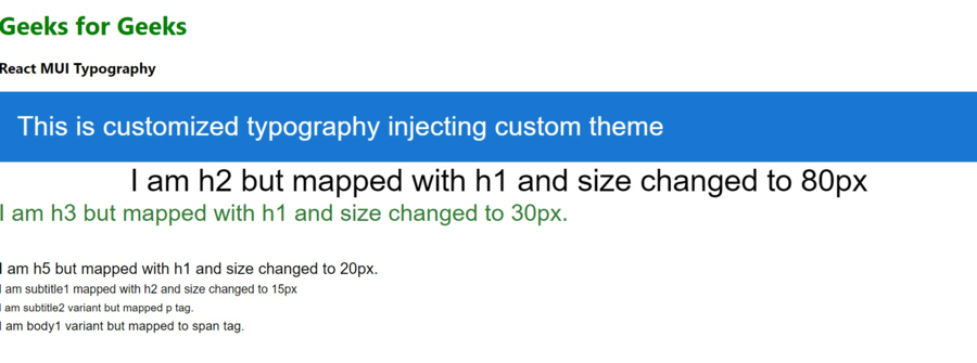
React MUI Typography
Explanation: This example of typography using a custom theme and hence mapping of variants changed to another HTML tag, also size of variants changed, no longer following the default size.
Like Article
Suggest improvement
Share your thoughts in the comments
Please Login to comment...