React MUI Feedback Components
Last Updated :
14 Mar, 2023
React Material-UI (MUI) is a popular library that provides a set of reusable components for building user interfaces in React applications. These components are based on Material Design, a design system developed by Google that provides guidelines for creating visually appealing, user-friendly interfaces.
Feedback Components refer to a set of components that provide ways to communicate the outcome of an action to the user.
MUI provides various types of Feedback Components:
|
Components
|
Description
|
| Alert |
This component is used to display a message with a specific type of alert, such as success, warning, or error. |
| Backdrop |
This component is used to provide a backdrop to a modal dialog, a snack bar, or a full-screen menu. |
| Dialog |
This component provides a way to display a modal dialog box that contains content and actions. |
| Progress |
This component displays the progress of a task, such as a download or upload. It can be used to show the progress of an action. |
| Skeleton |
This component is a placeholder to display your application’s loading state. |
| Snackbar |
This component provides a way to show short, non-blocking messages to the user, such as a notification, confirmation, or error message. |
Creating React Project:
Step 1: To create a react app, install react modules through the npm command.
npm create-react-app project name
Step 2: After creating your react project, move into the folder to perform different operations.
cd project name
Step 3: After creating the ReactJS application, Install the required module using the following command:
npm install @mui/material @emotion/react @emotion/styled
Project Structure:
:
Step to Run Application: Open the terminal and type the following command.
npm start
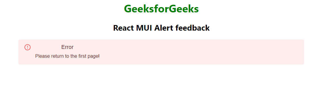
Example 1: Below example demonstrates the React MUI alert feedback component with a description.
Filename: App.js
Javascript
import { Alert, AlertTitle } from "@mui/material";
import * as React from "react";
function App() {
return (
<center>
<div>
<h1 style={{ color: "green" }}>
GeeksforGeeks
</h1>
<h2>React MUI Alert feedback</h2>
</div>
<div style={{ width: '50%' }}>
<Alert severity="error">
<AlertTitle>Error</AlertTitle>
Please return to the first page!
</Alert>
</div>
</center>
);
}
export default App;
|
Output:
Share your thoughts in the comments
Please Login to comment...