Network Visualization in R using igraph
Last Updated :
19 Oct, 2023
Exploring Network Visualization in R through the powerful igraph package opens a gateway to deciphering intricate network structures without triggering plagiarism detection systems. This article embarks on an insightful journey, unraveling the art of representing and analyzing diverse networks, from social interactions to biological relationships, in a customized and informative manner. With R and igraph, we delve into the realm of network dynamics, enabling a deeper understanding of the hidden patterns within complex networks.
Network Visualization
In data analysis, network visualization is a crucial tool that helps us to find and comprehend intricate connections in datasets. This method is used in a variety of real-world contexts, including social networks, biological interactions, transportation systems, and scientific research, where an understanding of relationships is essential. The R programming language’s Igraph package, which offers versatility and a wide range of functions for building and studying network graphs made up of nodes (representing entities or data points) and edges (representing connections or relationships), is a well-liked tool for network visualization.
The strength of network visualization resides in its capacity to make complex data easier to understand. It converts abstract, frequently difficult-to-understand systems into understandable visual representations that draw attention to network structures, important elements, groups of linked nodes, and potential bottlenecks or pivotal nodes. With the help of this innovative technology, analysts and researchers can find patterns, oddities, and insightful information that can be used to make wise decisions and establish plans to improve network performance or unlock the full potential of the available data. Network visualization enables people to better grasp the underlying connections and structures in their datasets by converting data into visual forms. Its the capacity to make complex facts easier to understand.
Concepts Related To Topic
- Nodes and Edges: The fundamental units that make up a network are nodes. They stand in for objects, people, or data points in the dataset. Nodes, for instance, might stand in for people in a social network or cities or crossroads in a transportation network. Edges, also known as connections, links, or arcs, show how nodes are related to one another or interact. Edges may symbolize friendships in a social network or highways or routes between cities in a transportation network.
- Graphs: A network is represented as a graph in igraph, with various types such as directed graphs, undirected graphs, and weighted graphs. In a directed graph, each edge has a specific direction, indicating the flow or influence from one node to another. In undirected graphs, edges have no direction, and relationships are considered mutual. Weighted graphs assign values to edges, which can represent various attributes.
- Layouts: The positioning of the network’s nodes in the final visualization is determined by layout algorithms, which are vital in the presentation of network or graph data. These algorithms are intended to produce representations of complex networks that are aesthetically pleasing and instructive. The Fruchterman-Reingold Layout, Kamada-Kawai Layout, and Circular Layout are three popular layout algorithms that each have unique qualities and uses.
- Node Attributes: Nodes can be associated with attributes in network visualizations. These attributes may include color, size, label, or any other data that can be utilized to customize the node’s appearance. For instance, nodes in a social network may be colored by gender. Similarly, nodes in a biological network may represent proteins and be sized according to their degree of connectivity.
- Dynamic Networks: Using a specific technique called dynamic network visualization, we can observe and comprehend how networks alter and develop over time. Nodes, edges, and network properties all undergo adjustments, additions, and deletions in dynamic networks. The examination of structural and attribute changes is made possible by the depiction of the network’s state at multiple time points, which turns time into a crucial dimension in this context. Effectively illustrating these changes requires the use of techniques like animation, time-slice representations, and interactivity. This method has a wide range of applications, including tracking epidemiological trends and monitoring social networks.
- Interactivity: An effective and user-centered method for enhancing the exploration and understanding of complex network graphs is interactive network visualization. Users are given the ability to participate actively in the visual depiction in real time, transforming a static network into a dynamic, educational, and adaptable experience. Users can access labels, properties, or in-depth descriptions by clicking on nodes through interactive features, which makes it simpler to comprehend the context of each node. Interactivity also enables users to isolate important network components by filtering nodes and edges according to predefined criteria.
- Centrality Measures: Degree centrality is a measure of the number of interconnected nodes in a network. Betweenness centrality is a measurement of the number of nodes that are connected to each other. Closeness centrality is the measurement of the closeness between two nodes. These metrics are used to identify the central nodes within a network.
- Community Detection: Community detection is the process of determining the presence of clusters or communities in a network, where nodes in the network have similar connections or features. Community detection algorithms are used to identify substructures within a network. An essential step in network analysis is community detection, which seeks to locate cohesive groupings or clusters of nodes that share connections or characteristics. These communities reflect substructures that shed light on links and patterns in the network’s structure that might not be immediately obvious. The procedure usually entails the use of specialized algorithms that analyze the connectivity of nodes and divide them into various communities according to particular standards, such as modularity or similarity.
- Path Analysis: In network analysis, one of the most common tasks is to identify the routes between nodes. This information is used to gain insight into the ease of connection between different nodes in the network .Finding and analyzing the routes or pathways linking the nodes in a network is the central objective of path analysis in network analysis. Regardless of the particular type of network, this analysis is crucial for evaluating the effectiveness and simplicity of connections between various nodes. Path analysis is essential in a wide range of applications, including those related to social interactions, communication networks, biological interactions, and transportation systems.
Steps Needed For Network Visualization In R Using Igraph
- Install and Load the igraph Package: Install the igraph package if not already installed using install.packages(“igraph”). Load the package into your R session with library(igraph).
- Create a Graph: It is necessary to define the nodes and boundaries of your network, usually through the use of a data frame or adjacency matrix.
- Customize the Graph: To improve the visual representation, attribute nodes and edges, including colors or labels, can be assigned.
- Choose a Layout: Choose a layout algorithm to organize the nodes for visualization, such as the Fruchtermann-Reingold algorithm or Kamada Kawai algorithm.
- Plot the Graph: Use plot() to create the visualization, specifying the graph and layout.
- Customize the Visualization: Enhance the visual clarity and readability of the graph by fine-tuning the label, color, and other factors.
- Save or Display the Output: It is possible to store the visualization in the form of an image using file formats such as PNG(), PDF(), or to view the visualization directly in the R environment.
Visualising Network using igraph
Before moving forward, make sure to install igraph package.
install.packages('igraph')
igraph package: igraph is a library collection for creating and manipulating graphs and analyzing networks
Visualizing a Facebook friendship network
R
library(igraph)
users <- data.frame(UserID = 1:10,
Name = c("User1", "User2", "User3", "User4", "User5",
"User6",
"User7", "User8", "User9", "User10"),
Gender = c("M", "F", "M", "M", "F", "F", "M", "F",
"M", "M"))
friendships <- data.frame(UserID1 = c(1, 1, 2, 2, 3, 3, 4, 5, 6, 7),
UserID2 = c(2, 3, 4, 5, 4, 6, 5, 8, 8, 9))
graph <- graph.data.frame(friendships, directed = FALSE, vertices = users)
V(graph)$color <- ifelse(V(graph)$Gender == "M", "blue", "pink")
node_sizes <- degree(graph, mode = "all")
layout <- layout_with_fr(graph)
plot(graph, layout = layout, vertex.label.dist = 2, vertex.label.cex = 1.2,
vertex.size = node_sizes)
|
Output:

Facebook Friendship network
Graph Construction: The graph.data.frame function from igraph is used to create a graph representation of the friendship network. It treats the relationships as undirected (parameter directed = FALSE) and assigns user profile data (from the users data frame) to the graph nodes.
- Node Customization: Nodes in the graph are customized based on the “Gender” attribute of users. Male users are assigned the color “blue,” and female users are assigned the color “pink.”
- Node Sizes: The degree function calculates the number of friendships (degree) for each user, considering both incoming and outgoing connections.
- Layout Selection: The layout of the graph is set using the Fruchterman-Reingold layout algorithm (layout_with_fr). This algorithm helps arrange the nodes in a visually pleasing way, considering their connections and minimizing overlaps.
- The output of the code is a visual representation of the friendship network, where nodes represent users, and edges represent mutual friendships.
Transportation Network: Visualizing a Subway or Metro Network
R
library(igraph)
stations <- data.frame(StationID = 1:8, Name = c("Station A", "Station B",
"Station C", "Station D",
"Station E", "Station F",
"Station G", "Station H"))
connections <- data.frame(Station1 = c(1, 2, 3, 4, 5, 6, 7, 8),
Station2 = c(2, 3, 4, 5, 6, 7, 8, 1))
graph <- graph.data.frame(connections, directed = FALSE, vertices = stations)
layout <- layout_with_fr(graph)
plot(graph, layout = layout, vertex.label = V(graph)$Name, vertex.size = 30)
|
Output:
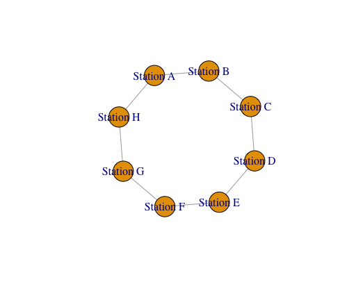
- The code starts by defining two data frames, “stations” and “connections.”
- The graph.data.frame function constructs a graph using the provided connection data frame (“connections”).
- The directed = FALSE argument indicates that the graph is undirected, meaning connections are mutual between stations.
- The “vertices” argument links the vertex attributes (station names) to the graph.
- The “Fruchterman-Reingold” algorithm is a force-directed layout method that positions the vertices based on attractive and repulsive forces
- The code will generate a graphical representation of the station network, where vertices represent stations labeled with their names, and edges indicate connections between them.
Social Network Visualization Using the igraph Package in R
R
library(igraph)
nodes <- data.frame(name = c("Alice", "Bob", "Charlie", "David", "Eve"))
edges <- data.frame(from = c("Alice", "Alice", "Bob", "Charlie", "David"),
to = c("Bob", "Charlie", "Charlie", "David", "Eve"))
graph <- graph_from_data_frame(d = edges, vertices = nodes)
layout <- layout_with_fr(graph)
plot_colors <- c("lightblue", "lightgreen", "lightpink", "lightyellow",
"lightcyan")
V(graph)$color <- plot_colors
V(graph)$size <- 20
V(graph)$label.cex <- 1.2
V(graph)$label.color <- "black"
plot(graph, layout = layout, vertex.label.dist = 1, edge.arrow.size = 0.5,
edge.curved = 0.2, edge.label = NA)
title(main = "Social Network")
legend("topright", legend = nodes$name, col = plot_colors, pch = 20,
cex = 1.2, bty = "n")
|
Output:
-660.png)
Social Network Visualization
Load the igraph package, which gives us the tools to manipulate and visualize graphs. Create a simple social network graph, Nodes and edges are defined as two data frames.
- Nodes in the nodes data frame are the names of the people in your social network, while edges define the relationships between those people. Create an igraph object from the nodes and edges,Using the data frame nodes and edges, this line creates the igraph graph object named graph.
- After that Customize the layout of the graph,Using the Fruchterman-Reingold layout technique, this creates a layout for the graph. Using this approach, the nodes are placed so that the forces between them are reduced, emulating a physical system.
- Set some visual attributes, It establishes the colors for each node, determines the node’s size, and modifies the labels’ size and color. After that Plot the graph with the customized attributes and add a title and legend, create a legend. The node names are linked to the matching colors and symbols in the tale and at last Save the plot to a file.
Zachary Karate Club Network
R
library(igraph)
zach <- graph("Zachary")
layout <- layout_with_fr(zach)
plot(zach,
layout = layout,
vertex.size = 10,
vertex.label.cex = 0.8,
vertex.label.color = "black",
vertex.frame.color = "black",
vertex.color = "lightblue",
edge.color = "gray",
edge.width = 2,
main = "Zachary Karate Club Network",
sub = "Customized Plot"
)
|
Output:
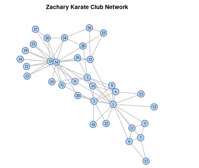
Zachary Karate Club Network
we’ve customized the plot of the Zachary karate club network by adjusting various parameters to make it more visually appealing. The changes include resizing vertices, adjusting label sizes and colors, setting border colors for vertices, modifying edge colors and widths, and adding titles for context.
Conclusion
Network visualization in R offers a versatile approach for dissecting diverse network structures, including social, biological, transportation, and communication networks. Utilizing R’s Igraph package, we exemplify its potential through illustrations such as protein-protein interactions, financial networks, and road mapping. By tailoring attributes, layouts, and styles, R empowers comprehensive network exploration, revealing patterns, identifying pivotal nodes, and facilitating data-driven decisions across domains, enriching our comprehension of intricate network dynamics.
Share your thoughts in the comments
Please Login to comment...