The ggvis is an interactive visualization package in R language that is based on the popular ggplot2 package. It allows you to create interactive plots and graphics that can be explored and manipulated by the user. ggvis supports a wide range of plot types including scatter plots, line charts, bar charts, histograms, and more.
One of the key features of ggvis is its interactivity. You can add features such as tooltips, clickable points, and zooming to your plots. This makes it easy for users to explore and analyze the data. Additionally, ggvis allows you to link plots together so that when you interact with one plot, the other plots are updated in real-time.
The ggvis uses a grammar of graphics approach to visualization, similar to ggplot2. This means that you can specify your plot using a set of building blocks, such as data, aesthetics, and layers. This makes it easy to create complex plots with multiple layers and customized aesthetics.
Sorting Data using ggvis Package in R
To sort data in ggvis, we can use the arrange() function from the dplyr package. This function allows us to sort the data based on one or more variables. We can then use the sorted data to create a plot in ggvis.
For example, let’s say we have a dataset of student grades with three variables: student_name, grade, and class. We want to create a plot that shows the average grade for each class, ordered by the average grade. We can use the following code to sort the data by the grade variable:
R
library(dplyr)
library(ggvis)
grades <- data.frame(
student_name = c("Alice", "Bob", "Charlie",
"David", "Eve", "Frank"),
grade = c(80, 90, 75, 85, 95, 70),
class = c("Math", "Science", "Math",
"Science", "Math", "Science")
)
grades
|
Output:
  student_name grade   class
1        Alice    80    Math
2          Bob    90 Science
3      Charlie    75    Math
4        David    85 Science
5          Eve    95    Math
6        Frank    70 Science
R
grades_sorted <- grades %>%
group_by(class) %>%
summarize(avg_grade = mean(grade)) %>%
arrange(avg_grade)
grades_sorted
|
Output:
# A tibble: 2 × 2
  class   avg_grade
  <chr>       <dbl>
1 Science      81.7
2 Math         83.3
In this code, we first load the dplyr and ggvis packages. We then create a dataset called grades with three variables. We use the arrange() function to sort the data by the grade variable in ascending order. We group the data by the class variable and calculate the mean of the grade variable for each group using the summarize() function. Finally, we arrange the data by the avg_grade variable in ascending order.
Before using ggvis and dplyr package you will need to install it, you can do it by –
Bar Chart using ggvis Package in R
Now that we have sorted the data, we can use ggvis to create a Bar Chart. We can use the ggvis() function to create a blank ggvis plot, and then add layers to the plot using the %>% operator.
For our example, we want to create a bar chart that shows the average grade for each class, ordered by the average grade. We can use the following code to create the plot:
R
grades_sorted %>%
ggvis(x = ~class, y = ~avg_grade) %>%
layer_bars() %>%
add_axis("x", title = "Class") %>%
add_axis("y", title = "Average Grade") %>%
scale_nominal("x", domain = grades_sorted$class)
|
Output:
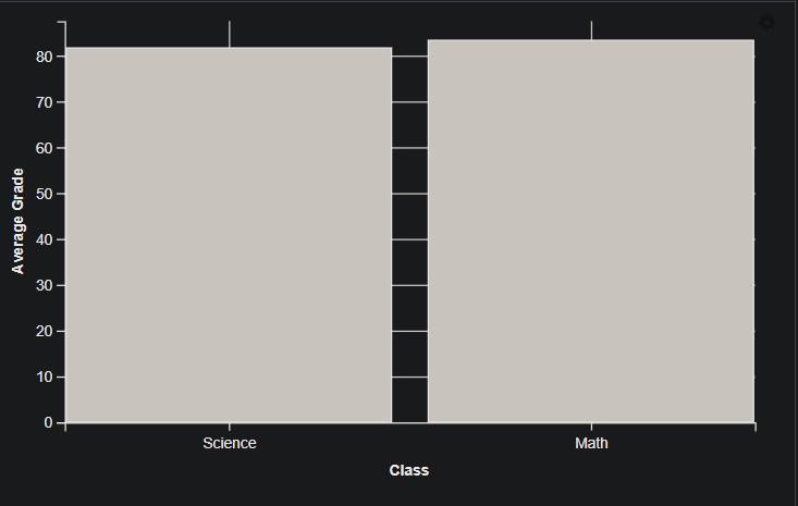
Plot for the subject-wise average marks.
In this code, we first use the ggvis() function to create a blank ggvis plot. We specify the x and y variables using the ~ syntax. We then add a layer_bars() layer to create a bar chart. We add x- and y-axes using the add_axis() function and set the axis titles using the title argument. Finally, we use the scale_x_discrete() function to set the order of the x-axis labels based on the sorted data.
Using scale_x_discrete() function
The ggvis() function is the primary function in the ggvis package in R, and it is used to create a new ggvis plot. It takes a set of arguments that specify the data to be plotted, the aesthetics of the plot, and any additional options or layers.
Here is the basic syntax for creating a ggvis plot using the ggvis() function:
Syntax:
ggvis(data = <data>, x = ~<x_variable>, y = ~<y_variable>, <additional_layers>)
where,
- data: This argument specifies the data frame to be used for the plot.
- x: This argument specifies the variable to be plotted on the x-axis. It should be specified using the formula notation (~) to indicate that it is a variable from the data frame.
- y: This argument specifies the variable to be plotted on the y-axis, using the same formula notation as for x.
- <additional_layers>: This argument allows you to add additional layers to the plot, such as points, lines, or text.
Using scale_x_discrete() function
The scale_x_discrete() function is a part of the ggplot2 package in R Programming Language, and it is used to customize the x-axis of a discrete scale in a plot.
The function takes several arguments that allow you to modify the labels and appearance of the x-axis. Here is the basic syntax of the scale_x_discrete() function:
Syntax:
scale_x_discrete(name = <axis_label>, labels = <label_list>, breaks = <breaks_list>, limits = <limits_range>)
where,
- name: This argument specifies the label for the x-axis.
- labels: This argument allows you to specify custom labels for the categories on the x-axis. It should be a character vector with the same length as the number of categories.
- breaks: This argument allows you to specify the breaks in the x-axis. It should be a character vector with the same length as the number of categories.
- limits: This argument allows you to specify the range of the x-axis. It should be a character vector with the same length as the number of categories.
Scatter Plot using ggvis Package in R
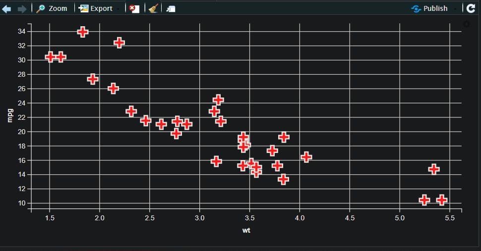
Creating a scatter plot using ggvis in R is a useful way to visualize the relationship between two continuous variables. ggvis is a data visualization package in R that uses reactive programming concepts to create interactive graphics. Scatter plots in ggvis allow you to see the relationship between two variables, as well as any patterns or trends that may exist in the data. The ggvis package allows for interactive exploration of the scatter plot, including zooming and panning, and provides customizable tooltips to display additional information about individual data points.
R
library(ggvis)
library(dplyr)
data(mtcars)
ggvis(mtcars, ~wt, ~mpg) %>%
layer_points()
|
Output:
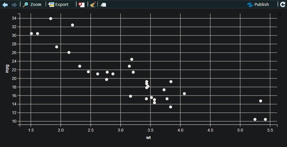
Scatter Plot using the ggvis Package in R
In the code snippet, we load the required libraries – ggvis for creating the scatter plot and dplyr for data manipulation. We then load the mtcars dataset from ggplot2 package using the data() function. Finally, we create a scatter plot using the ggvis() function with the weight of the car on the x-axis and miles per gallon on the y-axis using the ~wt and ~mpg notation. The layer_points() function adds the points to the plot.
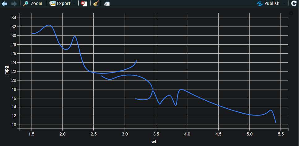
Scatter Plot with Regression Line using ggvis Package in R
A scatter plot with a regression line is a type of graph that displays the relationship between two continuous variables. It shows the individual data points as a collection of dots or circles and the regression line as a line that best fits the data points. The regression line is used to determine the overall trend of the data and can help to identify any outliers or unusual observations. This type of plot is commonly used in data analysis to visualize the relationship between two variables and to make predictions about future values based on the observed trend.
R
library(ggvis)
mtcars %>%
ggvis(~wt, ~mpg) %>%
layer_points() %>%
layer_model_predictions(model = "lm",
formula = mpg ~ wt) %>%
add_axis("x", title = "Weight") %>%
add_axis("y", title = "Miles per Gallon") %>%
add_tooltip(function(df) paste("Weight:", df$x,
"<br>", "Miles per Gallon:",
df$y, "<br>",
"Predicted Miles per Gallon:",
df$.pred))
|
Output:
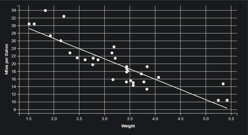
Scatter Plot with Regression Line using the ggvis Package in R
The code creates a scatter plot with a regression line using the mtcars dataset. The ggvis() function creates the initial plot object, with the x-axis representing “wt” (weight) and the y-axis representing “mpg” (miles per gallon). The layer_points() function adds a layer of individual data points to the plot. The layer_model_predictions() function adds a regression line to the plot, using the lm model and the formula mpg ~ wt. The add_axis() functions add x-axis and y-axis labels to the plot. Finally, the add_tooltip() function adds a tooltip that displays the weight, miles per gallon, and predicted miles per gallon for each data point.
Box Plot using ggvis Package in R
A box plot is a graphical representation of data that displays the median, quartiles, and outliers of a dataset. It is a useful tool for visualizing the distribution of numerical data.
R
library(ggvis)
library(ggplot2)
data("diamonds")
diamonds %>%
ggvis(~cut, ~price) %>%
layer_boxplots() %>%
add_axis("x", title = "Cut") %>%
add_axis("y", title = "Price") %>%
add_tooltip(function(df) format(df$y, digits = 4))
|
Output:
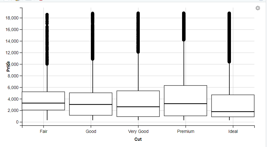
Box Plot using the ggvis Package in R
This code creates an interactive box plot using the ggvis package in R. It loads the “diamonds” dataset and plots the “cut” variable on the x-axis and the “price” variable on the y-axis. It then adds a box plot layer to the plot object and axes with labels for the x and y-axis. Finally, it adds a tooltip that displays the value of the “price” variable when the user hovers over a point, with formatting to display the number with 4 digits.
Line Chart using ggvis Package in R
Creating a line chart using ggvis package in R is a way to visually represent trends in data over time. Line charts are particularly useful for tracking changes and patterns over time, making them commonly used in various industries such as finance, sales, and marketing. Using ggvis, a line chart can be customized with interactive features such as hover tooltips, clickable legends, and zooming capabilities.
R
library(ggvis)
library(dplyr)
data(mtcars)
mtcars_grouped <- mtcars %>%
group_by(cyl) %>%
summarize(mean_mpg = mean(mpg))
ggvis(mtcars_grouped, ~cyl, ~mean_mpg) %>%
layer_paths()
|
Output:
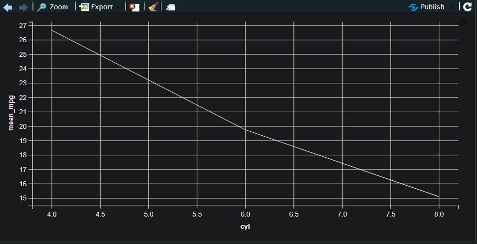
Line Graph using the ggvis Package in R
The mtcars dataset is first grouped by the number of cylinders using the group_by() function and summarized using summarize function to find the mean mpg for each group. The resulting data is then plotted as a line chart using ggvis, with the number of cylinders on the x-axis and the mean mpg on the y-axis. The layer_paths() function is used to connect the data points with lines.
Tree Map using ggvis Package in R
A TreeMap is a hierarchical visualization technique that displays hierarchical data as a set of nested rectangles, where each rectangle represents a category and its area corresponds to its value. In ggvis, a TreeMap can be created using the layer_rects() function, which maps the area of the rectangles to a variable and the fill color to another variable. Tree Maps can be useful for visualizing the relative sizes of categories within a hierarchical structure.
R
library(ggvis)
library(dplyr)
data(diamonds)
diamonds %>%
ggvis(x = ~carat, y = ~price, fill = ~cut) %>%
layer_points(size := 50, fillOpacity := 0.7) %>%
add_tooltip(function(df) paste0("Carat: ",
df$carat, "<br>",
"Price: $",
format(df$price,
big.mark = ","),
"<br>",
"Cut: ", df$cut))
|
Output:
This treemap includes all diamonds and is created by specifying x = ~carat, y = ~price, and fill = ~cut in the ggvis function. The layer_points function is used to add points to the plot with a size of 50 and a fill opacity of 0.7, and the add_tooltip function is used to display information about each diamond when hovering over it.
R
library(ggvis)
library(dplyr)
data(diamonds)
diamonds_filtered <- diamonds %>% filter(cut == "Ideal")
diamonds_filtered %>%
ggvis(x = ~carat, y = ~price, fill = ~clarity) %>%
layer_points(size := 50, fillOpacity := 0.7) %>%
add_tooltip(function(df) paste0("Carat: ",
df$carat, "<br>",
"Price: $",
format(df$price,
big.mark = ","),
"<br>",
"Clarity: ", df$clarity))
|
Output:
This second treemap is filtered to include only diamonds with an “Ideal” cut by using the filter function from the dplyr package. This filtered dataset is then used to create a second treemap with x = ~carat, y = ~price, and fill = ~clarity in the ggvis function. The layer_points function and add_tooltip function are used again to add points to the plot and display information about each diamond, respectively.
Histogram using ggvis Package in R
Creating a Histogram using ggvis in R is a visualization technique used to represent the distribution of a continuous variable. In ggvis, we can create a histogram using the layer_histograms() function. We need to specify the variable that we want to plot on the x-axis using the x argument. We can also set the number of bins using the binwidth argument. The add_tooltip() function can be used to add information about each bin when hovering over it. The resulting plot shows the frequency of observations falling into each bin.
R
library(ggvis)
library(dplyr)
data(diamonds)
diamonds %>%
ggvis(~price) %>%
layer_histograms() %>%
add_tooltip(function(df) paste0("Price: $",
format(df$price,
big.mark = ",")))
|
Output:
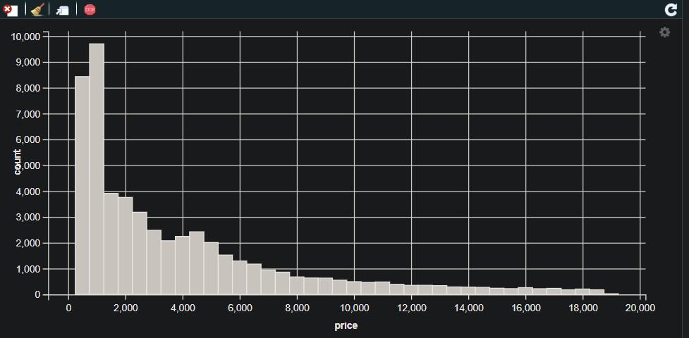
Histogram using the ggvis Package in R
Customizing Aesthetics of Plots (colors, shapes, sizes, etc.) using ggvis Package in R
The ggvis is an R package for creating interactive data visualizations that allow you to customize the aesthetics of plots using the layer_* functions. Commonly customized aesthetic properties include fill color, stroke color, size, and opacity, which can be specified using the fill, stroke, size, and opacity arguments in the layer_* functions. For instance, you can create a scatter plot with red circles of size 5 using the layer_points function with the fill:= “red” and size:= 5 arguments. With ggvis, you can experiment with different colors, sizes, and other properties to tailor the appearance of your plot to your preferences.
Defining a Scatter Plot with Custom Aesthetic
R
library(ggvis)
library(dplyr)
data(mtcars)
mtcars %>%
ggvis(~wt, ~mpg) %>%
layer_points(
fill := "red",
stroke := "black",
strokeWidth := 2,
size := 150,
shape := "cross"
)
|
Output:
Customized Scatter Plot using the ggvis Package in R
It is defining a scatter plot using ggvis by specifying the x-axis and y-axis variables as ~wt and ~mpg, respectively. The layer_points function is used to add points to the plot with custom aesthetics, which are specified using aesthetic mappings. In this example, the points are filled with red color, have a black border with a thickness of 2, and are in the shape of a cross. Finally, the ggvis object is printed to display the resulting plot.
Defining a Line Chart with Custom Aesthetic
R
library(ggvis)
library(dplyr)
data(mtcars)
mtcars %>%
group_by(cyl) %>%
ggvis(~wt, ~mpg) %>%
layer_lines(
stroke := "blue",
strokeWidth := 2,
interpolate := "basis"
)
|
Output:
Customized Line Chart using the ggvis Package in R
It is defining a line chart using ggvis by specifying the x-axis and y-axis variables as ~wt and ~mpg, respectively. The group_by function is used to group the data by the cyl variable. The layer_lines function is used to add lines to the plot with custom aesthetics, which are specified using aesthetic mappings. In this example, the lines are colored blue, have a thickness of 2, and are interpolated using the “basis” method. Finally, the ggvis object is printed to display the resulting plot.
Interactive Features (Sliders, dopdowns, etc) using ggvis Package in R
In ggvis, sliders and dropdowns are interactive features that can be added to scatter plots to allow users to change the visualization.
Sliders can be added to a scatter plot using input_slider(), which creates an interactive slider widget that allows the user to change the value of a variable. For example, a slider can be added to change the size of the points in the scatter plot. Dropdowns can be added to a scatter plot using input_select(), which creates an interactive dropdown widget that allows the user to choose a value from a list of options. For example, a dropdown can be added to change the color of the points in the scatter plot.
Both sliders and dropdowns can be used in conjunction with other interactive features such as tooltips and legends to create more complex and informative visualizations.
R
library(ggvis)
library(dplyr)
data(iris)
iris %>%
ggvis(~Petal.Length, ~Petal.Width, fill = ~Species) %>%
layer_points(size := input_slider(1, 10, 5, step = 0.5),
fill := input_select(choices = c("red",
"green", "blue"),
label = "Color")) %>%
add_axis("x", title = "Petal Length") %>%
add_axis("y", title = "Petal Width") %>%
add_tooltip(function(df) paste0("Species: ",
df$Species,
"<br>", "Petal Length: ",
format(df$Petal.Length,
digits = 2),
"<br>", "Petal Width: ",
format(df$Petal.Width,
digits = 2)))
iris %>%
ggvis(~1, ~1) %>%
layer_points(size := 0, fill := ~Species) %>%
add_legend("fill",
properties = legend_props(legend = list(title = "Species")),
values = c("setosa", "versicolor", "virginica"))
|
Output:
In this example, we load the iris dataset and create a scatter plot of Petal.Length vs Petal.Width, with the point size controlled by a slider and the point color controlled by a dropdown menu. We also add a tooltip that displays the species name, Petal.Length, and Petal.Width when the mouse hovers over a point. Finally, we add a legend that displays the colors used for each species.
Share your thoughts in the comments
Please Login to comment...