Data Visualisation using ggplot2(Scatter Plots)
Last Updated :
12 Jun, 2023
The correlation Scatter Plot is a crucial tool in data visualization and helps to identify the relationship between two continuous variables. In this article, we will discuss how to create a Correlation Scatter Plot using ggplot2 in R. The ggplot2 library is a popular library used for creating beautiful and informative data visualizations in R Programming Language.
- Scatter Plot: A scatter plot is a graphical representation of the relationship between two variables, where each observation is represented by a point on a 2D plane.
- Correlation: Correlation is a measure of the linear association between two variables. The correlation coefficient can range from -1 to 1, where -1 indicates a perfect negative correlation, 0 indicates no correlation, and 1 indicates a perfect positive correlation.
- ggplot2: ggplot2 is a widely used data visualization library in R. It provides a simple and intuitive syntax for creating complex visualizations.
- Load the ggplot2 library: Before creating a Correlation Scatter Plot, you need to load the ggplot2 library by using the following command: “library(ggplot2)”.
- Prepare the data: You need to prepare the data that you want to visualize in the form of a data frame. The data should contain two columns, representing the two variables that you want to visualize.
Basic correlation Scatter Plot using ggplot2:
The first we’ll do is load the necessary packages and create a sample dataset. For the below example, we’ll use the default mtcars dataset that contains information on various car models and their specifications.
R
library(ggplot2)
data(mtcars)
df <- mtcars[, c("mpg", "wt")]
|
The next thing we’ll do is use ggplot() function that creates a plot object and will use the geom_point() function to add points to the plot with mpg on the x-axis and wt on the y-axis:
R
ggplot(df, aes(x = mpg, y = wt)) +
geom_point()
|
Output:
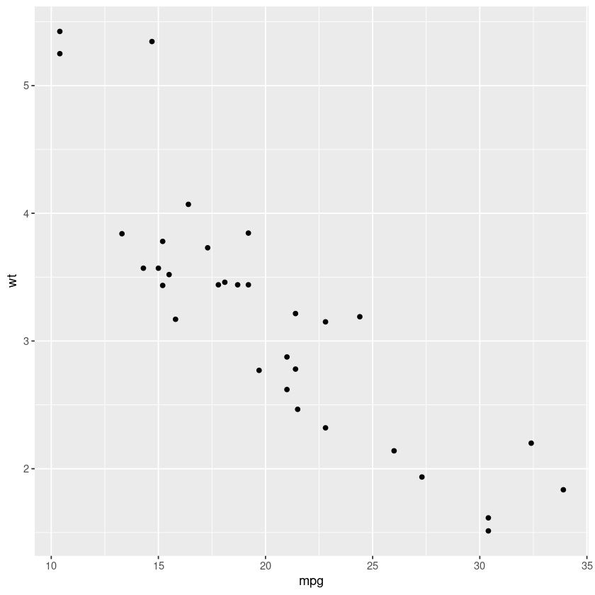
Scatter plot using ggplot2
It is often useful to add a regression line to plot for the visualization of the overall trend in data. For doing this we can use the geom_smooth() function:
R
ggplot(df, aes(x = mpg, y = wt)) +
geom_point() +
geom_smooth(method = "lm")
|
Output:
This above snippet will add a regression line to the plot using the linear regression method. Here’s another example of a correlation scatter plot using the ggplot2 package. For this example, we’ll use the iris dataset that contains information on various iris flowers and their petal and sepal dimensions.
R
data(iris)
df <- iris[, c("Sepal.Length", "Sepal.Width",
"Petal.Length", "Petal.Width",
"Species")]
|
Then, we’ll use the ggplot() function to create a plot object, and the geom_point() function to add points to the plot with Sepal.Length on the x-axis and Petal.Length on the y-axis. We’ll also use the aes() function to map the color of points to different Species of iris flowers.
R
ggplot(df, aes(x = Sepal.Length,
y = Petal.Length,
color = Species)) +
geom_point()
|
Output:
Now, to add a regression line to the plot, we would use the geom_smooth() function with the method argument set to “lm” for linear regression:
R
ggplot(df, aes(x = Sepal.Length,
y = Petal.Length,
color = Species)) +
geom_point() +
geom_smooth(method = "lm")
|
Output:
To further customize the plot, what we can do is use the facet_wrap() function to create separate plots for each Species of iris flower:
R
ggplot(df, aes(x = Sepal.Length,
y = Petal.Length,
color = Species)) +
geom_point() +
geom_smooth(method = "lm") +
facet_wrap(~Species, ncol = 2)
|
Output:
In conclusion to this example, we loaded the ggplot2 package, created a sample dataset, and used ggplot() to initialize a plot object anc then used the geom_point() to add points to the plot with the color of the points mapped to the different Species using the aes() function. Then, added a regression line to the plot using the geom_smooth() function with the method argument set to “lm” for linear regression. Finally used the facet_wrap() to create separate plots for each Species and specified the number of columns using the ncol argument.
Scatter Plot of MPG dataset using the ggplot2 function
As we know we’ll load the necessary packages and create a sample dataset first. For this example we are going to use the mpg dataset that contains information on various cars and their fuel economy:
R
library(ggplot2)
data(mpg)
df <- mpg[, c("displ", "hwy", "cyl", "class")]
|
Next, we’ll use the ggplot() function to create a plot object and the aes() function to map the displ column to the x-axis and hwy column to the y-axis. And also use the geom_point() function to add points to the plot with the color of the points mapped to cyl column and the shape of the points mapped to the class column. We’ll be using the scale_shape_manual() and scale_color_manual() functions to manually set the shapes and colors of the points.
R
ggplot(df, aes(x = displ, y = hwy,
color = factor(cyl),
shape = factor(class)))+
geom_point() +
scale_shape_manual(values = c(15, 16, 17,
18, 19, 24, 25))
|
Output:
Now to add a regression line to the plot we could use the stat_smooth() function with the method argument set to “lm” for linear regression:
R
ggplot(df, aes(x = displ, y = hwy,
color = factor(cyl),
shape = factor(class))) +
geom_point() +
scale_shape_manual(values = c(15, 16, 17,
18, 19, 24, 25)) +
stat_smooth(method = "lm", se = FALSE)
|
Output:
To further customize the plot, we’ve changed the color palette using the scale_color_brewer() function with palette = “Set1” to use a more visually appealing color scheme.
R
ggplot(df, aes(x = displ, y = hwy,
color = factor(cyl),
shape = factor(class))) +
geom_point() +
scale_shape_manual(values = c(15, 16,
17, 18,
19, 24, 25)) +
stat_smooth(method = "lm", se = FALSE)+
scale_color_brewer(palette = "Set1")
|
Output:
Finally, we can use the labs() function to add custom axis and legend labels:
R
ggplot(df, aes(x = displ, y = hwy,
color = factor(cyl),
shape = factor(class))) +
geom_point() +
scale_shape_manual(values = c(15, 16, 17,
18, 19, 24, 25)) +
stat_smooth(method = "lm", se = FALSE)+
scale_color_brewer(palette = "Set1") +
labs(x = "Engine displacement (L)",
y = "Highway fuel economy (mpg)",
color = "Number of cylinders",
shape = "Vehicle class")
|
In conclusion to this example, we created a correlation scatter plot with engine displacement (displ) on the x-axis, highway fuel economy (hwy) on the y-axis, and color and shape of points mapped to a number of cylinders (cyl) and vehicle class. The plot also includes a linear regression line with shaded confidence intervals and custom labels for the axes and legend. Also, the color and shape of the points are manually specified using the scale_color_manual() and scale_shape_manual() functions, respectively.
Conclusion:
In this article, we demonstrated how to create a correlation scatter plot in R using the ggplot2 library. We’ve discussed the concepts of scatter plots, correlation, and ggplot2, and provided step-by-step instructions on how to create a scatter plot. Three detailed examples were also provided to showcase the capabilities of ggplot2. The information in the article should be useful for anyone looking to visualize the relationship between two variables using a scatter plot in R.
Share your thoughts in the comments
Please Login to comment...