How to Insert Line of Best Fit in Google Spreadsheets
Last Updated :
06 Sep, 2023
How to Find the Line of Best Fit on Google Sheets
- Select the Customize tab from the Chart Editor
- Select the Series drop-down menu
- Scroll down to the three checkboxes
- Click on the Trend Line checkbox
Creating plots is a crucial aspect of working with spreadsheet software like Google Sheets and Microsoft Excel. Frequently, we encounter scenarios where we need to analyze data obtained from experiments or external sources, and manually identifying trends can be challenging. In such cases, we employ the technique of polynomial fitting from Statistics to determine a mathematical function that optimally aligns with the provided data. The utilization of graphs and charts for data visualization remains a valuable method for extracting insights and understanding relationships among different data points.
What is a Line of Best Fit?
The line of best fit is a highly used concept of statistics. It refers to a line/curve that represents the relation between two random/unknown variables in a scatter plot such that we can make predictions using this line and the error or, distance between the original data points and the predicted ones is minimized. Now, it is not necessary that the line of best fit has to be straight; it can be a curve depending upon the spread in the scatter plot. Presently, it is very easy to find the line of best fit of any data because there is a plethora of tools available for this analysis such as Google Sheets, Microsoft Excel, OriginPro, etc.
In this article, we will learn how to find the line of best fit (Polynomial Fitting) for a given data in Google Sheets. Google Sheets provides many functions that help us to find the best-fit line and add it to the plot of given data.
How to Create a Line of Best Fit in Google Sheets
Step 1: Create a Scatter Plot of Some Data
Before adding a line of best fit, we need a scatter plot of the data for which we require the best-fit line. Now, for demonstration purposes, we shall use the following data.
| 3 |
27.247 |
| 5 |
127.141 |
| 8 |
509.875 |
| 9 |
728.709 |
| 13 |
2196.798 |
Step 2. Open New Spreadsheet
Now open a new spreadsheet in Google Sheets and add the above data to the spreadsheet. Then, click on Insert in the toolbar and then choose Charts
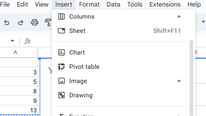
New Sheet > Insert > Charts
Step 3. Open Chart Editor
Now, this will create a default line chart and open the chart editor. Here, the first option will be to select the chart type from a drop-down menu. From this menu, select the scatter chart option.
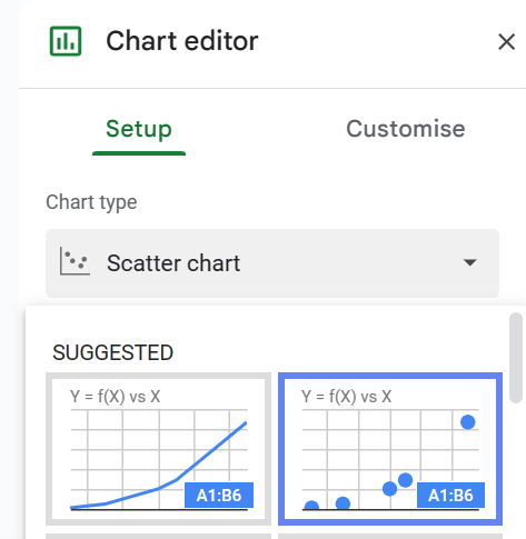
Selecting scatter Plot as the Chart type for our Chart/Plot
Now, our plot will look as follows:
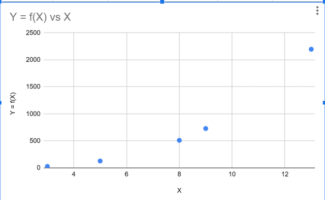
Scatter Chart in Google Sheets
Step 4. Adding Line of Best Fit Trendline
Now, that we have our plot, we can add the line of best fit to our data. To do the same, we need to open the chart editor, which can be accessed by clicking on the three dots icon on the top right corner of the chart and then, choosing Edit the chart.
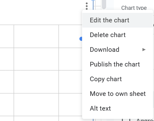
Accessing the Chart Editor in Google Sheets
Step 5: Customize and Select Series
Now, in the chart editor, select Customise from the horizontal options, and under the Customise section, select Series as shown in the figure below.
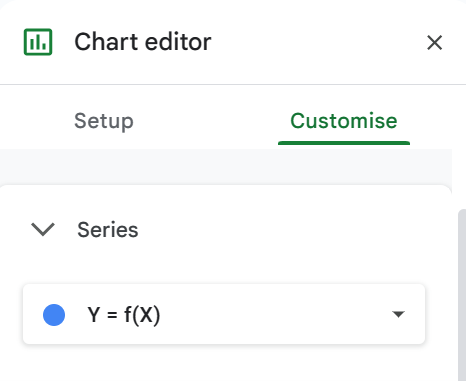
Accessing the Advanced customization options for the chart to add the line of best fit to it.
Step 6. Check the Trend Line
Now, under the Series section, check the trend line option to add a trend line (line of best fit) to your chart. The default nature of the trend line is linear; which is not always the best option with the majority of real-life data. Thus, for the best fit in most cases, we should keep the trend line as a polynomial. This can be done by changing the type of trend line to Polynomial, as shown in the figure below.
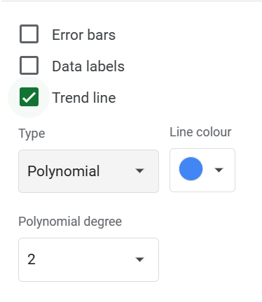
Option for adding the line of best fit/trend line to the chart
Step 7. Preview Added Line of Best Fit
Once this is done, a line of best fit will be added to your chart. A thing to be noted is that Google sheet smartly detects the degree of ploynomial of best fit however, this can be changed by the user according to their will. Now, our chart will look something like this.
Note: The blue curve represents the line of best fit for the data we used in this example.
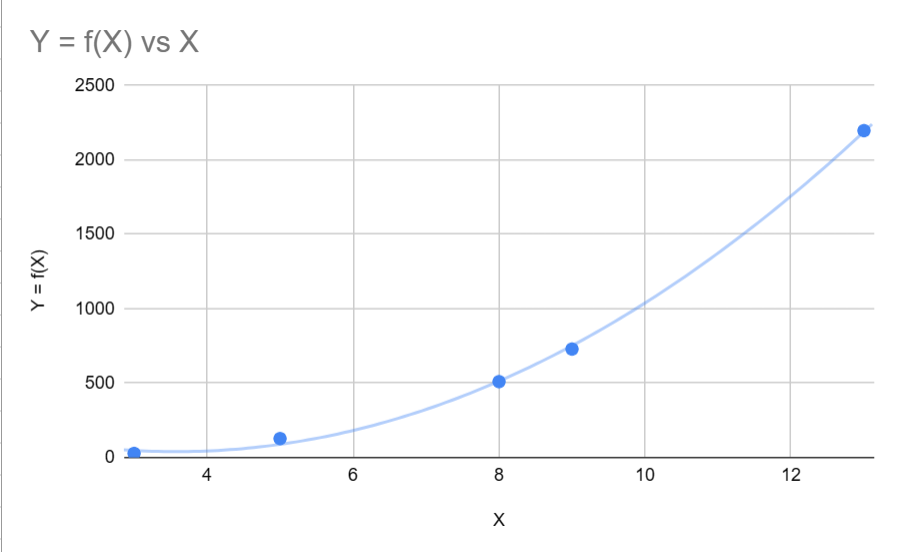
Scatter Plot with Line(Curve) of best fit in Google Sheets
How To Find the Slope of a Line of Best Fit In Google Sheets?
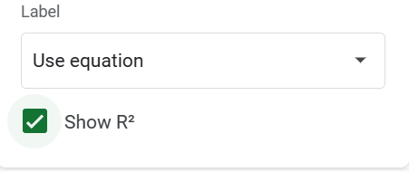
Now, for those who need extra insights into their data, they can get the equation of the best-fit line used and also the R^2 value of the line. The R^2 value represents how well the best-fit line fits the given data. The closer the value is to 1, the better the fit. Absolute 1 means the line fits the data. To add these values, we only need to choose the options in the chart editor.
How to Find R2 in Google Sheets [R-Squared]
Under the Trendline Checkbox, there are options for Label and a checkbox for \bold{r^2}. Set the label to Use Equation from the dropdown menu and tick the checkbox for R-squared value.
Adding the R-squared value to the chart
Once, the above steps are done, the graph should look like this:
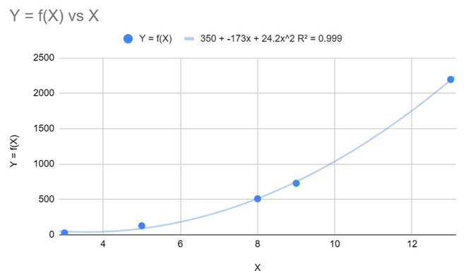
Chart line of best fit, trend line equation, and R-square value.
As we can see, the graph now displays the equation of the best-fit curve and the R-squared value.
Conclusion
In this article, we have learned the process of adding a line of best fit to a scatter plot in Google Sheets, using randomly generated data. Initially, we created a basic scatter plot using dummy data. Next, we outlined the steps to access the chart editor in Google Sheets, enabling us to incorporate the line of best fit into our scatter plot. Finally, we elucidated how to display the equation representing the line of best fit, as well as the R-squared value, directly on the chart.
Share your thoughts in the comments
Please Login to comment...