How to Create a Scatter Plot with Lines in Google Sheets
Last Updated :
11 Oct, 2023
How to Insert Line of Best Fit in Google Sheets – Quick Steps
- Select your data.
- Click “Insert” > “Chart.”
- Choose a scatter chart.
- In the chart, select the data points.
- Enable the trendline option and choose “Linear.”

Making various charts and graphs is one of Google Sheets’ core features, making it a potent tool for data analysis and visualization. The relationship between two sets of data points is frequently visualized using scatter plots. Although scatter plots are useful for displaying data points, there are instances when you might wish to add a line of best fit or a trendline to the plot to help you comprehend the data. We’ll demonstrate in this article how to add a line to a scatter plot in Google Sheets.
How to Make a Scatter Plot in Google Sheets
Step 1: Insert the Data
Before you can create a scatter plot with a line in Google Sheets, you need to have your data ready. Make sure you have two columns of data in your spreadsheet, one for the x-axis (independent variable) and one for the y-axis (dependent variable).
In our example, we’ll use a Salary dataset of x and y values.

Overview of the dataset
Step 2: Create a Scatter Plot
Select Your Data: Highlight the data you want to include in your scatter plot. In our case, select both columns (X for ‘Years of Experience’ and Y for ‘Salary’).
.webp)
Create a Scatter Plot
Step 3: Go to the Insert Tab and Select Chart
Click on the “Insert” menu at the top of Google Sheets and Choose the Chart from the displayed drop-down menu.

Click on Insert> Chart
Step 4: Select Scatter Chart
After Selecting an on,, Select the option of Scatter Chart from those.

Select Scatter Chart
Step 5: Preview the Scatter Plot
Your scatter plot will now be displayed in your Google Sheets document.
.webp)
Preview the Scatter Chart
How to Add a Trendline to a Scatter Chart in Google Sheet
Step 1: Click on Scatter Plot, Customize Your Chart, and Choose ‘Series’
Select the Scatter Plot by Clicking on it and then Customize Your Chart. In the Chart Editor panel on the right, click on the “Customize” tab then click “Series”.

Click on Scatter Plot> Customize > Choose Series
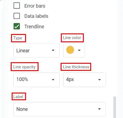
Step 2: Select the Trendline Type and Customize it
Scroll down until you see the “Trendline” section. Check the box next to “Trendline.” Select the type of trendline you want to add. Options include Linear, Exponential, Polynomial, or Moving Average. Further customize your trendline by adjusting options like line colour, opacity, and label.
.webp)
Select the Trendline Type
Step 3: Preview Your Scatter Plot with a Trendline
With the trendline added to your scatter plot, you can now analyze the relationship between your data points more effectively. The trendline provides a visual representation of the general direction or pattern in your data. For example, a linear trendline can show if the Salary is higher with higher Years of Experience.
.webp)
Preview your Chart with Trendline
How to Edit Scatter Plots in Google Sheets
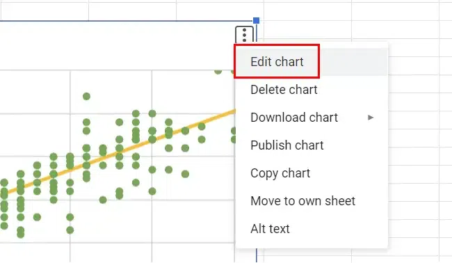
Step 1: Select the Scatter Plot, Click on Edit and Open the Chart Editor
Begin by selecting the scatter plot you want to edit in your Google Sheets document. Click on the chart to highlight it, right-click and select the edit option. A chart editor will open. In the Chart editor on the right side of your Google Sheets document, you’ll find various customization options for your scatter plot. This is where you can make edits to the chart.
Select the Scatter Plot, Click on Edit
Step 2: Click on Customize

Open the Chart Editor
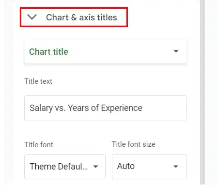
Step 3: Customize Chart Elements
Under the “Chart elements” section, click on the drop-down arrow to reveal a list of chart elements you can customize. Here, you can choose which aspect of the scatter plot to edit, such as axes, series, or titles.
Customize Chart Elements
Step 3: Adjust Chart Elements
After selecting a chart element, you can make adjustments to its appearance, style, and content in the Chart editor. For example, you can change axis labels, modify the trendline, or adjust data series properties.
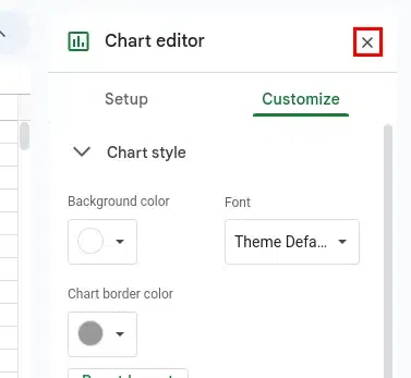
Step 4: Preview Changes and Save Your Edits
As you make edits, your scatter plot will update in real-time. Preview how your changes affect the chart’s appearance and functionality. Once you’re satisfied with your edits, click the Close icon on the Right side of the Chart editor to save your changes to the scatter plot.
How to Remove Scatter Plots in Google Sheets
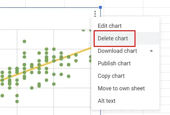
Step 1: Select the Scatter Plot
To remove a scatter plot, start by clicking on the scatter plot you want to delete within your Google Sheets document. Ensure the chart is selected.
Step 2: Delete the Scatter Plot
Under the “Edit Chart” section click on the “Delete Chart” option to delete the selected scatter plot from your document.
Step 3: Scatter Plot Removed
After confirming the deletion, the scatter plot will be removed from your Google Sheets document, leaving the rest of your data intact. Following these steps, you can easily edit and remove scatter plots in Google Sheets, allowing you to fine-tune your visualizations and manage your charts effectively.
Conclusion
A useful skill in the field of data analysis is knowing how to add a line to a scatter plot in Google Sheets. It turns a straightforward scatter plot into a useful instrument for figuring out data trends. This function can assist you in improving the quality of your decisions, whether you’re investigating academic data or business indicators. So, the next time you have a scatter plot, don’t forget to add a line for a more in-depth understanding that might alter how you perceive your data.
Frequently Asked Questions (FAQs)
Can I add multiple trendlines to a single scatter plot?
Yes, you can add multiple trendlines to analyze different aspects of your data simultaneously.
What’s the difference between a linear and exponential trendline?
A linear trendline represents a straight-line relationship, while an exponential trendline shows exponential growth or decay.
How do I make multiple lines in one cell in Google Sheets?
To make multiple lines in one cell you can simply write a formula using the & sign and CHAR function between lines.
How do I add multiple best fit lines in Google Sheets?
Once you have created your scatter plot, you can include a line of best fit by opening your Chart Editor and selecting the three dots from the right-hand corner.
Share your thoughts in the comments
Please Login to comment...