How To Facet a Scatter Plot with Altair?
Last Updated :
03 Jan, 2021
In this article, we will learn how to Facet a Scatter Plot with Altair. Let’s recall some concepts :
- Altair is a statistical visualization library in Python. It is declarative in nature and is based on Vega and Vega-Lite visualization grammars. It is fast becoming the first choice of people looking for a quick and efficient way to visualize datasets. If you have used imperative visualization libraries like matplotlib, you will be able to rightly appreciate the capabilities of Altair.
- A scatter plot (also called a scatterplot, scatter graph, scatter chart, scattergram, or scatter diagram) is a type of plot or mathematical diagram using Cartesian coordinates to display values for typically two variables for a set of data.
Here, we are making the scatter plot using Altair library. For this, we use Chart() function in Altair to load the data and then use the mark_point() function to make a scatter plot. We then use the aesthetics x and y-axis to encode() function. After making this scatter plot we will facet it with a grouped column values such as clusters.
Steps Needed
- Import Libraries (Altair).
- Create/Load data.
- Use Chart() to load data for plot.
- Use mark_point() to scatter plot.
- Use encode() for x and y axes.
- (Optional)Use properties() for setting width and height.
- Use facet() over scatter plot with clusters.
Examples
Let’s understand the above-mentioned steps with the help of some examples :
Example 1:
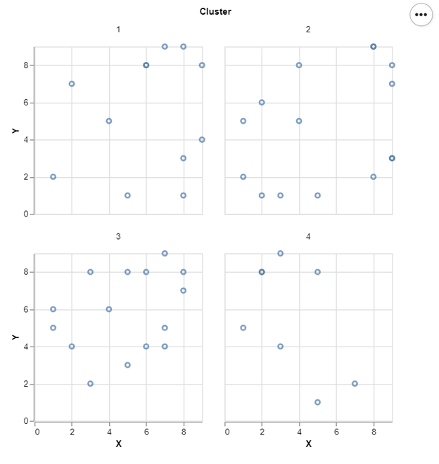
In this example, we draw a simple facet Scatter plot with some dummy data. That is shown below:
Below is the implementation:
Python3
import altair as alt
import pandas as pd
import numpy as np
np.random.seed(1)
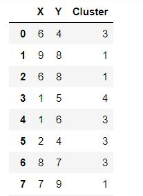
df = pd.DataFrame({'X':np.random.randint(1, 10, 50),
'Y':np.random.randint(1, 10, 50),
'Cluster':np.random.randint(1, 5, 50)})
alt.Chart(df).mark_point().encode(
x=alt.X('X'),
y=alt.Y('Y')
).properties(width = 200, height = 200).facet(
'Cluster:N',
columns = 2
)
|
Output:
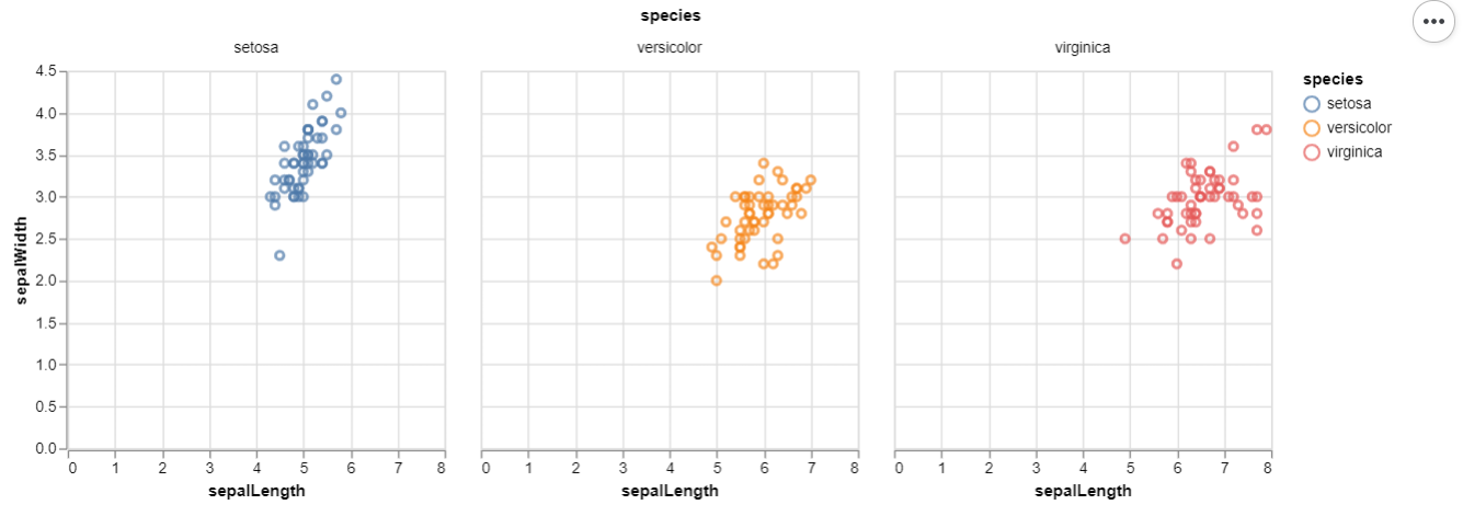
Example 2 : (Iris Data From Vega Dataset)
Python3
import altair as alt
from vega_datasets import data
iris = data.iris()
alt.Chart(iris).mark_point().encode(
x = alt.X('sepalLength'),
y = alt.Y('sepalWidth'),
color = 'species'
).properties(width = 250, height = 250).facet(
'species:N',
columns = 3
)
|
Output:
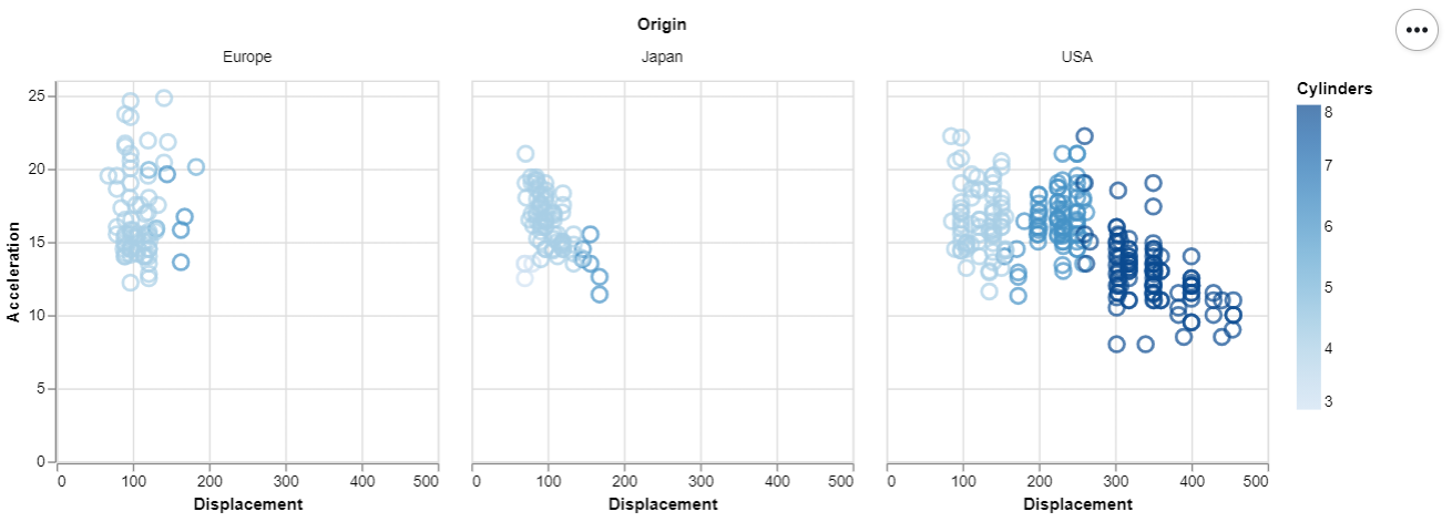
Example 3 : (Cars Data From Vega Dataset)
Python3
import altair as alt
from vega_datasets import data
cars = data.cars()
alt.Chart(cars).mark_point().encode(
x = alt.X('Displacement'),
y = alt.Y('Acceleration'),
size = alt.value(100),
color = 'Cylinders'
).properties(width = 250, height = 250).facet(
'Origin:N',
columns = 3
)
|
Output:
Share your thoughts in the comments
Please Login to comment...