How to Add a Shadow to a Button ?
Last Updated :
20 Mar, 2024
Adding a shadow to the button significantly enhances the visual appeal of the elements, improving the overall look and feel of the application. We can add a Shadow to a Button using different approaches including, the box-shadow property, CSS variables, filter property, and pseudo-class.
We can use these approaches to add a shadow to the button:
Using box-shadow Property
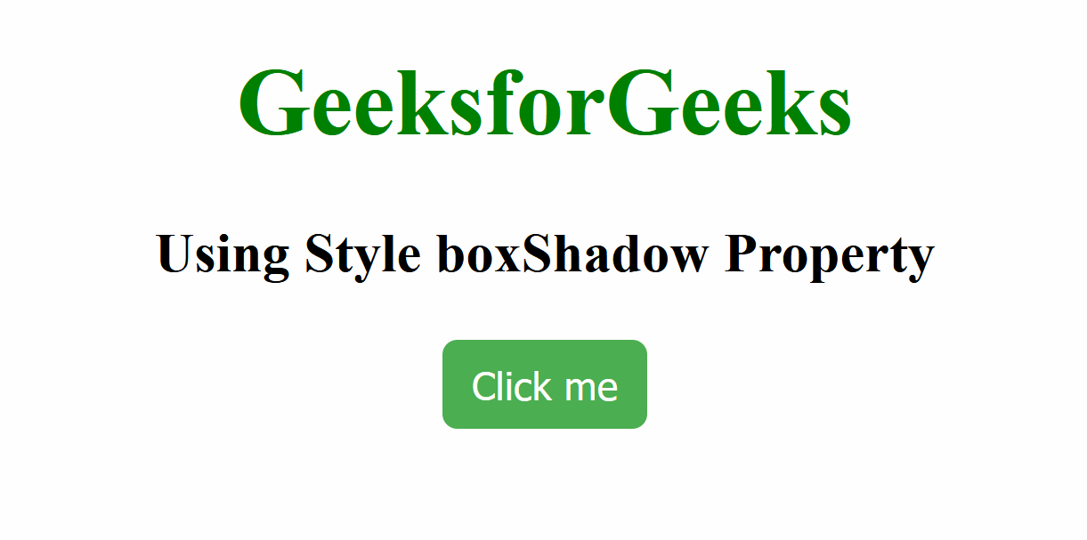
In this approach, we are using the box-shadow property. The JavaScript function randomFn() generates random values for the shadow’s offset, blur radius, and color, and applies them to the button.
Syntax:
object.style.boxShadow
Example: The below example uses boxShadow Property to add a shadow to a Button.
HTML
<!DOCTYPE html>
<html lang="en">

<head>
    <meta charset="UTF-8">
    <meta name="viewport"
          content="width=device-width, initial-scale=1.0">
    <title>Document</title>
    <style>
        h1 {
            color: green;
            text-align: center;
        }

        h3 {
            text-align: center;
        }

        .button {
            background-color: #4caf50;
            color: white;
            padding: 7px 10px;
            border: none;
            border-radius: 5px;
            cursor: pointer;
            transition: box-shadow 0.3s ease;
        }
    </style>
</head>

<body>
    <h1>GeeksforGeeks</h1>
    <h3>Using Style boxShadow Property</h3>
    <center>
        <button class="button" id="dynamicButton">
            Click me
        </button>
    </center>
    <script>
        document.getElementById('dynamicButton')
            .addEventListener('mouseover', function () {
                let randomShadow = randomFn();
                this.style.boxShadow = randomShadow;
            });
        function randomFn() {
            let x = Math.floor(Math.random() * 10);
            let y = Math.floor(Math.random() * 10);
            let r = Math.floor(Math.random() * 10);
            let col = getFn();
            return x + 'px ' + y + 'px ' + r + 'px ' + col;
        }
        function getFn() {
            let l = '0123456789ABCDEF';
            let col = '#';
            for (let i = 0; i < 6; i++) {
                col += l[Math.floor(Math.random() * 16)];
            }
            return col;
        }
    </script>
</body>

</html>
Output:
Using CSS Variables
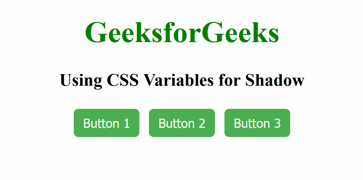
In this approach, we are using CSS variables to define the properties of the button’s box shadow, such as offset, blur, and color. The dynamic shadow effect is then done using JavaScript by applying a random box shadow when the mouse hovers over each button in the button group.
Syntax:
--shadow-offset-x: value;
--shadow-offset-y: value;
 --shadow-blur: value; // value is 10px
 --shadow-color: value; // value is #888888
Example: The below example uses CSS Variables to add a shadow to a Button.
HTML
<!DOCTYPE html>
<html lang="en">

<head>
    <meta charset="UTF-8">
    <meta name="viewport"
          content="width=device-width, initial-scale=1.0">
    <title>Document</title>
    <style>
        h1 {
            text-align: center;
            color: green;
        }

        h3 {
            text-align: center;
        }

        .button {
            background-color: #4caf50;
            color: white;
            padding: 7px 10px;
            border: none;
            border-radius: 5px;
            cursor: pointer;
            transition: box-shadow 0.3s ease;
            --shadow-offset-x: 5px;
            --shadow-offset-y: 5px;
            --shadow-blur: 10px;
            --shadow-color: #888888;
        }

        .button:hover {
            box-shadow: var(--shadow-offset-x)
                          var(--shadow-offset-y)
                          var(--shadow-blur)
                          var(--shadow-color);
        }

        .button-group {
            display: flex;
            justify-content: center;
            margin-top: 20px;
        }

        .button+.button {
            margin-left: 10px;
        }
    </style>
</head>

<body>
    <h1>GeeksforGeeks</h1>
    <h3>Using CSS Variables for Shadow</h3>
    <div class="button-group">
        <button class="button" id="button1">
            Button 1
        </button>
        <button class="button" id="button2">
            Button 2
        </button>
        <button class="button" id="button3">
            Button 3
        </button>
    </div>
    <script>
        function shadowFn(element) {
            element.addEventListener('mouseover', function () {
                let randomShadow = getFn();
                this.style.boxShadow = randomShadow;
            });
        }
        function getFn() {
            let x = Math.floor(Math.random() * 10);
            let y = Math.floor(Math.random() * 10);
            let r = Math.floor(Math.random() * 10);
            let sCol = getColFn();

            return x + 'px ' + y + 'px ' + r + 'px ' + sCol;
        }
        function getColFn() {
            let l = '0123456789ABCDEF';
            let col = '#';
            for (let i = 0; i < 6; i++) {
                col += l[Math.floor(Math.random() * 16)];
            }
            return col;
        }
        shadowFn(document.getElementById('button1'));
        shadowFn(document.getElementById('button2'));
        shadowFn(document.getElementById('button3'));
    </script>
</body>

</html>
Output:
Using filter property
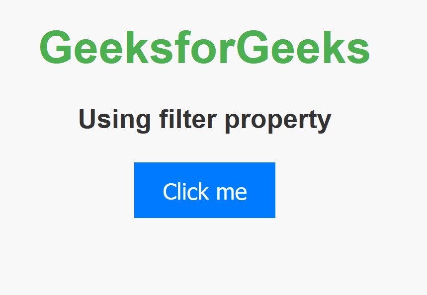
In this approach, we are using the CSS filter property with the drop-shadow function to add a shadow effect to the button. We have applied this property to the <button> element by referencing it in CSS.
Syntax:
filter: drop-shadow(x y z rgb(a, b, c));
where x= 4px , y= 4px , z= 6px , a= 255 , b= 0 , c= 0 .
Example: The below example uses filter property to add a shadow to a Button.
HTML
<!DOCTYPE html>
<html lang="en">

<head>
    <meta charset="UTF-8">
    <meta name="viewport"
          content="width=device-width, initial-scale=1.0">
    <title>Using filter</title>
    <style>
        body {
            font-family: Arial, sans-serif;
            text-align: center;
            margin: 50px;
            background-color: #f8f8f8;
            color: #333;
        }

        h1 {
            color: #4CAF50;
        }

        h3 {
            margin-bottom: 20px;
        }

        button {
            padding: 10px 20px;
            font-size: 16px;
            background-color: #007BFF;
            color: #fff;
            border: none;
            cursor: pointer;
            transition: filter 0.3s;
        }

        button:hover {
            filter: drop-shadow(4px 4px 6px rgb(255, 0, 0));
        }
    </style>
</head>

<body>
    <h1>GeeksforGeeks</h1>
    <h3>Using filter property</h3>
    <button>Click me</button>
</body>

</html>
Output:
Using:hover pseudo-class
In this approach, we are using the:hover pseudo-class in CSS to define a shadow effect for a button when it is hovered over. The box-shadow property is applied with specified values.
Syntax:
button:hover {
   box-shadow: x y z rgb(a, b, c);
}
where x= 8px , y= 8px , z= 9px , a= 0 , b= 255 , c= 0 .
Example: The below example uses:hover pseudo class to add a shadow to a Button.
HTML
<!DOCTYPE html>
<html lang="en">

<head>
    <meta charset="UTF-8">
    <meta name="viewport"
          content="width=device-width, initial-scale=1.0">
    <title>pseudo class</title>
    <style>
        body {
            font-family: Arial, sans-serif;
            text-align: center;
            margin: 50px;
            background-color: #f8f8f8;
            color: #333;
        }

        h1 {
            color: #4CAF50;
        }

        h3 {
            margin-bottom: 20px;
        }

        button {
            padding: 10px 20px;
            font-size: 16px;
            background-color: #007BFF;
            color: #fff;
            border: none;
            cursor: pointer;
            transition: box-shadow 0.3s;
        }

        button:hover {
            box-shadow: 8px 8px 9px rgb(0, 255, 0);
        }
    </style>
</head>

<body>
    <h1>GeeksforGeeks</h1>
    <h3>Using :hover pseudo class</h3>
    <button>Click me</button>
</body>

</html>
Output:

Share your thoughts in the comments
Please Login to comment...