Machine learning can effectively identify patterns in data, providing valuable insights from this data. This article explores one of these machine learning techniques called Logistic regression and how it can analyze the key patient details and determine the probability of heart disease based on patient health data in R Programming Language.
Logistic Regression
In binary classification tasks, we only have two output classes and logistic regression is a popularly used algorithm for this task. The basis of Logistic Regression is the sigmoid function that gives a probabilistic estimate between 0 and 1. This probability is used for predictions using a threshold value. In heart disease prediction, logistic regression is applied to estimate the likelihood of a patient having heart disease using factors like age, sex, cholesterol levels, and other pertinent variables.
Importing Libraries
In this project, we have incorporated several essential libraries to facilitate our data analysis and model building.
- ggplot2: This module is used for drawing data visualizations such as bar charts and histograms.
- gplots: This library provides advanced plotting functions such as plotting fourfold plot of the confusion matrix.
- GGally: This module enhances the functionality of ggplot2 for creating plots in a matrix layout.
- dplyr: This library is used for data manipulation tasks like filtering and summarizing data.
- tidyr: This library helps in tidying and reshaping of data.
- readr: Provides functions for reading and writing data.
- caret: This module provides functions for machine learning tasks like splitting data, training models (logistic regression), and evaluating model performance.
R
# Import libraries
library(dplyr)
library(tidyr)
library(readr)
library(caret)
library(ggplot2)
library(gplots)
library(GGally)
Importing Dataset
For this study, we will be using the heart disease dataset which includes patient data with a diagnosis of heart disease and is freely accessible on Kaggle. It consists of various factors pertaining to heart diseases such as age, sex, blood pressure, cholesterol level, blood sugar level, ECG results, etc. Based on the degree of blood vessel narrowing, the “target” variable, which represents our prediction target, is utilized to predict whether heart disease would manifest or not.
Dataset Link: Heart Disease Dataset
A target value of 0 indicates that the blood artery diameter is narrowing by less than 50%, implying a lower risk of heart disease.
- A target value of 1 indicates that the narrowing is greater than 50%, implying an increased risk of heart disease.
R
# Importing dataset
df <- read.csv("heart.csv")
head(df)
Output:
  age sex cp trestbps chol fbs restecg thalach exang oldpeak slope ca thal target
1  52   1  0      125  212   0       1     168     0     1.0     2  2    3      0
2  53   1  0      140  203   1       0     155     1     3.1     0  0    3      0
3  70   1  0      145  174   0       1     125     1     2.6     0  0    3      0
4  61   1  0      148  203   0       1     161     0     0.0     2  1    3      0
5  62   0  0      138  294   1       1     106     0     1.9     1  3    2      0
6  58   0  0      100  248   0       0     122     0     1.0     1  0    2      1
Dimension of the data
R
# Getting the dimensions of the dataframe
dim(df)
Output:
[1] 1025 14
From this we have learnt about the dimensions of our dataset. Our dataset has 1025 rows of data available and for each row, we have 14 different features.
Getting summary statistics for the dataframe
R
# Getting summary statistics for the dataframe
summary(df)
Output:
      age             sex               cp            trestbps          chol          fbs
 Min.   :29.00   Min.   :0.0000   Min.   :0.0000   Min.   : 94.0   Min.   :126   Min.   :0.0000
 1st Qu.:48.00   1st Qu.:0.0000   1st Qu.:0.0000   1st Qu.:120.0   1st Qu.:211   1st Qu.:0.0000
 Median :56.00   Median :1.0000   Median :1.0000   Median :130.0   Median :240   Median :0.0000
 Mean   :54.43   Mean   :0.6956   Mean   :0.9424   Mean   :131.6   Mean   :246   Mean   :0.1493
 3rd Qu.:61.00   3rd Qu.:1.0000   3rd Qu.:2.0000   3rd Qu.:140.0   3rd Qu.:275   3rd Qu.:0.0000
 Max.   :77.00   Max.   :1.0000   Max.   :3.0000   Max.   :200.0   Max.   :564   Max.   :1.0000
    restecg          thalach          exang           oldpeak          slope             ca
 Min.   :0.0000   Min.   : 71.0   Min.   :0.0000   Min.   :0.000   Min.   :0.000   Min.   :0.0000
 1st Qu.:0.0000   1st Qu.:132.0   1st Qu.:0.0000   1st Qu.:0.000   1st Qu.:1.000   1st Qu.:0.0000
 Median :1.0000   Median :152.0   Median :0.0000   Median :0.800   Median :1.000   Median :0.0000
 Mean   :0.5298   Mean   :149.1   Mean   :0.3366   Mean   :1.072   Mean   :1.385   Mean   :0.7541
 3rd Qu.:1.0000   3rd Qu.:166.0   3rd Qu.:1.0000   3rd Qu.:1.800   3rd Qu.:2.000   3rd Qu.:1.0000
 Max.   :2.0000   Max.   :202.0   Max.   :1.0000   Max.   :6.200   Max.   :2.000   Max.   :4.0000
      thal           target
 Min.   :0.000   Min.   :0.0000
 1st Qu.:2.000   1st Qu.:0.0000
 Median :2.000   Median :1.0000
 Mean   :2.324   Mean   :0.5132
 3rd Qu.:3.000   3rd Qu.:1.0000
 Max.   :3.000   Max.   :1.0000
We have the statistical summary for each variable in our dataset.
Getting information about the dataframe
R
# Getting information about the dataframe
str(df)
Output:
'data.frame':    1025 obs. of  14 variables:
 $ age     : int  52 53 70 61 62 58 58 55 46 54 ...
 $ sex     : int  1 1 1 1 0 0 1 1 1 1 ...
 $ cp      : int  0 0 0 0 0 0 0 0 0 0 ...
 $ trestbps: int  125 140 145 148 138 100 114 160 120 122 ...
 $ chol    : int  212 203 174 203 294 248 318 289 249 286 ...
 $ fbs     : int  0 1 0 0 1 0 0 0 0 0 ...
 $ restecg : int  1 0 1 1 1 0 2 0 0 0 ...
 $ thalach : int  168 155 125 161 106 122 140 145 144 116 ...
 $ exang   : int  0 1 1 0 0 0 0 1 0 1 ...
 $ oldpeak : num  1 3.1 2.6 0 1.9 1 4.4 0.8 0.8 3.2 ...
 $ slope   : int  2 0 0 2 1 1 0 1 2 1 ...
 $ ca      : int  2 0 0 1 3 0 3 1 0 2 ...
 $ thal    : int  3 3 3 3 2 2 1 3 3 2 ...
 $ target  : int  0 0 0 0 0 1 0 0 0 0 ...
We now have information about the type of each feature in our dataset.
Exploratory Data Analysis
EDA helps us in analyzing our data in detail and discover trends, patterns and other crucial information through statistical summaries and graphical representations. This understanding will help us in optimal training of the Logistic Regression model for better prediction accuracy.
Firstly we will check if our dataset consists of any null values in any columns.
R
# Count missing values in each column
colSums(is.na(df))
Output:
     age      sex       cp trestbps     chol      fbs  restecg  thalach
       0        0        0        0        0        0        0        0
   exang  oldpeak    slope       ca     thal   target
       0        0        0        0        0        0
The output shows that there are no missing values in our heart disease dataset.
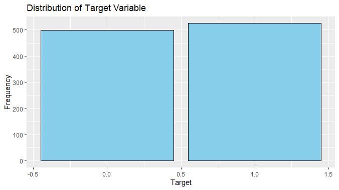
Now we will visualize our target variable using a barplot
R
# Visualizing the distribution of the target variable
ggplot(df, aes(x = target)) +
geom_bar(fill = "skyblue", color = "black", stat = "count") +
labs(title = "Distribution of Target Variable", x = "Target", y = "Frequency")
Output:
Logistic regression To predict heart disease using R
We can observe from this plot that the number of instances of patients with heart disease is slightly more than those without heart disease.
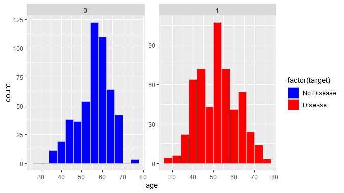
Next we shall plot a histogram to show the relation between heart disease and age
R
# Creating two separate plots for heart disease and no heart disease
ggplot(df, aes(x = age, fill = factor(target))) +
geom_histogram(binwidth = 4, position = "dodge", color = 'grey') +
scale_fill_manual(values = c("0" = "blue", "1" = "red"),
                  labels = c("No Disease", "Disease")) +
facet_wrap(~target, scales = "free_y")
Output:
Logistic regression To predict heart disease using R
We can observe that around 124 patients in the age of 50-60 had no heart diseases while around 100 patients in the age of 50-60 were suffering from heart diseases. This shows there is higher count of people without heart disease in ages of 50-60 in our dataset.
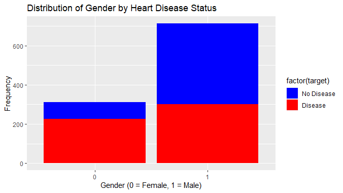
Next we will try to find a relation between gender and heart diseases
R
# Visualizing the relationship between gender and heart disease
ggplot(df, aes(x = factor(sex), fill = factor(target))) + geom_bar() +
labs(title = "Distribution of Gender by Heart Disease Status",
     x = "Gender (0 = Female, 1 = Male)", y = "Frequency") +
scale_fill_manual(values = c("0" = "blue", "1" = "red"),
                  labels = c("No Disease", "Disease"))
Output:
Logistic regression To predict heart disease using R
This visualization shows that the proportion of males with heart disease is much higher than females with heart disease showing a relation between gender and heart disease.
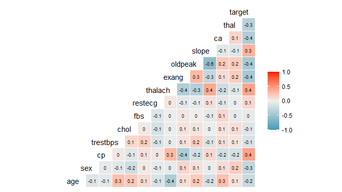
Correlation matrix Visualization
Finally, we use a correlation matrix to assess the relationships between the features. This matrix is a powerful tool for summarizing a large dataset, offering insights into patterns and potential dependencies among variables.
R
# Correlation matrix
ggcorr(df, label = TRUE, label_size = 2.5, hjust = 1, layout.exp = 2)
Output:
Logistic regression To predict heart disease using R
The variables “slope”, “thalach” and “cp” have a positive correlation with the target variable so these must be having strong relation with heart disease. On the other hand, the variable “fbs” has 0 correlation indicating it doesn’t have any relationship with our target variable.
Data Encoding
Exploratory Data Analysis reveals that certain factors like gender, type of chest pain, fasting blood sugar level, etc. are categorical variables and are not suitable for model training. We will encode these variables into “factor” data type in R for organized and improved understanding of this information. This encoding allows for efficient handling of categorical variables in statistical models and data analysis.
R
# Data Encoding
heart <- df %>%
  mutate(sex = as.factor(sex),
         cp = as.factor(cp),
         fbs = as.factor(fbs),
         restecg = as.factor(restecg),
         exang = as.factor(exang),
         slope = as.factor(slope),
         ca = as.factor(ca),
         thal = as.factor(thal),
         target = as.factor(target))

# Checking the structure of the dataset
str(heart)
Output:
'data.frame':    1025 obs. of  14 variables:
 $ age     : int  52 53 70 61 62 58 58 55 46 54 ...
 $ sex     : Factor w/ 2 levels "0","1": 2 2 2 2 1 1 2 2 2 2 ...
 $ cp      : Factor w/ 4 levels "0","1","2","3": 1 1 1 1 1 1 1 1 1 1 ...
 $ trestbps: int  125 140 145 148 138 100 114 160 120 122 ...
 $ chol    : int  212 203 174 203 294 248 318 289 249 286 ...
 $ fbs     : Factor w/ 2 levels "0","1": 1 2 1 1 2 1 1 1 1 1 ...
 $ restecg : Factor w/ 3 levels "0","1","2": 2 1 2 2 2 1 3 1 1 1 ...
 $ thalach : int  168 155 125 161 106 122 140 145 144 116 ...
 $ exang   : Factor w/ 2 levels "0","1": 1 2 2 1 1 1 1 2 1 2 ...
 $ oldpeak : num  1 3.1 2.6 0 1.9 1 4.4 0.8 0.8 3.2 ...
 $ slope   : Factor w/ 3 levels "0","1","2": 3 1 1 3 2 2 1 2 3 2 ...
 $ ca      : Factor w/ 5 levels "0","1","2","3",..: 3 1 1 2 4 1 4 2 1 3 ...
 $ thal    : Factor w/ 4 levels "0","1","2","3": 4 4 4 4 3 3 2 4 4 3 ...
 $ target  : Factor w/ 2 levels "0","1": 1 1 1 1 1 2 1 1 1 1 ...
Normalization and Data Splitting
Firstly we will select the features with higher relation with our target variable. Then we shall perform data normalization for stable and faster training of Logistic Regression model. After that, we split our dataset into two subsets. The initial subset, constituting 80% of the data, is employed to train the model, while the remaining 20% of the data is reserved for prediction purposes.
R
# Feature selection
features <- df[, c('age', 'sex',  'cp', 'trestbps', 'chol', 'restecg', 'thalach',
                   'exang', 'oldpeak', 'slope', 'ca', 'thal')]
target <- df$target

# Data normalization
preprocessParams <- preProcess(features, method = c("center", "scale"))
features_normalized <- predict(preprocessParams, features)

# Splitting the data
split <- createDataPartition(target, p = 0.8, list = FALSE)
X_train <- features_normalized[split, ]
X_test <- features_normalized[-split, ]
Y_train <- target[split]
Y_test <- target[-split]

# Print the shape of the training and test sets
print(paste("X_train shape:", paste(dim(X_train), collapse = "x")))
print(paste("X_test shape:", paste(dim(X_test), collapse = "x")))
Output:
X_train shape: 820x12

X_test shape: 205x12
Now that we have our data normalized and split into train and test sets, we are ready to train the Logistic Regression model on this data.
R
# Combine features and target into a single data frame
train_data <- as.data.frame(cbind(target = Y_train, X_train))

# Training the logistic regression model
model <- glm(target ~ ., data = train_data, family = "binomial")
Model Evaluation
After the model training is complete we can the predictions generated by Logistic Regression model on the test dataset. First we generate the probabilistic prediction by the Logistic Regression model and then we assign a threshold of 0.5 to further categorize these predictions into binary target classes.
R
# Making predictions on the test set
predictions <- predict(model, newdata = as.data.frame(X_test), type = "response")

# Converting probabilities to binary predictions based on threshold 0.5
binary_predictions <- ifelse(predictions >= 0.5, 1, 0)

# Combining actual values and predicted values into a data frame
result <- data.frame(actual = Y_test, predicted = binary_predictions)

# Evaluating the model
confusionMatrix(data = as.factor(binary_predictions), reference = as.factor(Y_test),
                   positive = "1")
Output:
Confusion Matrix and Statistics

          Reference
Prediction  0  1
         0 83 13
         1 15 94

               Accuracy : 0.8634
                 95% CI : (0.8087, 0.9073)
    No Information Rate : 0.522
    P-Value [Acc > NIR] : <2e-16

                  Kappa : 0.7261

 Mcnemar's Test P-Value : 0.8501

            Sensitivity : 0.8785
            Specificity : 0.8469
         Pos Pred Value : 0.8624
         Neg Pred Value : 0.8646
             Prevalence : 0.5220
         Detection Rate : 0.4585
   Detection Prevalence : 0.5317
      Balanced Accuracy : 0.8627

       'Positive' Class : 1
Here we have the model performance using evaluation metrics such as Accuracy, Confusion Matrix, Cohen’s Kappa statistic, Sensitivity, etc. All these metrics help us in evaluating the performance of Logistic Regression on the heart disease dataset.
Here we can clearly see that our Logistic Regression model has achieved an accuracy of 86.83% on the given dataset.
Next we will also plot our confusion matrix to visualize the actual values against the predicted values.
R
# Create a confusion matrix
conf_matrix <- table(factor(binary_predictions, levels = c("0", "1")),
                     factor(Y_test, levels = c("0", "1")))

# Set the dimension names of the confusion matrix
dimnames(conf_matrix) <- list(Actual = c("0", "1"), Predicted = c("0", "1"))

# Plot the fourfold plot with color and main title
fourfoldplot(conf_matrix, color = c("blue", "red"), main = "Confusion Matrix")
Output:
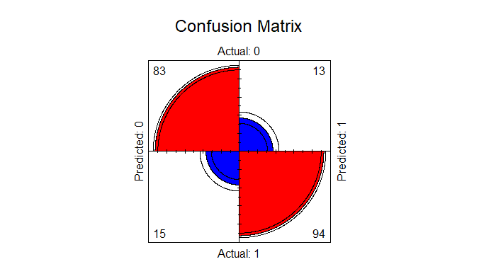
Logistic regression To predict heart disease using R
Now we will predict the new values from our model
R
# Assuming you have a test dataset named 'test_data' with the same features the training
# Combine features and target into a single data frame for the test set
test_data <- as.data.frame(cbind(target = Y_test, X_test))

# Making predictions on the test set
predictions <- predict(model, newdata = as.data.frame(test_data[, -1]),type ="response")

# Converting probabilities to binary predictions based on threshold 0.5
binary_predictions <- ifelse(predictions >= 0.5, 1, 0)

# Combining actual values and predicted values into a data frame
result <- data.frame(actual = test_data$target, predicted = binary_predictions)

# Displaying the results
print(result)
Output:
     actual predicted
1         0         0
4         0         0
7         0         0
12        0         0
13        1         1
14        0         0
15        0         1
Conclusion
As a prevalent disease today, predicting heart disease in patients is crucial for timely intervention and recovery. Logistic regression offers a valuable method to predict heart disease by analyzing patterns in patient data. This information can assist healthcare professionals in identifying high-risk patients and implementing preventive measures.
Share your thoughts in the comments
Please Login to comment...