Predict() function in R
Last Updated :
08 Nov, 2023
R is a statistical programming language that provides a set of tools, packages, and functions that help in data analysis. Predict() function is a powerful tool from the R language used in the field of data analysis and predictive modelling. In R Programming Language This function plays an important role in extracting relevant information from our models making it easier for the researchers to predict future values. In this article, we will understand the use of this function with the help of examples.
Understanding the Predict() Function
This is a built-in function in the R language used to extract predicted values from complex machine-learning models widely used by analysts.
Key features of extractPrediction() function:
- Versatility: This function can be applied to a wide range of models since it applies to various types of models.
- Accuracy: It helps in checking if our predictions are close to the actual data points making it more accurate.
- Model Interpretability: It is easier to understand which makes prediction simpler.
- Post-Processing Analysis: It provides in-depth analysis, makes reports, and provides informed decisions.
Implementation of Predict()
To utilize this function effectively we need to follow certain steps.
- Install and Load Required Packages
- Prepare and Preprocess Data
- Fit the Predictive Model
- Generate Predictions with Predict()
- Visualize Predictions
- Post-Processing Analysis
Before trying to understand the workflow of this function with the help of examples we need to understand the libraries we will use in this article.
Important Libraries
- ggplot2: ggplot2 library stands for grammar of graphics, popular because of its declarative syntax used to visualize and plot our data into graphs for better understanding.
- dplyr: dplyr package is used for data manipulation and it makes our data more concise and readable. It has a set of functions that help us in filtering, selecting columns, summarizing data, etc.
- randomForest: randomForest library manages large datasets, constructs decision trees, and then combines their predictions.
Build the modsel and Predict values Using Predict function
Environmental Science uses machine learning widely to predict the effect of climate change on other factors such as humidity or temperature. We will create fictional data on this problem and then try to use our function to get useful information.
Step 1: Install and Load Required Packages
randomForest package is widely used in environmental science mostly in predicting future values.
R
if (!require("ggplot2")) {
install.packages("ggplot2")
}
if (!require("randomForest")) {
install.packages("randomForest")
}
library(ggplot2)
library(randomForest)
|
Step 2: Prepare and Preprocess Data
We will take a small fictional dataset for this example based on temperature, humidity, and pollutant concentration and split the data into training and testing sets
R
temperature <- c(20, 25, 30, 22, 26, 28, 18, 24, 29, 27)
humidity <- c(60, 55, 70, 62, 58, 65, 57, 63, 68, 66)
pollutant_concentration <- c(0.5, 0.8, 1.2, 0.6, 0.9, 1.1, 0.4, 0.7, 1.0, 1.3)
environmental_data <- data.frame(temperature, humidity, pollutant_concentration)
head(environmental_data)
train_idx <- sample(1:nrow(environmental_data), 0.7 * nrow(environmental_data))
train_data <- environmental_data[train_idx, ]
test_data <- environmental_data[-train_idx, ]
|
Output:
  temperature humidity pollutant_concentration
1          20       60                     0.5
2          25       55                     0.8
3          30       70                     1.2
4          22       62                     0.6
5          26       58                     0.9
6          28       65                     1.1
Step 3: Fit the Predictive Model
randomForest model will be used here for more accurate predictions.
R
rf_model <- randomForest(pollutant_concentration ~ temperature + humidity,
data = train_data)
|
Step 4: Generate Predictions
Based on the model we used for predicting pollutant concentration based on temperature and humidity
R
predictions <- predict(rf_model, newdata = test_data)
print(predictions)
|
Output:
 2         5         7
0.6993067 0.8395367 0.6107900
Step 5: Visualize Predictions:
ggplot2 is used to plot the graph.
R
ggplot(data = environmental_data, aes(x = temperature, y = pollutant_concentration,
color = humidity)) +
geom_point(size = 3) +
geom_smooth(method = "lm", se = FALSE, color = "green", formula = y ~ x) +
labs(title = "Pollutant Concentration based on Temperature and Humidity",
x = "Temperature (Celsius)", y = "Pollutant Concentration (ppm)",
color = "Humidity (%)") +
scale_color_gradient(low = "limegreen", high = "darkgreen")
|
Output:
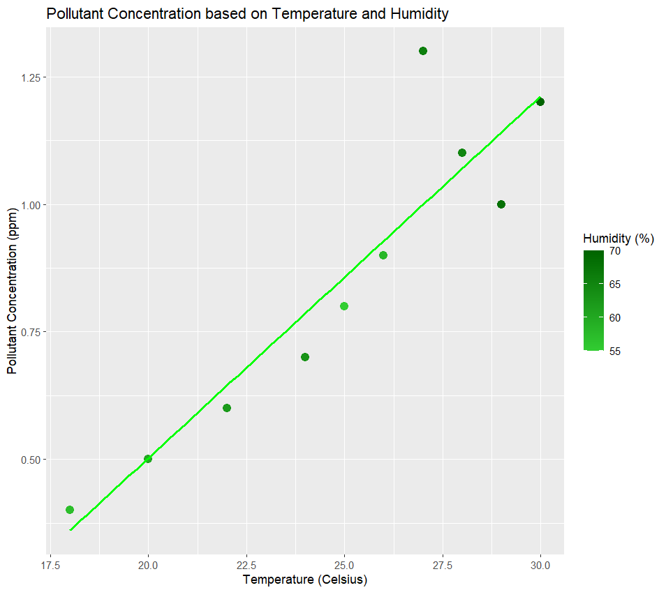
Pollutant Conc vs humidity+Temperature
The color gradient represents the humidity level of the data and the line shows the best fit of our model.
Step 7: Post-Processing Analysis
R
MAE <- mean(abs(predictions - test_data$pollutant_concentration))
print(paste("Mean Absolute Error:", MAE))
MSE <- mean((predictions - test_data$pollutant_concentration)^2)
print(paste("Mean Squared Error:", MSE))
SSR <- sum((predictions - mean(test_data$pollutant_concentration))^2)
SST <- sum((test_data$pollutant_concentration - mean(test_data$pollutant_concentration))^2)
R_squared <- SSR/SST
print(paste("R-squared Value:", R_squared))
|
Output:
"Mean Absolute Error: 0.123982222222222"
"Mean Squared Error: 0.0194091287185184"
"R-squared Value: 0.195924186825399"
Mean Absolute Error: This shows the average of deviation of predicted values from the actual values. A lower MAE value shows the model has good accuracy.
Mean Squared Error: This shows the average of the squared differences between the predicted and actual values.
R-squared Value: 0.19592 indicates that approximately 19.59% of the variance in the pollutant concentration can be explained by the independent variables.
In this example, we used the randomForest model to predict pollutant concentration based on variables such as humidity and temperature. We also checked the accuracy of the model. Such type of research help the scientist to understand the trends of the data and make informed decisions.
Implement predict function on Food Production dataset
Now we will work on a dataset downloaded from the Kaggle website based on the Environment Impact of Food Production.
This dataset has multiple columns of factors that affect food production directly or indirectly. We will take two such factors and check their dependency on each other.
R
food_data<- read.csv("yourpath.csv")
selected_data <- food_data[, c("Land.use.change", "Animal.Feed")]
head(selected_data)
|
Output:
  Land.use.change Animal.Feed
1             0.1           0
2             0.3           0
3             0.0           0
4             0.0           0
5             0.0           0
6             0.0           0
Upload the dataset and print the head of the data.
R
model <- lm(Animal.Feed ~ Land.use.change, data = selected_data)
predictions <- predict(model)
head(predictions)
|
Output:
        1         2         3         4         5         6
0.3760928 0.3894315 0.3694234 0.3694234 0.3694234 0.3694234
These are the first six predictions of the dependent variable we are predicting here. We got values for Animal Feed in kgs understanding how independent variable Land Use change affects it. It helps us to understand the relationship between these two variables.
Visualize Predictions
R
ggplot(selected_data, aes(x = Land.use.change, y = Animal.Feed)) +
geom_point(color = "blue") +
geom_smooth(method = "lm", color = "red") +
labs(x = "Land Use Change", y = "Animal Feed") +
ggtitle("Effect of Land Use Change on Animal Feed") +
theme_minimal()
|
Output:
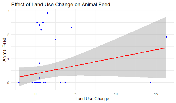
Predict() function in R
The dots represent the corresponding data points of each observation in our dataset and the line in green shows the best fit for the linear model we made.
Post-Processing Analysis
Here, we will check the correlation between the variables which represents the relationship between them. It indicates the strength of the linear relationship.
R
correlation <- cor(selected_data$Land.use.change, selected_data$Animal.Feed)
print(paste("Correlation between Land Use Change and Animal Feed: ", correlation))
|
Output:
"Correlation between Land Use Change and Animal Feed: 0.243623946455937"
This output suggests a weak positive linear relationship between ‘Land Use Change’ and ‘Animal Feed’ This means if the change in land use changes there are chances that animal feed will increase as well but the relationship is not that strong. This gave us a rough insight into our data.
Conclusion
This article explored the functions of extractPrediction() with the help of multiple real-life-based examples and explored statistical analysis in the last step to check the accuracy of the model we are building. We used ggplot2 to plot graphs of our predictions and visualized our results. Such predictions are widely used by researchers to analyze and make better decisions in different fields.
Share your thoughts in the comments
Please Login to comment...