Exploratory Graphs for EDA in R
Last Updated :
12 Jun, 2023
Exploratory Data Analysis (EDA) is a crucial step in the data science process that helps to understand the underlying structure of a data set. One of the most efficient ways to perform EDA is through the use of graphical representations of the data. Graphs can reveal patterns, outliers, and relationships within the data that may not be immediately apparent from the raw data.
R is a popular programming language for data analysis and visualization, and one of the most widely used libraries for creating high-quality, publication-ready graphics is ggplot2.
Some common examples of EDA plots that can be created using ggplot2 include:
- Scatter plots: It is used to visualize the relationship between two variables.
- Histograms: It is used to visualize the distribution of a single variable.
- Box plots: It is used to visualize the distribution of a variable and identify outliers.
- Scatter plot: It is used to identify relationships between all pairs of variables in a data set.
- Heatmaps: used to visualize the relationship between two variables by plotting the density of points in a 2D space
Scatter plots with.
- Smoothed density estimates: used to understand the distribution of a variable.
R
install.packages("ggplot2")
library(ggplot2)
library(tidyverse)
|
You can download the dataset which has been used in this article from here.
Bar Plot
Once the library is loaded, you can start creating visualizations. To create a bar plot, you can use the ggplot() function and specify the data, aesthetic mappings, and the type of geom, which in this case is “bar”:
R
library(tidyverse)
titanic <- read_csv('train.csv')
ggplot(titanic, aes(x = Age, y = Fare)) +
geom_bar(stat = "identity")
|
Output:
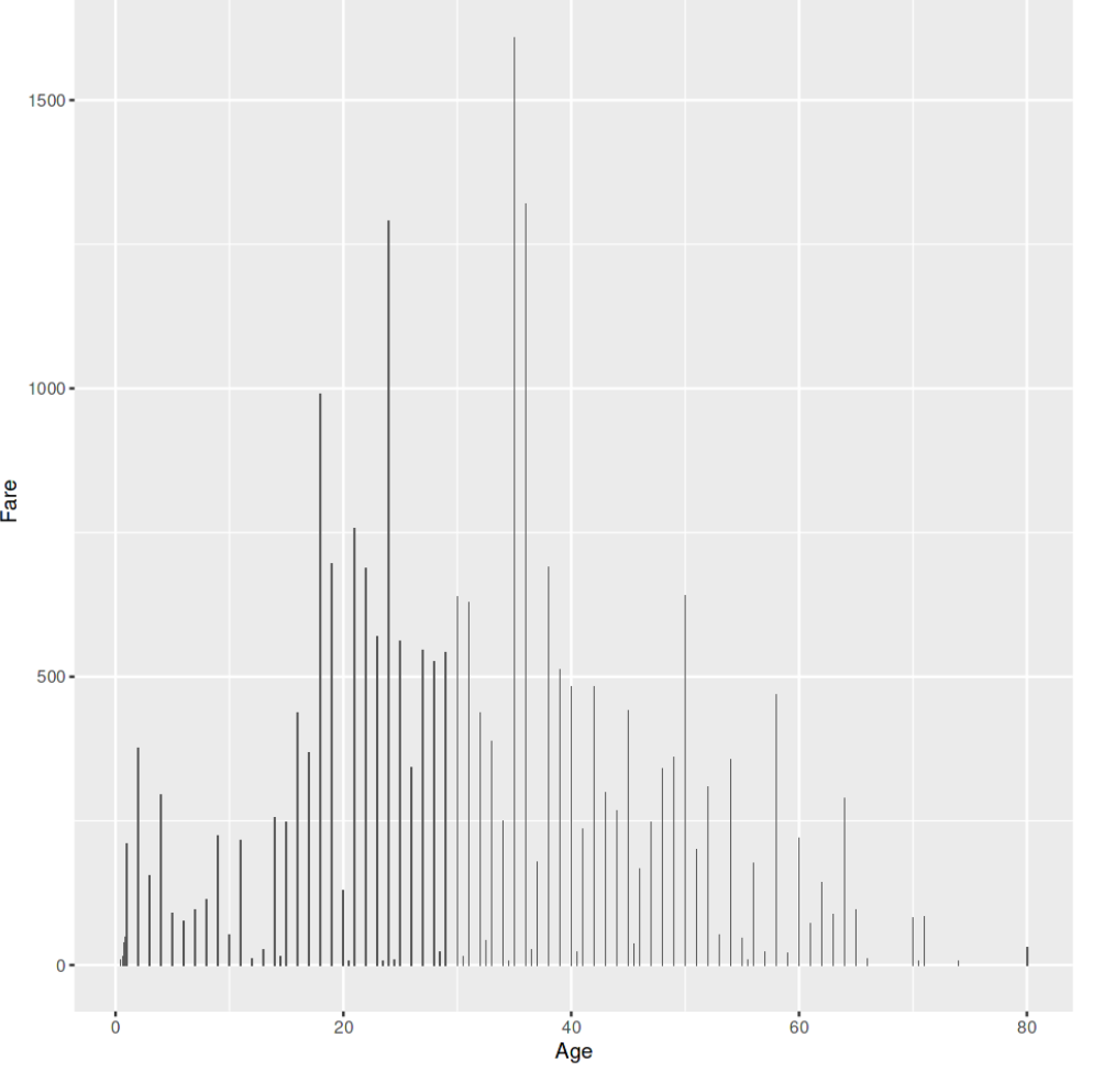
Bar plot using ggplot2
Line Plot
The geom_line() function creates a line plot and the xlab, ylab, and ggtitle functions add labels to the x-axis, y-axis, and plot title, respectively.
R
ggplot(titanic, aes(x = Age, y = Fare)) +
geom_line() +
xlab("Age") +
ylab("Gender") +
ggtitle("Age vs Gender")
|
Output:

Lineplot using ggplot2
Scatter Plot
This code creates a scatter plot of the data, with the x-axis variable specified by x_variable and the y-axis variable specified by y_variable. The geom_point() function adds points to the plot.
R
ggplot(data, aes(x = Age, y = Fare))
+ geom_point()
|
Output:

Scatterplot using ggplot2
Histogram
A histogram is a common EDA plot, which shows the distribution of a single variable. To create a histogram with ggplot2, use the geom_histogram() function. The below code creates a histogram of the variable Age, with a bin width of 1. The bin width determines the width of the bars in the histogram and can be adjusted as needed.
R
ggplot(titanic, aes(x = variable))
+ geom_histogram(binwidth = 1)
|
Output:
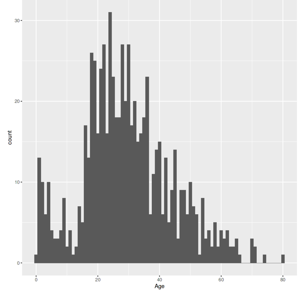
Data Exploration using Histogram
Box Plot
A box plot is another common EDA plot, which shows the distribution of a variable and can reveal outliers. To create a box plot with ggplot2, use the geom_boxplot() function. This code creates a box plot of the variable age, with the box representing the interquartile range (IQR) and the whiskers representing the minimum and maximum values.
R
ggplot(titanic, aes(x = age))
+ geom_boxplot()
|
Output:

Data Exploration using Boxplot for Outlier Detection
Heat Map
A heatmap is another useful EDA plot that shows the relationship between two variables by plotting the density of points in a 2D space. To create a heatmap with ggplot2, use the geom_tile() function. This code creates a heatmap of the data, with the x-axis variable specified by Sex, the y-axis variable specified by Fare, and the color of the tiles determined by Age. The geom_tile() function adds tiles to the plot, and the scale_fill_gradient() function sets the color scale of the tiles. In this example, the color scale is set to go from white to red, with white representing low values and red representing high values of the Age.
R
ggplot(titanic, aes(x = Sex, y = Fare, fill = Age)) +
geom_tile() +
scale_fill_gradient(low = "white", high = "red")
|
Output:

Data Exploration using Heat Map
Density Plot
Lastly, a scatter plot with a smoothed density estimate can also be useful for understanding the distribution of a variable. To create a scatter plot with a smoothed density estimate, use the geom_density_2d() function. This code creates a scatter plot of the data, with the x-axis variable specified by x_variable and the y-axis variable specified by y_variable. The geom_point() function adds points to the plot, and the geom_density_2d() function adds a smoothed density estimate to the plot.
R
ggplot(titanic, aes(x = Age, y = Fare)) +
geom_point() +
geom_density_2d()
|
Output:
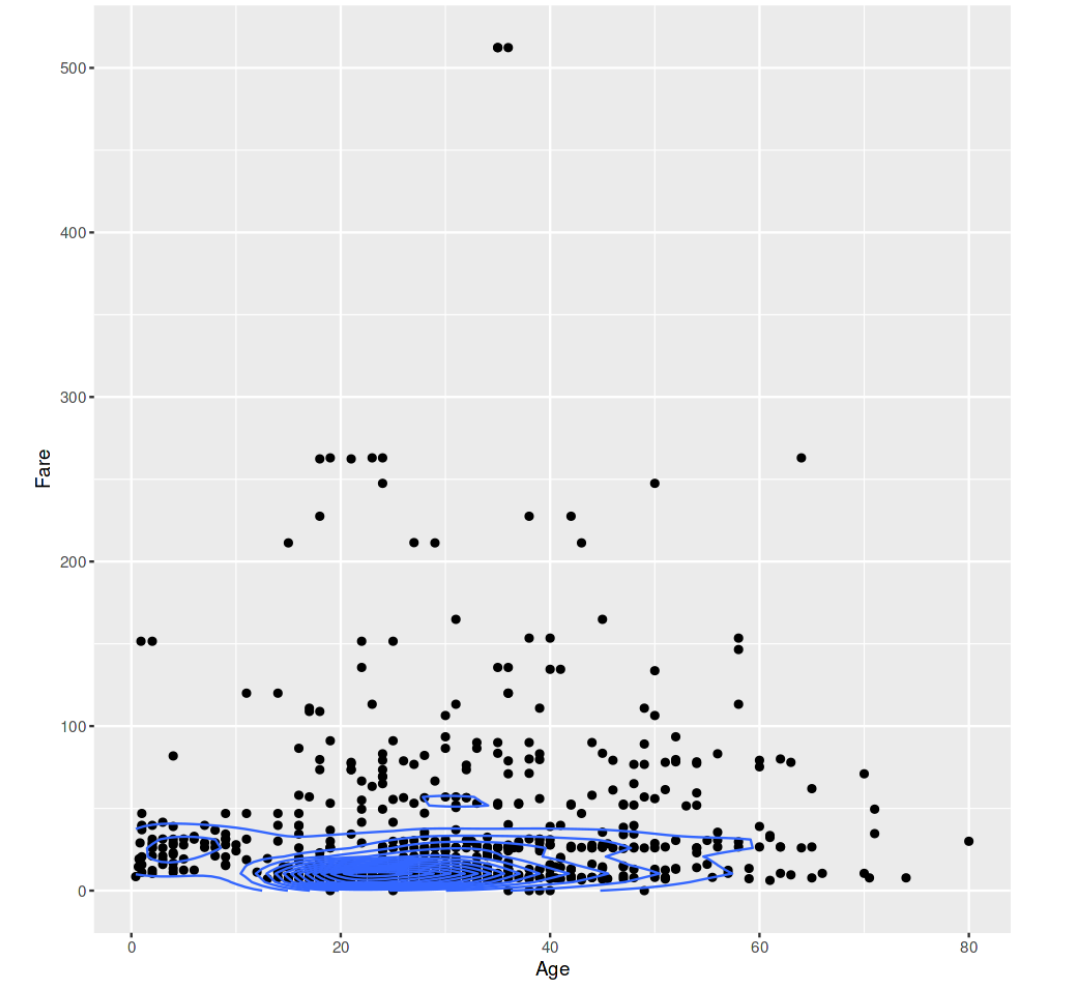
Data visualization using Density Plot with Scatter Plot
Real Life Use-Cases Include
- Identifying trends in sales data: A retail company can use ggplot2 to create line plots of their sales data over time. This can reveal trends such as seasonality, growth, or decline in sales, which can inform business decisions such as inventory management and marketing strategy.
- Analyzing customer demographics: A marketing team can use ggplot2 to create bar charts or pie charts of customer demographics such as age, gender, or income. This can reveal which demographic groups are most likely to purchase their products and tailor their marketing efforts accordingly.
- Investigating credit risk: A bank or financial institution can use ggplot2 to create scatter plots and box plots of loan applicant data, such as credit score and income, to identify patterns and outliers. This can help them assess the risk of default and make more informed lending decisions.
- Investigating medical data: A hospital can use ggplot2 to create scatter plots and heatmaps of patient data, such as medical history and lab results, to identify patterns and correlations. This can inform treatment decisions and lead to new insights about disease progression.
- Identifying patterns in sensor data: A manufacturing company can use ggplot2 to create scatter plot matrices of sensor data from their equipment. This can reveal patterns in the data that indicate when equipment is likely to fail, which can improve maintenance and increase equipment uptime.
In conclusion, ggplot2 is a powerful and flexible library for creating exploratory data visualization in R Programming Language. The plots discussed here are just a few examples of the types of plots that can be created with ggplot2, but there are many more options and customization options available to create a wide variety of plots that can aid in understanding your data and identifying patterns and relationships.
Share your thoughts in the comments
Please Login to comment...