Dataexplorer in R
Last Updated :
28 Aug, 2023
Data explorer is a part of modeling and it is a package in R programming. It is used for data analysis. This package, which might be what we are referring to, is designed to provide a convenient interface to explore and visualize data, especially for initial exploratory data analysis (EDA) tasks.
Installation of Data Explorer
R
install.packages("DataExplorer")
library(DataExplorer)
|
Here we are taking the dataset: penguins, from the Palmer penguins package, and also loading the package for usage by typing the following commands:
R
install.packages("palmerpenguins")
library(palmerpenguins)
|
Exploratory Data Analysis:
The introduce () function gives the basic information about our dataset i.e., penguins.
Output:
tibble [344 × 8] (S3: tbl_df/tbl/data.frame)
 $ species          : Factor w/ 3 levels "Adelie","Chinstrap",..: 1 1 1 1 1 1 1 1 1 1 ...
 $ island           : Factor w/ 3 levels "Biscoe","Dream",..: 3 3 3 3 3 3 3 3 3 3 ...
 $ bill_length_mm   : num [1:344] 39.1 39.5 40.3 NA 36.7 39.3 38.9 39.2 34.1 42 ...
 $ bill_depth_mm    : num [1:344] 18.7 17.4 18 NA 19.3 20.6 17.8 19.6 18.1 20.2 ...
 $ flipper_length_mm: int [1:344] 181 186 195 NA 193 190 181 195 193 190 ...
 $ body_mass_g      : int [1:344] 3750 3800 3250 NA 3450 3650 3625 4675 3475 4250 ...
 $ sex              : Factor w/ 2 levels "female","male": 2 1 1 NA 1 2 1 2 NA NA ...
 $ year             : int [1:344] 2007 2007 2007 2007 2007 2007 2007 2007 2007 2007 ...
Output:

To visualize the data which is shown above introduce the () function.
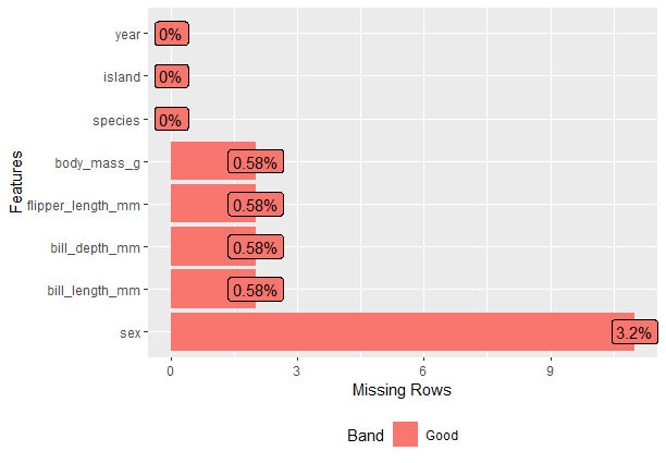
Plot the Missing values:
Output:
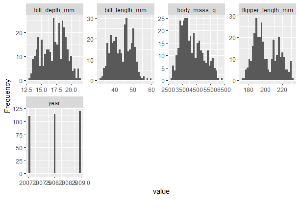
Continuous value columns with Plot_Histogram()
Output:
Correlation Plots
R
plot_correlation(penguins,type = "all")
|
Output:
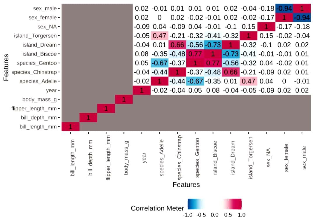
Visualizes the heatmap, in this, we use the argument called type=” ” .,
Data Report of Data Explorer
create_report() is used to create the report on a dataset. and this will generate a file on our computer.
R
create_report(
penguins,
output_file = "report_example.html",
output_dir = getwd(),
config = configure_report(),
report_title = "Data Report"
)
|
From this, we get a report in HTML format that will show the complete information of the data.
Here,
- data: the dataset which you want to work with
- output_file: The name of the output file.
- output_dir: location where the rendered
- config: configuration of output
- report_title: Title of the report.
Adding a ggplot2 Theme to the dataset
ggtheme() adds a ggplot2 theme, to the plot.
For example, we are taking the theme_minimal() theme.
As well title() adds title to the plot.
R
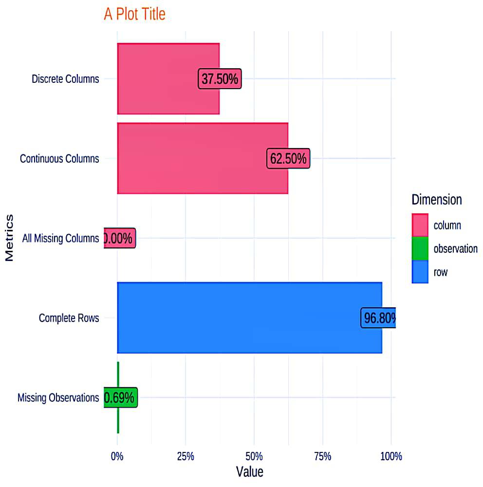
plot_intro(penguins,
title = "Missing Penguin Data Plot Title",
ggtheme = theme_minimal())
|
Output:
.jpg)
Extra Theme Configuration
theme_config() is used to customize the elements in the plot.
plot. title is used to add color to the plot.
R
plot_intro(
penguins,
ggtheme = theme_minimal(),
title = "A Plot Title",
theme_config = theme(plot.title = element_text(color = "orange"))
)
|
Output:
First, install the Dataexplorer from CRAN:
R
install.packages("DataExplorer")
|
Report:
To get the report of dataset: air quality we have to use create _ report.
R
library(DataExplorer)
create_report(airquality)
|
From this, we get a report in HTML format that will show the complete information of the data.
Output:
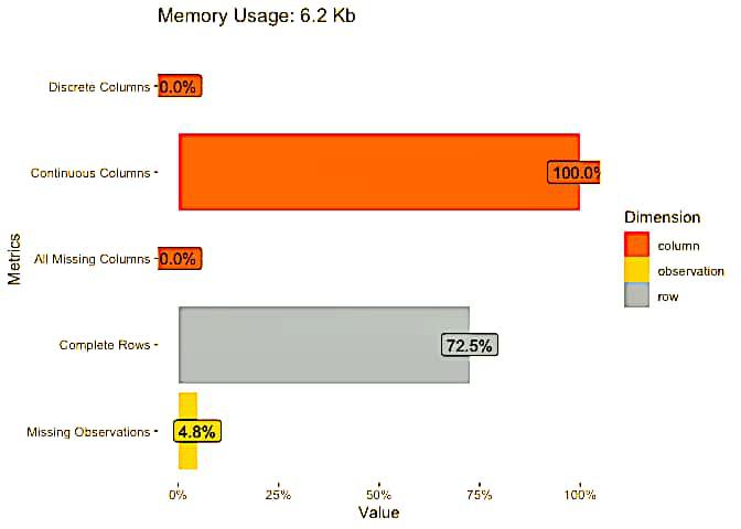
  rows columns discrete_columns continuous_columns all_missing_columns
1  153       6                0                  6                   0
  total_missing_values complete_rows total_observations memory_usage
1                   44           111                918         6376
Visual representation of our dataset
Output:
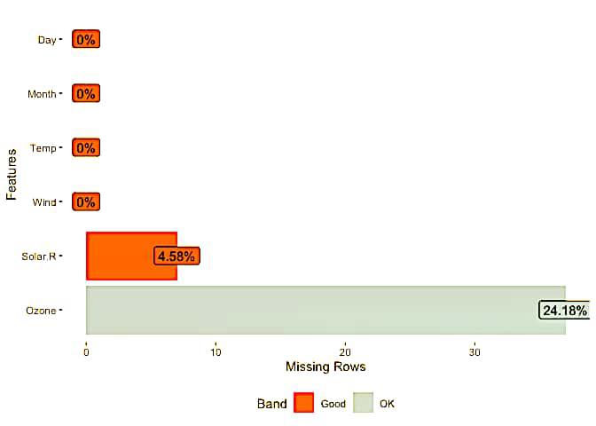
Missing values representation
Output:
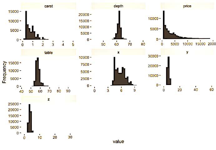
Histogram representation
Output:
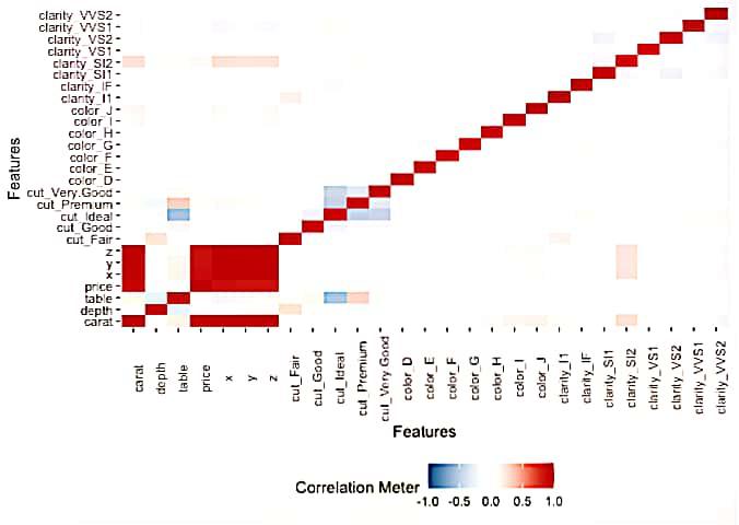
Heatmap representation
R
plot_correlation(diamonds)
|
Output:
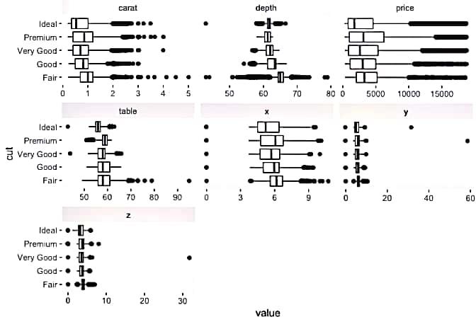
Bivariate continuous distribution using ‘cut’.
R
plot_boxplot(diamonds, by = "cut")
|
Output:
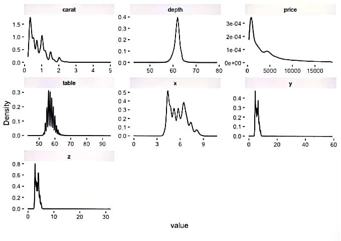
Estimated continuous distribution
Output:
Share your thoughts in the comments
Please Login to comment...