Welcome, adventurous data enthusiasts! Today we celebrate an exciting journey filled with lots of twists, turns, and fun, as we dive into the world of data cleaning and visualization through R Programming Language. Grab your virtual backpacks, put on your data detective hats, Ready to unravel the secrets of a dataset filled with test results and interesting features.
Data Preprocessing in R
Installing and loading the tidyverse package.
The Tidyverse Metapackage – Our adventure begins with the mysterious meta-package called “tidyverse.” With a simple incantation, “library(tidyverse)” we unlock the powerful tools and unleash the magic of data manipulation and visualization.
Listing files in the “../input” directory.
As we explore further, we stumble upon a mystical directory known as “../input/”. With a flick of our code wand, we unleash its secrets and reveal a list of hidden files.
R
list.files(path = "../input")
|
── Attaching core tidyverse packages ──────────────────────── tidyverse 2.0.0 ──
✔ dplyr     1.1.2     ✔ readr     2.1.4
✔ forcats   1.0.0     ✔ stringr   1.5.0
✔ ggplot2   3.4.2     ✔ tibble    3.2.1
✔ lubridate 1.9.2     ✔ tidyr     1.3.0
✔ purrr     1.0.1
── Conflicts ────────────────────────────────────────── tidyverse_conflicts() ──
✖ dplyr::filter() masks stats::filter()
✖ dplyr::lag()    masks stats::lag()
ℹ Use the conflicted package (<http://conflicted.r-lib.org/>) to force all conflicts to become errors
The Magical Powers of “psych“, we stumble upon a rare gem known as “psych.” With, “install.packages(‘psych’)” followed by “library(psych),” we unlock its potent abilities.
R
install.packages("psych")
library(psych)
|
Reading the Dataset
We stumbled upon a precious artifact—a CSV file named “Expanded_data_with_more_features.csv“. With a wave of our wand and the invocation of “read.csv()“, we summon the data into our realm.
R
data <- read.csv("/kaggle/input/students-exam-scores/"
"Expanded_data_with_more_features.csv")
|
Data Exploration & Analysis
Our adventure begins with a simple task—discovering what lies within our dataset. We load the data and take a sneak peek. With the “head()” function, we unveil the first five rows. We revel in the joy of exploring the dimensions of our dataset using “dim()“.
Output:
30641 * 15
You have summoned the names() function to reveal the secret names of the columns in your dataset. By capturing the output in the variable variable_names and invoking the print() spell, you have successfully unveiled the hidden names of the columns, allowing you to comprehend the structure of your dataset.
R
variable_names <- names(data)
print(variable_names)
|
Output:
 [1] "X"                   "Gender"              "EthnicGroup"
 [4] "ParentEduc"          "LunchType"           "TestPrep"
 [7] "ParentMaritalStatus" "PracticeSport"       "IsFirstChild"
[10] "NrSiblings"          "TransportMeans"      "WklyStudyHours"
[13] "MathScore"           "ReadingScore"        "WritingScore"
Next, you cast the str() spell upon your dataset. This spell reveals the data types of each variable (column) granting you insight into their mystical nature. By deciphering the output of this spell, you can understand the types of variables present in your dataset, such as character (chr) numeric (num), or factors, among others.
Output:
'data.frame':    30641 obs. of  15 variables:
 $ X                  : int  0 1 2 3 4 5 6 7 8 9 ...
 $ Gender             : chr  "female" "female" "female" "male" ...
 $ EthnicGroup        : chr  "" "group C" "group B" "group A" ...
 $ ParentEduc         : chr  "bachelor's degree" "some college" "master's degree"
                          "associate's degree" ...
 $ LunchType          : chr  "standard" "standard" "standard" "free/reduced" ...
 $ TestPrep           : chr  "none" "" "none" "none" ...
 $ ParentMaritalStatus: chr  "married" "married" "single" "married" ...
 $ PracticeSport      : chr  "regularly" "sometimes" "sometimes" "never" ...
 $ IsFirstChild       : chr  "yes" "yes" "yes" "no" ...
 $ NrSiblings         : int  3 0 4 1 0 1 1 1 3 NA ...
 $ TransportMeans     : chr  "school_bus" "" "school_bus" "" ...
 $ WklyStudyHours     : chr  "< 5" "5 - 10" "< 5" "5 - 10" ...
 $ MathScore          : int  71 69 87 45 76 73 85 41 65 37 ...
 $ ReadingScore       : int  71 90 93 56 78 84 93 43 64 59 ...
 $ WritingScore       : int  74 88 91 42 75 79 89 39 68 50 ...
Ah, but wait! Your keen eyes have spotted an anomaly. The variable “WklyStudyHours” appears to have been labeled as a character (chr) instead of its rightful numeric (num) nature. Fear not, for you possess the power to correct this. To rectify this discrepancy, you can use data$WklyStudy…….. Ooopz can’t connect with the spell keep exploring the adventure see in the next part hahaha hahaha hahaha
Data Cleaning & Formatting
The Magical Transformation Ah, But our dataset has a few quirks, like missing values and unwanted index columns. Fear not, With a dash of code, we bid farewell to the extra index column and wave our wands to convert blank spaces into the mystical realm of NA values. Step by step, we breathe life into our dataset, ensuring each column shines brightly with the correct data type.
R
data$X <- NULL
columns <- colnames(data)
for (column in columns) {
data[[column]] <- ifelse(trimws(data[[column]]) == "",
NA, data[[column]])
}
|
Handling Missing Values
A World of Missing Values Ahoy! We’ve stumbled upon missing values! But fret not, we shall fill these gaps and restore balance to our dataset. One by one, we rescue columns from the clutches of emptiness, replacing the void with the most common categories. The missing values tremble as we conquer them, transforming our dataset into a complete and harmonious entity.
Output:
Gender:0
EthnicGroup:1840
ParentEduc:1845
LunchType:0
TestPrep:1830
ParentMaritalStatus:1190
PracticeSport:631
IsFirstChild:904
NrSiblings:1572
TransportMeans:3134
WklyStudyHours:0
MathScore:0
ReadingScore:0
WritingScore:0
Handling Categorical Data
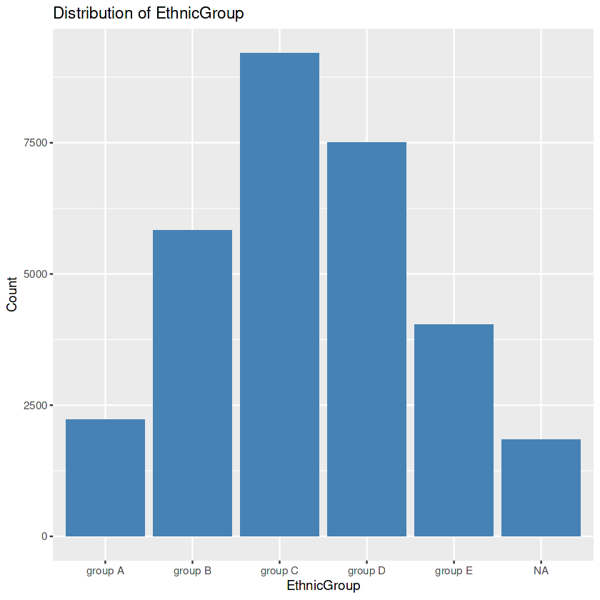
Unveiling the Secrets of Categorical Columns. Let’s start with the EthnicGroup column first as it has 1840 missing values.
R
unique_values <- unique(data$EthnicGroup)
unique_values
|
Output:
NA 'group C' 'group B' 'group A' 'group D' 'group E'
R
ggplot(data, aes(x = EthnicGroup)) +
geom_bar(fill = "steelblue") +
labs(title = "Distribution of EthnicGroup",
x = "EthnicGroup", y = "Count")
|
Output:
R
frequency <- table(data$EthnicGroup)
mode <- names(frequency)[which.max(frequency)]
print(mode)
|
Output:
[1] "group C"
R
data$EthnicGroup[is.na(data$EthnicGroup)] <- mode
ggplot(data, aes(x = EthnicGroup)) +
geom_bar(fill = "steelblue") +
labs(title = "Distribution of EthnicGroup",
x = "EthnicGroup", y = "Count")
|
Output:
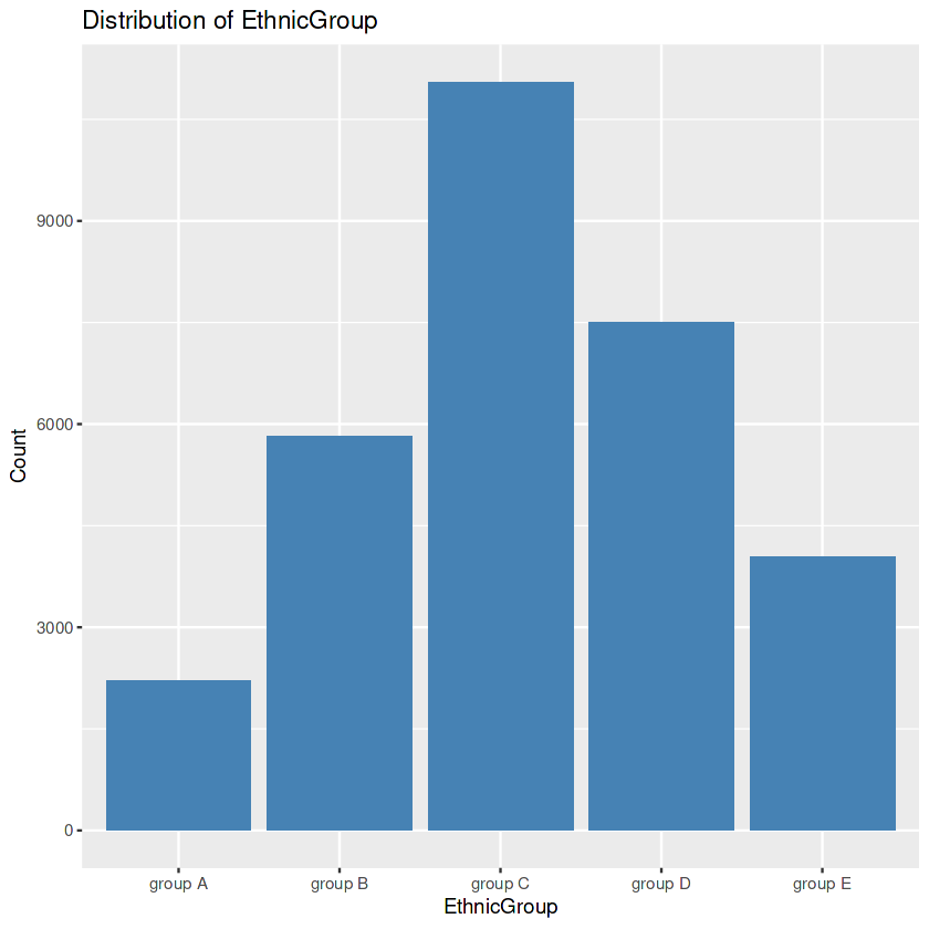
First, we seek the precise values within the “EthnicGroup” to discover the awesome ethnic groups present in our dataset. Then we create a bar plot. After this, we calculate the frequency rely for every class. This step allows us to understand the distribution of ethnic companies extra quantitatively. We then identify the class with the highest rely. In the event of lacking values within the “EthnicGroup” column, we address this difficulty by way of filling the ones gaps with the mode’s cost. Finally, we create another bar plot of the “EthnicGroup” column, this time after eliminating the missing values. The visualization serves as a contrast to the preceding plot.
By executing the below code block we will be able to impute the missing values in the ParentEduc, WklyStudyHours, and NrSiblings.
R
data <- na.omit(data, cols=c("ParentEduc",
"WklyStudyHours"))
median_value <- median(data$NrSiblings,
na.rm = TRUE)
data$NrSiblings <- ifelse(is.na(data$NrSiblings),
median_value, data$NrSiblings)
|
Now we will use a little bit sophisticated method to fill in the missing values in the remaining columns of the data.
R
column <- c("TransportMeans", "IsFirstChild", "TestPrep",
"ParentMaritalStatus", "PracticeSport")
for(column in columns){
frequency <- table(data$column)
most_common <- names(frequency)[which.max(frequency)]
data$column[is.na(data$column)] <- most_common
}
|
Now let’s check whether there are any more missing values left in the dataset or not.
R
sum(colSums(is.na(data)))
|
Output:
0
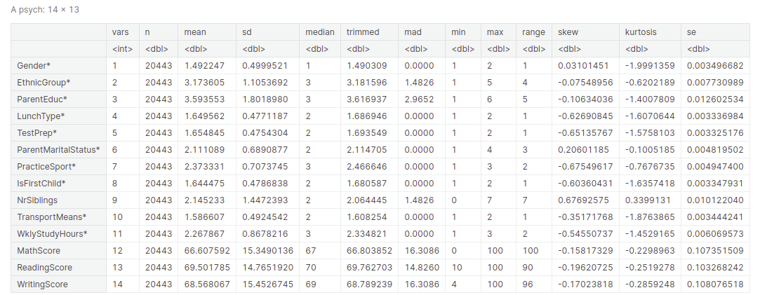
Descriptive statistical measures of a dataset help us better visualize and explore the dataset at hand without going through each observation of the dataset. We can get all the descriptive statistical measures of the dataset using the describe() function.
Output:
Feature scaling
There are times when we have different features in the dataset on different scales. So, while using the gradient descent algorithm for training of the Machine Learning Algorithms it is advised to use features which are on the same scale to have stable and fast training of our algorithm. There are different methods of feature scaling like standardization and normalization which is also known as Min-Max Scaling.
Standardization
Standardizing is like giving your stats a change! Imagine you have a group of friends, all of whom are of different heights and weights. Some are long, some are heavy, difficult to compare directly. So what do you guys do? You bring a magic tailor with their standards! The tailor takes each friend and measures their height and weight. Then, these measurements are converted to a new scale where each person’s height and weight are adjusted to equal mean and value. Now, all your friends are “standardized” in one way. Modified for ease of comparison and analysis.
Thus, standardization is all about converting data to a common scale to facilitate comparison and analysis. It’s like giving your stats a fashionable makeover to reveal their true beauty and power!
- Create a new dataframe standardized_data as a copy of the original data dataframe.
- Standardize the MathScore column in standardized_data using the scale() function.
- Print the first few standardized values of MathScore using head().
R
standardized_data <- data.frame(data)
standardized_math <- scale(standardized_data$MathScore)
head(standardized_math)
|
Output:
           [,1]
[1,]  0.2758342
[2,]  1.3395404
[3,]  0.6082424
[4,]  0.4087975
[5,]  1.2065771
[6,] -1.7186149
Normalization
Normalization is like giving your facts a makeover to make them first-class! It’s like dressing up your numbers and making them sense confident and pleasing. Just like getting each person to put on the same-sized t-shirt, normalization adjusts the values so all of them match properly inside a selected range(0-1). It’s like bringing harmony to your statistics, making it less complicated to examine and analyze. So, let’s get your facts equipped to polish with some normalization magic!
- Create a new dataframe
normalized_data as a copy of the original data.
- Normalize the values in the MathScore column using the formula:
(normalized_data$MathScore - min(normalized_data$MathScore)) / (max(normalized_data$MathScore) - min(normalized_data$MathScore)).
- The normalized MathScore values are stored in the variable
normalized_math, ranging from 0 to 1
R
normalized_data <- data.frame(data)
normalized_math <- (normalized_data$MathScore - \
min(normalized_data$MathScore)) /
(max(normalized_data$MathScore) - min(normalized_data$MathScore))
head(normalized_math)
|
Output:
0.71 0.87 0.76 0.73 0.85 0.41
Feature Encoding
Feature encoding is like teaching your data to speak the same language as your computer. It’s like giving your data a crash course in communications. Feature encoding is a technique for converting categorical or non-numeric data into a numeric representation .
One Hot Encoding
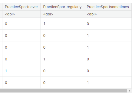
One Hot encoding is a way to represent categorical variables as numeric values. We’re creating a new data frame called “encoded_data” using one-hot encoding for the “PracticeSport” variable.
- Each unique value in the “PracticeSport” column is transformed into a separate column with binary values (0s and 1s) indicating the presence or absence of that value.
- The original data frame “data” is combined with the encoded columns using the “cbind” function, resulting in the new “encoded_data” data frame.
R
encoded_data <- as.data.frame(model.matrix(~ PracticeSport - 1, data))
encoded_data <- cbind(data, encoded_data)
head(encoded_data)
|
Output:
Ordinal encoding
- Ordinal encoding is used to represent categorical variables with ordered or hierarchical relationships using numerical values.
- In the case of the “PracticeSport” column, we assigned numerical values to the categories “never”, “sometimes”, and “regularly” based on their order. “never” was assigned 0, “sometimes” was assigned 1, and “regularly” was assigned 2.
R
encoded_data <- data
mapping <- c("never" = 0, "sometimes" = 1,
"regularly" = 2)
encoded_data$PracticeSport <- mapping[as.character(encoded_data$PracticeSport)]
head(encoded_data)
|
Output:
Handling outliers
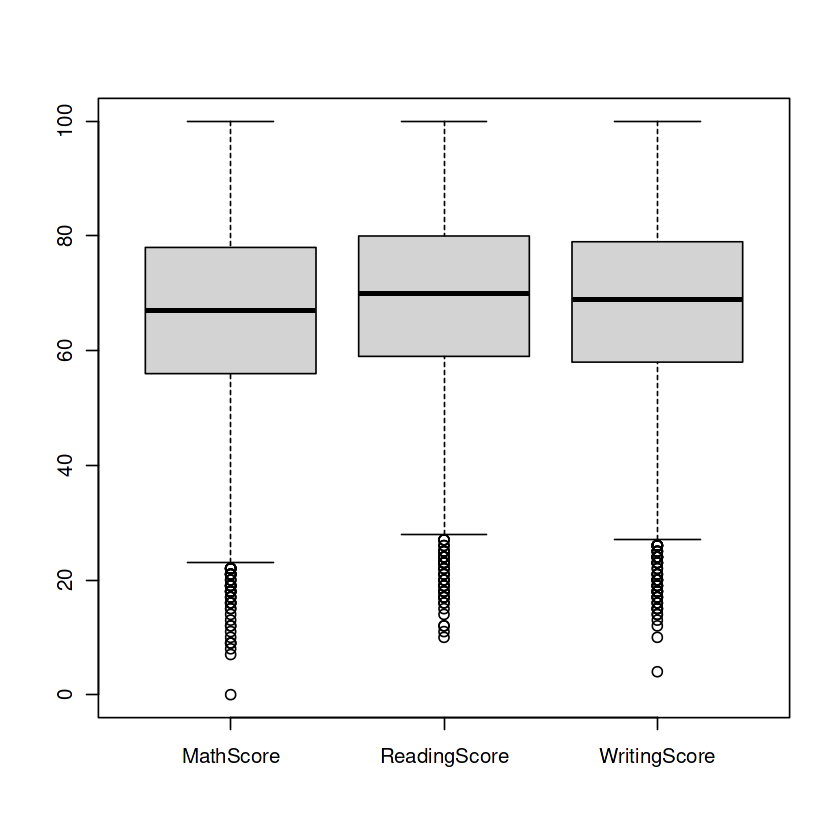
Box Plots: The Guardians of Numerical Columns – MathScore, ReadingScore, and WritingScore—hold untold tales within. But behold, outliers lurk in the shadows, threatening to skew our insights. Fear not, for we summon the power of box plots to vanquish these outliers and restore balance to our numerical realm.
R
boxplot(data[c("MathScore", "ReadingScore", "WritingScore")])
|
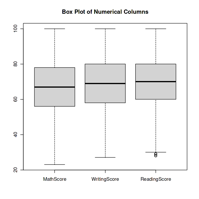
The code calculates the bounds for outlier detection in multiple columns of the information dataframe. It then eliminates the outliers from each column and creates a box plot. This enables to discover and cope with outliers inside the data.
R
columns <- c("MathScore", "WritingScore", "ReadingScore")
outlier_threshold <- 1.5
lower_bounds <- c()
upper_bounds <- c()
for (column in columns) {
column_iqr <- IQR(data[[column]])
column_lower_bound <- quantile(data[[column]], 0.25) - outlier_threshold * column_iqr
column_upper_bound <- quantile(data[[column]], 0.75) + outlier_threshold * column_iqr
lower_bounds <- c(lower_bounds, column_lower_bound)
upper_bounds <- c(upper_bounds, column_upper_bound)
}
for (i in 1:length(columns)) {
column <- columns[i]
lower_bound <- lower_bounds[i]
upper_bound <- upper_bounds[i]
data <- data[data[[column]] >= lower_bound & data[[column]] <= upper_bound, ]
}
boxplot_data <- data[, columns, drop = FALSE]
boxplot(boxplot_data, names = columns, main = "Box Plot of Numerical Columns")
|
Output:
And that’s a wrap! But remember, this is just the beginning of our data adventure. There’s a vast world of analysis, modeling, and interpretation awaiting us. So gear up, hold on tight, and let’s continue unraveling the mysteries hidden within the data!
Keep exploring and have fun on your data-driven escapades!
Share your thoughts in the comments
Please Login to comment...