Customer segmentation is one of unsupervised learning’s most important applications. Employing clustering algorithms to identify the numerous customer subgroups enables businesses to target specific consumer groupings. In this machine learning project, K-means clustering, a critical method for clustering unlabeled datasets, will be applied.
In the R Programming Language K-Means Unsupervised machine learning process called clustering divides the unlabeled dataset into many clusters.
What is Customer Segmentation?
Customer segmentation is the process of breaking down the customer base into various groups of people that are similar in many ways that are important to marketing, such as gender, age, interests, and various spending habits.
Companies that use customer segmentation operate under the premise that each customer has unique needs that must be addressed through a particular marketing strategy. Businesses strive to develop a deeper understanding of the customers they are aiming for. Therefore, they must have a clear objective and should be designed to meet the needs of each and every single customer. A deeper understanding of client preferences and the criteria for identifying profitable segments can also be gained by businesses through the data collected.
Segmenting Customers using KMeans
Steps to be followed:
- Importing necessary libraries
- Loading datasets
- Data preprocessing
- Exploratory Data Analysis
- Customer Segmentation using Kmeans
- Conclusion
Dataset: Customer Segmentation
Dataset Features :
|
CustomerID
|
Id’s of the customers
|
|
Gender
|
Male or Female
|
|
Age
|
The age of each customer
|
|
Annual.Income..k..
|
The annual income of each customer
|
|
Spending.Score..1.100.
|
The spending score of each customer
|
Importing Libraries and Datasets
The Libraries used are:
- ggplot2: The library is used for data visualisation and the plotting of charts. It is a helpful and practical version of the “Grammar of Graphics book” in R.
- purrr: A well-liked R programming package called purrr offers a reliable and potent set of tools for working with vectors and functions.
R
library(ggplot2)
library(purrr)
|
Loading The Dataset
The Dataset is Mall_Customers.csv, and it includes features like Customer Id, Age, Gender, their annual come and spending score.
R
df <- read.csv('../input/customer-segmentation/Mall_Customers.csv')
head(df)
|
Output:
   CustomerID Gender Age Annual.Income..k.. Spending.Score..1.100.
1           1   Male  19                 15                     39
2           2   Male  21                 15                     81
3           3 Female  20                 16                      6
4           4 Female  23                 16                     77
5           5 Female  31                 17                     40
6           6 Female  22                 17                     76
7           7 Female  35                 18                      6
8           8 Female  23                 18                     94
9           9   Male  64                 19                      3
10         10 Female  30                 19                     72
Preprocessing the Dataset
Now we look at the summary of the dataset
Output:
 CustomerID        Gender               Age        Annual.Income..k..
 Min.   :  1.00   Length:200         Min.   :18.00   Min.   : 15.00
 1st Qu.: 50.75   Class :character   1st Qu.:28.75   1st Qu.: 41.50
 Median :100.50   Mode  :character   Median :36.00   Median : 61.50
 Mean   :100.50                      Mean   :38.85   Mean   : 60.56
 3rd Qu.:150.25                      3rd Qu.:49.00   3rd Qu.: 78.00
 Max.   :200.00                      Max.   :70.00   Max.   :137.00
 Spending.Score..1.100.
 Min.   : 1.00
 1st Qu.:34.75
 Median :50.00
 Mean   :50.20
 3rd Qu.:73.00
 Max.   :99.00
We check the Null and duplicate Values in the dataset.
R
sum(is.na(df))
sum(duplicated(df))
|
Output:
0
0
Visualising the Dataset
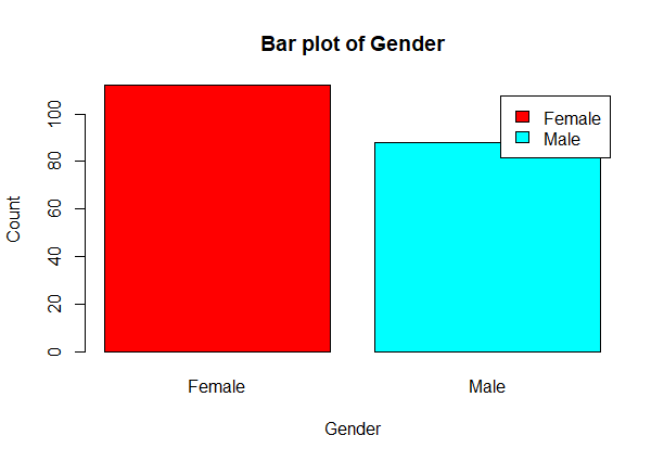
Let’s count the number of Male’s and Female’s
R
gender <- table(df$Gender)
print(gender)
barplot(gender,main='Bar plot of Gender',xlab='Gender',ylab='Count',
col=rainbow(2),legend=rownames(gender))
|
Output:
Female   Male
   112     88
Customer Segmentation using KMeans in R
From the above barplot, we observe that the number of females are higher than the males.
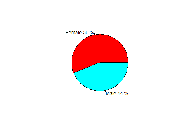
Now, let’s visualise a pie chart to observe the ratio of male and female distribution.
R
percent <- gender/sum(gender) * 100
print(percent)
labels <- paste(c('Female','Male'),percent,'%')
print(labels)
pie(percent,col=rainbow(2),labels=labels)
|
Output:
Female   Male
    56     44
[1] "Female 56 %" "Male 44 %"
Customer Segmentation using KMeans in R
From the above pie chart, we can conclude that the percentage of females is 56%, whereas the percentage of male in the customer dataset is 44%.
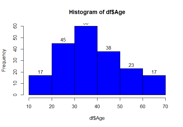
Visualisation of Age Distribution
Let us plot a histogram to view the distribution to plot the frequency of customer ages.
R
hist(df$Age,breaks=5,col='blue',labels=T)
|
Output:
Customer Segmentation using KMeans in R
From above graph, we conclude that the maximum customer ages are between 30 and 40. The minimum age of a customer is 18, whereas, the maximum age the customer is 70.
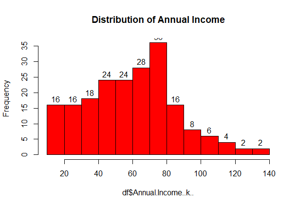
Analysing of the Annual Income of the Customers
R
hist(df$Annual.Income..k..,col='red',labels=T,main='Distribution of Annual Income')
|
Output:
Customer Segmentation using KMeans in R
From above graph, we conclude that the minimum annual income of the customers is 15 and the maximum income is 140. People who earn an average income of 70 have the highest frequency count in the histogram distribution. The average salary of the customers is 60.
Analyzing Spending Score of the Customers
R
hist(df$Spending.Score..1.100.,col='orange',labels=T,main='Distribution of Spending
Amount')
|
Output:
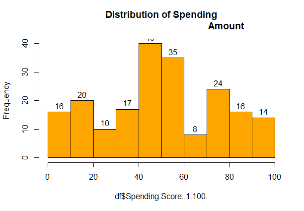
Customer Segmentation using KMeans in R
We can see that the minimum spending score is 1, maximum is 99 and the average is 50. From the above histogram, we can conclude that customers between the class 40-50 have the highest spending score.
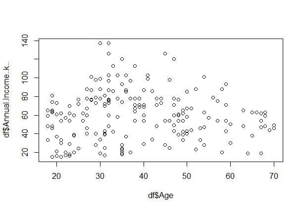
Analysing the relationship between Age and Annual Income
R
plot(df$Age,df$Annual.Income..k..,col='black')
|
Output:
Customer Segmentation using KMeans in R
From above scatter plot, we can conclude that customers between age group 30-40 earn’s the most.
Using KMeans for Segmenting Customers
- First, we specify the number of clusters that we need to create.
- The algorithm then selects k centres at random from the dataset.
- The closest centre obtains the assignment of a new observation. We do this assignment on the Euclidean Distance between object and the centroid.
- k clusters in the data points update the centre through calculation of the mean values present in all the data points of that cluster.
- Then through the iterative minimization of the total sum of the square, the assignment stop when we achieve maximum iteration.
Determining the Optimal value of K using Elbow Method
Elbow Method
Elbow Method is a technique that we use to determine the number of centres(k) to use in a k-means clustering algorithm. We iterate with different values of k starting from 1 to n (n being a hyper parameter). We plot a graph of k versus their WCSS ( sum of square of distances between the centroids and each points.) value. The graph looks like an elbow and the point where it bends is chosen as the optimal value of k.
R
library(purrr)
fun <- function(k){
kmeans(df[,3:5],k,iter.max=100,nstart = 100,algorithm='Lloyd')$tot.withinss
}
k.values <- 1:10
fun_value <- map_dbl(k.values,fun)
plot(k.values,fun_value,type='b',xlab='number of clusters',ylab='total sum of squares')
|
Output:
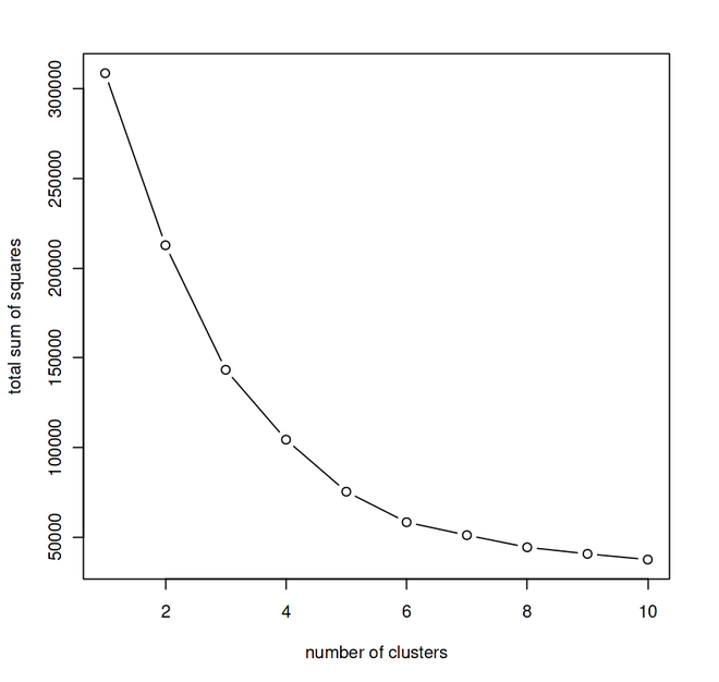
We performed iteration with different values of k starting from 1 to 10 and plotted the graph – K vs Sum of Squares.
From the above graph, we can conclude that 5 is the optimal number of clusters since it appears at the bend in the elbow plot.
Now, let us take k = 5 as our optimal cluster –
R
k5<- kmeans(df[,3:5],5,iter.max = 100,nstart = 50,algorithm = 'Lloyd')
print(k5)
|
Output:
K-means clustering with 5 clusters of sizes 79, 36, 39, 23, 23

Cluster means:
       Age Annual.Income..k.. Spending.Score..1.100.
1 43.08861           55.29114               49.56962
2 40.66667           87.75000               17.58333
3 32.69231           86.53846               82.12821
4 25.52174           26.30435               78.56522
5 45.21739           26.30435               20.91304

Clustering vector:
  [1] 5 4 5 4 5 4 5 4 5 4 5 4 5 4 5 4 5 4 5 4 5 4 5 4 5 4 5 4 5 4 5 4 5 4 5 4 5 4 5
 [40] 4 5 4 5 4 5 4 1 1 1 1 1 1 1 1 1 1 1 1 1 1 1 1 1 1 1 1 1 1 1 1 1 1 1 1 1 1 1 1
 [79] 1 1 1 1 1 1 1 1 1 1 1 1 1 1 1 1 1 1 1 1 1 1 1 1 1 1 1 1 1 1 1 1 1 1 1 1 1 1 1
[118] 1 1 1 1 1 1 3 2 3 1 3 2 3 2 3 2 3 2 3 2 3 2 3 2 3 1 3 2 3 2 3 2 3 2 3 2 3 2 3
[157] 2 3 2 3 2 3 2 3 2 3 2 3 2 3 2 3 2 3 2 3 2 3 2 3 2 3 2 3 2 3 2 3 2 3 2 3 2 3 2
[196] 3 2 3 2 3

Within cluster sum of squares by cluster:
[1] 30138.051 17669.500 13972.359  4622.261  8948.609
 (between_SS / total_SS =  75.6 %)

Available components:

[1] "cluster"      "centers"      "totss"        "withinss"     "tot.withinss"
[6] "betweenss"    "size"         "iter"         "ifault"
3 43.08861           55.29114               49.56962
4 25.52174           26.30435               78.56522
5 32.69231           86.53846               82.12821
Clustering vector:
  [1] 1 4 1 4 1 4 1 4 1 4 1 4 1 4 1 4 1 4 1 4 1 4 1 4 1 4 1 4 1 4 1 4 1 4 1 4 1
 [38] 4 1 4 1 4 1 4 1 4 3 3 3 3 3 3 3 3 3 3 3 3 3 3 3 3 3 3 3 3 3 3 3 3 3 3 3 3
 [75] 3 3 3 3 3 3 3 3 3 3 3 3 3 3 3 3 3 3 3 3 3 3 3 3 3 3 3 3 3 3 3 3 3 3 3 3 3
[112] 3 3 3 3 3 3 3 3 3 3 3 3 5 2 5 3 5 2 5 2 5 2 5 2 5 2 5 2 5 2 5 3 5 2 5 2 5
[149] 2 5 2 5 2 5 2 5 2 5 2 5 2 5 2 5 2 5 2 5 2 5 2 5 2 5 2 5 2 5 2 5 2 5 2 5 2
[186] 5 2 5 2 5 2 5 2 5 2 5 2 5 2 5
Within cluster sum of squares by cluster:
[1]  8948.609 17669.500 30138.051  4622.261 13972.359
 (between_SS / total_SS =  75.6 %)
Available components:
[1] "cluster"      "centers"      "totss"        "withinss"     "tot.withinss"
[6] "betweenss"    "size"         "iter"         "ifault"
- We see a list containing numerous important pieces of information in the output of our kmeans function. We draw the following conclusion from this information:
- cluster: This is a vector of several integers designating the cluster that is responsible for allocating each point.
- totes: The total square sum is denoted by the symbol totss.
- centres – A matrix made up of various cluster centres.
- withinss – This vector, which has one component per cluster, represents the intra-cluster sum of squares.
- tot.withinss – It denotes the total intra-cluster sum of squares
- betweenss – It is the sum of between-cluster squares.
- size – It is the sum of all the points that each cluster contains.
Visualising the Cluster Results
R
ggplot(df,
aes(x = Annual.Income..k..,y = Spending.Score..1.100.)) +
geom_point(stat = 'identity',aes(col = as.factor(k5$cluster))) +
scale_color_discrete(breaks = c('1','2','3','4','5'),
labels = c('C1','C2','C3','C4','C5')) +
ggtitle('Customer Segmentation using Kmeans')
|
Output:

From the above visualisation, we observe that there is a distribution of 5 clusters as follows
- Cluster 1: This Cluster represents the customers who have a low Annual Income as well as a low Annual spend.
- Cluster 2: This Cluster represents the customers who have a high Annual Income but spends low.
- Cluster 3: This Cluster represents the customers having a medium Annual Income as well as a medium Annual spend.
- Cluster 4: This Cluster represents the customers having a low Annual Income but spends way too much.
- Cluster 5: This Cluster represents the customers having a very high Annual Income along with a high spending.
In this data science project, the customer segmentation model was explored. We created this using unsupervised learning, a kind of machine learning. In particular, we applied the K-means clustering clustering technique. After performing an analysis and data visualisation, we implemented our method.
Share your thoughts in the comments
Please Login to comment...