Creating Responsive Grid Vanilla using HTML,CSS and Bootstrap
Last Updated :
13 Aug, 2020
Many modern websites use a grid system to display chunks of data on their home-page as well as other pages. To much extent grid resembles a table, however, it is much more visually appealing and most often displays sibling elements. A grid must be responsive, i.e. it should adjust to the screen size of the user.
Bootstrap is a very popular open-source HTML, CSS, and JavaScript library that helps to design the frontend of a website. Generally, bootstrap code is very compact and robust but there are a few reasons for which every developer should master Vanilla(Customizable) HTML and CSS :
- Ample of utilities and components are never used and are therefore a burden on the web page.
- Bootstrap code is difficult to customize.
- Bootstrap slows downloading of websites a bit because it first loads jQuery, then bootstraps CSS and then bootstrap JS.
The Two Possible Approaches for Creating a Grid:
1. Grid without Bootstrap(Vanilla HTML CSS)
HTML Code: We start with defining three div each with class “customRow“. Then create an img tag within each of the customRow div.
HTML
<!DOCTYPE html>
<html>
<head>
<title>geeksforgeeks vanilla grid</title>
<link rel="stylesheet"
type="text/css"
href="gfgVanillaGrid.css">
</head>
<body>
<div class="customRow">
<img src="gfg(G).png" alt="">
<img src="gfg(E).png" alt="">
<img src="gfg(E).png" alt="">
<img src="gfg(K).png" alt="">
<img src="gfg(S).png" alt="">
</div>
<div class="customRow">
<img src="gfg(F).png" alt="">
<img src="gfg(O).png" alt="">
<img src="gfg(R).png" alt="">
</div>
<div class="customRow">
<img src="gfg(G).png" alt="">
<img src="gfg(E).png" alt="">
<img src="gfg(E).png" alt="">
<img src="gfg(K).png" alt="">
<img src="gfg(S).png" alt="">
</div>
</body>
</html>
|
CSS Code: Most of the styling is predefined. However, we have to set the width of each image as a percentage of the “customRow ”, so that these are responsive i.e. their widths vary as the screen size changes. We set some nonzero margin to rows so that they don’t stick to one another. Lastly, we align all the images to the center of the screen by using the text-align attribute.
CSS
img{
width: 14%;
}
.customRow{
margin: 40px 0;
text-align: center;
}
|
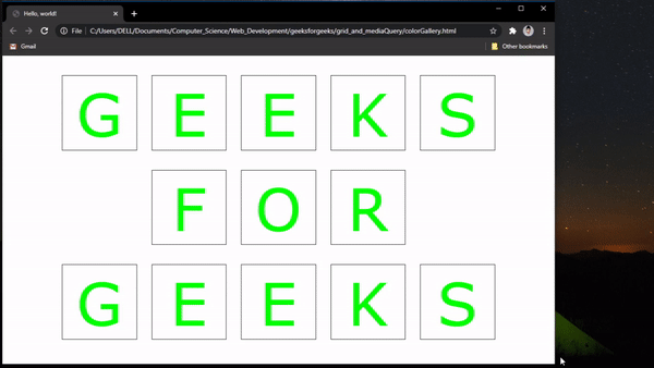
Output:

2. Grid using Bootstrap
HTML Code: First, we need to copy the bootstrap starter template from its official website. This template contains a bootstrap CDN, jQuery CDN, popper.js CDN, and Bootstrap JavaScript file. For convenience, I have put it here.
Then we start with building our grid by creating a div with the class container. This div will wrap all of our rows, then for each row we :
- Create a div with class row
- Inside this “row div”, create as many div as a number of columns required and give a class of col-* to each of these columns div. Here asterisk(*) resembles the width of the column. The total width of any screen is set as 12, this total width is too divided among the columns equally or unequally. In the first row, five columns each with a width of 2 is defined which makes up to a total of 10, the remaining 2(12-10) act for blank space.
- Then put image tags as required
- To the center, the images in each row, add a bootstrap class justify-content-center to each “row div”.
- Put a link to the custom CSS file( gfgBootstrapGrid.css here) in the header.
HTML
<!DOCTYPE html>
<html lang="en">
<head>
<meta charset="utf-8" />
<meta name="viewport"
content="width=device-width, initial-scale=1,
shrink-to-fit=no" />
<link rel="stylesheet" href=
integrity=
"sha384-VCmXjywReHh4PwowAiWNagnWcLhlEJLA5buUprzK8rxFgeH0kww/aWY76TfkUoSX"
crossorigin="anonymous" />
<link rel="stylesheet"
href="gfgBootstrapGrid.css" />
<title>Geeksforgeeks grid with bootstrap</title>
</head>
<body>
<div class="container-fluid">
<div class="row justify-content-center">
<div class="col-2">
<img src="gfg(G).png" alt="" />
</div>
<div class="col-2">
<img src="gfg(E).png" alt="" />
</div>
<div class="col-2">
<img src="gfg(E).png" alt="" />
</div>
<div class="col-2">
<img src="gfg(K).png" alt="" />
</div>
<div class="col-2">
<img src="gfg(S).png" alt="" />
</div>
</div>
<div class="row justify-content-center">
<div class="col-2">
<img src="gfg(F).png" alt="" />
</div>
<div class="col-2">
<img src="gfg(O).png" alt="" />
</div>
<div class="col-2">
<img src="gfg(R).png" alt="" />
</div>
</div>
<div class="row justify-content-center">
<div class="col-2">
<img src="gfg(G).png" alt="" />
</div>
<div class="col-2">
<img src="gfg(E).png" alt="" />
</div>
<div class="col-2">
<img src="gfg(E).png" alt="" />
</div>
<div class="col-2">
<img src="gfg(K).png" alt="" />
</div>
<div class="col-2">
<img src="gfg(S).png" alt="" />
</div>
</div>
</div>
<script src=
integrity=
"sha384-DfXdz2htPH0lsSSs5nCTpuj/zy4C+OGpamoFVy38MVBnE+IbbVYUew+OrCXaRkfj"
crossorigin="anonymous">
</script>
<script src=
integrity=
"sha384-9/reFTGAW83EW2RDu2S0VKaIzap3H66lZH81PoYlFhbGU+6BZp6G7niu735Sk7lN"
crossorigin="anonymous">
</script>
<script src=
integrity=
"sha384-XEerZL0cuoUbHE4nZReLT7nx9gQrQreJekYhJD9WNWhH8nEW+0c5qq7aIo2Wl30J"
crossorigin="anonymous">
</script>
</body>
</html>
|
CSS Code: First we need to give margin to each row, to avoid them from sticking. For this, we append the row class of bootstrap and give it a margin of “40px top and bottom” and “0 left and right”. We also resize each image tag to acquire 100% of its parent element(here the “column div”), this makes the images responsive
CSS
.row{
margin: 40px 0;
}
img{
width: 100%;
}
|
Output:
Differences Between the two approaches:
- As the code reflects, for small projects( like this one), custom CSS is the better option. This is because fewer classes and generalization are to be done and the code is written specifically for a particular use-case.
- However, in case of a large project with a lot of elements(for example a login page, a sign-up page, a home page … etc) the general margin and padding are always the same. Therefore, using bootstrap will avoid any repetition of code and hence is preferred.
- As Bootstrap is a predefined library, the chances of buggy code are very less than compared to custom CSS.
Share your thoughts in the comments
Please Login to comment...