CSS Viewer Cube without Three.js using Vanilla JavaScript
Last Updated :
28 Mar, 2024
Creating a CSS viewer cube without three.js using Vanilla JavaScript offers a lightweight alternative for rendering 3D cubes in web applications. This article explores various approaches to implementing a CSS viewer cube without relying on three.js, providing developers with flexibility and simplicity.
These are the following approaches:
Creating Cube with HTML and CSS
In this approach, we’ll use HTML and CSS to define a simple 3D cube and rotate it using JavaScript. We create six div elements representing the six faces of the cube and apply CSS styling for position and transformation.
Example: The below code creates a simple CSS viewer cube without using three.js.
HTML
<!DOCTYPE html>
<html lang="en">

<head>
    <meta charset="UTF-8">
    <meta name="viewport" content=
"width=device-width, initial-scale=1.0">
    <title>CSS Cube</title>
    <link rel="stylesheet" href="style.css">
</head>

<body style="text-align: center;">
    <h2>
        Below is the CSS viewer cube
        created using JavaScript
    </h2>
    <div class="cube">
        <div class="face front">Front</div>
        <div class="face back">Back</div>
        <div class="face top">Top</div>
        <div class="face bottom">Bottom</div>
        <div class="face left">Left</div>
        <div class="face right">Right</div>
    </div>
    <script>
        const cube = document.querySelector('.cube');
        function rotateCube() {
            cube.style.transform += ' rotateY(1deg)';
        }
        setInterval(rotateCube, 50);
    </script>
</body>

</html>
.cube {
    position: relative;
    width: 200px;
    height: 200px;
    margin: auto;
    transform-style: preserve-3d;
}

.face {
    position: absolute;
    width: 200px;
    height: 200px;
    display: flex;
    justify-content: center;
    align-items: center;
    background-color: rgba(255, 255, 255, 0.8);
    border: 1px solid black;
}

.front {
    transform: translateZ(100px);
}

.back {
    transform: rotateY(180deg) translateZ(100px);
}

.top {
    transform: rotateX(90deg) translateZ(100px);
}

.bottom {
    transform: rotateX(-90deg) translateZ(100px);
}

.left {
    transform: rotateY(-90deg) translateZ(100px);
}

.right {
    transform: rotateY(90deg) translateZ(100px);
}

@keyframes rotate {
    from {
        transform: rotateY(0deg);
    }

    to {
        transform: rotateY(360deg);
    }
}
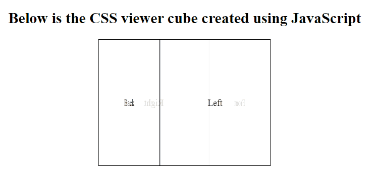
Output:
This approach enhances the cube’s interactivity by incorporating JavaScript to handle user interactions. We use CSS transforms to rotate the cube and position content on each face, while JavaScript manages user interaction to trigger rotations along different axes. CSS transitions are applied for smooth animations.
Example: The below code implements CSS properties and JavaScript to create a viewer cube.
HTML
<!DOCTYPE html>
<html lang="en">

<head>
    <meta charset="UTF-8">
    <meta name="viewport" content=
"width=device-width, initial-scale=1.0">
    <title>CSS Viewer Cube</title>
    <link rel="stylesheet" href="style.css">
</head>

<body style="text-align: center;">
    <h2>
        Below is the CSS viewer cube
        created using JavaScript
    </h2>
    <div class="cube-container">
        <div class="cube">
            <div class="face front">Front</div>
            <div class="face back">Back</div>
            <div class="face top">Top</div>
            <div class="face bottom">Bottom</div>
            <div class="face left">Left</div>
            <div class="face right">Right</div>
        </div>
    </div>
    <script>
        document.addEventListener
            ('DOMContentLoaded', function () {
                const cube = document.
                    querySelector('.cube');

                let angleX = 0;
                let angleY = 0;

                function rotateCube() {
                    angleX += 1;
                    angleY += 1;
                    cube.style.transform =
                        `rotateX(${angleX}deg)
                        rotateY(${angleY}deg)`;
                    requestAnimationFrame(rotateCube);
                }

                rotateCube();
            });
    </script>
</body>

</html>
.cube-container {
    perspective: 600px;
    width: 200px;
    height: 200px;
    margin: 100px auto;
}

.cube {
    position: relative;
    width: 100%;
    height: 100%;
    transform-style: preserve-3d;
    transition: transform 1s ease-in-out;
}

.face {
    position: absolute;
    width: 200px;
    height: 200px;
    background-color: rgba(255, 255, 255, 0.8);
    border: 2px solid #333;
    display: flex;
    justify-content: center;
    align-items: center;
    font-size: 24px;
}

.front {
    transform: translateZ(100px);
}

.back {
    transform: rotateY(180deg) translateZ(100px);
}

.top {
    transform: rotateX(90deg) translateZ(100px);
}

.bottom {
    transform: rotateX(-90deg) translateZ(100px);
}

.left {
    transform: rotateY(-90deg) translateZ(100px);
}

.right {
    transform: rotateY(90deg) translateZ(100px);
}
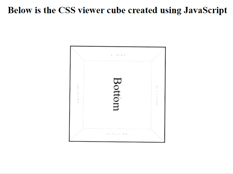
Output:
Using CSS Grid and Flexbox
In this approach, we leverage CSS Grid and Flexbox to lay out the cube’s faces and control their positioning. JavaScript is used to manage user interaction to rotate the cube and trigger animations. This approach offers a modern and responsive solution for creating complex layouts.
Example: The below code implements above-approach to create a viewer cube.
HTML
<!DOCTYPE html>
<html lang="en">

<head>
    <meta charset="UTF-8">
    <meta name="viewport" content=
"width=device-width, initial-scale=1.0">
    <title>CSS Viewer Cube</title>
    <link rel="stylesheet" href="style.css">

</head>

<body style="text-align: center;">
    <h2>
        Below is the CSS viewer cube
        created using JavaScript
    </h2>
    <div class="cube-container">
        <div class="cube">
            <div class="face front">Front</div>
            <div class="face back">Back</div>
            <div class="face right">Right</div>
            <div class="face left">Left</div>
            <div class="face top">Top</div>
            <div class="face bottom">Bottom</div>
        </div>
    </div>
    <script>
        const cube = document.
            querySelector('.cube');

        let rotateX = 0;
        let rotateY = 0;

        function rotateCube() {
            rotateX += 1;
            rotateY += 1;
            cube.style.transform =
                `rotateX(${rotateX}deg)
                rotateY(${rotateY}deg)`;
        }

        setInterval(rotateCube, 50);

    </script>
</body>

</html>
.cube-container {
    width: 320px;
    height: 320px;
    perspective: 1000px;
    margin: auto;
}

.cube {
    width: 100%;
    height: 100%;
    display: grid;
    position: relative;
    transform-style: preserve-3d;
    animation: rotate-cube 5s linear infinite;
}

.face {
    position: absolute;
    width: 100px;
    height: 100px;
    background-color: #ddd;
    border: 2px solid #333;
    display: flex;
    justify-content: center;
    align-items: center;
    font-size: 20px;
}

.front {
    transform: translateZ(50px);
}

.back {
    transform: rotateY(180deg) translateZ(50px);
}

.right {
    transform: rotateY(90deg) translateZ(50px);
}

.left {
    transform: rotateY(-90deg) translateZ(50px);
}

.top {
    transform: rotateX(90deg) translateZ(50px);
}

.bottom {
    transform: rotateX(-90deg) translateZ(50px);
}

@keyframes rotate-cube {
    from {
        transform: rotateY(0);
    }

    to {
        transform: rotateY(360deg);
    }
}
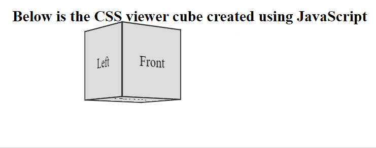
Output:
Share your thoughts in the comments
Please Login to comment...