How to make Form Responsive using Bootstrap ?
Last Updated :
08 Mar, 2024
We are going to create a responsive form by using Bootstrap 5. responsiveness is a feature that allows users to interact with the web app on any device easily. It helps to create better UI interactions and a better user experience that can be a reason to have great traffic on the respective website.
These are the following methods to make a form responsive:
Approach 1: Using Grid System
- Bootstrap’s grid system allows you to control the layout and sizing of elements responsively using a 12-column grid, breakpoints, and column width classes.
- To control their widths, you can wrap form elements in .row and .col classes.
- You can use the predefined grid classes such as “col-sm“, “col-md“, “col-lg“, and “col-xl” to make a form responsive.
- In Bootstrap 5, Each column will automatically adjust its width based on the screen size.
Example: This example shows the use of grid in Bootstrap for creation of responsive form.
HTML
<!DOCTYPE html>
<html lang="en">
<head>
<meta charset="UTF-8">
<meta name="viewport" content="width=device-width,
initial-scale=1.0">
<title>Responsive Form with Bootstrap Grid System</title>
<link href=
rel="stylesheet">
<style>
/* Additional styles */
.form-control {
margin-bottom: 10px;
}
.header {
text-align: center;
margin-bottom: 30px;
color: green;
}
</style>
</head>
<body>
<div class="container">
<div class="header">
<h3>GeeksForGeeks</h3>
</div>
<div class="row">
<div class="col-md-6">
<form>
<div class="mb-3">
<input type="text"
class="form-control"
placeholder="First Name">
</div>
<div class="mb-3">
<input type="text"
class="form-control"
placeholder="Last Name">
</div>
<div class="mb-3">
<input type="email"
class="form-control"
placeholder="Email">
</div>
</form>
</div>
<div class="col-md-6">
<form>
<div class="mb-3">
<input type="password"
class="form-control"
placeholder="Password">
</div>
<div class="mb-3">
<select class="form-control">
<option selected>Select Course</option>
<option>Course 1</option>
<option>Course 2</option>
<option>Course 3</option>
</select>
</div>
<button type="submit"
class="btn btn-primary">Submit</button>
</form>
</div>
</div>
</div>
</body>
</html>
|
Output:
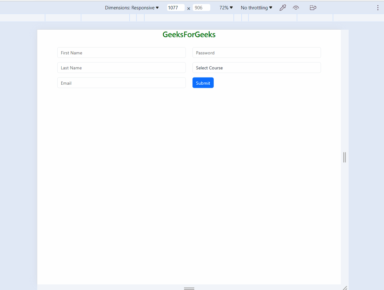
form
Approach 2: Using Flexbox
- To make a form responsive using flexbox, you can use the “d-flex” and “flex-column” classes to create a flex container and stack the form elements vertically.
- In Bootstrap 5 you can Add “d-flex` class to form a container to enable flexbox and Direction can be set using “flex-column” or “flex-row” classes
- Flex items will automatically wrap and resize across screen sizes
- We are using the “d-flex” class to make a form row a flex container and the “flex-column” class to make the form columns stack vertically on smaller screens. Additionally, and the `order` class to change the order of the form elements on different screen sizes.
Example: This example shows the use of Flexbox in Bootstrap for creation of responsive form.
HTML
<!DOCTYPE html>
<html lang="en">
<head>
<meta charset="UTF-8">
<meta name="viewport" content="width=device-width,
initial-scale=1.0">
<title>Responsive Form with Bootstrap Grid System</title>
<link href=
rel="stylesheet">
<style>
/* Additional styles */
.form-control {
margin-bottom: 10px;
}
.header {
text-align: center;
margin-bottom: 30px;
color: green;
}
</style>
</head>
<body>
<div class="container">
<div class="header">
<h3>GeeksForGeeks</h3>
</div>
<div class="row">
<div class="col-md-6">
<form class="d-flex flex-column">
<input type="text"
class="form-control mb-3"
placeholder="First Name">
<input type="text"
class="form-control mb-3"
placeholder="Last Name">
<input type="email"
class="form-control mb-3"
placeholder="Email">
</form>
</div>
<div class="col-md-6">
<form class="d-flex flex-column">
<input type="password"
class="form-control mb-3"
placeholder="Password">
<select class="form-control mb-3">
<option selected>Select Course</option>
<option>Course 1</option>
<option>Course 2</option>
<option>Course 3</option>
</select>
<button type="submit"
class="btn btn-primary">Submit</button>
</form>
</div>
</div>
</div>
</body>
</html>
|
Output:
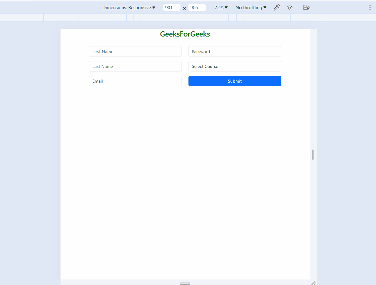
form
- In this approach, we are using Form that is inbuild component in bootstrap.
- The in build Form is already responsive but if we want any other extra features or color we can use custom CSS to do that.
Example: This example shows the use of Forms in Bootstrap for creation of responsive form.
HTML
<!DOCTYPE html>
<html lang="en">
<head>
<meta charset="UTF-8">
<meta name="viewport" content="width=device-width,
initial-scale=1.0">
<title>Responsive Form with Bootstrap Grid System</title>
<link href=
rel="stylesheet">
<style>
/* Additional styles */
.form-control {
margin-bottom: 10px;
}
.header {
text-align: center;
margin-bottom: 30px;
color: green;
}
</style>
</head>
<body>
<div class="container">
<div class="header">
<h3>GeeksForGeeks</h3>
</div>
<form>
<div class="row">
<div class="col-lg-6">
<div class="mb-3">
<input type="text"
class="form-control
custom-margin"
placeholder="First Name">
</div>
<div class="mb-3">
<input type="text"
class="form-control
custom-margin"
placeholder="Last Name">
</div>
</div>
<div class="col-lg-6">
<div class="mb-3">
<input type="email"
class="form-control
custom-margin"
placeholder="Email">
</div>
<div class="mb-3">
<input type="password"
class="form-control
custom-margin"
placeholder="Password">
</div>
<div class="mb-3">
<select class="form-control
custom-margin">
<option selected>Select Course</option>
<option>Course 1</option>
<option>Course 2</option>
<option>Course 3</option>
</select>
</div>
<button type="submit"
class="btn btn-primary">
Submit</button>
</div>
</div>
</form>
</div>
</body>
</html>
|
Output:
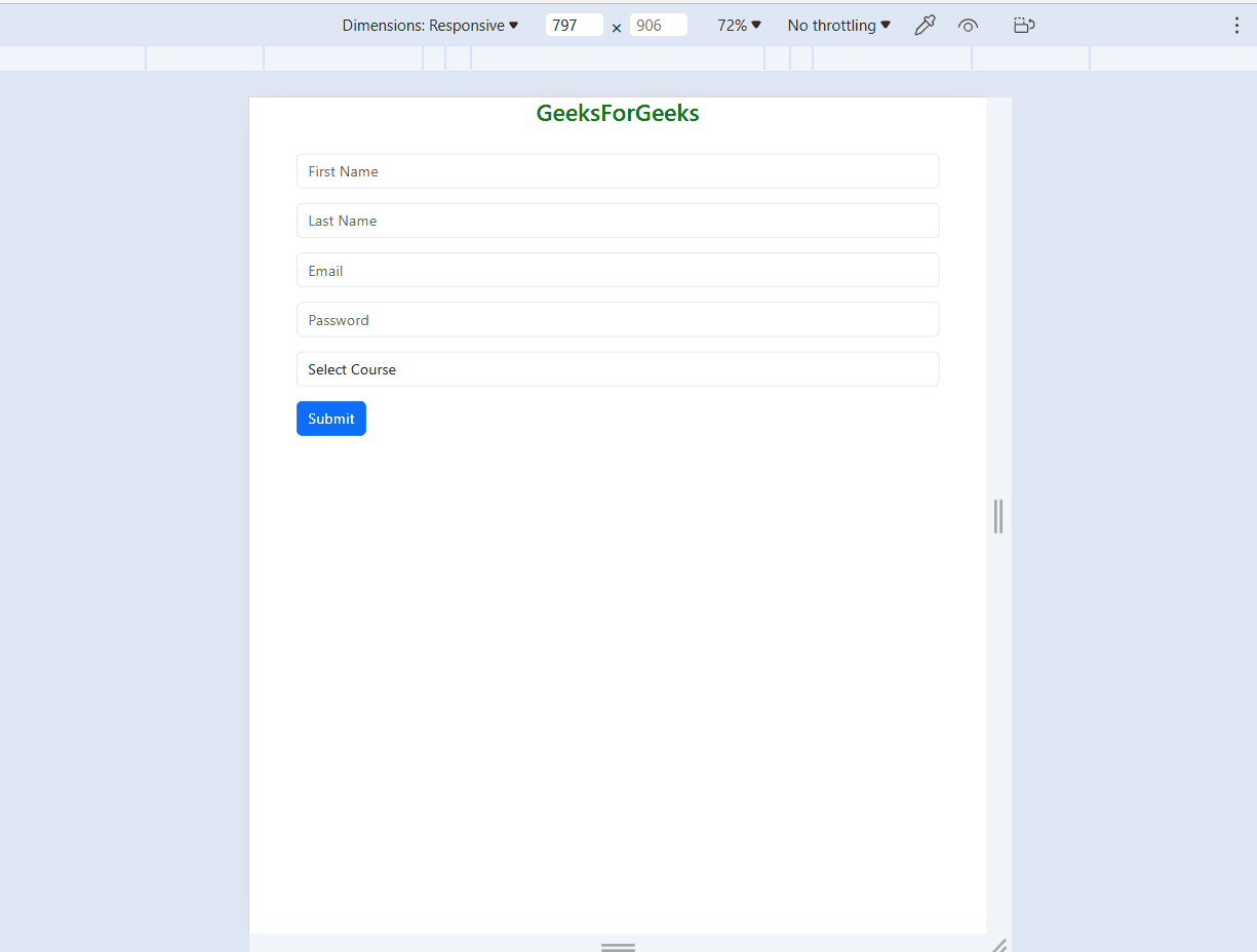
form
Share your thoughts in the comments
Please Login to comment...