Creating Interactive Plots with R and Highcharts
Last Updated :
25 Jan, 2023
The R Programming language is widely used for statistics, data visualization and data analysis, etc. Using the Highchart library data is graphically represented in the software. Not only meaning but Interactive charts are also prepared.
Types of charts:
- Column Chart
- Bar Chart
- Pie Chart
- Scatter Plot
Examples:
Creating Interactive Charts for the following dataset.
| Country |
Gdp (lakhs crores usd) |
| America |
23.00 |
| Brazil |
1.61 |
| Canada |
1.99 |
| China |
17.73 |
| India |
3.17 |
| Indonesia |
1.19 |
| Japan |
4.94 |
HighChart Syntax:
 hchart(object, type, hcaes(x, y), color)
 object      : Represents the data object.
 type        : Represents type of the graph.
 hacaes(x,y) : Represents the axes to represent the data.
 color       : Represents the plotting colors.
Column Chart
A column chart displays data with categories represented by a rectangle, sometimes called a vertical bar chart. Categories are typically organized along the horizontal axis and values along the vertical axis.
R
library(highcharter)
country=c('America', 'India', 'Indonesia',
'Japan', 'Canada', 'China', 'Brazil')
gdp=c(23, 3.17, 1.19, 4.94, 1.99, 17.73,1.61)
data=data.frame(country,gdp)
p1<- hchart(object =data,
type = "column",
hcaes(x = country, y = gdp),
color ='red')
p1
|
Output:

Interactive Column Chart
Bar Chart
A column chart displays data with categories represented by a rectangle, sometimes called a Horizontal bar chart. categories are typically organized along the Vertical axis and values along the Horizontal axis.
R
library(highcharter)
country=c('America', 'India', 'Indonesia',
'Japan', 'Canada', 'China', 'Brazil')
gdp=c(23, 3.17, 1.19, 4.94, 1.99, 17.73,1.61)
data=data.frame(country,gdp)
View(data)
p2 <- hchart(object =data,
type = "bar",
hcaes(x = country, y = gdp),
color ='red')
p2
|
Output:

Interactive Horizontal Bar Chart
Pie Chart
A type of graph in which a circle is divided into groups representing a proportion of the whole. Category values are divided among various circumferences in the circle. each sector represents a category.
R
library(highcharter)
country=c('America', 'India', 'Indonesia',
'Japan', 'Canada', 'China', 'Brazil')
gdp=c(23, 3.17, 1.19, 4.94, 1.99, 17.73,1.61)
data=data.frame(country,gdp)
p3 <- hchart(object =data,
type = "pie",
hcaes(x = country, y = gdp),
color ='red')
p3
|
Output:
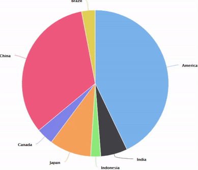
Interactive Pie Chart
Scatter Plot
A scatter plot (also known as a scatter chart) uses dots to represent values for two different numeric variables. Scatter plots are used to see relationships between variables. how one variable is affected by another variable can be visualized easily.
R
library(highcharter)
country=c('America', 'India', 'Indonesia',
'Japan', 'Canada', 'China', 'Brazil')
gdp=c(23, 3.17, 1.19, 4.94, 1.99, 17.73,1.61)
data=data.frame(country,gdp)
p4 <- hchart(object =data,
type = "scatter",
hcaes(x = country, y = gdp),
color ='red')
p4
|

Interactive Scatter Chart
Share your thoughts in the comments
Please Login to comment...