Creating Interactive Plots using Shiny
Last Updated :
27 Mar, 2024
Data visualization is an essential part of data analysis, allowing us to explore trends, patterns, and relationships within our data. While static plots are informative, interactive plots take visualization to the next level, enabling users to interact with the data dynamically.
Shiny App
Shiny is an R package that simplifies the process of building web applications directly from R code. It provides a framework for creating interactive web applications without requiring expertise in web development technologies such as HTML, CSS, or JavaScript.
It contains basic two components:
- User Interface (UI): The UI component shows a blueprint for defining the visual elements of the Shiny app using R functions that generate HTML.
- Server: It reacts responsively to user input, processes data, and generates dynamic output predicated on user interactions.
Syntax:
library(shiny)
ui <- fluidPage()
server <- function(input, output) {}
shinyApp(ui = ui, server = server)
Step 1:Install and load required packages
R
install.packages("shiny")
install.packages("cluster")
library(shiny)
library(cluster)
Step 2: Define the UI
Create a UI with dropdown lists (select inputs) for choosing the X and Y variables and a slider for selecting the number of clusters.
R
ui <- fluidPage(
  titlePanel("K-means Clustering on Iris Dataset"),
  sidebarLayout(
    sidebarPanel(
      selectInput("x_var", "X Variable:", choices = names(iris)[-5]),
      selectInput("y_var", "Y Variable:", choices = names(iris)[-5]),
      sliderInput("clusters", "Number of clusters:", min = 1, max = 5, value = 3)
    ),
    mainPanel(
      plotOutput("plot")
    )
  )
)
Step 3:Define the server logic
R
server <- function(input, output) {
  output$plot <- renderPlot({
    # Perform K-means clustering on the selected X and Y variables
    iris_clusters <- kmeans(iris[,c(input$x_var, input$y_var)],centers = input$clusters)

    # Plot clusters
    plot(iris[, c(input$x_var, input$y_var)], col = iris_clusters$cluster,
         main = "K-means Clustering on Iris Dataset")
    points(iris_clusters$centers, col = 1:input$clusters, pch = 8, cex = 2)
  })
}
Step 4:Run the Shiny app
Combine the UI and server functions using `shinyApp()` and run the app.
R
shinyApp(ui = ui, server = server)
Output:
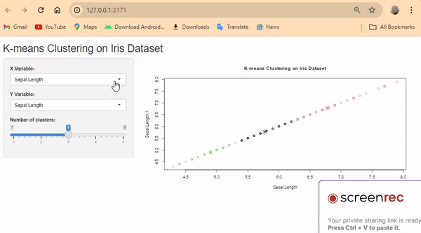
Plotting K-Means Clustering Using Shiny
Create a UI layout with dropdown lists (select inputs) and a slider for selecting variables and clusters.
- Use fluidPage() to create a flexible layout.
- Include titlePanel() to set the title.
- Use sidebarLayout() to organize the sidebar and main panel.
- Inside sidebarPanel(), add selectInput() for X and Y variables, and sliderInput() for clusters.
- Use mainPanel() to display the plot.
- Create a server function that generates a plot based on user inputs.
- Inside renderPlot(), perform K-means clustering using kmeans().
- Plot the clusters using plot() and points() functions.
- Combine UI and server functions using shinyApp().
- Run the app to launch the interactive interface.
Creating Interactive Plots using Shiny
An interactive plot is a type of graph or chart that allows users to engage with the data in different ways. Unlike static plots, which only show the data as it is, interactive plots enable users to explore and analyze the data dynamically.
To make an interactive plot, typically use a programming tool or library that supports interactivity, such as Plotly, Bokeh, or Shiny in R. These tools allow to create plots with features like zooming, panning, hovering to see data details, selecting specific data points, and more.So, making an interactive plot involves using a special software tool or library to create a graph or chart that responds to user actions, making it easier to understand and explore the data.
R
library(shiny)
library(plotly)

# Define UI
ui <- fluidPage(
  titlePanel("Interactive Plot with mtcars Dataset"),
  sidebarLayout(
    sidebarPanel(
      selectInput("x_var", "X-axis variable:", choices = names(mtcars)),
      selectInput("y_var", "Y-axis variable:", choices = names(mtcars), selected = "mpg")
    ),
    mainPanel(
      plotlyOutput("plot")
    )
  )
)

# Define server logic
server <- function(input, output) {
  output$plot <- renderPlotly({
    # Create plotly plot based on user inputs
    plot_ly(data = mtcars, x = ~get(input$x_var), y = ~get(input$y_var),
            type = 'scatter', mode = 'markers') %>%
      layout(title = 'Interactive Plot with mtcars Dataset',
             xaxis = list(title = input$x_var), yaxis = list(title = input$y_var))
  })
}

# Run the application
shinyApp(ui = ui, server = server)
Output:
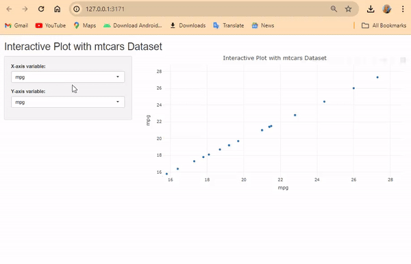
Interactive Plotting using Plotly
The output is an interactive plot generated using the Shiny framework and the Plotly library.
- The plot allows users to select variables from the mtcars dataset for both the X-axis and Y-axis.
- It displays the relationship between the selected variables as a scatter plot with markers.
- Users can interact with the plot by hovering over data points to see additional information and by zooming or panning to explore specific regions of interest.
- It can be deployed online using services like shinyapps.io or hosted locally on a server for broader accessibility.
Creating Customized Interactive Plot
R
library(shiny)
library(plotly)
library(ggplot2)

# Define UI
ui <- fluidPage(
  titlePanel("Interactive Plot with mtcars Dataset"),
  sidebarLayout(
    sidebarPanel(
      radioButtons("plot_type", "Select Plot Type:",
                   choices = c("Scatter Plot", "Box Plot", "Bar Plot")),
      selectInput("x_var", "X-axis variable:", choices = names(mtcars)),
      selectInput("y_var", "Y-axis variable:", choices = names(mtcars), selected = "mpg"),
      checkboxInput("add_line", "Add Line", value = FALSE),
      sliderInput("smooth_span", "Smooth Span:", min = 0, max = 1, value = 0.5, step = 0.1),
      checkboxInput("add_regression", "Add Regression Line", value = FALSE),
      sliderInput("limit", "Limit:", min = min(mtcars$mpg), max = max(mtcars$mpg),
                  value = c(min(mtcars$mpg), max(mtcars$mpg))),
      textInput("plot_title", "Plot Title:", value = "Interactive Plot"),
      downloadButton("download_plot", "Download Plot")
    ),
    mainPanel(
      plotlyOutput("plot")
    )
  )
)

# Define server logic
server <- function(input, output) {
  output$plot <- renderPlotly({
    # Determine plot type
    if (input$plot_type == "Scatter Plot") {
      p <- plot_ly(data = mtcars, x = ~get(input$x_var), y = ~get(input$y_var),
                   type = "scatter", mode = "markers")
    } else if (input$plot_type == "Box Plot") {
      p <- plot_ly(data = mtcars, x = ~get(input$x_var), y = ~get(input$y_var),
                   type = "box")
    } else if (input$plot_type == "Bar Plot") {
      p <- plot_ly(data = mtcars, x = ~get(input$x_var), y = ~get(input$y_var),
                   type = "bar")
    }

    # Add line
    if (input$add_line) {
      p <- p %>% add_lines()
    }

    # Add smooth line
    if (input$add_line) {
      p <- p %>% add_trace(y = fitted(loess(get(input$y_var) ~ get(input$x_var),
                                            span = input$smooth_span)),
                           name = "Smooth Line")
    }

    # Add regression line
    if (input$add_regression) {
      lm_model <- lm(get(input$y_var) ~ get(input$x_var), data = mtcars)
      p <- p %>% add_trace(y = predict(lm_model), name = "Regression Line")
    }

    # Set limits
    p <- p %>% layout(xaxis = list(range = input$limit))

    # Customize plot title
    p <- p %>% layout(title = input$plot_title)

    # Return the plot
    p
  })

  # Download plot
  output$download_plot <- downloadHandler(
    filename = function() {
      paste(input$plot_type, "plot.html", sep = "_")
    },
    content = function(file) {
      htmlwidgets::saveWidget(output$plot, file)
    }
  )
}

# Run the application
shinyApp(ui = ui, server = server)
Output:
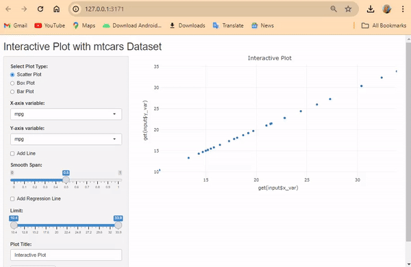
Customized Interactive Plot
Users can select the plot type (Scatter Plot, Box Plot, Bar Plot) via radio buttons and select variables for X and Y axes with dropdown menus.
- They can add a line, smooth line (with adjustable span), and regression line using checkboxes.
- Users can set limits on the X-axis using a slider.
- Customize the plot title using a text input.
- Download option is available for the plot as an HTML file.
Creating Heatmap using Shiny
R
library(shiny)
library(plotly)

# Define UI
ui <- fluidPage(
  titlePanel("Interactive Heatmap with mtcars Dataset"),
  sidebarLayout(
    sidebarPanel(
      selectInput("x_var", "X-axis variable:", choices = names(mtcars)),
      selectInput("y_var", "Y-axis variable:", choices = names(mtcars)),
      selectInput("z_var", "Z-axis variable:",choices = names(mtcars),selected = "mpg"),
      selectInput("color_scale", "Color Scale:",
                  choices = c("Viridis", "Plasma", "Inferno", "Magma", "Cividis")),
      textInput("plot_title", "Plot Title:", value = "Heatmap"),
      actionButton("refresh", "Refresh Plot"),
      downloadButton("download_plot", "Download Plot")
    ),
    mainPanel(
      plotlyOutput("plot")
    )
  )
)

# Define server logic
server <- function(input, output, session) {
  # Generate heatmap plot
  generate_heatmap <- function() {
    plot <- plot_ly(
      x = mtcars[, input$x_var],
      y = mtcars[, input$y_var],
      z = mtcars[, input$z_var],
      type = "heatmap",
      colorscale = input$color_scale
    ) %>% layout(title = input$plot_title)
    return(plot)
  }

  # Initial plot generation
  output$plot <- renderPlotly({
    generate_heatmap()
  })

  # Refresh plot on button click
  observeEvent(input$refresh, {
    output$plot <- renderPlotly({
      generate_heatmap()
    })
  })

  # Download plot
  output$download_plot <- downloadHandler(
    filename = function() {
      paste(input$plot_title, ".html", sep = "")
    },
    content = function(file) {
      htmlwidgets::saveWidget(output$plot, file)
    }
  )
}

# Run the application
shinyApp(ui = ui, server = server)
Output:

Creating Interactive Heatmap
Users can select the variables for the X-axis (x_var), Y-axis (y_var), and Z-axis (z_var) from dropdown menus.
- They can choose the color scale for the heatmap from a predefined list (color_scale).
- Users can customize the plot title using a text input (plot_title).
- The “Refresh Plot” button allows users to update the plot with the selected options.
- There’s an option to download the plot as an HTML file.
Conclusion
Using Shiny in R lets us make interactive plots. These plots allow users to play with data, like choosing variables or customizing the plot. By teaming up with Plotly, we can create easy-to-use tools for exploring and understanding data better. It’s helpful for researchers, analysts, and teachers.
Share your thoughts in the comments
Please Login to comment...