In statistics, confidence intervals are a type of interval estimate used to provide an estimate of the range of values that a population parameter, such as a mean or proportion, is likely to fall within. These intervals are essential for interpreting the results of statistical analyses and providing a measure of uncertainty around point estimates.
Adding Confidence Intervals to Dotchart in R
In R programming, dotcharts are a type of visualization used to display categorical data as points on a horizontal axis. They are commonly used to show the distribution of data across different groups or categories. Adding confidence intervals to dotcharts can provide valuable information about the uncertainty around the point estimates of the data.
In this article, we will explore how to add confidence intervals to dotcharts in R using the ggplot2 and plotrix packages.
Concepts related to the topic:
Before we dive into the steps for adding confidence intervals to dotcharts in R, let’s briefly review some important concepts related to the topic.
Confidence intervals
A confidence interval is a range of values that is likely to contain the true population parameter with a certain level of confidence. The level of confidence is typically set to 95%, meaning that if the same statistical procedure were repeated many times, 95% of the resulting intervals would contain the true population parameter.
Dotcharts
A dotchart, also known as a Cleveland dot plot, is a type of visualization used to display categorical data as points on a horizontal axis. Each point represents a single observation or data point, and the points are arranged according to their category or group.
ggplot2
ggplot2 is a popular data visualization package in R. It provides a powerful and flexible system for creating a wide range of visualizations, including scatterplots, histograms, and boxplots.
Plotrix
The plotrix package in R is used in complex data visualization. It provides various functions to customize the graphs. It is really useful when the basic plotting functions of R fail in the visualization of complex data.
Steps needed to add Confidence Intervals in Dotchart
Now that we have reviewed some of the important concepts related to adding confidence intervals to dotcharts in R, let’s take a look at the steps involved in doing so.
Step 1: Load the necessary packages
We will be using the ggplot2, dplyr, and ggpubr packages to create our dotchart with confidence intervals. To load these packages, we can use the following code:
library(ggplot2)
library(dplyr)
library(ggpubr)
Step 2: Create the data
Next, we need to create the data that we will use to create our dotchart. For this example, we will use the built-in mtcars dataset, which contains information about various characteristics of different car models.
data(mtcars)
We will create a new dataset that summarizes the average miles per gallon (mpg) for each number of cylinders (cyl).
mpg_summary <- mtcars %>%
 group_by(cyl) %>%
 summarize(mean_mpg = mean(mpg))
Step 3: Create the dotchart
Now we are ready to create the dotchart using ggplot2. We will use the geom_dotplot() function to create the dotchart and the geom_errorbar() function to add the confidence intervals.
ggplot(mpg_summary, aes(x = factor(cyl), y = mean_mpg)) +
 geom_dotplot(binaxis = "y", stackdir = "center", dotsize = 0.8) +
 geom_errorbar(aes(ymin = mean_mpg - 1.96*sd(mpg)/sqrt(length(mpg)),
                   ymax = mean_mpg + 1.96*sd(mpg)/sqrt(length(mpg))),
               width = 0.2, size = 0.7) +
 labs(x = "Number of cylinders", y = "Average miles per gallon")
In the geom_errorbar() function, we use the mean_mpg column from our mpg_summary dataset to specify the center of the confidence intervals. We also calculate the upper and lower bounds of the intervals using the formula mean_mpg ± 1.96*(sd(mpg)/sqrt(n)), where sd(mpg) is the standard deviation of the mpg variable for each cyl group, and n is the number of observations in each group. The constant 1.96 corresponds to a 95% confidence level.
We also specify the width and size arguments to control the width and thickness of the error bars, respectively.
Finally, we use the labs() function to add appropriate labels to the x and y axes.
Step 4: Customize the plot
We can further customize the plot by changing the colors, font sizes, and other elements. For example, we can change the color of the points and error bars using the fill and color arguments in the geom_dotplot() and geom_errorbar() functions, respectively.
ggplot(mpg_summary, aes(x = factor(cyl), y = mean_mpg)) +
 geom_dotplot(binaxis = "y", stackdir = "center", dotsize = 0.8, fill = "#0072B2") +
 geom_errorbar(aes(ymin = mean_mpg - 1.96*sd(mpg)/sqrt(length(mpg)),
                   ymax = mean_mpg + 1.96*sd(mpg)/sqrt(length(mpg))),
               width = 0.2, size = 0.7, color = "#E69F00") +
 labs(x = "Number of cylinders", y = "Average miles per gallon") +
 theme_pubclean() +
 theme(axis.title = element_text(size = 12),
       axis.text = element_text(size = 10))
Examples of Confidence Intervals in Dotchart
Let’s take a look at some additional examples of dotcharts with confidence intervals using different datasets and customization options.
Example 1: Dotchart with Confidence Intervals for two groups
At first, the ggplot2 package is loaded and sample dataset is created using the data.frame() function. The dataset has two columns: “x” and “y”. There are three groups, “A”, “B”, and “C”, and each group has 10 values that are generated using the rnorm() function. The values are drawn from a normal distribution with mean 5 and standard deviation 1. The set.seed() function is used to ensure that the random number generation is reproducible. The aggregate() function is used to compute the mean, standard deviation, standard error, and confidence interval of the values in each group.
The ggplot() function is used to create a plot object. The df_summary data frame is used as the data source, and the aes() function is used to specify that the “x” column should be used for the x-axis, the “y” column should be used for the y-axis, and the “ymin” and “ymax” arguments should be computed based on the confidence interval in the y column of df_summary. Then geom_point() function is used to create a dot chart of the means for each group and geom_errorbar() function is used to add confidence intervals to the plot.
R
library(ggplot2)
set.seed(123)
df <- data.frame(x = rep(c("A", "B", "C"), each = 10),
y = rnorm(30, 5, 1))
df_summary <- aggregate(y ~ x, df, function(x) c(mean = mean(x),
sd = sd(x),
se = sd(x)/sqrt(length(x)),
ci = 1.96*sd(x)/sqrt(length(x))))
ggplot(df_summary, aes(x = x, y = y[,1], ymin = y[,4][1], ymax = y[,4][1])) +
geom_point(size = 3) +
geom_errorbar(width = 0.2) +
labs(title = "Dotchart with Confidence Intervals",
x = "Group", y = "Value")
|
Output:
Overall, the code produces a dot chart with confidence intervals for three groups of values. The ggplot2 package provides a lot of flexibility for customizing the appearance of the plot, so you can modify the arguments to the ggplot(), geom_point(), and geom_errorbar() functions to change the colors, fonts, and other visual aspects of the plot.
Example 2: Dotchart with Confidence Intervals by multiple factors
In this example, the first 50 values are drawn from a normal distribution with mean 10 and standard deviation 2, and the second 50 values are drawn from a normal distribution with mean 13 and standard deviation 2. The set.seed() function is used to ensure that the random number generation is reproducible. The geom_dotplot() function is used to create a dot chart of the means for each group. The binaxis argument is set to “y” to indicate that the dots should be arranged vertically, and the stackdir argument is set to “center” to indicate that the dots should be centered on the y-axis. The dotsize argument controls the size of the dots.
The following example demonstrates how to create a dotchart with confidence intervals using the ggplot2 package in R.
R
library(ggplot2)
set.seed(123)
df <- data.frame(group = rep(c("A", "B"), each = 50),
value = c(rnorm(50, 10, 2), rnorm(50, 13, 2)))
df_summary <- aggregate(value ~ group, df, FUN = function(x) c(mean = mean(x),
sd = sd(x)))
ggplot(df_summary, aes(x = group, y = value[, "mean"])) +
geom_dotplot(binaxis = "y", stackdir = "center", dotsize = 0.8) +
geom_errorbar(aes(ymin = value[, "mean"] - 1.96*value[, "sd"]/sqrt(50),
ymax = value[, "mean"] + 1.96*value[, "sd"]/sqrt(50)),
width = 0.2) +
labs(title = "Dotchart with Confidence Intervals",
x = "Group", y = "Value")
|
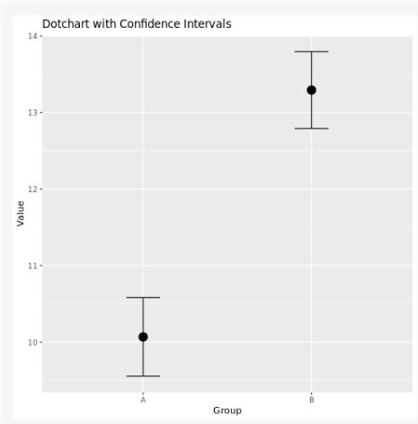
Confidence Intervals in Dotchart using ggplot2
Example 3: Add Confidence Intervals to Dotchart using plotrix package
In this example, we first load the plotrix package. We then create a data frame df with some example data consisting of three groups (A, B, and C) and their corresponding values. Next, we use the aggregate() function to calculate the mean and standard error of each group.
We then create a dot chart using the dotchart() function, with the means as the data and the group labels as the labels argument. We also set the x-axis limits using xlim and add an x-axis label using xlab.
Finally, we use the arrows() function to add error bars to the plot representing the standard error of the mean for each group. The x0 and x1 arguments specify the start and end points of the error bars along the x-axis, while the y0 and y1 arguments specify the groups for which the error bars should be drawn. The angle, code, and length arguments control the appearance of the error bars.
This code should produce a dot chart with error bars representing the standard error of the mean for each group. You can adjust the appearance of the plot and the error bars by modifying the arguments to the dotchart() and arrows() functions, respectively.
R
library(plotrix)
df <- data.frame(
group = c("A", "A", "B", "B", "C", "C"),
value = c(10, 12, 8, 9, 6, 7)
)
means <- aggregate(value ~ group, data = df, FUN = mean)
stderrs <- aggregate(value ~ group, data = df,
FUN = function(x) sd(x) / sqrt(length(x)))
dotchart(means$value, labels = means$group, xlim = c(0, max(means$value) * 1.1),
xlab = "Value")
arrows(
x0 = means$value - stderrs$value,
y0 = 1:length(means$group),
x1 = means$value + stderrs$value,
y1 = 1:length(means$group),
angle = 90,
code = 3,
length = 0.1
)
|
Output:
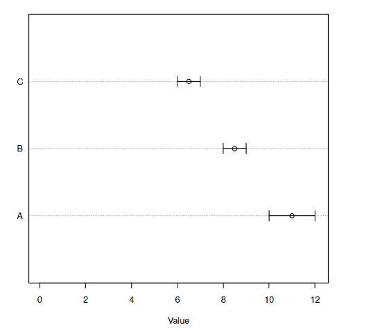
Confidence Intervals in Dotchart using plotrix
Conclusion
In conclusion, adding confidence intervals to a dotchart is an important aspect of data visualization that allows researchers to display the uncertainty of their estimates. With the ggplot2 package in R, it is easy to create a dotchart with confidence intervals by following the steps outlined in this article. By customizing the plot using various options, researchers can create informative and visually appealing dotcharts that help to convey their findings.
Share your thoughts in the comments
Please Login to comment...