How to create interactive data visualizations with ggvis
Last Updated :
25 Aug, 2023
ggvis is a Data Visualization Package in R Programming Language that helps you to create Interactive and Dynamic visualizations for exploratory Data Analysis. ggvis incorporates both the reactive programming model of Shiny and the grammar of data transformation from the dplyr library. It is designed to work seamlessly with other packages, such as dplyr and ggplot2.
Shiny
Shiny is a popular open-source package in the R programming language. It allows you to create interactive web applications. You can build dynamic and interactive applications which respond to user’s input and update the output in real time.
Dplyr
Dplyr is a popular package in R that provides various functions for data manipulation and transformation. Dplyr allows you to create complex operations using a set of simple and readable functions.
Syntex :
ggvis( Dataset , x , y, Parameter)
First, we need to start with a call to ggvis(). We need to pass the parameters in it :
- Dataset
- Variables
- Plotting Tools
Layer Functions :
layer_points(): It helps in adding points to the graph/plot.layer_bars(): It helps in adding add bars to the graph/plot.layer_lines(): It helps in adding lines to the graph/plot.layer_paths(): It helps in adding paths (connected lines) to the graph/plot.layer_rects(): It helps in adding rectangles to the graph/plot.layer_text(): It helps in adding text labels to the graph/plot.layer_image(): It helps in adding images to the graph/plot.layer_smooths(): It helps in adding smoothed lines or curves to the graph/plot.layer_histograms(): It helps in adding histograms to the graph/plot.layer_density(): It helps in adding density plots to the graph/plotlayer_ribbons(): It helps in adding thick layer to the graph/plot
Plotting Parameters :
Parameters :
x and y: These parameters specify the variables that determine the position of the points along the x-axis and y-axis, respectively. fill: This parameter determines the fill color of the points. You can specify a color or use a variable to map different colors to the points based on categories or values.fillOpacity: This parameter controls the transparency of the fill color of the points. It takes a value between 0 and 1, where 0 represents transparent and 1 represent being opaque.stroke: This parameter sets the color of the outline or border of the points. It can be specified as a color name or a variable for mapping different colors.strokeWidth: This parameter determines the width of the outline or border of the points. It accepts a numeric value representing the width in pixels.size: This parameter is used to control the size of the points. You can specify a constant size or use a variable to map different sizes to the points based on values.opacity: This parameter adjusts the transparency or opacity of the points. It takes a value between 0 and 1, where 0 represents transparent and 1 represents opaque.
Package Installation
R
install.packages("ggvis")
library(ggvis)
|
1. Displaying Points
R
Plot1 <- ggvis(iris, x = ~Sepal.Length, y = ~Sepal.Width)
layer_points(Plot1)
layer_points(ggvis(iris, x = ~Sepal.Length, y = ~Sepal.Width))
|
Output :
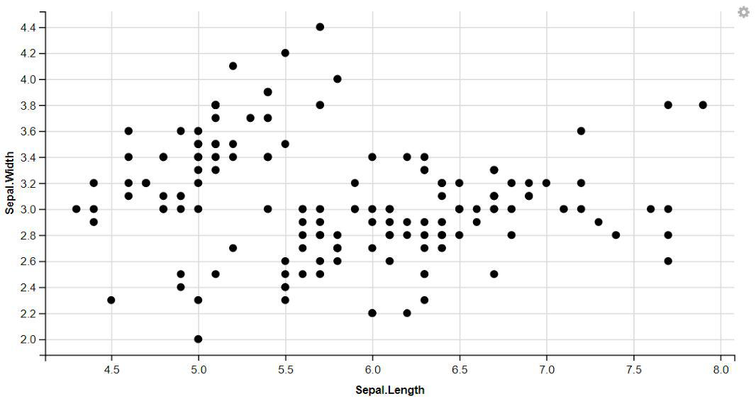
Data Visualization With ggvis
We can also use the Pronounced Pipe Operator, %<% of the magrittr package, to see the visualization.
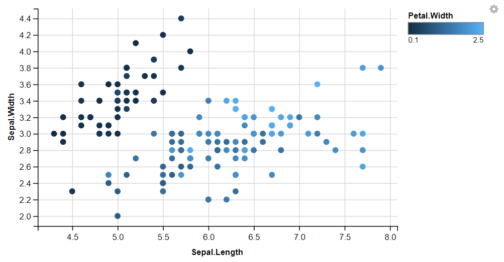
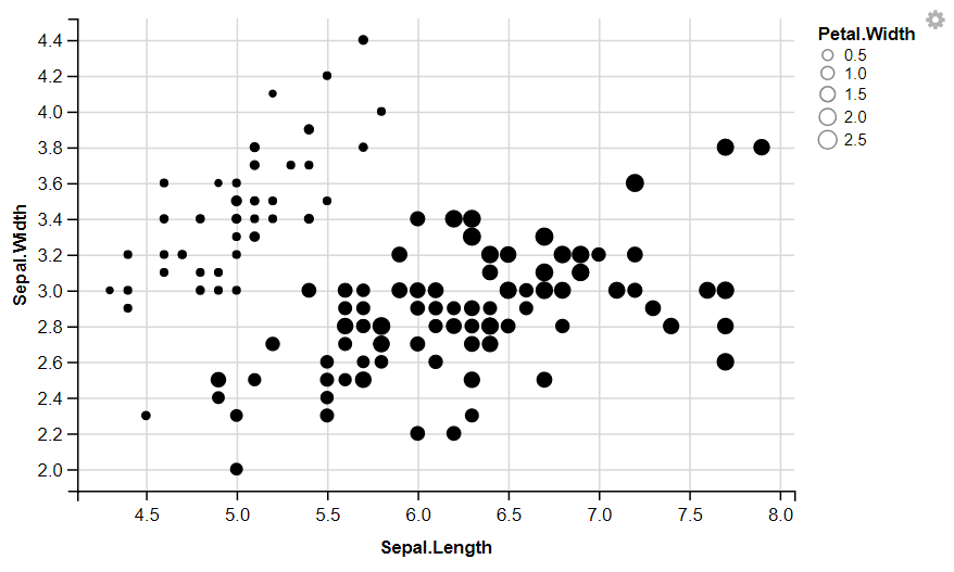
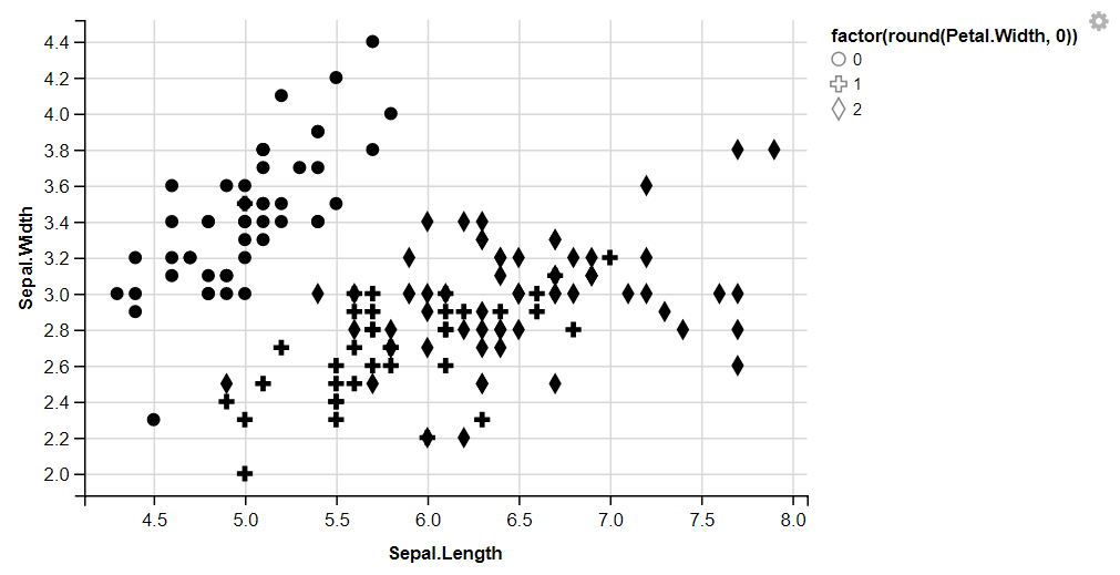
Displaying Points with Colors, Shapes, Size, and Stroke
We can add more variables to the plot by mapping them to other visual properties like fill, size, shape And stroke.
R
iris %>%
ggvis( x = ~Sepal.Length, y = ~Sepal.Width, fill = ~Petal.Width) %>%
layer_points()
|
Output:
Size
R
iris %>%
ggvis( x = ~Sepal.Length, y = ~Sepal.Width, size = ~Petal.Width) %>%
layer_points()
|
Output:
Shape
R
iris %>%
ggvis(x = ~Sepal.Length, y = ~Sepal.Width, shape = ~factor(round(Petal.Width,0)))%>%
layer_points()
|
Output:
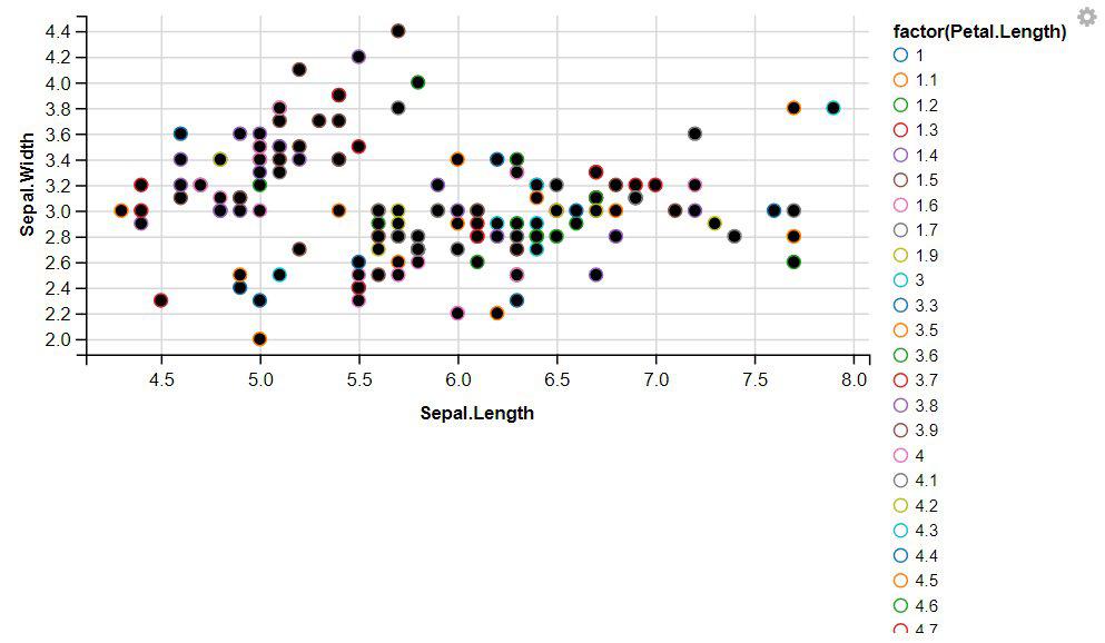
Stroke
R
iris %>%
ggvis(x = ~Sepal.Length, y = ~Sepal.Width, stroke = ~factor(Petal.Length)) %>%
layer_points()
|
Output:
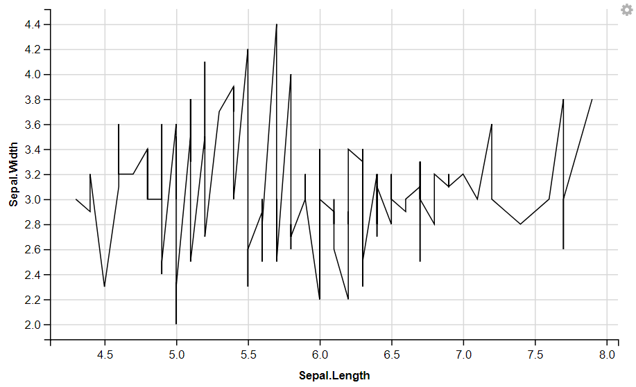
2. Displaying Lines
R
iris %>%
ggvis( x = ~Sepal.Length, y = ~Sepal.Width) %>%
layer_lines()
|
Output:
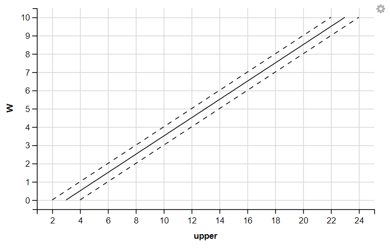
Displaying Dotted Lines (using strokeDash)
R
W <- seq(0, 10, 0.1)
data <- data.frame(fit=3+2*W, upper=4+2*W, lower=2+2*W)
strokes <- data %>%
ggvis(x= ~fit, y= ~W) %>%
layer_lines() %>%
layer_lines(x= ~lower, y= ~W, strokeDash:=6) %>%
layer_lines(x= ~upper, y= ~W, strokeDash:=6)
strokes
|
Output:
3. Displaying Histograms
R
iris %>%
ggvis(~Sepal.Length) %>%
layer_histograms()
iris %>%
ggvis(~Sepal.Length) %>%
layer_histograms(width = 0.5, center = 0)
|
Output:
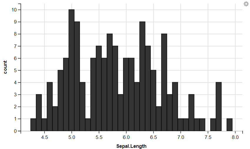
With Width
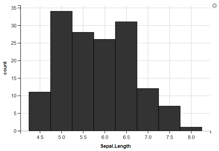
ggvis Width Histogram
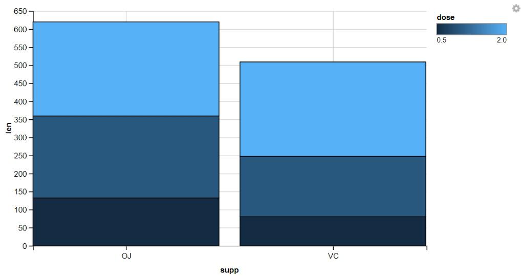
4. Displaying Stacked Bar Graphs
R
ToothGrowth %>%
group_by(dose) %>%
ggvis(x = ~supp, y = ~len, fill = ~dose) %>%
layer_bars()
|
Output:
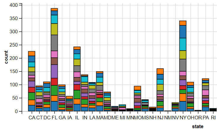
Automatic Grouping
R
cocaine %>%
ggvis(x = ~state, fill = ~as.factor(month)) %>%
layer_bars()
|
Output:
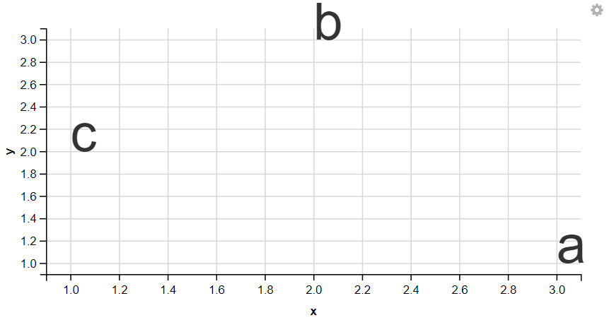
5. Displaying Texts
R
df <- data.frame(x = 3:1, y = c(1, 3, 2), label = c("a", "b", "c"))
df %>%
ggvis(~x, ~y, text := ~label) %>%
layer_text(fontSize := 50)
|
Output:
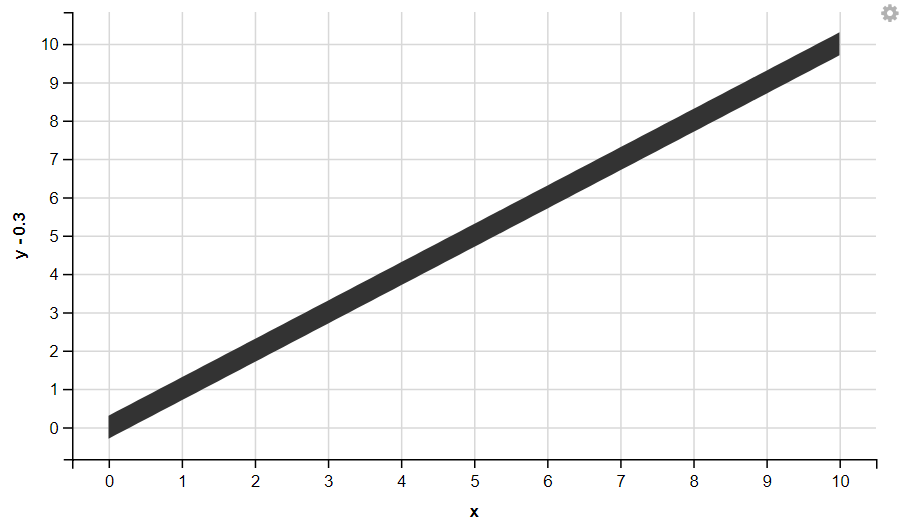
6. Displaying Ribbon
R
df <- data.frame(x = seq(0,10,by=0.1), y = seq(0,10,by=0.1))
df %>%
ggvis( x = ~x, y = ~y + 0.3, y2 = ~y-0.3 ) %>%
layer_ribbons()
|
Output:
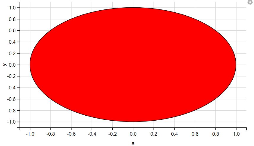
7. Displaying Polygon
R
t <- seq(0, 2 * pi, length = 100)
df <- data.frame(x = sin(t), y = cos(t))
df %>%
ggvis(x = ~x, y = ~y) %>%
layer_paths(fill := "red")
|
Output:
8. Displaying Box Plots
R
iris %>%
ggvis( x = ~factor(Species), y = ~Sepal.Length) %>%
layer_boxplots()
|
Output:
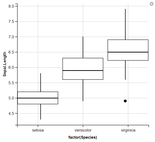
We used ggvis to initialize the plot and mapped the Species column to the x-axis using ~factor(Species) and the Sepal.Length column to the y-axis using ~Sepal.Length. Then, it adds box plots to the plot to visualize the distribution of Sepal. Length for each species of iris flowers.
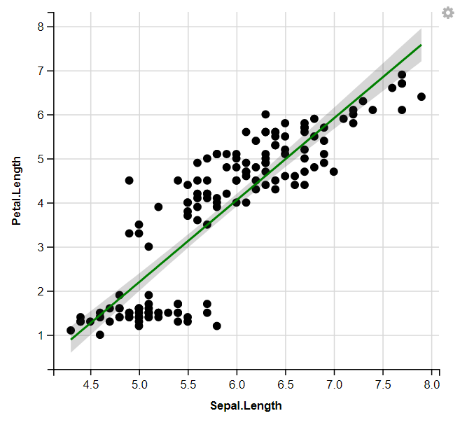
9. Displaying Regression Lines
R
iris %>%
ggvis(x = ~Sepal.Length, y = ~Petal.Length) %>%
layer_points() %>%
layer_model_predictions(model = "lm", stroke := "green", se=T)
|
Output:
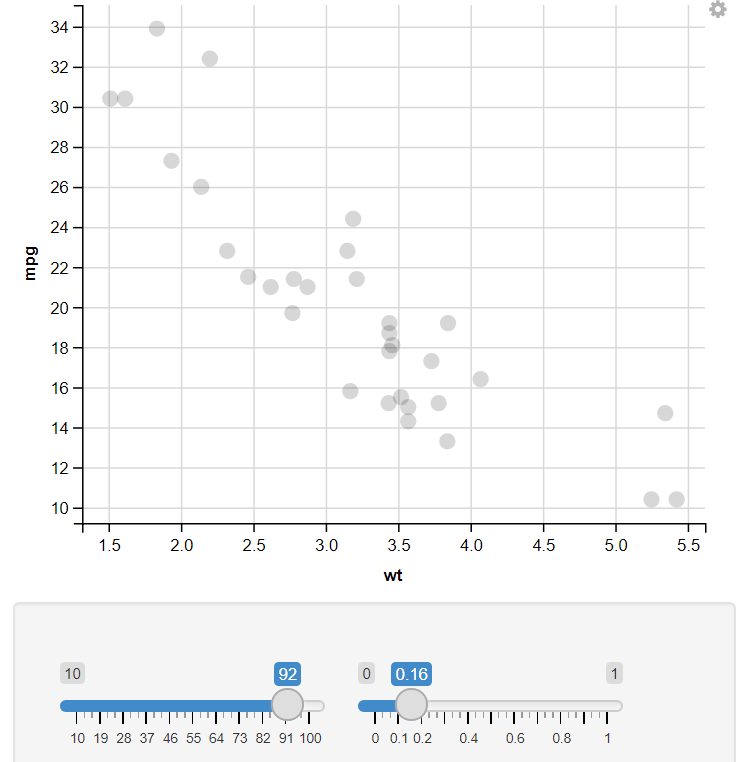
10. Change the size of the dot & Change the opacity of the dot :
R
mtcars %>%
ggvis(~wt, ~mpg,
size := input_slider(10, 100),
opacity := input_slider(0, 1)
) %>%
layer_points()
|
Output:
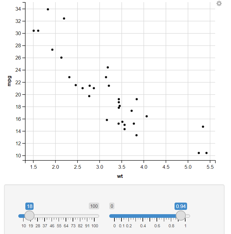
In this example, I have used the input selector function, which takes two values (Starting and Ending values) to show variation in that Feature. Like in the example, I have an Input Selector on two Features, Size and Opacity. On changing the input selector value, It automatically changes the Output plot.
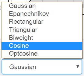
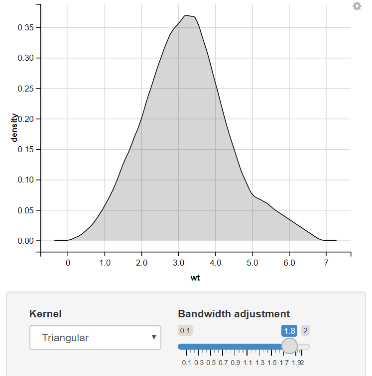
11. Using Input Section
Change the Kernel using Input_Select & Change the bandwidth adjustment using the slider.
R
mtcars %>%
ggvis(x = ~wt) %>%
layer_densities(
adjust = input_slider(.1, 2, value = 1, step = .1, label = "Bandwidth adjustment"),
kernel = input_select(
c("Gaussian" = "gaussian", "Epanechnikov" = "epanechnikov",
"Rectangular" = "rectangular", "Triangular" = "triangular",
"Biweight" = "biweight", "Cosine" = "cosine", "Optcosine" = "optcosine"),
label = "Kernel")
)
|
Output:
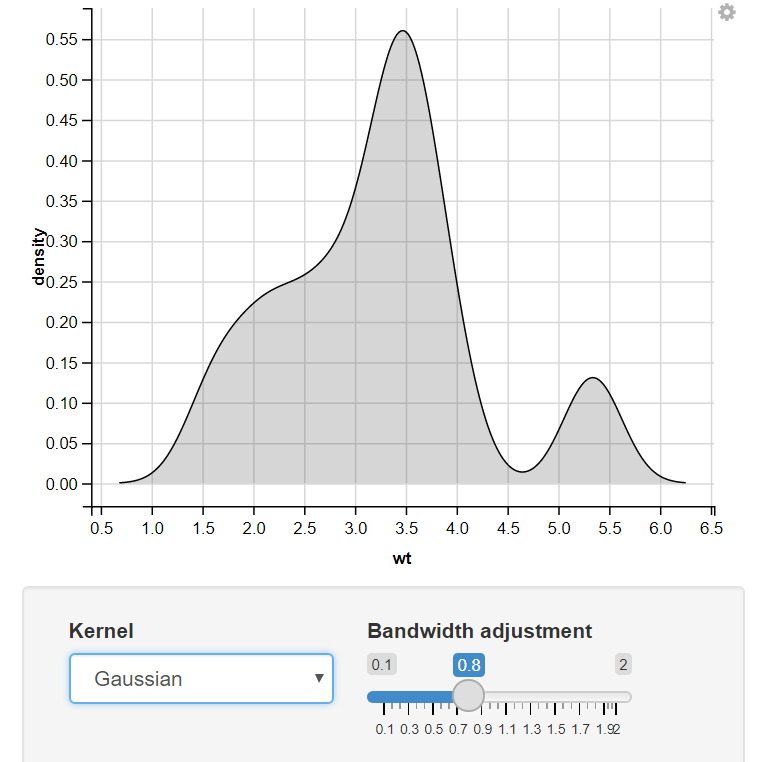
Change the Input of the Kernel using Drop-Down Menu
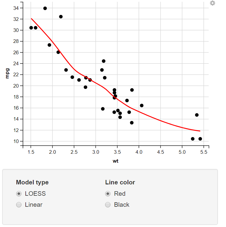
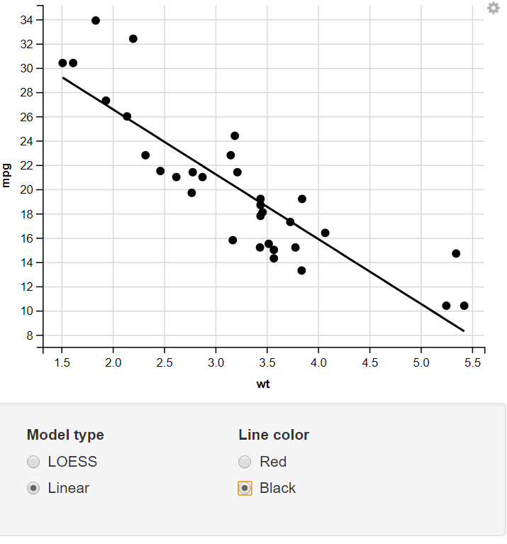
12. Using the Radio Button
Change the Model Type & Line Color using the Radio Button
R
mtcars %>% ggvis(x = ~wt, y = ~mpg) %>%
layer_points() %>%
layer_model_predictions(
model = input_radiobuttons(c("LOESS" = "loess", "Linear" = "lm"),
label = "Model type"),
stroke := input_radiobuttons(c("Red" = "red", "Black" = "black"),
label = "Line color")
)
|
Output:
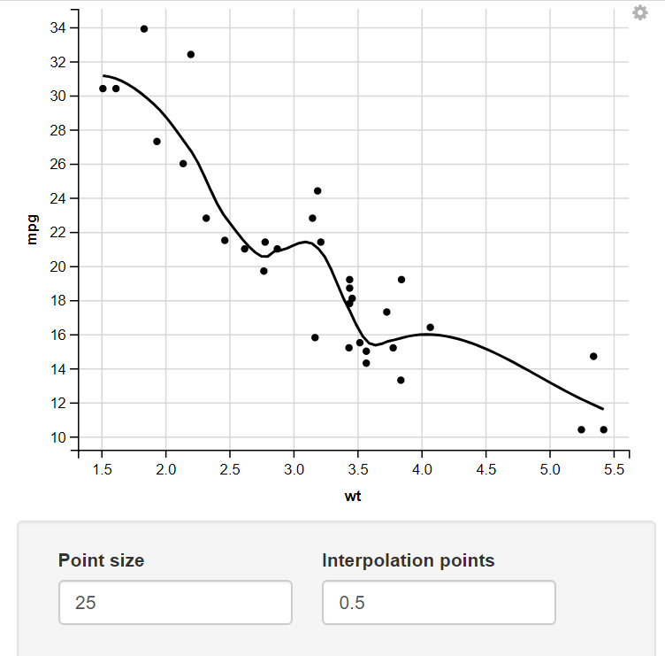
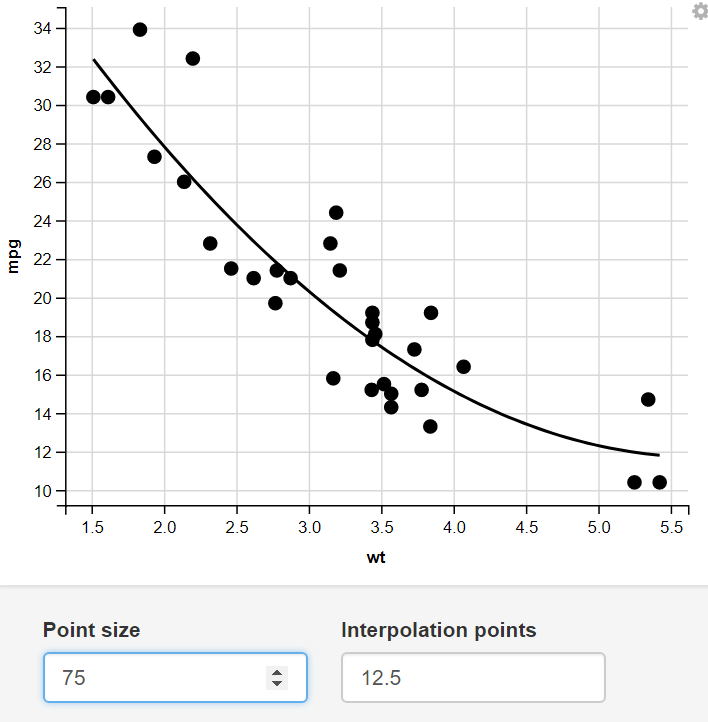
13. Taking Numeric Input
Change the size of the Point and number of Interpolation Points through numeric Input.
R
mtcars %>%
ggvis(x = ~wt, y = ~mpg) %>%
layer_points(size := input_numeric(value = 25, label = "Point size")) %>%
layer_smooths(span = input_numeric(value = 0.5, label = "Interpolation points"))
|
Output:
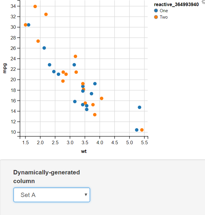
14. Using the Mapping Function
Creating a function mapping different values to two sets and using the Input Select to Display the Required set
R
new_vals <- input_select(c("Set A" = "A", "Set B" = "B"),
label = "Dynamically-generated column",
map = function(value) {
vals <- switch(value,
"A" = c("One", "Two"),
"B" = c("First", "Second", "Third", "Fourth"))
rep(vals, length = nrow(mtcars))
})
mtcars %>%
ggvis(x = ~wt, y = ~mpg, fill = new_vals) %>%
layer_points()
|
Output:
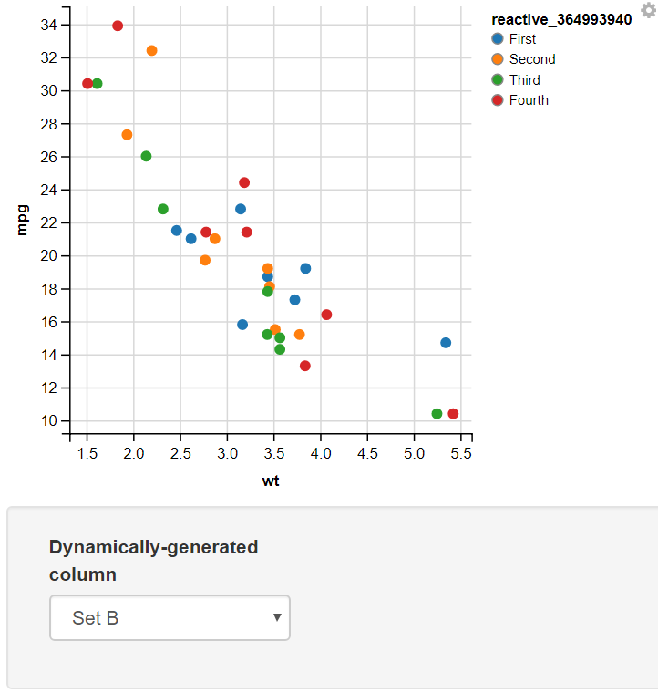
In this example, I have added two values for the user to select input as Set A or Set B. In this, I have used the map function to map the values of Set A to “One” and “Two” and Set B to “First”, “Second”, “Third”, and “Fourth”. The switch statement takes the selected value from the dropdown menu(value) and, On the basis of its value, assigns different sets of values to the variable.
Share your thoughts in the comments
Please Login to comment...