Creating Interactive Dashboard from Jupyter Notebooks
Last Updated :
14 Dec, 2023
Creating interactive dashboards is a required and powerful way to communicate insights in the field of Data Analysis and Data Visualization. In this article, we are going to dive into the process of creating an interactive dynamic dashboard using Python, Jupyter Notebook, and Dash framework complete with interactivity through user input.
Prerequisites
Before we dig into actually making a dashboard in Jupyter Notebook, make sure you have the required libraries installed. You can use the following command to install the libraries.
pip install dash jupyter-dash
pip install yfinance
This will install the Dash and Jupyter Dash and also the yfinance package.
Creating Dashboard from Jupyter Notebook
Step 1: Import the Necessary Libraries
Here, dash imports the Dash library which is necessary for building interactive dashboards.
Python3
from jupyter_dash import JupyterDash
from dash import dcc, html, Input, Output
import yfinance as yf
import plotly.express as px
|
Here is the explanation of the code:
- dcc, html import the specific components from Dash which include graphs, dropdowns, etc. from dcc and html imports html components for structuring the layout of the web page.
- JupyterDash is a class provided by the ‘jupyter_dash’ library which is an extension of dash which helps to seamlessly work within Jupyter Notebook.
- Input, Output are the classes from the dash.dependencies module which used to specify the inputs and outputs for callback functions in Dash.
- yfinance is a library used to fetch stock data.
- plotly.express is a data visualization library which provides a simple and concise syntax for creating a variety of interactive plots.
Step 2: Initialization
Next, we will initialize our Dash application within the Jupyter Notebook,
Python3
app = JupyterDash(__name__)
|
Step 3 : Building the Layout
We will define a simple layout which will include heading, a label, dropdown menu for selecting a stock symbol and an empty graph area.
Python3
app.layout = html.Div([
html.H1("Stock Price Analysis Dashboard"),
html.Label("Select Stock Symbol:"),
dcc.Dropdown(
id='stock-selector',
options=[
{'label': 'AAPL', 'value': 'AAPL'},
{'label': 'GOOGL', 'value': 'GOOGL'},
{'label': 'MSFT', 'value': 'MSFT'},
],
value='AAPL'
),
dcc.Graph(id='stock-price-chart'),
])
|
This section uses HTML and Dash components to define a layout. This layout will work as the initial main appearance of the dashboard.
Step 4: Adding Interactivity with Callback
To make our dashboard interactive, we will create a callback which will then dynamically update the line chart based on the selected stock symbol.
Python3
@app.callback(
Output('stock-price-chart', 'figure'),
[Input('stock-selector', 'value')]
)
def update_chart(selected_stock):
stock_data = yf.download(selected_stock, start='2022-01-01',
end='2023-01-01')
fig = px.line(stock_data, x=stock_data.index, y='Close',
title=f'{selected_stock} Stock Price Analysis')
return fig
|
When the user selects a different stock symbol, this callback function is triggered. It fetches the previous stock data for the selected stock and updates the content of the line chart with the new data, providing an interactive experience for analyzing stock prices.
Step 5: Running the Application
To run the above application, run the below line which will start the Dash server and display the Dashboard within the Jupyter Notebook and also in a separate web browser.
Python3
if __name__ == '__main__':
app.run_server(port=8050, mode='external')
|
Output:
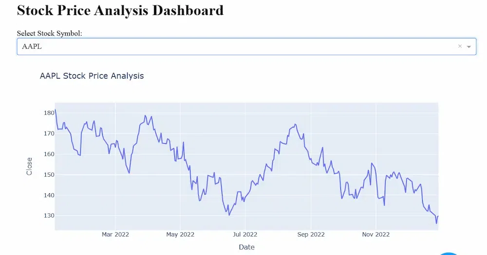
This will display the dashboard on Jupyter Notebook and will provide a link for the external web browser where the dashboard is displayed.
You will see an output like,
Dash app running on http://127.0.0.1:8050/
You can access the web browser dashboard by simply navigating to the provided link.
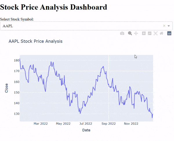
Video Output:
The dashboard on web browser will be like,
Deployment using Binder
Binder is a free and open platform that allows you to create interactive, shareable, and reproducible computational environments. You can deploy your Jupyter Notebook on Binder which can be accessible to anyone on internet.
Here’s how you can deploy the dashboard using binder:
Step 1: Create a file named ‘requirements.txt’ in the same directory as your Jupyter Notebook. In the ‘requirements.txt’ list the necessary libraries ; for this dashboard the ‘requirements.txt’ file will look like this:
jupyter-dash
dash
yfinance
plotly
Step 2: Create a file named ‘Procfile'(without any file extension) with the following content:
web: jupyter-dash your_notebook_name.ipynb
Here, ‘your_notebook_name’ will be replaced by your actual Jupyter Notebook file name.
Step 3: Commit both ‘requirements.txt’ and ‘Procfile’ along with the dashboard Jupyter Notebook file to Github repository.
Step 4: Now, go to Binder(https://mybinder.org/) and enter the URL of your Github repository in the “GitHub repository name or URL” section.
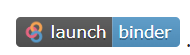
Next, click on the “Launch” button. This will generate a binder link that you can share with others.
Step 5: Share the generated Binder link with others, and they will be able to interact with your Jupyter Notebook in an online environment.
Now, anyone can access your Jupyter Notebook through the Binder link without having to download the dependencies locally. This makes your analysis and visualization easily reproducible in an interactive environment.
This is how a binder link looks like:
Conclusion
Dash enables the creation of powerful yet interactive dashboards directly within Jupyter Notebook. When you create a dashboard using Python in Jupyter Notebook, it shows a wonderful integration of Data Analysis with Data Visualization. By adding user inputs and dynamic components, you can make dashboards which are adept to changing data on the basis of user preferences. Start experimenting and discover the endless possibilities for your data storytelling!
Share your thoughts in the comments
Please Login to comment...