Interactive Graphs in Jupyter Notebook
Last Updated :
25 Sep, 2023
When working in a Jupyter Notebook environment, you can produce interactive Matplotlib plots that allow you to explore data and interact with the charts dynamically. In this article, we’ll explore how to create such interactive plots using Matplotlib within Jupyter. Before we proceed with the steps, let’s understand some key concepts related to producing interactive Matplotlib plots in Jupyter:
- Matplotlib is a data visualization library for Python that provides tools for creating various types of plots, including line charts, bar charts, scatter plots, and more.
- Jupyter Notebook is an interactive web-based environment that allows you to create and share documents containing live code, equations, visualizations, and narrative text. It’s widely used for data analysis and scientific computing.
- Interactive Matplotlib plots allow users to interact with the charts by zooming, panning, hovering, or clicking on data points. These interactive features are particularly useful for exploring data in detail.
Interactive Graphs in Jupyter Notebook
Let’s walk through the steps to create interactive Matplotlib plots in a Jupyter Notebook:
Install Required Libraries
Ensure you have the necessary libraries installed. You can install them using pip:
Python
pip install matplotlib ipywidgets
|
Import Libraries
In your Jupyter Notebook, import the required libraries:
Python
import matplotlib.pyplot as plt
from ipywidgets import interact
|
Create Interactive Plot Function
Define a function that generates the plot you want to make interactive. This function should accept parameters that you can adjust interactively. For example:
Python
def interactive_plot(amplitude, frequency):
x = np.linspace(0, 2 * np.pi, 1000)
y = amplitude * np.sin(frequency * x)
plt.figure(figsize=(8, 4))
plt.plot(x, y)
plt.xlabel('X-axis')
plt.ylabel('Y-axis')
plt.title('Interactive Sine Wave')
plt.grid(True)
plt.show()
|
Use the Interact Function
Use the interact function from ipywidgets to create interactive controls for the parameters of your plot function:
Python
interact(interactive_plot, amplitude=(1, 5, 0.1), frequency=(1, 10, 0.1))
|
In this example, amplitude and frequency are parameters you can adjust using sliders. The (1, 5, 0.1) and (1, 10, 0.1) tuples define the range and step size for each parameter.
Explore and Interact
Run the cell containing the interact function. You will see interactive sliders for adjusting the amplitude and frequency of the sine wave plot. As you move the sliders, the plot will update in real-time.
Complete Code
Python3
import numpy as np
import matplotlib.pyplot as plt
from ipywidgets import interact
def interactive_plot(amplitude, frequency):
x = np.linspace(0, 2 * np.pi, 1000)
y = amplitude * np.sin(frequency * x)
plt.figure(figsize=(8, 4))
plt.plot(x, y)
plt.xlabel('X-axis')
plt.ylabel('Y-axis')
plt.title('Interactive Sine Wave')
plt.grid(True)
plt.show()
interact(interactive_plot, amplitude=(1, 5, 0.1), frequency=(1, 10, 0.1))
|
Output
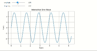
Interactive sine wave with Matplotlib
In this , you can see the Jupyter Notebook cell displaying an interactive sine wave plot with sliders for adjusting the amplitude and frequency parameters. As you move the sliders, the plot updates in real-time, allowing for interactive exploration of the plot’s characteristics.
Producing interactive Matplotlib plots in a Jupyter environment is a valuable technique for data analysis and visualization, as it allows you to quickly explore and understand data patterns by interacting with the charts.
Share your thoughts in the comments
Please Login to comment...