Create a Modal Component using React Hooks
Last Updated :
14 Mar, 2024
In this article, we are going to build a modal component using React Hooks. The modal is going to be a user register form modal that will appear on a button click. The modal will utilize the useState hook for its state management.
Output Preview: Let us have a look at how the final output will look like.
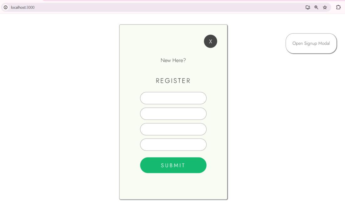
Final Output Image Preview
Prerequisites:
Approach to Build a Modal Component with React Hooks:
- The
App component manages the state for controlling the visibility of the signup modal. - A button triggers the opening of the signup modal by updating the state.
- The
Signup component receives props to manage its visibility state and toggles its visibility accordingly. - CSS styles are applied to create a fixed-positioned signup modal.
- Clicking the cross button or outside the modal closes it by updating the state.
- Input fields and submit button are styled within the signup modal.
- A separate CSS file (
App.css) contains styles for both the main app and the signup modal. - CSS classes are utilized to style components and achieve desired layout and appearance effects.
- CSS transitions are applied for smooth animations, such as hover effects on buttons.
Steps to Create a React App:
Step 1: Create a new application using the following command.
npx create-react-app react-modal
Step 2: Switch to the project directory
cd react-modal
Step 3: We will create a folder `components` as the best practice. We will create our Signup.jsx inside the components folder.
Project Structure:
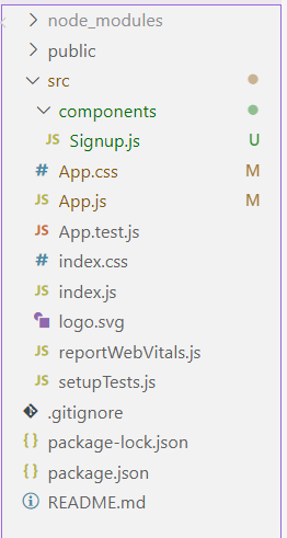
project structure
Example : Provided below are the working codes for a modal component that is triggered using the useState hook.
CSS
/* src/App.css */

@import url('https://fonts.googleapis.com/css2?family=Jost:ital,wght@0,100..900;1,100..900&display=swap');

* {
    font-family: jost;
    font-weight: 300;
}

.fixed {
    position: fixed;
    top: 50%;
    left: 50%;
    background-color: rgb(248, 252, 243);
    width: 300px;
    height: 500px;
    transform: translate(-50%, -50%);
    border: 1px solid gray;
    border-radius: 4px;
    display: flex;
    padding: 12px;
    flex-direction: column;
    justify-content: center;
    align-items: center;
    box-shadow: 1px 1px 2px 0px rgb(91, 97, 97);
    opacity: 0;
    transition: opacity 0.5s ease;
}

.m-text {
    text-align: center;
    font-family: 'Lucida Sans', 'Lucida Sans Regular', 'Lucida Grande', 'Lucida Sans Unicode', Geneva, Verdana, sans-serif;
    letter-spacing: 4px;
    color: rgb(56, 86, 4);
}

.d-text {
    font-size: 14px;
    text-align: center;
}

.input-main {
    padding: 12px;
    width: 250px;
}

.btn-main {
    background-color: rgb(64, 96, 64);
    color: white;
    padding: 12px;
    border: 2px solid gray;
}

.promise {
    font-size: 12px;
}

.cross-btn {
    position: absolute;
    top: 30px;
    background-color: rgb(70, 70, 70);
    color: white;
    width: 40px;
    height: 40px;
    display: flex;
    justify-content: center;
    align-items: center;
    right: 30px;
    border-radius: 100%;
    cursor: pointer;
}

.header {
    display: flex;
    flex-direction: column;
    justify-content: center;
    align-items: center;
}

.form-header {
    font-size: 20px;
    letter-spacing: 3px;
}

.inputs {
    display: flex;
    flex-direction: column;
    width: 200px;
    gap: 10px;
}

input {
    padding: 8px;
    border-radius: 24px;
    border: 1px solid gray;
}

.submit-btn {
    background-color: rgb(21, 186, 112);
    margin-top: 20px;
    text-align: center;
    border-radius: 24px;
    padding: 12px;
    color: white;
    letter-spacing: 4px;
}

.main-btn {
    position: fixed;
    top: 10%;
    right: 10%;
    background-color: rgb(255, 255, 255);
    color: rgb(49, 49, 49);
    border: 1px solid gray;
    border-radius: 24px;
    padding: 20px;
    box-shadow: 1px 1px 1px gray;
    cursor: pointer;
}

.main-btn:hover {
    background-color: rgb(26, 148, 97);
    color: white;
    transition: 0.5s ease;
}
// src/App.js

import './App.css';
import { useState } from 'react';
import Signup from './components/Signup.js';

function App() {
    const [openSignUpModal, setopenSignUpModal] = useState(false)
    return (
        <div>
            <Signup openSignUpModal={openSignUpModal}
                setopenSignUpModal={setopenSignUpModal} />
            <button className='main-btn'
                onClick={() => setopenSignUpModal(true)}>
                Open Signup Modal
            </button>
        </div>
    );
}

export default App;
// components/Signup.jsx

import React from 'react'

const Signup = ({ openSignUpModal, setopenSignUpModal }) => {
    return (
        <div style={{ opacity: openSignUpModal ? 1 : 0 }}
            className='fixed'>
            <div onClick={() => setopenSignUpModal(false)}
                className='cross-btn'>X</div>
            <div className='form'>
                <div className='header'>
                    <p>New Here?</p>
                    <p className='form-header'>REGISTER</p>
                </div>
                <div className='inputs'>
                    <input />
                    <input />
                    <input />
                    <input />
                </div>
                <div className='submit-btn'>SUBMIT</div>
            </div>
        </div>
    )
}

export default Signup
Start your application using the following command.
npm start
Output:
Modal Component using React Hooks
Share your thoughts in the comments
Please Login to comment...