Correspondence Analysis Using R
Last Updated :
12 Jun, 2023
Correspondence Analysis is a dimension reduction technique used to summarize large contingency tables into a smaller number of dimensions, allowing you to visualize the relationships between categories. The technique is based on singular value decomposition, and it results in a scatterplot that shows the relationships between categories in a 2-dimensional space.
Getting Started with Correspondence Analysis in R
To perform a Correspondence Analysis in R Programming Language, you need to have a contingency table, also known as a cross-tabulation. A contingency table is a table that displays the frequency of occurrences of a set of variables. The contingency table is then transformed into a dissimilarity matrix, which is used as the input for the Correspondence Analysis.
Correspondence Analysis using FactoMiner package
In this example, we will perform Correspondence Analysis on the “USArrests” data set, which contains statistics on arrests made in each of the 50 US states in 1973. This data set is quantitative, making it suitable for Correspondence Analysis.
R
install.packages("FactoMineR")
library(FactoMineR)
data("USArrests")
result = CA(USArrests)
|
Output:
To visualize the results, we will use the “factoextra” package to create a biplot with the results of the Correspondence Analysis. To install the “factoextra” package, use the following code:
R
install.packages("factoextra")
library(factoextra)
fviz_ca_biplot(result, repel = TRUE)
|
Output:
This biplot shows the relationships between the variables in the “USArrests” data set. The length and direction of the vectors represent the strength and direction of the relationships between the variables.
Correspondence Analysis using ca package
We’ll again use the “USArrests” data set, which contains statistics on arrests made in each of the 50 US states in 1973.
Here’s how can we perform Correspondence Analysis using the ca package in R:
R
install.packages("ca")
library(ca)
res.ca <- ca(USArrests, graph = FALSE)
|
The ca() function takes in the dataset and an optional graph parameter to indicate whether to plot the results graphically. In this case, we set graph = FALSE to suppress the plot and store the results in res.ca.
Eigenvalues and scree plot
We can extract the eigenvalues using the get_eigenvalue() function. This function returns a list of values that can be used to create a scree plot to determine how many dimensions to retain.
R
eig <- get_eigenvalue(res.ca)
eig
|
Output:

Eigenvalues of the Correspondence Analysis
The eig variable contains a list of values including the eigenvalues, the percentage of the variance explained by each eigenvalue, and the cumulative percentage of the variance explained by each eigenvalue. We can use these values to create a scree plot:
R
library(factoextra)
fviz_eig(res.ca)
|
Output:
The above scree plot shows us the percentage of the total variance explained by each dimension. We can use this plot to determine how many dimensions to retain for further analysis.
Row and column profiles
We can extract the row and column profiles using the get_ca_row() and get_ca_col() functions, respectively. The row profiles show the distribution of each categorical variable across the dimensions of the analysis. The column profiles show the distribution of each category within each categorical variable.
R
row.profiles <- get_ca_row(res.ca)
row.profiles
col.profiles <- get_ca_col(res.ca)
col.profiles
|
Output:
Correspondence Analysis - Results for rows
===================================================
 Name       Description
1 "$coord"   "Coordinates for the rows"
2 "$cos2"    "Cos2 for the rows"
3 "$contrib" "contributions of the rows"
4 "$inertia" "Inertia of the rows"
Correspondence Analysis - Results for columns
===================================================
 Name       Description
1 "$coord"   "Coordinates for the columns"
2 "$cos2"    "Cos2 for the columns"
3 "$contrib" "contributions of the columns"
4 "$inertia" "Inertia of the columns"
Visualization of Row and Column Profiles
We can visualize the row and column profiles using the fviz_ca_row() and fviz_ca_col() functions, respectively. These functions create bar plots that show the distribution of each variable or category across the dimensions of the analysis.
R
fviz_ca_row(res.ca)
fviz_ca_col(res.ca)
|
Output:
Biplot
We can also create a biplot to visualize the relationship between the rows and columns of the analysis. And from the previous example, we know that fviz_ca_biplot() function creates a scatter plot of the rows and columns of the analysis with arrows indicating the strength and direction of the relationship between them.
Output:

Biplot for the Correspondence Analysis
Correspondence Analysis using the ade4 package
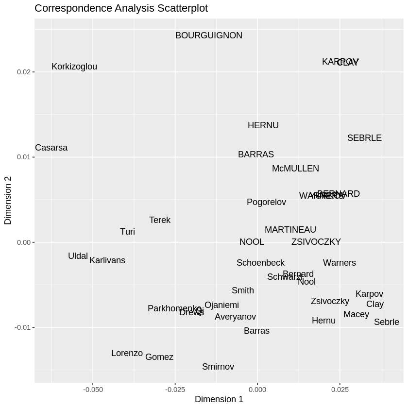
In the below example, we’ll use the decathlon data set, which represents the performance of athletes in the decathlon competition across different events. We will perform correspondence analysis using the ade4 package. We will extract the scores, and we will visualize them using the ggplot2 package.
R
library(ade4)
library(ggplot2)
data("decathlon")
res.ca <- dudi.coa(decathlon, scannf = FALSE, nf = 2)
scores <- as.data.frame(res.ca$li)
colnames(scores) <- c("Dim.1", "Dim.2")
|
Here we extracted scores using the $li component of the res.ca object, which contains the coordinates of the individuals and events on the first two dimensions. We convert the scores to a data frame and rename the columns for clarity.
R
ggplot(scores, aes(x = Dim.1, y = Dim.2,
label = rownames(scores))) +
geom_text() +
xlab("Dimension 1") +
ylab("Dimension 2") +
ggtitle("Correspondence Analysis Scatterplot")
|
Above we used ggplot() to create a scatterplot of the scores. The x-axis and y-axis represent the first and second dimensions of the correspondence analysis, respectively. The points represent the individuals (athletes), and the labels represent the events used geom_text() to display the labels. We also add axis labels and a title to the plot using xlab(), ylab(), and ggtitle().
Output:
Correspondence Analysis using the ade4 package
The points represent the individuals (athletes), and the labels represent the events. The x-axis and y-axis represent the first and second dimensions of the correspondence analysis, respectively. The plot allows you to visualize the relationships between the individuals and events in the data set.
Conclusion
Correspondence Analysis is a powerful tool for exploring relationships between categorical variables. By reducing the data into a smaller number of dimensions, you can gain insight into the relationships between categories, making it easier to understand and interpret the data. In this article, we explored how to perform Correspondence Analysis in R using the FactoMineR, ca, ade4 packages. We also demonstrated how to extract and visualize various aspects of the analysis using the get_eigenvalue(), get_ca_row(), get_ca_col(), fviz_eig(), fviz_ca_row(), fviz_ca_col(), and fviz_ca_biplot() functions. Using these tools, we were able to gain insights into the relationship between categorical variables in datasets. By following the steps outlined in this article, you can perform a Correspondence Analysis in R, making it easy to get started with this technique.
Share your thoughts in the comments
Please Login to comment...