Chakra UI Feedback
Last Updated :
04 Feb, 2024
Chakra UI is a powerful tool that simplifies web development, offering a collection of customizable components and a well-thought-out design system. This article delves into user feedback, exploring the platform’s strengths and areas for improvement.
We will discuss about the following Feedback Components in Chakra UI
Alert Component:
Chakra UI’s Alert component provides a visually appealing and user-friendly way to communicate important messages to users. With various styles and easy integration, alerts enhance the overall user experience.
Syntax:
import { Alert, AlertIcon, AlertTitle, AlertDescription } from "@chakra-ui/react";
//...
<Alert status="success">
  <AlertIcon />
  <AlertTitle mr={2}>Success!</AlertTitle>
  <AlertDescription>Your request was successful.</AlertDescription>
</Alert>
Circular Progress Component:
Incorporating a Circular Progress component adds a dynamic visual element to indicate ongoing processes. It not only informs users but also enhances the aesthetics of the application.
Syntax:
import { CircularProgress } from "@chakra-ui/react";
//...
<CircularProgress isIndeterminate color="green.300" />
Progress Component:
Chakra UI’s Progress component offers a flexible and customizable way to display linear progress. Whether tracking file uploads or loading data, it provides a visually informative element.
Syntax:
import { Progress } from "@chakra-ui/react";
//...
<Progress value={60} />
Skeleton Component:
For a seamless loading experience, the Skeleton component mimics the content’s structure, giving users a preview of what to expect. It effectively reduces perceived loading times.
Syntax:
import { Skeleton } from "@chakra-ui/react";
//...
<Skeleton height="20px" width="80%" />
Spinner Component:
The Spinner component is a versatile tool for indicating ongoing activity. With its straightforward integration and customization options, it provides a visually engaging loading indicator.
Syntax:
import { Spinner } from "@chakra-ui/react";
//...
<Spinner size="xl" color="teal.500" />
Toast Component:
Chakra UI’s Toast component offers unobtrusive notifications, keeping users informed without disrupting their workflow. With customizable options, it serves as an effective feedback mechanism.
Syntax:
import { useToast } from "@chakra-ui/react";
//...
const toast = useToast();
toast({
  title: "Operation Successful",
  status: "success",
  duration: 3000,
  isClosable: true,
});
Steps to Create React Application And Installing Module:
Step 1: Create a React application using the following command:
npx create-react-app chakra
Step 2: After creating your project folder(i.e. chakra), move to it by using the following command:
cd chakra
Step 3: After creating the React application, Install the required package using the following command:
npm i @chakra-ui/react @emotion/react@^11 @emotion/styled@^11 framer-motion@^6
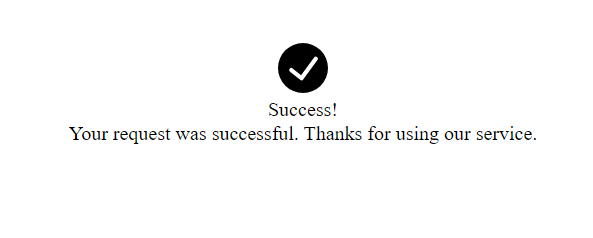
Example 1: This example show alert.
Javascript
import {
Alert, AlertIcon,
AlertTitle, AlertDescription
}
from "@chakra-ui/react";
import React from "react";
const App = () => {
return (
<>
<Alert
status="success"
variant="subtle"
flexDirection="column"
alignItems="center"
justifyContent="center"
textAlign="center"
height="200px"
borderRadius="10px"
boxShadow="lg"
>
<AlertIcon boxSize="40px" mr={0} />
<AlertTitle mt={4} mb={1} fontSize="lg">
Success!
</AlertTitle>
<AlertDescription fontSize="sm">
Your request was successful.
Thanks for using our service.
</AlertDescription>
</Alert>
</>
);
}
export default App
|
Start your application using the following command:
npm start
Output:
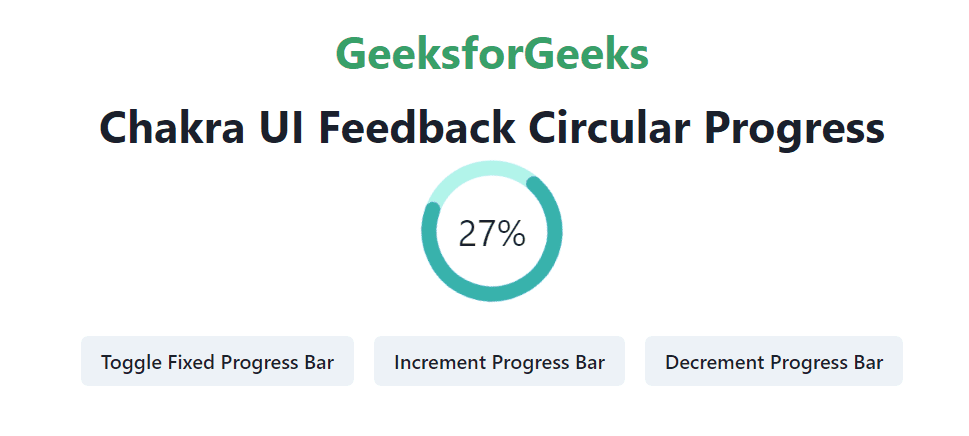
Example 2: This example show Spinner.
Javascript
import React, { useState } from 'react';
import {
ChakraProvider, Flex, Button,
Heading, CircularProgress,
CircularProgressLabel
}
from '@chakra-ui/react';
function App() {
const [progress_val, set_progress_val] = useState(40);
const [fix_progress, set_fix_progress] = useState(false);
const fixProgressFn = () => {
set_fix_progress((prevValue) => !prevValue);
};
const progressValFn = () => {
set_progress_val((prevValue) =>
(prevValue + 10) % 101);
};
const progressValDecFn = () => {
set_progress_val((prevValue) =>
(prevValue - 10 + 100) % 101);
};
return (
<ChakraProvider>
<Flex direction="column" align="center"
justify="center" minHeight="100vh" p={8}>
<Heading as="h1" color="green.500" mb={4}>
GeeksforGeeks
</Heading>
<Heading as="h3" mb={1}>
Chakra UI Feedback Circular Progress
</Heading>
<Flex direction="row" justify="center">
<CircularProgress
value={fix_progress ? progress_val : undefined}
isIndeterminate={fix_progress}
capIsRound
color="teal.400"
size="120px"
thickness={10}
trackColor="teal.100"
>
<CircularProgressLabel>
{fix_progress ? `${progress_val}%` : ''}
</CircularProgressLabel>
</CircularProgress>
</Flex>
<Flex direction="row" justify="center" mt={4}>
<Button onClick={fixProgressFn} m={2}>
Toggle Fixed Progress Bar
</Button>
<Button onClick={progressValFn} m={2}>
Increment Progress Bar
</Button>
<Button onClick={progressValDecFn} m={2}>
Decrement Progress Bar
</Button>
</Flex>
</Flex>
</ChakraProvider>
);
}
export default App;
|
Start your application using the following command:
npm start
Output:
Share your thoughts in the comments
Please Login to comment...