Chakra UI Feedback Progress
Last Updated :
29 Jan, 2024
Chakra UI Feedback Progress is the component that is used to show the progress of a specific activity. The Feedback Progress component simplifies the process of handling loading states, giving an easy and efficient tool to implement progress feedback in their applications. For example, we can embed this functionality to indicate the progress of File Downloading from the application and we can customize this Progress component using various other props. This article will see the practical implementation and customization of the Chakra UI Feedback Progress component.
Prerequisites:
Approach:
We have created various Chakra UI Feedback Progress like Basic Progress, Color-based Progress Bar, Size-based, and also Animated Bar. According to the user’s actions, the value of the Progress is dynamically changed and also the user can manage the colour and size of the Progress according to the selection from the Drop down list.
Steps to Create React Application And Installing Module:
Step 1: Create a React application using the following command:
npx create-react-app my-app
Step 2: After creating your project folder(i.e. chakra), move to it by using the following command:
cd chakra
Step 3: After creating the React application, Install the required package using the following command:
npm i @chakra-ui/react @emotion/react@^11 @emotion/styled@^11 framer-motion@^6
Project Structure:
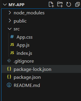
The updated dependencies are in the package.json file.
"dependencies": {
        "@chakra-ui/react": "^2.8.2",
        "@emotion/react": "^11.11.3",
        "@emotion/styled": "^11.11.0",
        "@testing-library/jest-dom": "^5.17.0",
        "@testing-library/react": "^13.4.0",
        "@testing-library/user-event": "^13.5.0",
        "framer-motion": "^6.5.1",
        "react": "^18.2.0",
        "react-dom": "^18.2.0",
        "react-scripts": "5.0.1",
        "web-vitals": "^2.1.4"
 }
Example: Below is the practical implementation of the Chakra UI Feedback Progress:
Javascript
import React, { useState } from 'react';
import { Progress } from '@chakra-ui/react';
import {
ChakraProvider, CSSReset, Box, Flex,
Stack, Heading, Button, FormControl,
FormLabel, Select,
} from '@chakra-ui/react';
const App = () => {
const [pVal, set_pVal] = useState(0);
const [colorScheme, set_ColorScheme] = useState('blue');
const [pSize, set_pSize] = useState('md');
const increaseFn = () => {
if (pVal < 100) {
set_pVal(pVal + 10);
}
};
const colorFn = (e) => {
set_ColorScheme(e.target.value);
};
const sizeFn = (e) => {
set_pSize(e.target.value);
};
return (
<ChakraProvider>
<CSSReset />
<Box p={8}>
<Flex direction="column"
align="center" justify="center"
mb={8}>
<Heading mb={2} color="green">
GeeksforGeeks
</Heading>
<Heading mb={4}>
Chakra UI Feedback Progress
</Heading>
</Flex>
<Stack spacing={6} align="center">
<Heading size="md">
Basic Progress
</Heading>
<Progress value={pVal} w="80%" />
<Button onClick={increaseFn} mt={4}>
Increment Progress
</Button>
<FormControl>
<FormLabel mt={2}>
Select Color Scheme
</FormLabel>
<Select value={colorScheme}
onChange={colorFn} size="sm">
<option value="blue">
Blue
</option>
<option value="green">
Green
</option>
<option value="pink">
Pink
</option>
</Select>
</FormControl>
<Progress value={pVal} size={pSize}
colorScheme={colorScheme} w="80%" />
<FormControl>
<FormLabel mt={2}>Select Size</FormLabel>
<Select value={pSize} onChange={sizeFn} >
<option value="xs">
Extra Small
</option>
<option value="sm">
Small
</option>
<option value="md">
Medium
</option>
<option value="lg">
Large
</option>
</Select>
</FormControl>
<Progress value={pVal}
size={pSize} w="80%" />
<Heading size="md">
Animated Progress
</Heading>
<Progress size="xs"
isIndeterminate w="80%" />
</Stack>
</Box>
</ChakraProvider>
);
}
export default App;
|
Step to run the application:
npm start
Output: Now go to http://localhost:3000 in your browser:

Share your thoughts in the comments
Please Login to comment...