Bootstrap | Spinners Set-2
Last Updated :
28 Apr, 2022
Bootstrap provides us with various classes for creating different styles of the spinner to indicate the loading state. We can also modify the appearance, size, and placement of the spinners with the classes provided by Bootstrap.
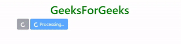
Buttons with border spinner: We can place the border spinner within the button by using the spinner-border class within a <span> tag which is in turn nested inside a <button> tag having Bootstrap Button classes as given below.
HTML
<!DOCTYPE html>
<html>
<head>
<link rel="stylesheet" href=
integrity=
"sha384-GJzZqFGwb1QTTN6wy59ffF1BuGJpLSa9DkKMp0DgiMDm4iYMj70gZWKYbI706tWS"
crossorigin="anonymous">
<title>Bootstrap | Spinner</title>
<style>
h1 {
color: green;
text-align: center;
}
div {
margin-top: 10px;
}
</style>
</head>
<body>
<div class="container">
<h1>GeeksForGeeks</h1>
<button type="button" class="btn btn-secondary" disabled>
<span class="spinner-border spinner-border-sm"
role="status" aria-hidden="true"></span>
<span class="sr-only">Loading</span>
</button>
<button type="button" class="btn btn-primary" disabled>
<span class="spinner-border spinner-border-sm"
role="status" aria-hidden="true"></span>
Processing...
</button>
</div>
</body>
</html>
|
Note: We have placed “disabled” attribute within the <button> tag to deactivate it and used “role” and “aria-hidden” attributes within <span> tag for accessibility purposes.
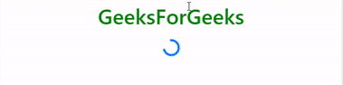
Output:
Buttons with growing spinner: We can place the growing spinner within the button by using the spinner-grow class within a <span> tag which is in turn nested inside a <button> tag having Bootstrap Button classes as given below.
Changing the size:
- Using class: We can make the spinner smaller using the classes spinner-border-sm and spinner-grow-sm along with the spinner-border and spinner-grow classes, respectively, as given below.
HTML
<!DOCTYPE html>
<html>
<head>
<link rel="stylesheet" href=
integrity=
"sha384-GJzZqFGwb1QTTN6wy59ffF1BuGJpLSa9DkKMp0DgiMDm4iYMj70gZWKYbI706tWS"
crossorigin="anonymous">
<title>Bootstrap | Spinner</title>
<style>
h1 {
color: green;
text-align: center;
}
div {
margin-top: 10px;
}
</style>
</head>
<body>
<div class="container">
<h1>GeeksForGeeks</h1>
<div class="spinner-border text-primary spinner-border-sm"
role="status">
<span class="sr-only">Loading</span>
</div>
<div class="spinner-grow text-primary spinner-grow-sm"
role="status">
<span class="sr-only">Loading</span>
</div>
</div>
</body>
</html>
|
Output:
- Using CSS: We can also change the size of the spinner using CSS styling as given below.
HTML
<!DOCTYPE html>
<html>
<head>
<link rel="stylesheet" href=
integrity=
"sha384-GJzZqFGwb1QTTN6wy59ffF1BuGJpLSa9DkKMp0DgiMDm4iYMj70gZWKYbI706tWS"
crossorigin="anonymous">
<title>Bootstrap | Spinner</title>
<style>
h1 {
color: green;
text-align: center;
}
div {
margin-top: 10px;
}
</style>
</head>
<body>
<div class="container">
<h1>GeeksForGeeks</h1>
<div class="spinner-border text-primary"
role="status" style="height:5rem; width:5rem;">
<span class="sr-only">Loading</span>
</div>
<div class="spinner-grow text-primary"
role="status" style="height:5rem; width:5rem;">
<span class="sr-only">Loading</span>
</div>
</div>
</body>
</html>
|
Output:
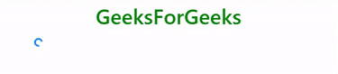
Changing the alignment:
- Using text alignment utilities: We can change the alignment of the spinner by placing it inside the <div> tag which uses the text alignment utility class to control the alignment of children elements as given below.
HTML
<!DOCTYPE html>
<html>
<head>
<link rel="stylesheet" href=
integrity=
"sha384-GJzZqFGwb1QTTN6wy59ffF1BuGJpLSa9DkKMp0DgiMDm4iYMj70gZWKYbI706tWS"
crossorigin="anonymous">
<title>Bootstrap | Spinner</title>
<style>
h1 {
color: green;
text-align: center;
}
div {
margin-top: 10px;
}
</style>
</head>
<body>
<div class="container">
<h1>GeeksForGeeks</h1>
<div class="text-center">
<div class="spinner-border text-primary"
role="status">
<span class="sr-only">Loading</span>
</div>
</div>
</div>
</body>
</html>
|
Output:

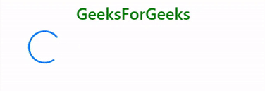
- Using float utilities: We can change the alignment of the spinner by placing it inside the <div> tag which uses the float utility class to control the alignment of children elements or use the float utility class directly within the <div> tag through which spinner is created as given below.
HTML
<!DOCTYPE html>
<html>
<head>
<link rel="stylesheet" href=
integrity=
"sha384-GJzZqFGwb1QTTN6wy59ffF1BuGJpLSa9DkKMp0DgiMDm4iYMj70gZWKYbI706tWS"
crossorigin="anonymous">
<title>Bootstrap | Spinner</title>
<style>
h1 {
color: green;
text-align: center;
}
div {
margin-top: 10px;
}
</style>
</head>
<body>
<div class="container">
<h1>GeeksForGeeks</h1>
<div class="clearfix float-right">
<div class="spinner-border text-primary"
role="status">
<span class="sr-only">Loading</span>
</div>
</div>
</div>
</body>
</html>
|
Output:
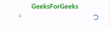
- Using flexbox utilities: We can change the alignment of the spinner by placing it inside the <div> tag which uses the flexbox utility class to control the alignment of children elements as given below.
HTML
<!DOCTYPE html>
<html>
<head>
<link rel="stylesheet" href=
integrity=
"sha384-GJzZqFGwb1QTTN6wy59ffF1BuGJpLSa9DkKMp0DgiMDm4iYMj70gZWKYbI706tWS"
crossorigin="anonymous">
<title>Bootstrap | Spinner</title>
<style>
h1 {
color: green;
text-align: center;
}
div {
margin-top: 10px;
}
</style>
</head>
<body>
<div class="container">
<h1>GeeksForGeeks</h1>
<div class="d-flex justify-content-center">
<div class="spinner-border text-primary"
role="status">
<span class="sr-only">Loading</span>
</div>
</div>
</div>
</body>
</html>
|
Output:
Supported Browser:
- Google Chrome
- Microsoft Edge
- Firefox
- Opera
- Safari
Share your thoughts in the comments
Please Login to comment...