Bootstrap Buttons with Examples
Last Updated :
28 Apr, 2022
Bootstrap provides us with different classes that can be used with different tags, such as <button>, <a>, <input>, and <label> to apply custom button styles. Bootstrap also provides classes that can be used for changing the state and size of buttons, also, it provides classes for applying toggle, checkbox, and radio buttons like effects.
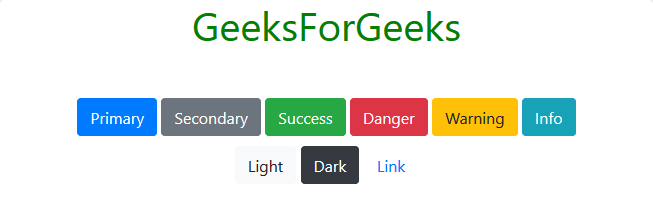
Solid Buttons: Bootstrap provides us with a series of classes that corresponds to different solid button styles. These classes are listed below:
| btn-primary |
btn-secondary |
btn-success |
| btn-danger |
btn-warning |
btn-info |
| btn-light |
btn-dark |
btn-link |
Note: We must use an additional btn class with the classes mentioned above and that follows.
Example:
HTML
<!DOCTYPE html>
<html lang="en">
<head>
<link rel="stylesheet" href=
integrity=
"sha384-GJzZqFGwb1QTTN6wy59ffF1BuGJpLSa9DkKMp0DgiMDm4iYMj70gZWKYbI706tWS"
crossorigin="anonymous">
<title>Hello, world!</title>
<style>
h1 {
color: green;
text-align: center;
}
div.one {
margin-top: 40px;
text-align: center;
}
button {
margin-top: 10px;
}
</style>
</head>
<body>
<div class="container">
<h1>GeeksForGeeks</h1>
<div class="one">
<button type="button" class="btn btn-primary">
Primary</button>
<button type="button" class="btn btn-secondary">
Secondary</button>
<button type="button" class="btn btn-success">
Success</button>
<button type="button" class="btn btn-danger">
Danger</button>
<button type="button" class="btn btn-warning">
Warning</button>
<button type="button" class="btn btn-info">
Info</button>
<button type="button" class="btn btn-light">
Light</button>
<button type="button" class="btn btn-dark">
Dark</button>
<button type="button" class="btn btn-link">
Link</button>
</div>
</div>
<script src=
integrity=
"sha384-q8i/X+965DzO0rT7abK41JStQIAqVgRVzpbzo5smXKp4YfRvH+8abtTE1Pi6jizo"
crossorigin="anonymous"></script>
<script src=
integrity=
"sha384-wHAiFfRlMFy6i5SRaxvfOCifBUQy1xHdJ/yoi7FRNXMRBu5WHdZYu1hA6ZOblgut"
crossorigin="anonymous"></script>
<script src=
integrity=
"sha384-B0UglyR+jN6CkvvICOB2joaf5I4l3gm9GU6Hc1og6Ls7i6U/mkkaduKaBhlAXv9k"
crossorigin="anonymous"></script>
</body>
</html>
|
Output:
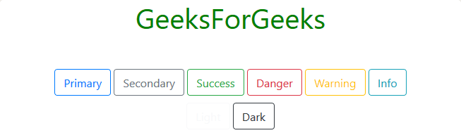
Outlined Buttons:
Bootstrap provides us with a series of classes that can be used when we need to use outline-styled buttons in our project, that is buttons without background color. The outline button classes remove any background color or background image style applied to the button(s). These classes are listed below:
| btn-outline-primary |
btn-outline-secondary |
btn-outline-success |
| btn-outline-danger |
btn-outline-warning |
btn-outline-info |
| btn-outline-light |
btn-outline-dark |
|
Example:
HTML
<!DOCTYPE html>
<html>
<head>
<link rel="stylesheet" href=
integrity=
"sha384-GJzZqFGwb1QTTN6wy59ffF1BuGJpLSa9DkKMp0DgiMDm4iYMj70gZWKYbI706tWS"
crossorigin="anonymous">
<title>Hello, world!</title>
<style>
h1 {
color: green;
text-align: center;
}
div.one {
margin-top: 40px;
text-align: center;
}
button {
margin-top: 10px;
}
</style>
</head>
<body>
<div class="container">
<h1>GeeksForGeeks</h1>
<div class="one">
<button type="button"
class="btn btn-outline-primary">
Primary</button>
<button type="button"
class="btn btn-outline-secondary">
Secondary</button>
<button type="button"
class="btn btn-outline-success">
Success</button>
<button type="button"
class="btn btn-outline-danger">
Danger</button>
<button type="button"
class="btn btn-outline-warning">
Warning</button>
<button type="button"
class="btn btn-outline-info">
Info</button>
<button type="button"
class="btn btn-outline-light">
Light</button>
<button type="button"
class="btn btn-outline-dark">
Dark</button>
</div>
</div>
<script src=
integrity=
"sha384-q8i/X+965DzO0rT7abK41JStQIAqVgRVzpbzo5smXKp4YfRvH+8abtTE1Pi6jizo"
crossorigin="anonymous"></script>
<script src=
integrity=
"sha384-wHAiFfRlMFy6i5SRaxvfOCifBUQy1xHdJ/yoi7FRNXMRBu5WHdZYu1hA6ZOblgut"
crossorigin="anonymous"></script>
<script src=
integrity=
"sha384-B0UglyR+jN6CkvvICOB2joaf5I4l3gm9GU6Hc1og6Ls7i6U/mkkaduKaBhlAXv9k"
crossorigin="anonymous"></script>
</body>
</html>
|
Output:
Changing Size:
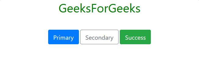
Bootstrap provides us with different classes that allow changing the size of the button. These classes are listed below:
- btn-lg: This class is used to make a button(s) large in size.
Example:
HTML
<!DOCTYPE html>
<html>
<head>
<link rel="stylesheet" href=
integrity=
"sha384-GJzZqFGwb1QTTN6wy59ffF1BuGJpLSa9DkKMp0DgiMDm4iYMj70gZWKYbI706tWS"
crossorigin="anonymous">
<title>Hello, world!</title>
<style>
h1 {
color: green;
text-align: center;
}
div.one {
margin-top: 40px;
text-align: center;
}
button {
margin-top: 10px;
}
</style>
</head>
<body>
<div class="container">
<h1>GeeksForGeeks</h1>
<div class="one">
<button type="button"
class="btn btn-primary btn-lg">
Primary</button>
<button type="button"
class="btn btn-outline-secondary btn-lg">
Secondary</button>
<button type="button"
class="btn btn-success btn-lg">
Success</button>
</div>
</div>
<script src=
integrity=
"sha384-q8i/X+965DzO0rT7abK41JStQIAqVgRVzpbzo5smXKp4YfRvH+8abtTE1Pi6jizo"
crossorigin="anonymous"></script>
<script src=
integrity=
"sha384-wHAiFfRlMFy6i5SRaxvfOCifBUQy1xHdJ/yoi7FRNXMRBu5WHdZYu1hA6ZOblgut"
crossorigin="anonymous"></script>
<script src=
integrity=
"sha384-B0UglyR+jN6CkvvICOB2joaf5I4l3gm9GU6Hc1og6Ls7i6U/mkkaduKaBhlAXv9k"
crossorigin="anonymous"></script>
</body>
</html>
|
Output:
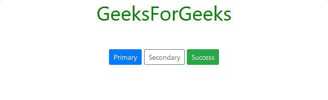
- btn-sm: This class is used to make a button(s) small in size.
Example:
HTML
<!DOCTYPE html>
<html>
<head>
<link rel="stylesheet" href=
integrity=
"sha384-GJzZqFGwb1QTTN6wy59ffF1BuGJpLSa9DkKMp0DgiMDm4iYMj70gZWKYbI706tWS"
crossorigin="anonymous">
<title>Hello, world!</title>
<style>
h1 {
color: green;
text-align: center;
}
div.one {
margin-top: 40px;
text-align: center;
}
button {
margin-top: 10px;
}
</style>
</head>
<body>
<div class="container">
<h1>GeeksForGeeks</h1>
<div class="one">
<button type="button"
class="btn btn-primary btn-sm">
Primary</button>
<button type="button"
class="btn btn-outline-secondary btn-sm">
Secondary</button>
<button type="button"
class="btn btn-success btn-sm">
Success</button>
</div>
</div>
<script src=
integrity=
"sha384-q8i/X+965DzO0rT7abK41JStQIAqVgRVzpbzo5smXKp4YfRvH+8abtTE1Pi6jizo"
crossorigin="anonymous"></script>
<script src=
integrity=
"sha384-wHAiFfRlMFy6i5SRaxvfOCifBUQy1xHdJ/yoi7FRNXMRBu5WHdZYu1hA6ZOblgut"
crossorigin="anonymous"></script>
<script src=
integrity=
"sha384-B0UglyR+jN6CkvvICOB2joaf5I4l3gm9GU6Hc1og6Ls7i6U/mkkaduKaBhlAXv9k"
crossorigin="anonymous"></script>
</body>
</html>
|
Output:
- btn-block: This class is used to make the button(s) occupy the entire width of their parent element.
Example:
HTML
<!DOCTYPE html>
<html>
<head>
<link rel="stylesheet" href=
integrity=
"sha384-GJzZqFGwb1QTTN6wy59ffF1BuGJpLSa9DkKMp0DgiMDm4iYMj70gZWKYbI706tWS"
crossorigin="anonymous">
<title>Hello, world!</title>
<style>
h1 {
color: green;
text-align: center;
}
div.one {
margin-top: 40px;
text-align: center;
}
button {
margin-top: 10px;
}
</style>
</head>
<body>
<div class="container">
<h1>GeeksForGeeks</h1>
<div class="one">
<button type="button"
class="btn btn-primary btn-block">
Primary</button>
<button type="button"
class="btn btn-outline-secondary btn-block">
Secondary</button>
<button type="button"
class="btn btn-success btn-block">
Success</button>
</div>
</div>
<script src=
integrity=
"sha384-q8i/X+965DzO0rT7abK41JStQIAqVgRVzpbzo5smXKp4YfRvH+8abtTE1Pi6jizo"
crossorigin="anonymous"></script>
<script src=
integrity=
"sha384-wHAiFfRlMFy6i5SRaxvfOCifBUQy1xHdJ/yoi7FRNXMRBu5WHdZYu1hA6ZOblgut"
crossorigin="anonymous"></script>
<script src=
integrity=
"sha384-B0UglyR+jN6CkvvICOB2joaf5I4l3gm9GU6Hc1og6Ls7i6U/mkkaduKaBhlAXv9k"
crossorigin="anonymous"></script>
</body>
</html>
|
Output:
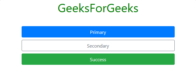
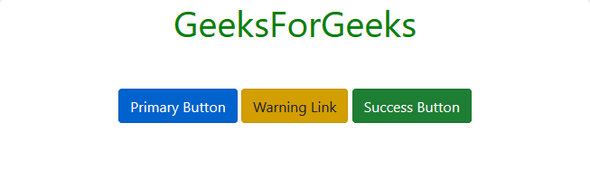
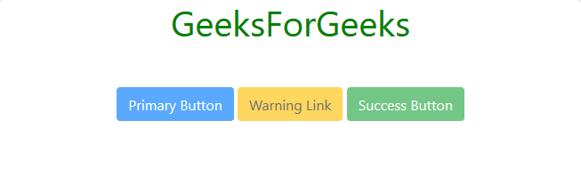
Changing State:
Bootstrap provides us with “active” and “disabled” classes to change the state of the button.
- active: This class is used to make buttons and links appear inactive state, i.e., with a dark background, dark border, and an inset shadow.
Example:
HTML
<!DOCTYPE html>
<html>
<head>
<link rel="stylesheet" href=
integrity=
"sha384-GJzZqFGwb1QTTN6wy59ffF1BuGJpLSa9DkKMp0DgiMDm4iYMj70gZWKYbI706tWS"
crossorigin="anonymous">
<title>Hello, world!</title>
<style>
h1 {
color: green;
text-align: center;
}
div.one {
margin-top: 40px;
text-align: center;
}
a,
button {
margin-top: 10px;
}
</style>
</head>
<body>
<div class="container">
<h1>GeeksForGeeks</h1>
<div class="one">
<button type="button"
class="btn btn-primary active">
Primary Button</button>
<a href="#" class="btn btn-warning active"
role="button" aria-pressed="true">
Warning Link</a>
<button type="button"
class="btn btn-success active">
Success Button</button>
</div>
</div>
<script src=
integrity=
"sha384-q8i/X+965DzO0rT7abK41JStQIAqVgRVzpbzo5smXKp4YfRvH+8abtTE1Pi6jizo"
crossorigin="anonymous"></script>
<script src=
integrity=
"sha384-wHAiFfRlMFy6i5SRaxvfOCifBUQy1xHdJ/yoi7FRNXMRBu5WHdZYu1hA6ZOblgut"
crossorigin="anonymous"></script>
<script src=
integrity=
"sha384-B0UglyR+jN6CkvvICOB2joaf5I4l3gm9GU6Hc1og6Ls7i6U/mkkaduKaBhlAXv9k"
crossorigin="anonymous"></script>
</body>
</html>
|
Note: When <a> tag is used we should insert role=”button” attribute-value pair within the tag, and if the button is active, than, we use aria-pressed=”true” attribute-value pair within the <a> tag and set class value to active (class=”active”).
Output:
- disabled: This class is used to make buttons and links appear in a disabled state, i.e., with lighter background color and outset appearance.
Example:
HTML
<!DOCTYPE html>
<html>
<head>
<link rel="stylesheet" href=
integrity=
"sha384-GJzZqFGwb1QTTN6wy59ffF1BuGJpLSa9DkKMp0DgiMDm4iYMj70gZWKYbI706tWS"
crossorigin="anonymous">
<title>Hello, world!</title>
<style>
h1 {
color: green;
text-align: center;
}
div.one {
margin-top: 40px;
text-align: center;
}
a,
button {
margin-top: 10px;
}
</style>
</head>
<body>
<div class="container">
<h1>GeeksForGeeks</h1>
<div class="one">
<button type="button"
class="btn btn-primary disabled">
Primary Button</button>
<a href="#" class="btn btn-warning disabled"
role="button" aria-disabled="true" tabindex="-1">
Warning Link</a>
<button type="button"
class="btn btn-success disabled">
Success Button</button>
</div>
</div>
<script src=
integrity=
"sha384-q8i/X+965DzO0rT7abK41JStQIAqVgRVzpbzo5smXKp4YfRvH+8abtTE1Pi6jizo"
crossorigin="anonymous"></script>
<script src=
integrity=
"sha384-wHAiFfRlMFy6i5SRaxvfOCifBUQy1xHdJ/yoi7FRNXMRBu5WHdZYu1hA6ZOblgut"
crossorigin="anonymous"></script>
<script src=
integrity=
"sha384-B0UglyR+jN6CkvvICOB2joaf5I4l3gm9GU6Hc1og6Ls7i6U/mkkaduKaBhlAXv9k"
crossorigin="anonymous"></script>
</body>
</html>
|
Note: When <a> is used tag we should insert role=”button” attribute-value pair within the tag. When using “disabled” class with <a> tag we should insert aria-disabled=”true” and tabindex=”-1″ attribute-value pair with in the <a> tag. Also, we can make <button> disable by just adding “disabled” attribute within the <button> tag, without using “disabled” class of Bootstrap.
Output:
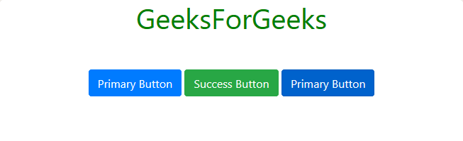
Toggle State:
We can make the button to toggle its state by adding data-toggle=”button” attribute-value pair to <button> tag. We can also preset the toggle state of the button to active by adding the “active” class and aria-pressed=”true” attribute-value pair to the <button> tag.
Example:
HTML
<!DOCTYPE html>
<html>
<head>
<link rel="stylesheet" href=
integrity=
"sha384-GJzZqFGwb1QTTN6wy59ffF1BuGJpLSa9DkKMp0DgiMDm4iYMj70gZWKYbI706tWS"
crossorigin="anonymous">
<title>Hello, world!</title>
<style>
h1 {
color: green;
text-align: center;
}
div.one {
margin-top: 40px;
text-align: center;
}
a,
button {
margin-top: 10px;
}
</style>
</head>
<body>
<div class="container">
<h1>GeeksForGeeks</h1>
<div class="one">
<button type="button" data-toggle="button"
class="btn btn-primary" aria-pressed="false">
Primary Button</button>
<button type="button" data-toggle="button"
class="btn btn-success" aria-pressed="false">
Success Button</button>
<button type="button" data-toggle="button"
class="btn btn-primary active" aria-pressed="true">
Primary Button</button>
</div>
</div>
<script src=
integrity=
"sha384-q8i/X+965DzO0rT7abK41JStQIAqVgRVzpbzo5smXKp4YfRvH+8abtTE1Pi6jizo"
crossorigin="anonymous"></script>
<script src=
integrity=
"sha384-wHAiFfRlMFy6i5SRaxvfOCifBUQy1xHdJ/yoi7FRNXMRBu5WHdZYu1hA6ZOblgut"
crossorigin="anonymous"></script>
<script src=
integrity=
"sha384-B0UglyR+jN6CkvvICOB2joaf5I4l3gm9GU6Hc1og6Ls7i6U/mkkaduKaBhlAXv9k"
crossorigin="anonymous"></script>
</body>
</html>
|
Note: The third button is preset to active.
Output:
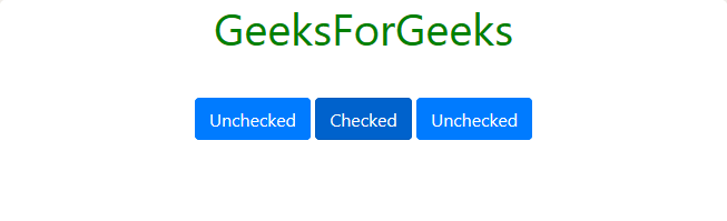
Check Box Styled Buttons:
To get a check box styled buttons, we need to use <input> tag with type=”checkbox” attribute-value pair, which is surrounded by <label> tag with class value set to “btn” and one of the class from the solid or the outline button class mentioned above. The <label> tag in turn is surrounded by <div> tag with class value set to “btn-group-toggle” (class=”btn-group-toggle”) and data-toggle=”buttons” attribute-pair is also required within the <div> tag. Following example will clear the procedure:
Example:
HTML
<!DOCTYPE html>
<html>
<head>
<link rel="stylesheet" href=
integrity=
"sha384-GJzZqFGwb1QTTN6wy59ffF1BuGJpLSa9DkKMp0DgiMDm4iYMj70gZWKYbI706tWS"
crossorigin="anonymous">
<title>Hello, world!</title>
<style>
h1 {
color: green;
text-align: center;
}
div.one {
margin-top: 40px;
text-align: center;
}
a,
button {
margin-top: 10px;
}
</style>
</head>
<body>
<div class="container">
<h1>GeeksForGeeks</h1>
<div class="one">
<div class="btn-group-toggle" data-toggle="buttons">
<label class="btn btn-primary">
<input type="checkbox" autocomplete="off">
Unchecked</label>
<label class="btn btn-primary active">
<input type="checkbox" checked autocomplete="off">
Checked</label>
<label class="btn btn-primary">
<input type="checkbox" autocomplete="off">
Unchecked</label>
</div>
</div>
</div>
<script src=
integrity=
"sha384-q8i/X+965DzO0rT7abK41JStQIAqVgRVzpbzo5smXKp4YfRvH+8abtTE1Pi6jizo"
crossorigin="anonymous"></script>
<script src=
integrity=
"sha384-wHAiFfRlMFy6i5SRaxvfOCifBUQy1xHdJ/yoi7FRNXMRBu5WHdZYu1hA6ZOblgut"
crossorigin="anonymous"></script>
<script src=
integrity=
"sha384-B0UglyR+jN6CkvvICOB2joaf5I4l3gm9GU6Hc1og6Ls7i6U/mkkaduKaBhlAXv9k"
crossorigin="anonymous"></script>
</body>
</html>
|
Note: To make the button checked by default, we need to add the “active” class within the <label> tag of the input control and also put the “checked” attribute within the <input> tag.
Output:
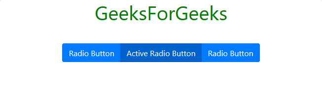
Radio Styled Buttons:
To get a radio styled buttons, we need to use <input> tag with type=”radio” attribute-value pair and other essential attribute-value combination for the working of radio button, as usual. The <input> tag is in turn surrounded by <label> tag with class value set to “btn” and one of the class from the solid or the outline button classes as mentioned above. The <label> tag in turn is surrounded by <div> tag with class value set to “btn-group btn-group-toggle” (class=”btn-group btn-group-toggle”) and data-toggle=”buttons” attribute-pair is also required within the <div> tag. Following example will clear the procedure:
Example:
HTML
<!DOCTYPE html>
<html>
<head>
<link rel="stylesheet" href=
integrity=
"sha384-GJzZqFGwb1QTTN6wy59ffF1BuGJpLSa9DkKMp0DgiMDm4iYMj70gZWKYbI706tWS"
crossorigin="anonymous">
<title>Hello, world!</title>
<style>
h1 {
color: green;
text-align: center;
}
div.one {
margin-top: 40px;
text-align: center;
}
a,
button {
margin-top: 10px;
}
</style>
</head>
<body>
<div class="container">
<h1>GeeksForGeeks</h1>
<div class="one">
<div class="btn-group btn-group-toggle"
data-toggle="buttons">
<label class="btn btn-primary">
<input type="radio" name="options"
id="option1" autocomplete="off">
Radio Button</label>
<label class="btn btn-primary active">
<input type="radio" name="options"
id="option2" autocomplete="off"
checked>
Active Radio Button</label>
<label class="btn btn-primary">
<input type="radio" name="options"
id="option3" autocomplete="off">
Radio Button</label>
</div>
</div>
</div>
<script src=
integrity=
"sha384-q8i/X+965DzO0rT7abK41JStQIAqVgRVzpbzo5smXKp4YfRvH+8abtTE1Pi6jizo"
crossorigin="anonymous"></script>
<script src=
integrity=
"sha384-wHAiFfRlMFy6i5SRaxvfOCifBUQy1xHdJ/yoi7FRNXMRBu5WHdZYu1hA6ZOblgut"
crossorigin="anonymous"></script>
<script src=
integrity=
"sha384-B0UglyR+jN6CkvvICOB2joaf5I4l3gm9GU6Hc1og6Ls7i6U/mkkaduKaBhlAXv9k"
crossorigin="anonymous"></script>
</body>
</html>
|
Note: To make the button checked by default, we need to add the “active” class within the <label> tag of the input control and also put the “checked” attribute within the <input> tag.
Output:
Supported Browser:
- Google Chrome
- Internet Explorer
- Firefox
- Opera
- Safari
Share your thoughts in the comments
Please Login to comment...