Flexbox utilities in bootstrap with examples
Last Updated :
03 Aug, 2023
The Flexible Box Layout Module in bootstrap is used for designing the flexible and responsive layout structure. It is used in Bootstrap 4.
- The d-flex class is used to create a simple flexbox container
Syntax:
<div class="d-flex p-2"></div>
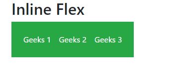
- The d-inline-flex class is used to create an inline flexbox container
Syntax:
<div class="d-inline-flex p-2"></div>
- .d-flex and .d-inline-flex can be used for all breakpoints(sm, md, lg, xl) like .d-sm-flex, .d-sm-inline-flex, etc.
Syntax:
<div class="d-sm-flex p-2"></div>
<div class="d-sm-inline-flex p-2"></div>
Example 1:
HTML
<!DOCTYPE html>
<html lang="en">
<head>
<meta charset="utf-8">
<meta name="viewport" content="width=device-width,
initial-scale=1, shrink-to-fit=no">
<link rel="stylesheet" href=
<title>GeeksForGeeks Bootstrap Example</title>
</head>
<body>
<div class="container mt-3">
<h2>Flex</h2>
<div class="d-flex p-3 bg-success text-white">
<div class="p-2 bg-success">Geeks 1</div>
<div class="p-2 bg-success ">Geeks 2</div>
<div class="p-2 bg-success">Geeks 3</div>
</div>
</div>
<script src=
</script>
<script src=
</script>
<script src=
</script>
</body>
</html>
|
Output:
 Example 2:
HTML
<!DOCTYPE html>
<html lang="en">
<head>
<meta charset="utf-8">
<meta name="viewport" content="width=device-width,
initial-scale=1, shrink-to-fit=no">
<link rel="stylesheet" href=
<title>GeeksForGeeks Bootstrap Example</title>
</head>
<body>
<div class="container mt-3">
<h2>Inline Flex</h2>
<div class="d-inline-flex p-3 bg-success text-white">
<div class="p-2 bg-success">Geeks 1</div>
<div class="p-2 bg-success ">Geeks 2</div>
<div class="p-2 bg-success">Geeks 3</div>
</div>
</div>
<script src=
</script>
<script src=
</script>
<script src=
</script>
</body>
</html>
|
Output:
Horizontal And Vertical Direction of Flexbox: The direction of flex items can be positioned in a flex container.
- To set a horizontal direction (the browser default) use .flex-row.
Syntax:
<div class="d-flex flex-row"></div>
- To start the horizontal direction from the opposite side use .flex-row-reverse.
Syntax:
<div class="d-flex flex-row-reverse"></div>
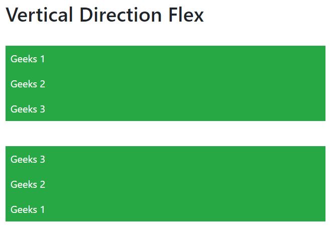
- To set a vertical direction use .flex-column.
Syntax:
<div class="d-flex flex-column"></div>
- To start the vertical direction from the opposite side use .flex-column-reverse.
Syntax:
<div class="d-flex flex-column-reverse"></div>
- Flex-direction can be used for all breakpoints(sm, md, lg, xl) like .flex-sm-row, flex-sm-row-reverse, etc.
Syntax:
<div class="d-flex flex-column-reverse"></div>
<div class="d-flex flex-column"></div>
Example 3:
HTML
<!DOCTYPE html>
<html lang="en">
<head>
<meta charset="utf-8">
<meta name="viewport" content="width=device-width,
initial-scale=1, shrink-to-fit=no">
<link rel="stylesheet" href=
<title>GeeksForGeeks Bootstrap Example</title>
</head>
<body>
<div class="container mt-3">
<h2>Horizontal Direction Flex</h2>
<br>
<div class="d-flex flex-row bg-success mb-3 text-white">
<div class="p-2 bg-success">Geeks 1</div>
<div class="p-2 bg-success ">Geeks 2</div>
<div class="p-2 bg-success">Geeks 3</div>
</div>
<br>
<div class="d-flex flex-row-reverse bg-success text-white">
<div class="p-2 bg-success">Geeks 1</div>
<div class="p-2 bg-success">Geeks 2</div>
<div class="p-2 bg-success">Geeks 3</div>
</div>
</div>
<script src=
</script>
<script src=
</script>
<script src=
</script>
</body>
</html>
|
Output:
 Example 4:
HTML
<!DOCTYPE html>
<html lang="en">
<head>
<meta charset="utf-8">
<meta name="viewport" content="width=device-width,
initial-scale=1, shrink-to-fit=no">
<link rel="stylesheet" href=
<title>GeeksForGeeks Bootstrap Example</title>
</head>
<body>
<div class="container mt-3">
<h2>Vertical Direction Flex</h2>
<br>
<div class="d-flex flex-column bg-success mb-3 text-white">
<div class="p-2 bg-success">Geeks 1</div>
<div class="p-2 bg-success ">Geeks 2</div>
<div class="p-2 bg-success">Geeks 3</div>
</div>
<br>
<div class="d-flex flex-column-reverse bg-success text-white">
<div class="p-2 bg-success">Geeks 1</div>
<div class="p-2 bg-success">Geeks 2</div>
<div class="p-2 bg-success">Geeks 3</div>
</div>
</div>
<script src=
</script>
<script src=
</script>
<script src=
</script>
</body>
</html>
|
Output:
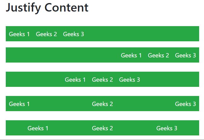
Justify Content: In order to change the alignment of flex items, one can use the .justify-content-* classes.
* can be any one of them start (default), end, center, between, or around.
Similarly, justify-content can be used for all breakpoints(sm, md, lg, xl) like .justify-content-sm-start, .justify-content-sm-end, etc.
Syntax:
<div class="d-flex justify-content-start"></div>
Example 5:
HTML
<!DOCTYPE html>
<html lang="en">
<head>
<meta charset="utf-8">
<meta name="viewport" content="width=device-width,
initial-scale=1, shrink-to-fit=no">
<link rel="stylesheet" href=
<title>GeeksForGeeks Bootstrap Example</title>
</head>
<body>
<div class="container mt-3">
<h2>Justify Content</h2>
<br>
<div class="d-flex justify-content-start
bg-success mb-3 text-white">
<div class="p-2 bg-success">Geeks 1</div>
<div class="p-2 bg-success ">Geeks 2</div>
<div class="p-2 bg-success">Geeks 3</div>
</div>
<div class="d-flex justify-content-end
bg-success text-white">
<div class="p-2 bg-success">Geeks 1</div>
<div class="p-2 bg-success">Geeks 2</div>
<div class="p-2 bg-success">Geeks 3</div>
</div>
<br>
<div class="d-flex justify-content-center
bg-success text-white">
<div class="p-2 bg-success">Geeks 1</div>
<div class="p-2 bg-success">Geeks 2</div>
<div class="p-2 bg-success">Geeks 3</div>
</div>
<br>
<div class="d-flex justify-content-between
bg-success text-white">
<div class="p-2 bg-success">Geeks 1</div>
<div class="p-2 bg-success">Geeks 2</div>
<div class="p-2 bg-success">Geeks 3</div>
</div>
<br>
<div class="d-flex justify-content-around
bg-success text-white">
<div class="p-2 bg-success">Geeks 1</div>
<div class="p-2 bg-success">Geeks 2</div>
<div class="p-2 bg-success">Geeks 3</div>
</div>
</div>
<script src=
</script>
<script src=
</script>
<script src=
</script>
</body>
</html>
|
Output:
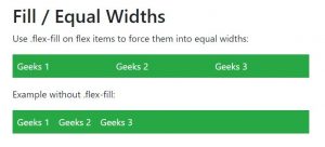
Filling of Widths of flex items:
Flex items can be forced into equal widths by using the .flex-fill class.
.flex-fill can be used for all breakpoints(sm, md, lg, xl) like .flex-sm-fill, etc.
Syntax:
<div class="p-2 flex-fill"></div>
Example 6:
HTML
<!DOCTYPE html>
<html lang="en">
<head>
<meta charset="utf-8">
<meta name="viewport" content="width=device-width,
initial-scale=1, shrink-to-fit=no">
<link rel="stylesheet" href=
<title>GeeksForGeeks Bootstrap Example</title>
</head>
<body>
<div class="container mt-3">
<h2>Fill / Equal Widths</h2>
<p>Use .flex-fill on flex items to force
them into equal widths:</p>
<div class="d-flex bg-success mb-3 text-white">
<div class="p-2 flex-fill bg-success">Geeks 1</div>
<div class="p-2 flex-fill bg-success">Geeks 2</div>
<div class="p-2 flex-fill bg-success">Geeks 3</div>
</div>
<p>Example without .flex-fill:</p>
<div class="d-flex bg-success mb-3 text-white">
<div class="p-2 bg-success">Geeks 1</div>
<div class="p-2 bg-success">Geeks 2</div>
<div class="p-2 bg-success">Geeks 3</div>
</div>
</div>
<script src=
</script>
<script src=
</script>
<script src=
</script>
</body>
</html>
|
Output:
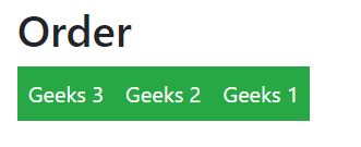
Order:
.order classes are used for changing the visualization order of a flex item.
Ordering is done on a number basis from 0 to 12.
0 has highest priority.
.order can be used for all breakpoints(sm, md, lg, xl) like .order-sm-0 to .order-sm-12, etc.
Syntax:
<div class="p-2 order-4"></div>
Example 7:
HTML
<!DOCTYPE html>
<html lang="en">
<head>
<meta charset="utf-8">
<meta name="viewport" content="width=device-width,
initial-scale=1, shrink-to-fit=no">
<link rel="stylesheet" href=
<title>GeeksForGeeks Bootstrap Example</title>
</head>
<body>
<div class="container mt-3">
<h2>Order</h2>
<div class="d-flex mb-3 text-white">
<div class="p-2 order-3 bg-success">
Geeks 1</div>
<div class="p-2 order-2 bg-success">
Geeks 2</div>
<div class="p-2 order-1 bg-success">
Geeks 3</div>
</div>
</div>
<script src=
</script>
<script src=
</script>
<script src=
</script>
</body>
</html>
|
Output:
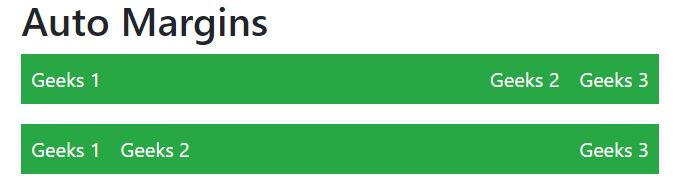
Automation of margins:
- .mr-auto used to push items to the right.
- .ml-auto used to push items to the left
Syntax:
<div class="p-2 mr-auto"></div>
Example 8:
HTML
<!DOCTYPE html>
<html lang="en">
<head>
<meta charset="utf-8">
<meta name="viewport" content="width=device-width,
initial-scale=1, shrink-to-fit=no">
<link rel="stylesheet" href=
<title>GeeksForGeeks Bootstrap Example</title>
</head>
<body>
<div class="container mt-3">
<h2>Auto Margins</h2>
<div class="d-flex mb-3 bg-success text-white">
<div class="p-2 mr-auto bg-success">Geeks 1</div>
<div class="p-2 bg-success">Geeks 2</div>
<div class="p-2 bg-success">Geeks 3</div>
</div>
<div class="d-flex mb-3 bg-success text-white">
<div class="p-2 bg-success">Geeks 1</div>
<div class="p-2 bg-success">Geeks 2</div>
<div class="p-2 ml-auto bg-success">Geeks 3</div>
</div>
</div>
<script src=
</script>
<script src=
</script>
<script src=
</script>
</body>
</html>
|
Output:
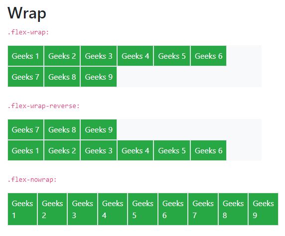
Wrapping of flex item:
.flex-nowrap (default), .flex-wrap and .flex-wrap-reverse are used for wrapping the flex items in a flex container.
.flex-wrap can be used for all breakpoints(sm, md, lg, xl) like .flex-sm-nowrap, .flex-sm-wrap, etc.
Syntax:
<div class="p-2 border"></div>
Example 9:
HTML
<!DOCTYPE html>
<html lang="en">
<head>
<meta charset="utf-8">
<meta name="viewport" content="width=device-width,
initial-scale=1, shrink-to-fit=no">
<link rel="stylesheet" href=
<title>GeeksForGeeks Bootstrap Example</title>
</head>
<body>
<div class="container mt-3">
<h2>Wrap</h2>
<p><code>.flex-wrap:</code></p>
<div class="d-flex flex-wrap text-white bg-light">
<div class="p-2 border bg-success">Geeks 1</div>
<div class="p-2 border bg-success">Geeks 2</div>
<div class="p-2 border bg-success">Geeks 3</div>
<div class="p-2 border bg-success">Geeks 4</div>
<div class="p-2 border bg-success">Geeks 5</div>
<div class="p-2 border bg-success">Geeks 6</div>
<div class="p-2 border bg-success">Geeks 7</div>
<div class="p-2 border bg-success">Geeks 8</div>
<div class="p-2 border bg-success">Geeks 9</div>
</div>
<br>
<p><code>.flex-wrap-reverse:</code></p>
<div class="d-flex flex-wrap-reverse text-white bg-light">
<div class="p-2 border bg-success">Geeks 1</div>
<div class="p-2 border bg-success">Geeks 2</div>
<div class="p-2 border bg-success">Geeks 3</div>
<div class="p-2 border bg-success">Geeks 4</div>
<div class="p-2 border bg-success">Geeks 5</div>
<div class="p-2 border bg-success">Geeks 6</div>
<div class="p-2 border bg-success">Geeks 7</div>
<div class="p-2 border bg-success">Geeks 8</div>
<div class="p-2 border bg-success">Geeks 9</div>
</div>
<br>
<p><code>.flex-nowrap:</code></p>
<div class="d-flex flex-nowrap text-white bg-light">
<div class="p-2 border bg-success">Geeks 1</div>
<div class="p-2 border bg-success">Geeks 2</div>
<div class="p-2 border bg-success">Geeks 3</div>
<div class="p-2 border bg-success">Geeks 4</div>
<div class="p-2 border bg-success">Geeks 5</div>
<div class="p-2 border bg-success">Geeks 6</div>
<div class="p-2 border bg-success">Geeks 7</div>
<div class="p-2 border bg-success">Geeks 8</div>
<div class="p-2 border bg-success">Geeks 9</div>
</div>
<br>
</div>
<script src=
</script>
<script src=
</script>
<script src=
</script>
</body>
</html>
|
Output:
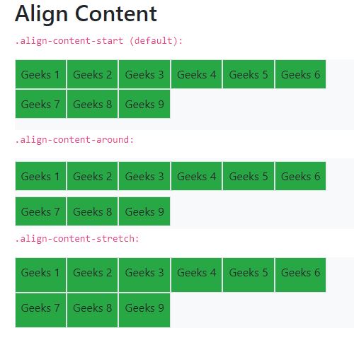
Align Content:
Basically, it is used for the vertical alignment of flex items.
align-content can be implemented in various ways.
- .align-content-start
- .align-content-end
- .align-content-center
- .align-content-around
- .align-content-stretch
- .align-content-sm-start
- Similarly for sm, md, lg, xl
Syntax:
<div class="p-2 align-content-start"></div>
Example 10:
HTML
<!DOCTYPE html>
<html lang="en">
<head>
<meta charset="utf-8">
<meta name="viewport" content="width=device-width,
initial-scale=1, shrink-to-fit=no">
<link rel="stylesheet" href=
<title>GeeksForGeeks Bootstrap Example</title>
</head>
<body>
<div class="container mt-3">
<h2>Align Content</h2>
<p><code>.align-content-start (default):</code></p>
<div class="d-flex flex-wrap align-content-start bg-light"
style="height:100px">
<div class="p-2 border bg-success">Geeks 1</div>
<div class="p-2 border bg-success">Geeks 2</div>
<div class="p-2 border bg-success">Geeks 3</div>
<div class="p-2 border bg-success">Geeks 4</div>
<div class="p-2 border bg-success">Geeks 5</div>
<div class="p-2 border bg-success">Geeks 6</div>
<div class="p-2 border bg-success">Geeks 7</div>
<div class="p-2 border bg-success">Geeks 8</div>
<div class="p-2 border bg-success">Geeks 9</div>
</div>
<p><code>.align-content-around:</code></p>
<div class="d-flex flex-wrap align-content-around bg-light"
style="height:100px">
<div class="p-2 border bg-success">Geeks 1</div>
<div class="p-2 border bg-success">Geeks 2</div>
<div class="p-2 border bg-success">Geeks 3</div>
<div class="p-2 border bg-success">Geeks 4</div>
<div class="p-2 border bg-success">Geeks 5</div>
<div class="p-2 border bg-success">Geeks 6</div>
<div class="p-2 border bg-success">Geeks 7</div>
<div class="p-2 border bg-success">Geeks 8</div>
<div class="p-2 border bg-success">Geeks 9</div>
</div>
<p><code>.align-content-stretch:</code></p>
<div class="d-flex flex-wrap align-content-stretch bg-light"
style="height:100px">
<div class="p-2 border bg-success">Geeks 1</div>
<div class="p-2 border bg-success">Geeks 2</div>
<div class="p-2 border bg-success">Geeks 3</div>
<div class="p-2 border bg-success">Geeks 4</div>
<div class="p-2 border bg-success">Geeks 5</div>
<div class="p-2 border bg-success">Geeks 6</div>
<div class="p-2 border bg-success">Geeks 7</div>
<div class="p-2 border bg-success">Geeks 8</div>
<div class="p-2 border bg-success">Geeks 9</div>
</div>
<br>
</div>
<script src=
</script>
<script src=
</script>
<script src=
</script>
</body>
</html>
|
Output:
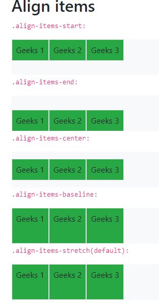
Align items:
Use the align-items class to change the alignment of flex items on the cross axis.
align-items can be implemented in various ways.
- .align-items-start
- .align-items-end
- .align-items-center
- .align-items-baseline
- .align-items-stretch
- .align-items-sm-start
- Similarly for sm, md, lg, xl
Syntax:
<div class="p-2 align-items-start"></div>
Example 11:
HTML
<!DOCTYPE html>
<html lang="en">
<head>
<meta charset="utf-8">
<meta name="viewport" items="width=device-width,
initial-scale=1, shrink-to-fit=no">
<link rel="stylesheet" href=
<title>GeeksForGeeks Bootstrap Example</title>
</head>
<body>
<div class="container mt-3">
<h2>Align items</h2>
<p><code>.align-items-start:</code></p>
<div class="d-flex flex-wrap align-items-start bg-light"
style="height:70px">
<div class="p-2 border bg-success">Geeks 1</div>
<div class="p-2 border bg-success">Geeks 2</div>
<div class="p-2 border bg-success">Geeks 3</div>
</div>
<p><code>.align-items-end:</code></p>
<div class="d-flex flex-wrap align-items-end bg-light"
style="height:70px">
<div class="p-2 border bg-success">Geeks 1</div>
<div class="p-2 border bg-success">Geeks 2</div>
<div class="p-2 border bg-success">Geeks 3</div>
</div>
<p><code>.align-items-center:</code></p>
<div class="d-flex flex-wrap align-items-center bg-light"
style="height:70px">
<div class="p-2 border bg-success">Geeks 1</div>
<div class="p-2 border bg-success">Geeks 2</div>
<div class="p-2 border bg-success">Geeks 3</div>
</div>
<p><code>.align-items-baseline:</code></p>
<div class="d-flex flex-wrap align-items-around bg-light"
style="height:70px">
<div class="p-2 border bg-success">Geeks 1</div>
<div class="p-2 border bg-success">Geeks 2</div>
<div class="p-2 border bg-success">Geeks 3</div>
</div>
<p><code>.align-items-stretch(default):</code></p>
<div class="d-flex flex-wrap align-items-stretch bg-light"
style="height:70px">
<div class="p-2 border bg-success">Geeks 1</div>
<div class="p-2 border bg-success">Geeks 2</div>
<div class="p-2 border bg-success">Geeks 3</div>
</div>
<br>
</div>
<script src=
</script>
<script src=
</script>
<script src=
</script>
</body>
</html>
|
Output:
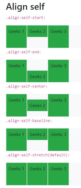
Align self:
align-self class can be used to change the alignment on the cross axis.
align-self can be implemented in various ways.
- .align-self-start
- .align-self-end
- .align-self-center
- .align-self-around
- .align-self-stretch
- .align-self-sm-start
- Similarly for sm, md, lg, xl
Syntax:
<div class="p-2 align-self-center"></div>
Example 12:
HTML
<!DOCTYPE html>
<html lang="en">
<head>
<meta charset="utf-8">
<meta name="viewport" self="width=device-width,
initial-scale=1, shrink-to-fit=no">
<link rel="stylesheet" href=
<title>GeeksForGeeks Bootstrap Example</title>
</head>
<body>
<div class="container mt-3">
<h2>Align self</h2>
<p><code>.align-self-start:</code></p>
<div class="d-flex bg-light" style="height:80px">
<div class="p-2 border bg-success">
Geeks 1</div>
<div class="p-2 border align-self-start bg-success">
Geeks 2</div>
<div class="p-2 border bg-success">
Geeks 3</div>
</div>
<p><code>.align-self-end:</code></p>
<div class="d-flex bg-light" style="height:80px">
<div class="p-2 border bg-success">
Geeks 1</div>
<div class="p-2 border align-self-end bg-success">
Geeks 2</div>
<div class="p-2 border bg-success">
Geeks 3</div>
</div>
<p><code>.align-self-center:</code></p>
<div class="d-flex bg-light" style="height:80px">
<div class="p-2 border bg-success">
Geeks 1</div>
<div class="p-2 border align-self-center bg-success">
Geeks 2</div>
<div class="p-2 border bg-success">
Geeks 3</div>
</div>
<p><code>.align-self-baseline:</code></p>
<div class="d-flex bg-light" style="height:80px">
<div class="p-2 border bg-success">
Geeks 1</div>
<div class="p-2 border align-self-baseline bg-success">
Geeks 2</div>
<div class="p-2 border bg-success">
Geeks 3</div>
</div>
<p><code>.align-self-stretch(default):</code></p>
<div class="d-flex bg-light" style="height:80px">
<div class="p-2 border bg-success">
Geeks 1</div>
<div class="p-2 border align-self-stretch bg-success">
Geeks 2</div>
<div class="p-2 border bg-success">
Geeks 3</div>
</div>
<br>
</div>
<script src=
</script>
<script src=
</script>
<script src=
</script>
</body>
</html>
|
Output:
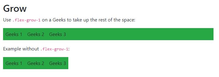
Growing and Shrinking of available space:
.flex-grow-* is used to grow flex items to fill available space.
.flex-shrink-* is used to shrink the flex item.
flex-grow and flex-shrink can be implemented as follows.
- .flex-{grow|shrink}-0
- .flex-{grow|shrink}-1
Similarly for sm, md, lg, xl
Syntax:
<div class="p-2 flex grow-1"></div>
Example 13:
HTML
<!DOCTYPE html>
<html lang="en">
<head>
<meta charset="utf-8">
<meta name="viewport" self="width=device-width,
initial-scale=1, shrink-to-fit=no">
<link rel="stylesheet" href=
<title>GeeksForGeeks Bootstrap Example</title>
</head>
<body>
<div class="container mt-3">
<h2>Grow</h2>
<p>Use <code>.flex-grow-1</code> on a Geeks
to take up the rest of the space:</p>
<div class="d-flex mb-3">
<div class="p-2 bg-success">
Geeks 1</div>
<div class="p-2 bg-success">
Geeks 2</div>
<div class="p-2 flex-grow-1 bg-success">
Geeks 3</div>
</div>
<p>Example without <code>.flex-grow-1</code>:</p>
<div class="d-flex mb-3">
<div class="p-2 bg-success">
Geeks 1</div>
<div class="p-2 bg-success">
Geeks 2</div>
<div class="p-2 bg-success">
Geeks 3</div>
</div>
</div>
<script src=
</script>
<script src=
</script>
<script src=
</script>
</body>
</html>
|
Output:
Supported Browser:
- Google Chrome
- Firefox
- Opera
- Safari
Share your thoughts in the comments
Please Login to comment...