Bootstrap 5 Spinners Growing
Last Updated :
08 Dec, 2022
Bootstrap 5 Spinner is used to show the loading stage of the component, these spinners are built only with HTML and CSS. The Growing Spinner does not technically spin like regular spinners, it repeatedly grows. You can easily change its appearance with color utilities.
Bootstrap 5 Spinners Growing Classes:
- spinner-grow: This class is used to add the spinner with the growing effect.
Syntax:
…
<div class="spinner-grow" >
 </div>
Example 1: In this example, we set spinners growing in informative colors like primary, secondary, success, etc.
HTML
<!DOCTYPE html>
<html>
<head>
<link href=
rel="stylesheet"
integrity=
"sha384-EVSTQN3/azprG1Anm3QDgpJLIm9Nao0Yz1ztcQTwFspd3yD65VohhpuuCOmLASjC"
crossorigin="anonymous">
</head>
<body>
<div class="text-center">
<h1 class="text-success"> GeeksforGeeks </h1>
<h3>Bootstrap 5 Spinners Growing</h3>
</div>
<ul>
<li>
black:
<div class="spinner-grow">
</div>
</li>
<li>
Primary:
<div class="spinner-grow text-primary">
</div>
</li>
<li>
Secondary:
<div class="spinner-grow text-secondary">
</div>
</li>
<li>
Success:
<div class="spinner-grow text-success">
</div>
</li>
<li>
Danger:
<div class="spinner-grow text-danger">
</div>
</li>
</ul>
</body>
</html>
|
Output:
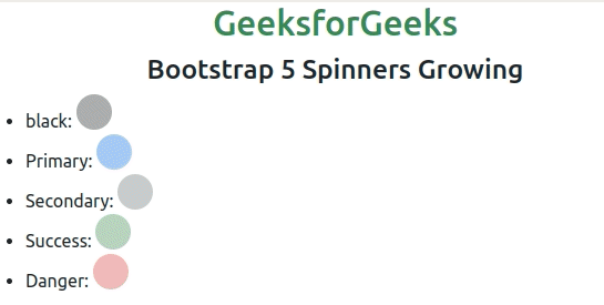
Bootstrap 5 Growing Spinners
Example 2: The following example demonstrates the Spinners Growing of colors using warning, info, light, and dark classes with Spinners Growing properties.
HTML
<!DOCTYPE html>
<html>
<head>
<link href=
rel="stylesheet"
integrity=
"sha384-EVSTQN3/azprG1Anm3QDgpJLIm9Nao0Yz1ztcQTwFspd3yD65VohhpuuCOmLASjC"
crossorigin="anonymous">
</head>
<body>
<div class="text-center">
<h1 class="text-success"> GeeksforGeeks </h1>
<h3>Bootstrap 5 Spinners Growing</h3>
</div>
<ul>
<li>
Warning:
<div class="spinner-grow text-warning">
</div>
</li>
<li>
Info:
<div class="spinner-grow text-info">
</div>
</li>
<li>
Light:
<div class="spinner-grow text-light">
</div>
</li>
<li>
Dark:
<div class="spinner-grow text-dark">
</div>
</li>
</ul>
</body>
</html>
|
Output:
Reference: https://getbootstrap.com/docs/5.0/components/spinners/#growing-spinner
Like Article
Suggest improvement
Share your thoughts in the comments
Please Login to comment...