Bootstrap | Cards
Last Updated :
15 Feb, 2023
A card is a flexible and extensible content container. It includes options for headers and footers, a wide variety of content, contextual background colors, and powerful display options.
It replaces the use of panels, wells and thumbnails. All of it can be used in a single container called card.
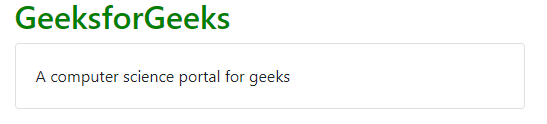
Basic Card: The building block of a card is the card-body within the parent class card.
Example:
HTML
<!DOCTYPE html>
<html lang="en">
<head>
<title>Bootstrap Card</title>
<meta charset="utf-8">
<meta name="viewport"
content="width=device-width, initial-scale=1">
<link rel="stylesheet" href=
<script src=
</script>
<script src=
</script>
<script src=
</script>
</head>
<body>
<div class="container">
<h2 class="text-success">GeeksforGeeks</h2>
<div class="card">
<div class="card-body">
A computer science portal for geeks
</div>
</div>
</div>
</body>
</html>
|
Output:
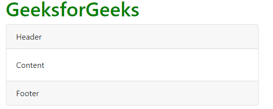
Header and Footer: The card-header provides a header to the cards and card-footer provides a footer to the cards.
Example:
HTML
<!DOCTYPE html>
<html lang="en">
<head>
<title>Bootstrap Card</title>
<meta charset="utf-8">
<meta name="viewport"
content="width=device-width, initial-scale=1">
<link rel="stylesheet" href=
</head>
<body>
<div class="container">
<h1 class="text-success">GeeksforGeeks</h1>
<div class="card">
<div class="card-header">Header</div>
<div class="card-body">Content</div>
<div class="card-footer">Footer</div>
</div>
</div>
</body>
</html>
|
Output:
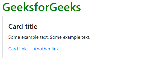
Card Title and Links: The card-title is used to give a title to the card and card-link is used to provide link to the card if required in it.
Example:
HTML
<!DOCTYPE html>
<html lang="en">
<head>
<title>Bootstrap Card</title>
<meta charset="utf-8">
<meta name="viewport"
content="width=device-width, initial-scale=1">
<link rel="stylesheet" href=
</head>
<body>
<div class="container">
<h1 class="text-success">GeeksforGeeks</h1>
<div class="card">
<div class="card-body">
<h4 class="card-title">Card title</h4>
<p class="card-text">
Some example text. Some example text.
</p>
<a href="#" class="card-link">Card link</a>
<a href="#" class="card-link">Another link</a>
</div>
</div>
</div>
</body>
</html>
|
Output:
Card Images: The images to the card are inserted with card-img-top and with card-img-bottom with the help of these two and img tag is used with it to input the image.
Example:
HTML
<!DOCTYPE html>
<html lang="en">
<head>
<title>Bootstrap Card</title>
<meta charset="utf-8">
<meta name="viewport"
content="width=device-width, initial-scale=1">
<link rel="stylesheet" href=
<script src=
</script>
<script src=
</script>
<script src=
</script>
</head>
<body>
<div class="container">
<h1 style="color:green">GeeksforGeeks</h1>
<div class="card" style="width:200px">
<img class="card-img-top" src=
alt="Card image" style="width:100%">
<div class="card-body">
<h4 class="card-title">Developer Guy</h4>
<p class="card-text">
Developer Guy love to develop
front-end and back-end
</p>
<a href="#" class="btn btn-primary">
See Profile
</a>
</div>
</div>
</div>
</body>
</html>
|
Output:
Example of Bottom-Image:
Example:
HTML
<!DOCTYPE html>
<html lang="en">
<head>
<title>Bootstrap Card</title>
<meta charset="utf-8">
<meta name="viewport"
content="width=device-width, initial-scale=1">
<link rel="stylesheet" href=
<script src=
</script>
<script src=
</script>
<script src=
</script>
</head>
<body>
<div class="container">
<h1 style="color:green">GeeksforGeeks</h1>
<div class="card" style="width:200px">
<div class="card-body">
<h4 class="card-title">Developer Guy</h4>
<p class="card-text">
Developer Guy love to develop
front-end and back-end
</p>
<a href="#" class="btn btn-primary">
See Profile
</a>
</div>
<img class="card-img-bottom" src=
alt="Card image" style="width:100%">
</div>
</div>
</body>
</html>
|
Output:
Image Overlays: In this we have to just use an extra class call the card-img-overlay in the same line of code which you have used for card images.
Example:
HTML
<!DOCTYPE html>
<html lang="en">
<head>
<title>Bootstrap Card</title>
<meta charset="utf-8">
<meta name="viewport"
content="width=device-width, initial-scale=1">
<link rel="stylesheet" href=
<script src=
</script>
<script src=
</script>
<script src=
</script>
</head>
<body>
<div class="container">
<h1 style="color:green">GeeksforGeeks</h1>
<div class="card" style="width:300px">
<img class="card-img-bottom" src=
alt="Card image" style="width:100%">
<div class="card-img-overlay">
<div class="card-body">
<h4 class="card-title">Developer Guy</h4>
<p class="card-text" style="color:red;">
Developer Guy love to develop
front-end and back-end </p>
<a href="#" class="btn btn-primary">
See Profile</a>
</div>
</div>
</div>
</div>
</body>
</html>
|
Output:
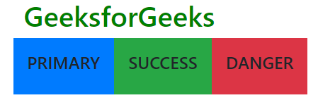
Example for Card-Group:
Example:
HTML
<!DOCTYPE html>
<html lang="en">
<head>
<title>Bootstrap Card</title>
<meta charset="utf-8">
<meta name="viewport"
content="width=device-width, initial-scale=1">
<link rel="stylesheet" href=
<script src=
</script>
<script src=
</script>
<script src=
</script>
</head>
<body>
<div class="container">
<h1 style="color:green">GeeksforGeeks</h1>
<div class="card-deck">
<div class="card-text-white bg-primary">
<div class="card-body">
<h4 class="card-title">PRIMARY</h4>
</div>
</div>
<div class="card-text-white bg-success">
<div class="card-body">
<h4 class="card-title">SUCCESS</h4>
</div>
</div>
<div class="card-text-white bg-danger">
<div class="card-body">
<h4 class="card-title">DANGER</h4>
</div>
</div>
</div>
</div>
</body>
</html>
|
Output:
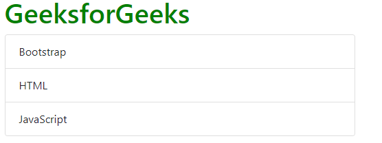
List groups: It creates a list of content in a card.
Example:
HTML
<html lang="en">
<head>
<title>Bootstrap Card</title>
<meta charset="utf-8">
<meta name="viewport"
content="width=device-width, initial-scale=1">
<link rel="stylesheet" href=
<script src=
</script>
<script src=
</script>
<script src=
</script>
</head>
<body>
<div class="container">
<h1 style="color:green">GeeksforGeeks</h1>
<div class="card">
<ul class="list-group list-group-flush">
<li class="list-group-item">Bootstrap</li>
<li class="list-group-item">HTML</li>
<li class="list-group-item">JavaScript</li>
</ul>
</div>
</div>
</body>
</html>
|
Output:
Kitchen sink: It is the name given to the type of card which consists of everything in it, it’s a mix and match of multiple contents to make your desired card
Example:
HTML
<html lang="en">
<head>
<title>Bootstrap Card</title>
<meta charset="utf-8">
<meta name="viewport" content="width=device-width, initial-scale=1">
</script>
</script>
</script>
</head>
<body>
<div class="container">
<h1 style="color:green">GeeksforGeeks</h1>
<div class="card">
<ul class="list-group list-group-flush">
<li class="list-group-item">Bootstrap</li>
<li class="list-group-item">HTML</li>
<li class="list-group-item">JavaScript</li>
</ul>
<div class="card-block">
<a href="" class="card-link">Cart</a>
<a href="" class="card-link">Add Item</a>
</div>
</div>
</div>
</body>
</html>
|
Output:
Navigation: It adds a navigation bar to the cards.
Example:
HTML
<html lang="en">
<head>
<title>Bootstrap Card</title>
<meta charset="utf-8">
<meta name="viewport"
content="width=device-width, initial-scale=1">
<link rel="stylesheet" href=
<script src=
</script>
<script src=
</script>
<script src=
</script>
</head>
<body>
<div class="container">
<h1 style="color:green">GeeksforGeeks</h1>
<div class="card-text-center">
<div class="card-header">
<ul class="nav nav-tabs card-header-tabs">
<li class="nav-item">
<a class="nav-link active" href="#">
Active</a>
</li>
<li class="nav-item">
<a class="nav-link " href="#">
link</a>
</li>
<li class="nav-item">
<a class="nav-link disabled" href="#">
Disabled</a>
</li>
</ul>
</div>
<div class="card-block">
<h4 class="card-title">Title</h4>
<p class="card-text">This is the test area</p>
<a href="#" class="btn btn-primary">Click me</a>
</div>
</div>
</div>
</body>
</html>
|
Output:
Another Example in Pills Form:
Example:
HTML
<html lang="en">
<head>
<title>Bootstrap Card</title>
<meta charset="utf-8">
<meta name="viewport"
content="width=device-width, initial-scale=1">
<link rel="stylesheet" href=
<script src=
</script>
<script src=
</script>
<script src=
</script>
</head>
<body>
<div class="container">
<h1 style="color:green">GeeksforGeeks</h1>
<div class="card-text-center">
<div class="card-header">
<ul class="nav nav-pills card-header-tabs">
<li class="nav-item">
<a class="nav-link active" href="#">
Active</a>
</li>
<li class="nav-item">
<a class="nav-link " href="#">
link</a>
</li>
<li class="nav-item">
<a class="nav-link disabled" href="#">
Disabled</a>
</li>
</ul>
</div>
<div class="card-block">
<h4 class="card-title">Title</h4>
<p class="card-text">This is the test area</p>
<a href="#" class="btn btn-primary">Click me</a>
</div>
</div>
</div>
</body>
</html>
|
Output:
Supported Browser:
- Google Chrome
- Microsoft Edge
- Firefox
- Opera
- Safari
Share your thoughts in the comments
Please Login to comment...