Attribute directives are a powerful tool that allows you to manipulate the behavior and appearance of HTML elements. In this article, you will see the fundamentals of attribute directives.
What are Attribute Directive?
Directives are the fundamental concepts in angular that help us to add or modify the behavior or appearance of HTML elements. They help us to modify DOM behavior, user functionality, and customizing components.
Benefits of Attribute Directive:
- Dynamic Styling: Attribute directives can be used to dynamically apply styles to HTML elements based on certain conditions.
- DOM Manipulation: They enable you to interact with and manipulate the DOM based on user actions or application state changes.
- Reusability: Attribute directives promote code reuse by encapsulating behavior that can be applied to multiple elements across the application.
- Enhanced Functionality: They allow you to extend HTML with custom functionality, improving the overall user experience.
Types of Attribute Directives:
1. Built-in Attribute directives:
These attributes are used within html tags to modify the appearance of elements, components or directives.
We have 3 main built in attribute directives: ngClass, ngStyle and ngModel
1. ngClass
This attribute is used to conditionally give the classes to the elements based on the value binded to ngClass directive.
Syntax:
<element [ngClass]="expression"></element>
2. ngStyle
This attribute is used to dynamically apply the styles to elements based on the value binded to ngStyle directive. It helps us to modify the appearance of elements on conditional basis. We can also use ngStyles to override in
Syntax:
<element [ngStyle]="expression"></element>
3. ngModel
This attribute is generally used to bind form control data to a class variable . This allows a two way binding and this is most commonly used directive with forms. It also comes with few basic validations like required,minLength , maxLength which can be directly used in our input tags.
To use this directive we need to import Forms Module in our module file.
Syntax:
<input name="name" [(ngModel)]="name"/>
2. Custom Attribute directives
We can also create our own directives based on our own requirements. This helps us creating reusable components and validating data etc. We can also create our own directives based on our own requirements. This helps us creating reusable components and validating data etc. Custom directives can be created using the `@Directive` decorator and can implement various methods to interact with the host element and perform actions.
Steps to create Custom Directives:
Step 1: Create a Directive
ng generate directive <directive-name>
The above command helps us to create new directive.
Step 2: Implement necessary imports
Open the generated directive file and import necessary modules like ElementRef , HostListener etc.
ElementRef : Provides access to the respective DOM element to change the styles or properties .
HostListener : Decorator used to listen for events on the host element such as mouse controls , clicks etc.
Input (optional) : Allows you to pass data from the component template to the directive.
import {Directive, ElementRef, HostListener , Input } from '@angular/core';Step 3: Define the Selector
In the @Directive decorator , we need to provide the `selector` property to specify how the directive will be used in the template. If we use the ng generate directive command, it gives selector property by default, we can also change this selector name for our usage.
 @Directive({
  selector: '[appHighlight]'
}
Step 4: Implement the logic
Here, we can write our custom functionality in the directive file. We can also implement life cycle hook methods in the directive file if required. Here we can also pass inputs to the directive using @Input decorator.
Step 5: Using our directive in template
In our component’s template, we can use the selector given in the directive as an attribute to the required element on which we want to perform our logic.
<element appNewDirective>.....content </element>
Here appNewDirective is the selector of our directive. In this way we can use the directive in our component templates with the custom functionality.
As mentioned above, we can also pass inputs to directive.
<element appNewDirective [input1]="value">.....content </element>
In this way we can pass inputs to our custom directive, here input1 is the input we declared as @Input() in our decorative, and `value` is the data we are passing to that particular input. Based on our requirement we can pass multiple inputs .
Example of Attribute Directives:
Now let us take an example to understand both built-in attribute directives and also custom directives.
Step 1: Create a new angular project
ng new project
Step 2. To generate a new directive, we can use the following command.
ng generate directive upperCase
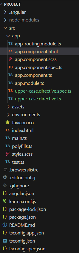
Folder Structure :
Dependencies:
  "dependencies": {
    "@angular/animations": "~13.0.0-next.0",
    "@angular/common": "~13.0.0-next.0",
    "@angular/compiler": "~13.0.0-next.0",
    "@angular/core": "~13.0.0-next.0",
    "@angular/forms": "~13.0.0-next.0",
    "@angular/platform-browser": "~13.0.0-next.0",
    "@angular/platform-browser-dynamic": "~13.0.0-next.0",
    "@angular/router": "~13.0.0-next.0",
    "rxjs": "~7.4.0",
    "tslib": "^2.3.0",
    "zone.js": "~0.11.4"
  },
  "devDependencies": {
    "@angular-devkit/build-angular": "~13.0.0",
    "@angular/cli": "~13.0.0",
    "@angular/compiler-cli": "~13.0.0-next.0",
    "@types/jasmine": "~3.10.0",
    "@types/node": "^12.11.1",
    "jasmine-core": "~3.10.0",
    "karma": "~6.3.0",
    "karma-chrome-launcher": "~3.1.0",
    "karma-coverage": "~2.0.3",
    "karma-jasmine": "~4.0.0",
    "karma-jasmine-html-reporter": "~1.7.0",
    "typescript": "~4.4.3"
  }
3. Implement the logic
HTML
<!-- app.component.html -->

<form>
  <div>
    <label>Name: </label>
    <input
      appUpperCase
      type="text"
      name="name"
      minlength="4"
      [(ngModel)]="name"
      #nameInput="ngModel"
      required
      [ngClass]="{ 'is-invalid': nameInput.touched && nameInput.invalid }"
    />
    <div *ngIf="nameInput.touched && nameInput.invalid">
      Minimum length of name is 4 characters
    </div>
  </div>
  <div>
    <label>Age: </label>
    <input
      type="number"
      name="age"
      [(ngModel)]="age"
      #ageInput="ngModel"
      required
      [ngStyle]="{
        'border-color': ageInput.invalid && ageInput.touched ? 'red' : ''
      }"
    />
    <div *ngIf="ageInput.touched && ageInput.invalid">Age is required</div>
  </div>
</form>
//app.component.ts

import { Component } from '@angular/core';

@Component({
    selector: 'app-root',
    templateUrl: './app.component.html',
    styleUrls: ['./app.component.scss'],
})
export class AppComponent {
    name: string = '';
    age!: number;
}
//upper-case.directive.ts

import { Directive, HostListener, ElementRef } from '@angular/core';

@Directive({
    selector: '[appUpperCase]',
})
export class UpperCaseDirective {
    constructor(private el: ElementRef) { }
    @HostListener('input')
    onInput(event: any) {
        const input = this.el.nativeElement.value.toUpperCase();
        this.el.nativeElement.value = input;
    }
}
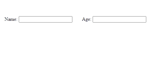
Output:
Share your thoughts in the comments
Please Login to comment...