TIme Series Forecasting using TensorFlow
Last Updated :
26 Mar, 2024
TensorFlow emerges as a powerful tool for data scientists performing time series analysis through its ability to leverage deep learning techniques. By incorporating deep learning into time series analysis, we can achieve significant advancements in both the depth and accuracy of our forecasts. TensorFlow sits at the forefront of this transformative landscape, offering a robust and versatile platform to construct, train, and deploy these deep neural networks. In this tutorial, we will see how we can leverage LSTM for time series analysis and forecasting.
Why LSTM for Time Series Forecasting?
Long Short-Term Memory (LSTM), a type of Recurrent neural network (RNN) architecture, was specifically designed to address the vanishing gradient problem that can plague traditional RNN training. Traditional RNNs struggle to learn and remember information over extended periods due to their recurrent connections. This can lead to exploding or vanishing gradients during backpropagation, hindering the learning process.
LSTMs tackle this issue by introducing a memory cell with self-connections, known as the “cell state.” This cell state effectively captures long-term relationships within the data by enabling the network to retain information across lengthy sequences.
Time series forecasting frequently uses LSTM because of its capacity to identify long-term patterns and dependencies in sequential data. The following justifies the suitability of LSTM for time series forecasting:
- Long-term Dependencies: Because LSTMs can retain information over extended periods of time, they are excellent at identifying intricate patterns and dependencies in time series data.
- Non-linear Relationships: LSTMs may learn non-linear relationships and patterns from time series data, which are frequently seen in these types of data.
- Variable-Length Inputs: LSTMs are capable of modelling time series data with varying lengths since they can handle variable-length sequences.
- Feature Learning: By using the input data, LSTMs may automatically extract pertinent features, eliminating the need for human feature engineering.
TensorFlow for Time Series Analysis: Implementation
For this tutorial, well-known “Air Passengers” dataset is used to demonstrate univariate time series forecasting with an LSTM model. This dataset contains monthly passenger numbers for flights within the United States from 1949 to 1960. Once you have downloaded the dataset, you can proceed with the implementation of univariate time series forecasting using an LSTM model.
Step 1: Loading and Visualizing the Dataset
- Necessary libraries are imported to perform the functioning and Data processing has been done by converting the ‘Month’ column to datetime format using pd.to_datetime().
- We set the ‘Month’ column as the index of the DataFrame using set_index().
Python3
import numpy as np
import pandas as pd
import matplotlib.pyplot as plt
from sklearn.preprocessing import MinMaxScaler
from tensorflow.keras.models import Sequential
from tensorflow.keras.layers import LSTM, Dense

# Load the dataset
data = pd.read_csv("AirPassengers.csv")

# Convert the 'Month' column to datetime format
data['Month'] = pd.to_datetime(data['Month'])

# Set 'Month' column as the index
data.set_index('Month', inplace=True)

data.head()
Output:
            #Passengers
Month
1949-01-01          112
1949-02-01          118
1949-03-01          132
1949-04-01          129
1949-05-01          121
The dataset records the data of the passenger on the first day of every month starting from 1949 to 1960.
Python3
# Plot the time series data
plt.figure(figsize=(10, 6))
plt.plot(data)
plt.title('Air Passengers Time Series')
plt.xlabel('Year')
plt.ylabel('Number of Passengers')
plt.show()
Output:

The output is a plot showing the Air Passengers time series data over the years.
The line graph is showing clear upward trend in the number of passengers over time. This suggests that air travel was becoming more popular during this period.
Step 2: Preprocessing the Data
Next, we’ll preprocess the data and split it into training and testing sets.
Feature scaling is essential for neural network models to ensure that all input features are within a similar range, preventing any particular feature from dominating the learning process due to its scale. In this guide, MinMaxScaler class from the sklearn.preprocessing module is used to perform feature scaling.
Python3
# Normalize the data
scaler = MinMaxScaler()
scaled_data = scaler.fit_transform(data)

# Split the data into train and test sets
train_size = int(len(scaled_data) * 0.8)
train_data = scaled_data[:train_size]
test_data = scaled_data[train_size:]
Step 3: Creating Sequences for LSTM Model
Now, let’s create sequences of input data and corresponding target values for training the LSTM model:
- We define a function create_sequences() to create input sequences and corresponding target values for the LSTM model.
- The function takes two arguments: data (the time series data) and seq_length (the number of time steps to look back).
- We iterate through the data to create sequences of length seq_length along with their corresponding target values returning the NumPy arrays X containing input sequences and y containing target values creating the sequences for both training and testing sets.
Python3
def create_sequences(data, seq_length):
    X, y = [], []
    for i in range(len(data) - seq_length):
        X.append(data[i:i+seq_length])
        y.append(data[i+seq_length])
    return np.array(X), np.array(y)

seq_length = 12  # Number of time steps to look back
X_train, y_train = create_sequences(train_data, seq_length)
X_test, y_test = create_sequences(test_data, seq_length)
Step 4: Defining and Training the LSTM Model
Now, let’s define and train the LSTM model
We define an LSTM model using Sequential() and add an LSTM layer with 50 units, ReLU activation function, and input shape (seq_length, 1) where seq_length is the length of the input sequences with Dense layer with one unit (for regression) to output the predicted value compiling the model with Adam optimizer and mean squared error loss function.
Python3
model = Sequential([
    LSTM(50, activation='relu', input_shape=(seq_length, 1)),
    Dense(1)
])

model.compile(optimizer='adam', loss='mse')
model.fit(X_train, y_train, epochs=100, batch_size=32, verbose=1)
Output:
Epoch 1/100
4/4 [==============================] - 2s 9ms/step - loss: 0.1129
Epoch 2/100
4/4 [==============================] - 0s 8ms/step - loss: 0.0951
Epoch 3/100
4/4 [==============================] - 0s 8ms/step - loss: 0.0800
Epoch 4/100
4/4 [==============================] - 0s 8ms/step - loss: 0.0668
.
.
Epoch 98/100
4/4 [==============================] - 0s 8ms/step - loss: 0.0023
Epoch 99/100
4/4 [==============================] - 0s 8ms/step - loss: 0.0022
Epoch 100/100
4/4 [==============================] - 0s 8ms/step - loss: 0.0021
<keras.src.callbacks.History at 0x7a45ebc3edd0>
Step 5: Predictions and Visualization
Finally, let’s make predictions using the trained model and evaluate its performance and understanding the plot of actual data points and a forecasted trendline.
Python3
# Make predictions
train_predictions = model.predict(X_train)
test_predictions = model.predict(X_test)

# Inverse transform the predictions
train_predictions = scaler.inverse_transform(train_predictions)
test_predictions = scaler.inverse_transform(test_predictions)

# Plot predictions
plt.figure(figsize=(10, 6))

# Plot actual data
plt.plot(data.index[seq_length:], data['#Passengers'][seq_length:], label='Actual', color='blue')

# Plot training predictions
plt.plot(data.index[seq_length:seq_length+len(train_predictions)], train_predictions, label='Train Predictions',color='green')

# Plot testing predictions
test_pred_index = range(seq_length+len(train_predictions), seq_length+len(train_predictions)+len(test_predictions))
plt.plot(data.index[test_pred_index], test_predictions, label='Test Predictions',color='orange')

plt.title('Air Passengers Time Series Forecasting')
plt.xlabel('Year')
plt.ylabel('Number of Passengers')
plt.legend()
plt.show()
Output:
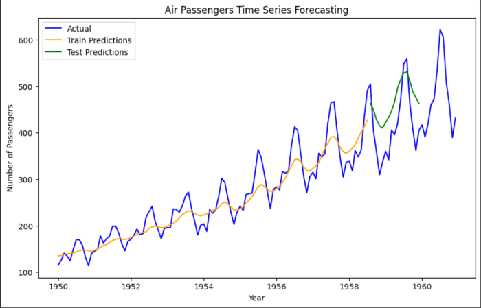
- The blue line with square markers represents the actual number of air passengers each year from 1950 to 1960. There seems to be a seasonal pattern with peaks likely corresponding to holidays or summer travel seasons.
- The orange line represents the forecasted number of air passengers based on an LSTM model. The forecast extends beyond 1960. The forecasted trend shows a gradual increase in passenger numbers.
- Potential Overfitting: It is difficult to assess the accuracy of the forecast from this visualization alone. However, the forecasted line seems to very closely follow the actual data points, particularly towards the end. This could be a sign of overfitting..
Step 6: Forecasting
In this model, to understand the forecasting precisely, let’s create a graph for the period of 30 days:
- Initialize an empty list to store the forecasted values, we use the last sequence from the test data to initialize last_sequence with a loop through the forecast period to predict the next value using the model.
- Let’s plot the actual values for the test period along with the forecasted values for the next 30 days.
Python3
forecast_period = 30
forecast = []

# Use the last sequence from the test data to make predictions
last_sequence = X_test[-1]

for _ in range(forecast_period):
    # Reshape the sequence to match the input shape of the model
    current_sequence = last_sequence.reshape(1, seq_length, 1)
    # Predict the next value
    next_prediction = model.predict(current_sequence)[0][0]
    # Append the prediction to the forecast list
    forecast.append(next_prediction)
    # Update the last sequence by removing the first element and appending the predicted value
    last_sequence = np.append(last_sequence[1:], next_prediction)

# Inverse transform the forecasted values
forecast = scaler.inverse_transform(np.array(forecast).reshape(-1, 1))

# Plot the forecasted values
plt.figure(figsize=(10, 6))
plt.plot(data.index[-len(test_data):], scaler.inverse_transform(test_data), label='Actual')
plt.plot(pd.date_range(start=data.index[-1], periods=forecast_period, freq='M'), forecast, label='Forecast')
plt.title('Air Passengers Time Series Forecasting (30-day Forecast)')
plt.xlabel('Year')
plt.ylabel('Number of Passengers')
plt.legend()
plt.show()
Output:
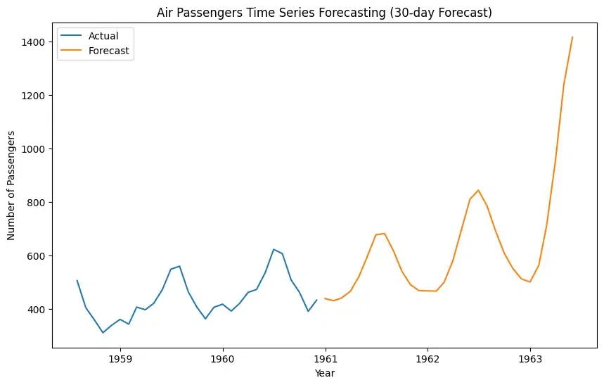
Note: The forecasted number of passengers is not for the next 30 days; instead, the forecasted number of passengers is for the first day of the next 30 months.
Both the actual data and the forecast depict an upward trend, indicating a general increase in the number of air passengers over this period. Seasonal Pattern: The actual data (blue line) exhibits a seasonal pattern, with peaks likely corresponding to holidays or summer travel seasons. The forecast (orange line) captures this seasonality to some extent, but it appears smoother.
Share your thoughts in the comments
Please Login to comment...