React MUI Chip API
Last Updated :
26 Jun, 2022
Chips are elements that represent an action, an attribute, or an input. Material UI is one of the most popular React Frontend libraries. It provides tons of ready-to-use components, hence saving the time to create our styles and presenting a good design. These components are easily customizable and hence they are easy to pick up. The Chip component of MUI is one of the components available in MUI. We will see how to use them in our React project.
Chip props:
- label: It is used to display the text inside the chip.
- variant: It changes the appearance of the chip. One is the ‘contained’ chip and the other is the ‘outlined’ chip.
- size: It changes the size of the chip.
- color: It changes the fill color or outline color of the chip.
- clickable: It is a Boolean value. If true, then the chip will show subtle effects when it has hovered over. If its value is false then no such effect is observed.
- onClick: This prop takes in a function as its value. When the chip is clicked, the function given in the onClick prop is called.
- onDelete: This prop also takes in a function as its value. It adds a little delete icon at the end of the chip. When the icon is clicked, the function given in the onDelete prop is called.
- deleteIcon: It takes in an element as its value and overrides the default delete icon.
- icon: It takes in an element, generally an icon component, and adds it to the prefix of the chip’s label.
- avatar: It takes in an element as its value and adds an avatar to the prefix of the chip’s label.
- classes: It is used to override the CSS styles applied on the chip.
- component: It is used to change the root node used by the chip. It can be an HTML element or any other component.
- disabled: If true, then the chip is disabled.
- sx: It is also used to override the default CSS styles applied on the chip.
Creating React Application: Follow the below steps to create a React.js application:
Step 1: Create the React project using the command given below
npx create-react-app mui-chip
Step 2: Navigate into the React project created. Open your preferred code editor/IDE.
cd mui-chip
Step 3: Install the MUI dependencies as suggested by the MUI team. Enter the command given below in your terminal.
npm install @mui/material @emotion/react @emotion/styled
# or
yarn add @mui/material @emotion/react @emotion/styled
Step 4 (Optional): Install the MUI icons dependency to use Material icons in our project
npm install @mui/icons-material
# or
yarn add @mui/icons-material
Project Structure: After creating the React project and installing all the dependencies, the project structure would look similar to the figure given below.
Importing MUI’s Chip component: In your JSX file, import the Chip component by using the below import line.
import Chip from '@mui/material/Chip';
// or
import { Chip } from '@mui/material';
Example 1: Variants of chip
Javascript
import Chip from '@mui/material/Chip';
export default function App() {
return (
<div>
<Chip label="Filled" />
<Chip label="Outlined" variant="outlined" />
</div>
);
}
|
Steps to run the application: Run the application by entering the given command in the terminal at the root directory of the project.
npm start
# or
yarn start
Output:
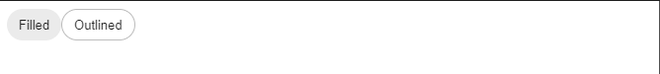
Variants of chip
Example 2: onClick and onDelete prop
Javascript
import Chip from "@mui/material/Chip";
import DoneIcon from "@mui/icons-material/Done";
import { useState } from "react";
export default function App() {
const [message, setMessage] = useState("Default message");
function handleDelete() {
setMessage("deleted");
}
function handleClick() {
setMessage("clicked");
}
return (
<div>
<Chip label="Clickable chip"
onClick={handleClick} />
<Chip label="Deletable chip"
onDelete={handleDelete} />
<Chip
label="Custom delete icon"
onDelete={handleDelete}
deleteIcon={<DoneIcon />}
/>
<p>Message - {message}</p>
</div>
);
}
|
Explanation: The handleClick function sets the message to “clicked” and the handleDelete function sets the message to “deleted”. handleClick is called when the chip is clicked. handleDelete is called when the chip’s delete icon is clicked.
Output:
Example 3: Colors of Chip
Javascript
import Stack from '@mui/material/Stack';
import Chip from '@mui/material/Chip';
export default function App() {
return (
<Stack direction="row" gap={3}>
<Chip label="Default" />
<Chip label="Primary" color="primary" />
<Chip label="Secondary" color="secondary" />
<Chip label="Error" color="error" />
<Chip label="Info" color="info" />
<Chip label="Success" color="success" />
<Chip label="Warning" color="warning" />
</Stack>
);
}
|
Output:

Chips with different values of color prop
Example 4: icon and avatar prop
Javascript
import Chip from "@mui/material/Chip";
import DoneIcon from "@mui/icons-material/Done";
import { Avatar, Stack } from "@mui/material";
export default function App() {
return (
<Stack direction="row" gap={3}>
<Chip avatar={<Avatar>G</Avatar>}
color="success" label="GeeksForGeeks" />
<Chip icon={<DoneIcon />}
color="success" label="Geeks filled" />
<Chip icon={<DoneIcon />}
color="success" label="Geeks outlined"
variant="outlined" />
</Stack>
);
}
|
Output:

avatar and icon props in MUI Chip
Reference: https://mui.com/material-ui/react-chip/
Share your thoughts in the comments
Please Login to comment...