React-Bootstrap Range
Last Updated :
06 Nov, 2023
In this article, we will learn about the React-Bootstrap Range known as FormRange is a fantastic component that you’ll find in React Bootstrap, FormRange and is specifically designed for creating range input elements in forms. It allows users to select a numeric value from within a defined range by dragging a slider thumb along a track. Bootstrap, which is a super popular CSS framework.
Syntax:
<Form.Range/>
We can use the following attributes inside the Form.Range component:
Properties:
- className: It is used to add custom classes.
- value: t represents the selected value or position of the slider thumb.
- disabled: When it is
true it disables the range slider, preventing user interaction.
- id: It is used to define an id for the component.
- min: This prop sets the minimum value of the range. Users cannot select values lower than this minimum value.
- max: This prop sets the maximum value of the range. Users cannot select values more than this maximum value.
- step: It is used to set the stepping interval.
- onChange: This is a callback function that is triggered when the user interacts with the range slider.
- name: It is used to specify the name of the input element, which can be beneficial when working with forms.
bsPrefix: This lets you customize the Bootstrap prefix for the range slider.
Example 1: Here is an example of how we can create a range slider using the react-bootstrap Form.Range.
Javascript
import React, { useState } from 'react';
import Form from 'react-bootstrap/Form';
import './App.css';
function RangeExample() {
const [sliderValue, setSliderValue] = useState(50);
const handleSliderChange = (e) => {
setSliderValue(e.target.value);
};
return (
<div className="outer">
<div>
<Form.Label>
Range Slider
</Form.Label>
<Form.Range
value={sliderValue}
name='hello'
onChange={handleSliderChange}
className="custom-slider"/>
<p>Selected Value: {sliderValue}</p>
</div>
</div>
);
}
export default RangeExample;
|
CSS
.outer{
display: flex;
align-items: center;
justify-content: center;
background-color: #152128f0;
height: 100vh;
width: 100vw;
color: rgb(191, 210, 210);
}
.custom-slider {
width: 70%;
margin: 0 auto;
}
|
Output:
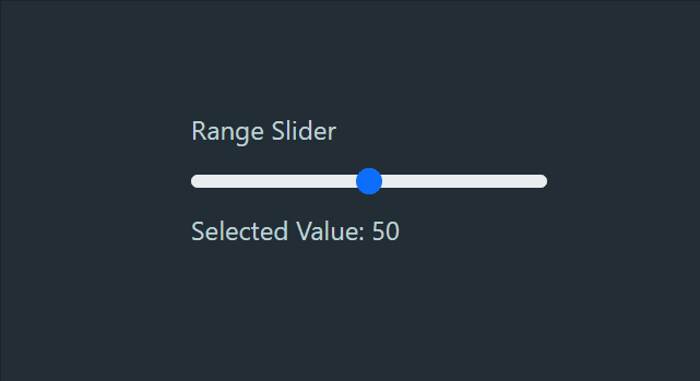
Output
Example 2: Here is an example of how we can create range slider which can prevent user behaviour using the react-bootstrap Form.Range disabled prop.
Javascript
import React, { useState } from 'react';
import Form from 'react-bootstrap/Form';
import './App.css';
function RangeExample() {
const [sliderValue, setSliderValue] = useState(38);
const handleSliderChange = (e) => {
setSliderValue(e.target.value);
};
return (
<div className="outer">
<div>
<Form.Label>
Range Slider
</Form.Label>
<Form.Range
value={sliderValue}
disabled
onChange={handleSliderChange}
className="custom-slider"/>
<p>Selected Value: {sliderValue}</p>
</div>
</div>
);
}
export default RangeExample;
|
CSS
.outer{
display: flex;
align-items: center;
justify-content: center;
background-color: #152128f0;
height: 100vh;
width: 100vw;
color: rgb(191, 210, 210);
}
.custom-slider {
width: 70%;
margin: 0 auto;
}
|
Output:
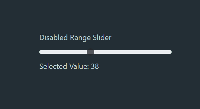
Output
Share your thoughts in the comments
Please Login to comment...