How to Dismiss a React-Bootstrap Popover on Click Outside ?
Last Updated :
26 Oct, 2023
This article implements popover functionality using the React Bootstrap library. It consists of a button labelled “Show Popover,” and when this button is clicked, a popover with the title “Popover Right” and the content “Some Amazing Content” is displayed to the right of the button. The popover is shown or hidden based on the state of the “showPopover” variable. The component uses event listeners to detect clicks outside of the popover, allowing it to automatically close when clicked outside.

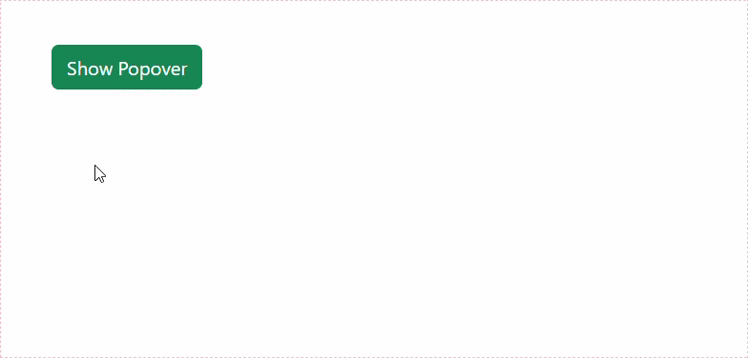
Preview Image
Approach
The “PopOver” component in React Bootstrap implements a button trigger to display a popover. It utilises state management to control popover visibility and employs event listeners to detect clicks outside the popover, automatically closing it when necessary. The popover contains a title and content, and the user can modify that according to the requirement by taking references from official documentation. This component offers a user-friendly way to reveal additional information or actions in a popover, making it an interactive UI element for displaying contextual content.
Steps to Create the Application
Step 1: Set up React project using the command
npx create-react-app <<name of project>>
Step 2: Navigate to the project folder using
cd <<Name_of_project>>
Step 3: Install the react-bootstrap library using the following command
npm install react-bootstrap bootstrap
Step 4: Create a folder “components” and add a new file Popover.js that implements the popover feature.
Project Structure

Project Structure
The updated dependencies in package.json will look like this:
{
    "name": "Project Name",
    "version": "0.1.0",
    "private": true,
    "dependencies": {
        "@testing-library/jest-dom": "^5.17.0",
        "@testing-library/react": "^13.4.0",
        "@testing-library/user-event": "^13.5.0",
        "bootstrap": "^5.3.2",
        "react": "^18.2.0",
        "react-bootstrap": "^2.9.0",
        "react-dom": "^18.2.0",
        "react-scripts": "5.0.1",
        "web-vitals": "^2.1.4"
    }
}
Example: Write the following code in respective files
Javascript
import "./App.css";
import
"bootstrap/dist/css/bootstrap.min.css";
import PopOver from
"./components/Popover";
function App() {
return (
<div>
<PopOver />
</div>
);
}
export default App;
|
Javascript
import {
useEffect,
useState,
} from "react";
import {
Button,
Popover,
OverlayTrigger,
} from "react-bootstrap";
export default function PopOver() {
const [
showPopover,
setShowPopover,
] = useState(false);
const handleClick = (e) => {
const buttonElement =
document.querySelector(
".btn"
);
if (showPopover) {
const popoverElement =
document.querySelector(
".popover"
);
if (
!popoverElement.contains(
e.target
)
)
setShowPopover(false);
} else {
if (
buttonElement.contains(
e.target
)
)
setShowPopover(true);
}
};
useEffect(() => {
document.addEventListener(
"mousedown",
handleClick
);
return () => {
document.removeEventListener(
"mousedown",
handleClick
);
};
}, [showPopover]);
return (
<div>
<OverlayTrigger
trigger="manual"
show={showPopover}
placement="right"
overlay={
<Popover id="popover-right">
<Popover.Header as="h3">
Popover
Right
</Popover.Header>
<Popover.Body>
<strong>
Some
Amazing
Content
</strong>
</Popover.Body>
</Popover>
}
>
<Button
variant="success"
className="m-5"
>
Show Popover
</Button>
</OverlayTrigger>
</div>
);
}
|
Steps to Run the Application
Step 1: Type the following command in terminal
npm start
Step 2: Open web-browser and type the following URL
http://localhost:3000/
Output:
Created Popover using React-BootStrap
Share your thoughts in the comments
Please Login to comment...