React-Bootstrap Carousel Controlled
Last Updated :
01 Nov, 2023
React-Bootstrap Carousel Controlled is a feature that allows you to style engaging images or content sliders for your web pages. React-Bootstrap’s Carousel component provides control, enabling you to take the reins over the carousel’s content, navigation, and behavior.
React-Bootstrap Carousel Controlled Props:
- activeIndex: It identifies the currently shown slide in a Carousel based on its index.
- onSelect: onSelect is a function which called when the user changes the active slide.
<Carousel activeIndex={index} onSelect={handleSelect}>
Example: Here, below is the basic implementation of the Carousel Controlled.
Javascript
import React, { useState } from 'react';
import 'bootstrap/dist/css/bootstrap.css';
import Carousel from 'react-bootstrap/Carousel';
export default function App() {
const [index, setIndex] = useState(0);
const handleSelect = (selectedIndex) => {
setIndex(selectedIndex);
};
return (
<div style={{
display: 'block',
width: 700, padding: 30
}}>
<h2 style={{ color: 'green' }}>
GeeksforGeeks
</h2>
<h2>React-Bootstrap Carousel Controlled</h2>
<Carousel activeIndex={index}
onSelect={handleSelect}>
<Carousel.Item interval={1500}>
<img className="d-block w-100" src=
alt="JAVA" />
</Carousel.Item>
<Carousel.Item interval={500}>
<img className="d-block w-100" src=
alt="HTML" />
</Carousel.Item>
<Carousel.Item interval={500}>
<img className="d-block w-100" src=
alt="Angular" />
</Carousel.Item>
</Carousel>
</div>
);
}
|
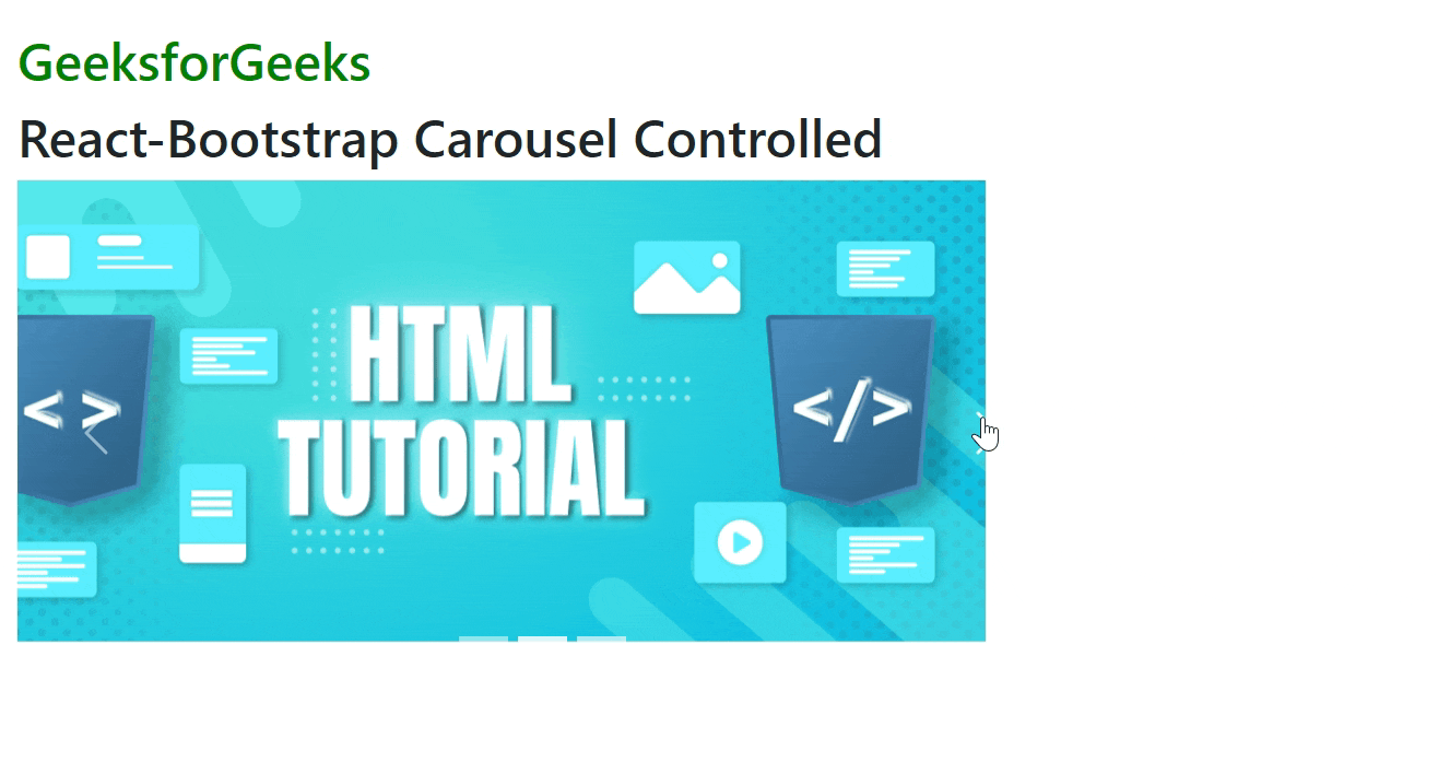
Output: Now open your browser and go to http://localhost:3000/, you will see the following output
Example 2: In this example, we will see how to add Carousel.Caption to the Carousel Controlled
Javascript
import React, { useState } from 'react';
import 'bootstrap/dist/css/bootstrap.css';
import Carousel from 'react-bootstrap/Carousel';
export default function App() {
const [index, setIndex] = useState(0);
const handleSelect = (selectedIndex) => {
setIndex(selectedIndex);
};
return (
<div style={{
display: 'block',
width: 700, padding: 30
}}>
<h2 style={{ color: 'green' }}>
GeeksforGeeks
</h2>
<h2>React-Bootstrap Carousel Controlled</h2>
<Carousel activeIndex={index}
onSelect={handleSelect}>
<Carousel.Item interval={1500}>
<img className="d-block w-100" src=
alt="Image One" />
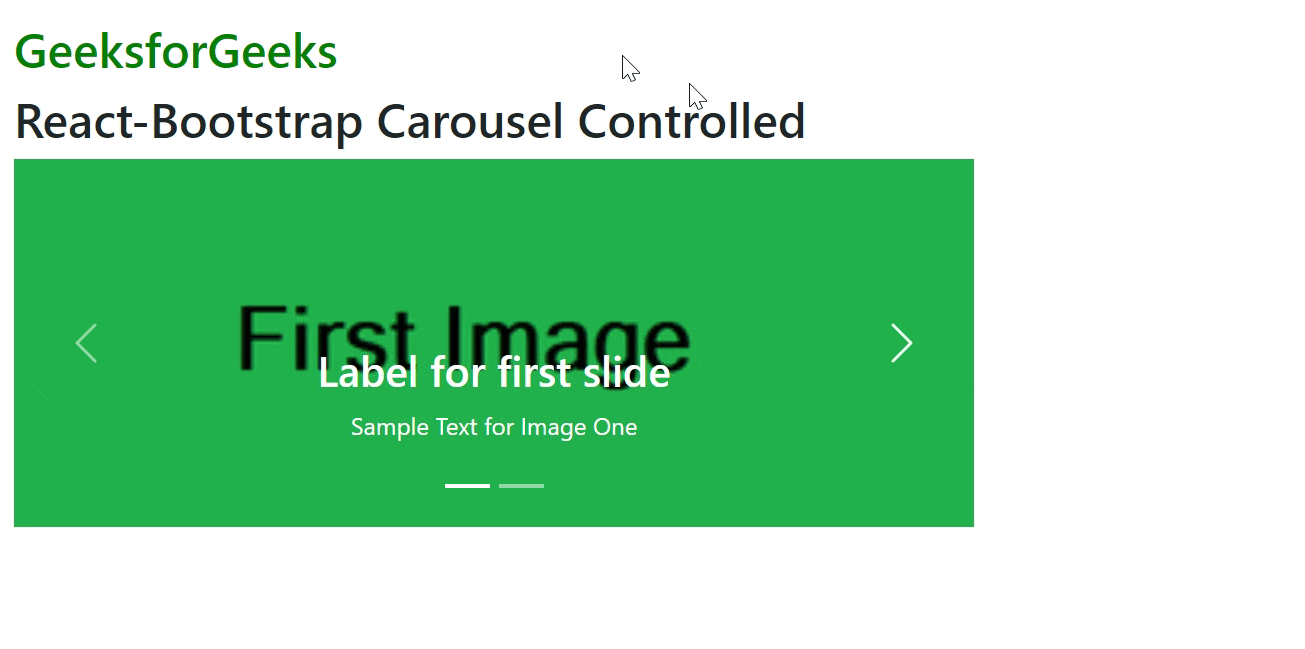
<Carousel.Caption>
<h3>Label for first slide</h3>
<p>Sample Text for Image One</p>
</Carousel.Caption>
</Carousel.Item>
<Carousel.Item interval={500}>
<img className="d-block w-100" src=
alt="Image Two" />
<Carousel.Caption>
<h3>Label for second slide</h3>
<p>Sample Text for Image Two</p>
</Carousel.Caption>
</Carousel.Item>
</Carousel>
</div>
);
}
|
Output: Now open your browser and go to http://localhost:3000/, you will see the following output
Reference: https://react-bootstrap.github.io/docs/components/carousel#controlled
Share your thoughts in the comments
Please Login to comment...