Plotting multiple time series on the same plot using ggplot in R
Last Updated :
24 Jun, 2021
Time series data is hierarchical data. It is a series of data associated with a timestamp. An example of a time series is gold prices over a period or temperature range or precipitation during yearly storms. To visualize this data, R provides a handy library called ggplot. Using ggplot, we can see all sorts of plots. Along with ggplot, R also provides libraries to clean up data and transform or manipulate it to fit our visualization requirements.
This article will look at one dataset from the R datasets and one dataset obtained from a CSV file.
Dataset 1: EU Covid deaths for March 2020
The dataset gives us the daily death counts from Covid-19 for all European Countries for March 2020. We will plot the number of deaths(y-axis) vs. day(x-axis) for every country.
Data in use can be downloaded from here.
Plot 1: Daily Death Count
The steps for plotting are as follows:
- Open R Studio and open an R notebook (has more options).
- Save this file as .rmd, preferably in the same folder as your data.
- Select the Working directory to where your data is
- Import all the R libraries
- Read the data from the CSV.
- The data above is spread across columns. To make plotting easier, we need to format the data in the required format.
- Plot data
- Display data
Example:
R
library(ggplot2)
library(reshape2)
library(dplyr)
covid1 =(read.csv(file="EUCOVIDdeaths.csv",header=TRUE)[,-c(2)])
head(covid1)
covid_deaths <- melt(covid1,id.vars=c("Country"),value.name="value",
variable.name="Day")
head(covid_deaths)
covid_plot <- ggplot(data=covid_deaths, aes(x=Day, y=value, group = Country,
colour = Country))
+ geom_line() +labs(y= "Deaths", x = "Day")
covid_plot + ggtitle("Daily Deaths for European countries in March,2020")+geom_point()
covid_plot
|
Output:
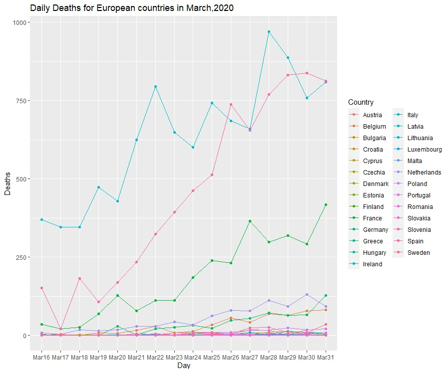
Daily Deaths timeseries plot with points
Plot 2: Plotting covid deaths per capita.
We will be using the same data as the previous example. But here we will be dealing with per capita data.
R
library(ggplot2)
library(reshape2)
library(dplyr)
covid1 =(read.csv(file="EUCOVIDdeaths.csv",header=TRUE)[,-c(2)])
head(covid1)
covid_perCapita <- covid1[,c(2:17)] / covid$PopulationM
covid_perCapita$Country <- covid1$Country
head(covid_perCapita)
covid_perCapita_deaths <- melt(covid_perCapita,id.vars=c("Country"),
value.name="value", variable.name="Day")
covidPerCapitaPlot <- ggplot(data=covid_perCapita_deaths,
aes(x=Day, y=value, group = Country, colour = Country)) + geom_line()
+labs(y= "Deaths per Capita", x = "Day") + theme_bw(base_size = 16)
+ theme(axis.text.x=element_text(angle=60,hjust=1))
+ ggtitle("Day-wise Covid-Deaths per Capita in Europe in 2020")
covid_perCapitaPlot
|
Output:
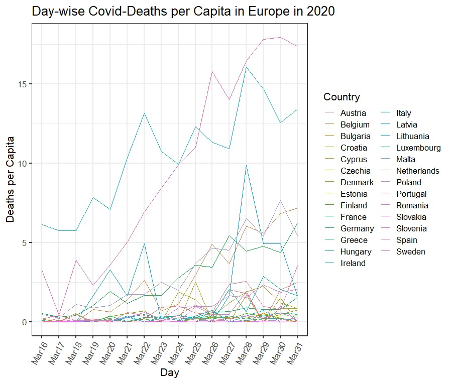
Capita Plot
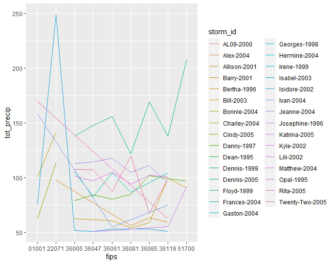
Dataset 2: Rainfall for US counties during tropical storms.
First install the package: hurricaneexposuredata
Before installing the package, please check the R version. To check the R version in RStudio go to Tools -> Global Options. In the window that opens, in the Basic Tab, we see the R version.
#If the R version is the greater than 4
install.packages(“hurricaneexposuredata”)
#For R versions lower than 4.0, please install this way
install.packages(‘hurricaneexposuredata’, repos=’https://geanders.github.io/drat/’, type=’source’)
Example:
R
library(hurricaneexposuredata)
library(hurricaneexposure)
rain_data <- county_rain(counties = c("01001","36005", "36047",
"36061","36085", "36081",
"36119","22071", "51700"),
start_year = 1995, end_year = 2005, rain_limit = 50,
dist_limit = 500, days_included = c(-1, 0, 1))
ggplot(data = rain_data, aes(x=fips, y=tot_precip, group=storm_id,
color=storm_id)) + geom_line()
|
Output:
Share your thoughts in the comments
Please Login to comment...