Remove Axis Labels and Ticks in ggplot2 Plot in R
Last Updated :
24 Oct, 2021
In this article, we will discuss how to remove axis labels and ticks in ggplot2 in R Programming Language.
The axes labels and ticks can be removed in ggplot using the theme() method. This method is basically used to modify the non-data components of the made plot. It gives the plot a good graphical customized look. The theme() method is used to work with the labels, ticks, and text of the plot made. The labels and ticks are aligned to the element_blank() method in order to remove them.
Syntax :
theme(axis.text.x = , axis.ticks.x = , axis.text.y = , axis.ticks.y = )
Arguments :
- axis.text.x , axis.text.y = tick labels along axes
- axis.ticks.x, axis.ticks.y = tick labels along axes
R
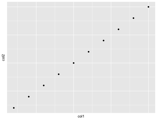
col1 = c(1: 10)
col2 = c(11: 20)
print("X coordinates")
print(col1)
print("Y coordinates")
print(col2)
graph < - ggplot(df, aes(x=col1, y=col2)) +
geom_point()
graph +
theme(axis.text.x=element_blank(),
axis.ticks.x=element_blank(),
axis.text.y=element_blank(),
axis.ticks.y=element_blank())
print(graph)
|
Output
[1] "X coordinates"
[1]  1  2  3  4  5  6  7  8  9 10
[1] "Y coordinates"
[1] 11 12 13 14 15 16 17 18 19 20
Explanation: The x and y axes markings and tick marks have been removed from the graph by setting them to the element_blank() method.
Like Article
Suggest improvement
Share your thoughts in the comments
Please Login to comment...