Pandas – Plot multiple time series DataFrame into a single plot
Last Updated :
17 Oct, 2021
In this article, we are going to see how to plot multiple time series Dataframe into single plot.
If there are multiple time series in a single DataFrame, you can still use the plot() method to plot a line chart of all the time series. To Plot multiple time series into a single plot first of all we have to ensure that indexes of all the DataFrames are aligned. So let’s take two examples first in which indexes are aligned and one in which we have to align indexes of all the DataFrames before plotting.
Plotting DataFrames with same DateTime Index:
Step 1: Importing Libraries
Python3
import pandas as pd
import matplotlib.pyplot as plt
plt.style.use('default')
%matplotlib inline
|
Step 2: Importing Data
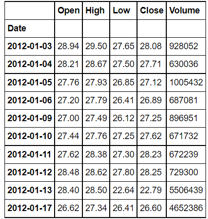
We will be plotting open prices of three stocks Tesla, Ford, and general motors, You can download the data from here or yfinance library.
Tesla file:
Python3
tesla = pd.read_csv('Tesla_Stock.csv',
index_col='Date',
parse_dates=True)
tesla.head(10)
|
Output:
Ford_stock:
Python3
ford = pd.read_csv('Ford_Stock.csv',
index_col='Date',
parse_dates=True)
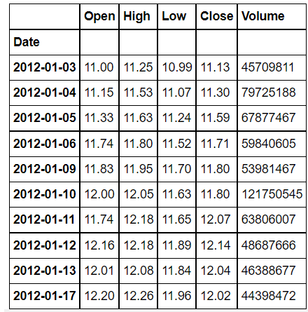
ford.head(10)
|
Output:
GM_Stock:
Python3
gm = pd.read_csv('GM_Stock.csv',
index_col='Date',
parse_dates=True)
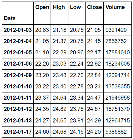
gm.head(10)
|
Output:
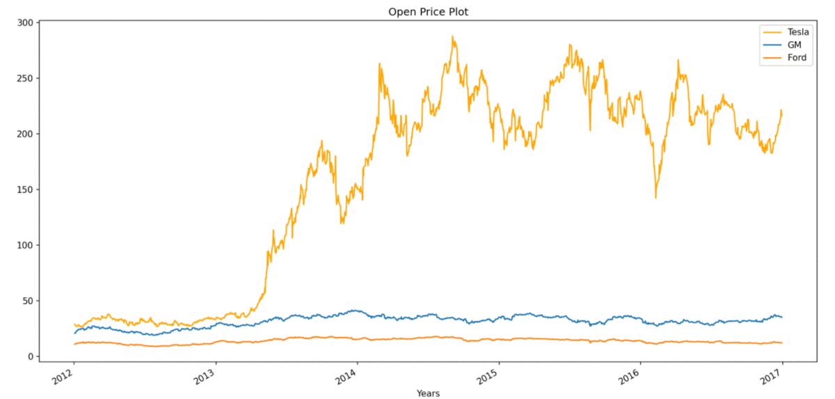
Step 3: Now Plotting Open Prices of the Stocks
Python3
plt.figure(figsize=(16, 8), dpi=150)
tesla['Open'].plot(label='Tesla', color='orange')
gm['Open'].plot(label='GM')
ford['Open'].plot(label='Ford')
plt.title('Open Price Plot')
plt.xlabel('Years')
plt.legend()
|
Output:
Plotting DataFrames with different DateTime Index:
In the second example, we will take stock price data of Apple (AAPL) and Microsoft (MSFT) off different periods. Our first task here will be to reindex any one of the dataFrame to align with the other dataFrame and then we can plot them in a single plot.
Step 1: Importing Libraries
Python3
import pandas as pd
import matplotlib.pyplot as plt
plt.style.use('default')
%matplotlib inline
|
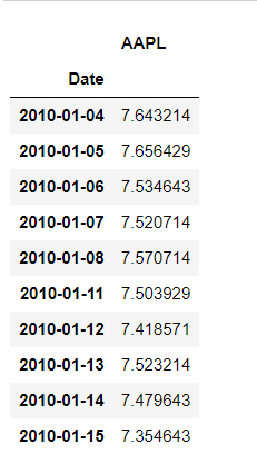
Step 2: Importing Data
Python3
aapl = pd.read_csv('aapl.csv',
index_col='Date',
parse_dates=True)
aapl.head(10)
|
Output:
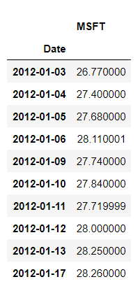
msft file:
Python3
msft = pd.read_csv('msft.csv',
index_col='Date',
parse_dates=True)
msft.head(10)
|
Output:
As you can clearly see, DateTime index of both DataFrames is not the same, so firstly we have to align them. When we will make DateTime index of msft the same as that of all, then we will have some missing values for the period 2010-01-04 to 2012-01-02 , before plotting It is very important to remove missing values.
Python3
aapl["MSFT"] = msft.MSFT
aapl.dropna(inplace=True)
aapl.head(10)
|
Output:
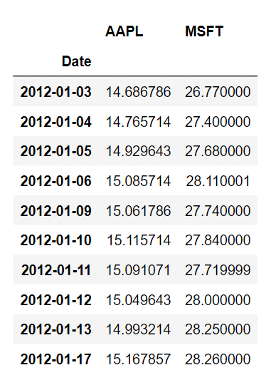
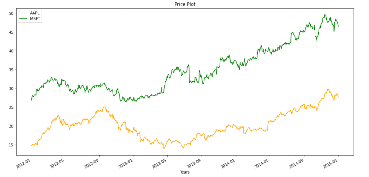
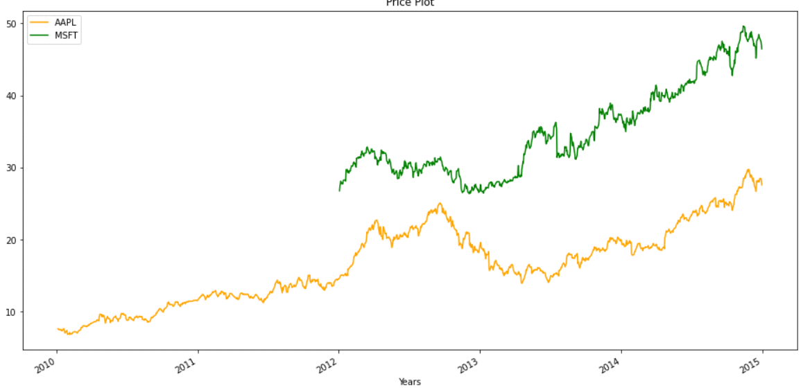
We have merged the two DataFrames, into a single DataFrame, now we can simply plot it,
Python3
plt.figure(figsize=(16, 8), dpi=150)
aapl.plot(label='aapl', color=['orange', 'green'])
plt.title('Price Plot')
plt.xlabel('Years')
plt.legend()
|
Output:
In some cases we can’t afford to lose data, so we can also plot without removing missing values, plot for the same will look like:
Share your thoughts in the comments
Please Login to comment...