Plotting time-series with Date labels on X-axis in R
Last Updated :
30 Jun, 2021
In this article, we will discuss how to plot time-series with date labels on the x-axis in R Programming Language supportive examples.
Method 1 : Using plot() method
The plot() method in base R is a generic plotting function. It plots the corresponding coordinates of the x and y axes respectively. The plot can be customized to add the line type, line width in the plot.
Syntax:
plot(x, y, …)
Parameter :
x, y – The coordinates to plot.
The input data frame contains col1 as the date character strings and col2 as the corresponding time stamps.
Example:
R
data_frame <- data.frame( col1 = c("6/7/2021","7/7/2021","8/7/2021",
"9/7/2021","10/7/2021"),
col2 = c(799355, 805800,701262,531579,
690068)
)
print ("Original Dataframe")
print (data_frame)
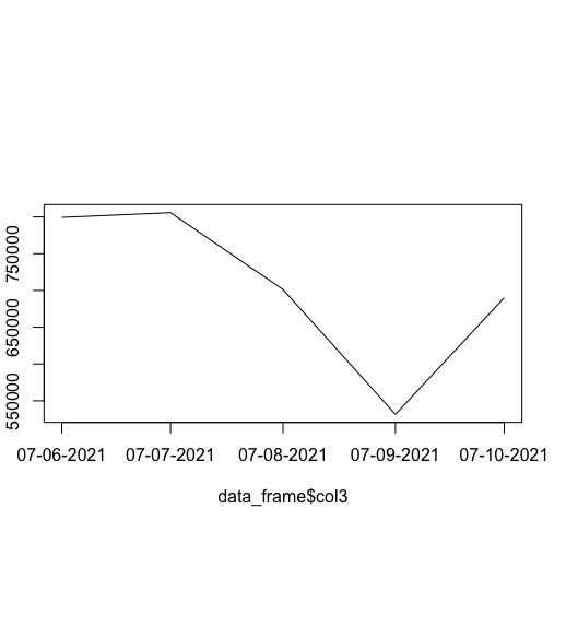
data_frame$col3 <- as.Date(data_frame$col1, "%m/%d/%Y",)
plot(data_frame$col3, data_frame$col2 ,
cex = 0.9,type = "l" ,xaxt = "n" )
axis(1,
data_frame$col3,
format(data_frame$col3, "%d-%m-%Y"))
|
Output
[1] "Original Dataframe"
col1   col2
1  6/7/2021 799355
2  7/7/2021 805800
3  8/7/2021 701262
4  9/7/2021 531579
5 10/7/2021 690068
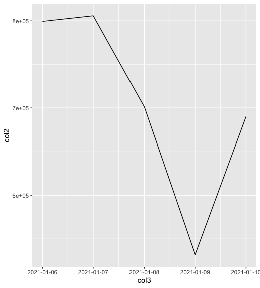
Method 2 : Using ggplot() method
The ggplot2 library is used to display descriptive complex plots in the R programming language working space window.
The ggplot() method is used to plot the data points of the specified data frame and specify the set of plot aesthetics. It is used to create an aesthetic mapping and add a particular geom function mapping.
Syntax:
ggplot(data = NULL, mapping = aes(c1, c2 )) + geom_line()
Parameters :
data – The default data set to plot
mapping – The aesthetic mapping to use
The geom_line() is used to add geoms in the form of lines and points. It is used to plotting time series as well as lines in the plot.
Example:
R
library("ggplot2")
data_frame <- data.frame( col1 = c("1/6/2021","1/7/2021","1/8/2021",
"1/9/2021","1/10/2021"),
col2 = c(799355, 805800,701262,531579,
690068)
)
print ("Original Dataframe")
print (data_frame)
data_frame$col3 <- as.Date(data_frame$col1, "%m/%d/%Y")
ggplot( data = data_frame, aes( col3, col2 )) + geom_line() +
scale_x_date(date_labels = "%Y-%m-%d")
|
Output
[1] "Original Dataframe"
col1   col2
1  6/7/2021 799355
2  7/7/2021 805800
3  8/7/2021 701262
4  9/7/2021 531579
5 10/7/2021 690068
Share your thoughts in the comments
Please Login to comment...