Plot Paired dot plot and box plot on same graph in R
Last Updated :
06 Sep, 2023
R Programming Language is used for statistical computing and graphics. R was first developed at the University of Auckland by two professors Ross Ihanka and Robert Gentleman
Dot Plot
The dot plot is a graphical representation of how one attribute varies with respect to another attribute. On the x-axis, we usually plot the attribute with respect to which we want to track the variation, and on the y-axis, you plot the value whose variation we want to see. Suppose you are given a set of data with attribute height and width and you want to see how width varies with respect to height. Then you can plot the height on the x-axis and width on the y-axis.
Box Plot
A box plot is a graphical representation of the data which gives a five-number summary of the data: Minimum, First Quarter (Q1), Median, Second Quarter(Q2), and Maximum. They are mainly used for visualizing the distribution of the data.
- For building the dot plot and box plot we are going to use the three main building blocks of the grammar of graphics .i.e data, aesthetics, and geometrics.
Importing Data
We are going to use the mpg dataset that will be loaded when we install the ggplot2 package. To install ggplot2 we need to install the tidyverse package which consists of 8 core packages and ggplot2 is one of them. Copy and paste the below code in the terminal for installing tidyverse :
R
install.packages("tidyverse")
|
After installing the tidyverse package you can view the list of datasets that are available in the environment, you can use the data() command which will display the list of r datasets available to use. The mpg consists of the fuel economy data from the year 1999 to 2008 for 38 popular models of cars. To learn more about the mpg dataset you can use the below command
?mpg
The above command will open the help window which displays the information related to mpg such as column name and the number of rows present.
Defining Aesthetics
Aesthetics are the properties of the graph that is used to customize the graph according to the requirements. Examples of various aesthetics are the x-axis, y-axis, color, shape, etc. For plotting the graph we are going to use the ggplot function available in the ggplot2 package. We will be mapping the manufacturer attribute in mpg to the x-axis and the display attribute to the y-axis.
R
library(tidyverse)
mpg %>%
ggplot(aes(x=manufacturer, y=displ))+
labs(title = "Paired dot plot and box plot")
|
Output:

Plot paired dot plot and box plot on the same graph in R
ggplot function takes the dataframe as input of which it is going to plot the graph. We passed the mpg dataset using the pipe operator(%>%), which just passes the value before the pipe operator as the first argument to the function. It also takes aesthetics as input which specifies which aesthetics attributes are mapped to which column in the dataframe. The manufacturer attribute is plotted on the x-axis and the display attribute is plotted on the y-axis. We also set the title of the plot using the lab’s function in which we passed the argument title.
Plotting Dot Plot
For plotting the dot plot we are going to the geom_point function present in the ggplot2 package which plots the relationship between two continuous variables.
R
library(tidyverse)
mpg %>%
ggplot(aes(x=manufacturer, y=displ, color = year))+
labs(title = "Paired dot plot and box plot")+
geom_point()
|
Output:

In the above code, we added the geom_point() function which will draw the dot plot of the data. We also mapped the color aesthetic to the year attribute in the mpg data set which will ensure that every year will have a unique color. The information about which year is mapped to which color is depicted on the right side of the graph.
Plotting box plot
For plotting the dot plot we are going to the geom_boxplot function present in the ggplot2 package which plots the distribution of a continuous variable.
R
library(tidyverse)
mpg %>%
ggplot(aes(x=manufacturer, y=displ))+
labs(title = "Box plot")+
geom_boxplot()
|
Output:

Plotting dot plot and box plot on the same graph using mpg dataset
We are going the combine the geom_point and geom_boxplot functions present in the ggplot2 package.
R
mpg %>%
ggplot(aes(x=manufacturer, y=displ))+
geom_point(aes(color = year))+
geom_boxplot()+
labs(title = "Paired dot plot and box plot")
|
Output:

plot paired dot plot and box plot on same graph in R
in the above code, we first mapped the attribute manufacturer with the x-axis and the attribute display with the y-axis. Then we defined the dot plot using the geom_point function, in which we defined an additional aesthetic color mapped to year which will only be applicable to the dot plot in the graph. After that, we defined the boxplot using the geom_boxplot function and set the title of the graph using the lab’s function.
Plotting the dot plot and box plot on the same graph using iris dataset
The iris dataset is present in the “dataset” package in r. The iris dataset consists data from the three iris Species namely setosa, versicolor, and virginica. It contains information about the Sepal Length, Sepal Width, Petal Length, and Petal Width of 50 flowers.
For drawing the graph we are going to map the x-axis with the Species and the y-axis with the Petal. Length. So for each species. i.e. setosa, versicolor and verginica we are going to have a separate box and dot plot. We will be mapping the Petal. Width to the color aesthetics just for the dot plot, so each unique Sepal. The width will have a unique color.
R
library(tidyverse)
iris %>%
ggplot(aes(x=Species,y = Petal.Length))+
geom_point(aes(color = Petal.Width))+
geom_boxplot()+
labs(title="Paired Dot and Box Plot")
|
Output:
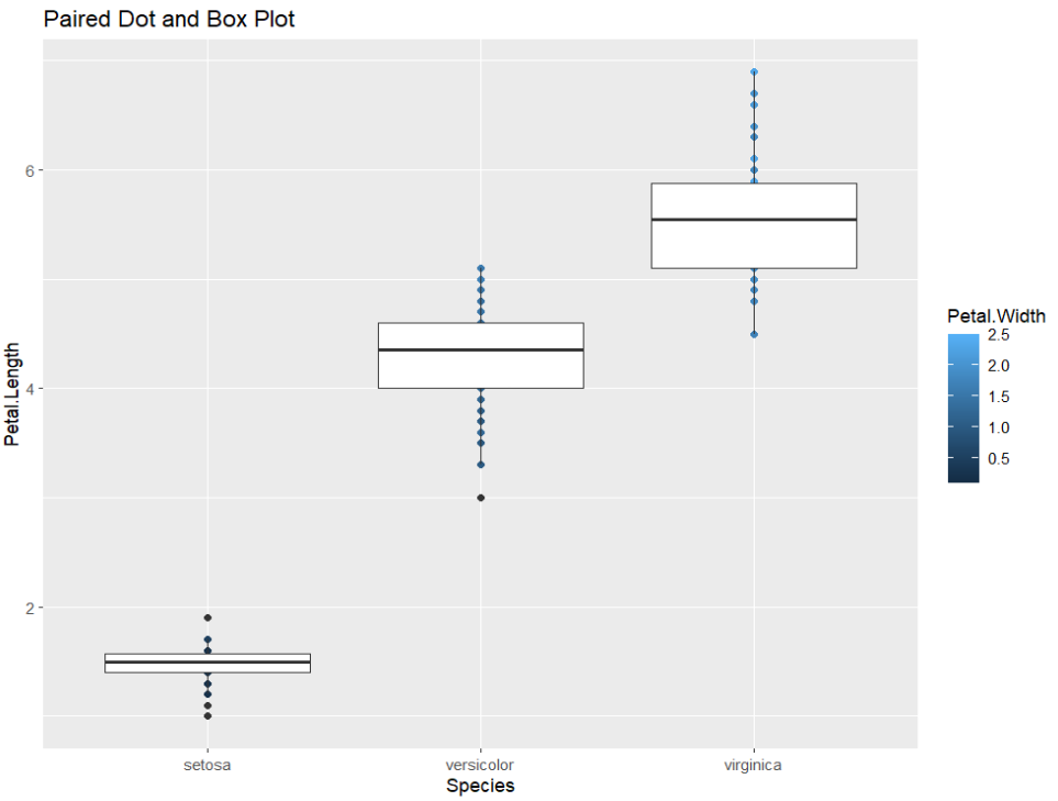
In the above code, we passed the iris dataset as the first argument to the ggplot function using the pipe operator, then defined the aesthetics which is going to be common to both the dot plot and the box plot. i.e. the x-axis and the y-axis. After that, we plotted the dot plot using the geom_point function in which we passed the color aesthetic to Petal. Width which is going to be applied only to the dot plot. The color aesthetic will ensure that every unique Petal. The width will have a unique color which is shown on the right side of the graph specifying which width will be mapped to which color.
Then we defined the boxplot using the geom_boxplot function and assigned the title of the graph using the lab’s function.
Plotting dot plot and box plot on the same data using the Orange dataset
The “Orange” dataset is present in the “datasets” package in r. It consists of 3 columns namely Tree, Age, and Circumference. The tree column defines the type of the tree, there are five different types of trees available in the dataset. Age defines the age of the trees in days since 12/31/1968 and circumference defines the circumference of the tree.
The age of the trees varies for different types. We will map the x-axis to the Tree attribute and the y-axis to the Age attribute. This will create the dot and box plot for each type of tree separately.
R
library(tidyverse)
ggplot(data=Orange, aes(x=Tree,y = age))+
geom_point(aes(size = circumference, color="red"))+
geom_boxplot(linetype="dotted", fill="blue")+
labs(title="Paired Dot and Box Plot", x="Tree Id", y="Age in Days")+
theme_bw()
|
Output:
.png)
First, we passed the Orange dataset to the ggplot function and mapped the x-axis to the Tree Id and y to the age of the tree. Then we plotted the dot plot using the geom_point function, in which we mapped the size aesthetic to the circumference of the tree, you can see the circumference and the dot size on the right side of the graph. We also set the colors of the dot to red using the color aesthetic. The size aesthetic will only be applicable to the dot plot and not the box plot. Then we built the box plot using the geom_boxplot function and mapped the line type aesthetic to dotted and filled the color aesthetic to blue. We also assigned labels to the graph, x-axis, and y-axis.
Share your thoughts in the comments
Please Login to comment...