Real Life Applications of Pie Chart
Last Updated :
08 Apr, 2024
Pie charts are used in various aspects of our life, they are used in business analysis, used in mathematical modeling, used to represent large data, and others. For examples, showing percentages of types of customers, percentage of revenue from different products, and profits from different categories, etc. are easily shown using pie charts.
Here in this article we have covered, definition of pie chart, applications of pie chart, and others in detail.
What is Pie Chart?
A pie chart is a graph of circular segments whose sum equals 100%. A pie chart is a symbolic way of showing that a circle is divided into slices of different sizes as per the category proportion in a data set. In simple language, it can be compared to how we cut a pizza in order to see how many pieces of topping we will get. Each circle of the pie chart is dedicated to one separate category.
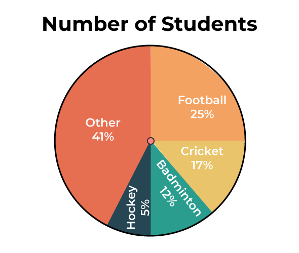
In a company 800 employees are asked about their favorite sports, the result for the same is shown in the pie chart below:
Applications of Pie Charts
Pie charts are handy visual aids that have a huge impact on various fields that use data visualization and analysis. These media platforms are widely used by professionals in different areas, i.e., business and finance, education and research, products, and sales. The significance of pie charts also extends to other areas such as medical and health, demographic analysis, project management, and statistical analysis.
Market Analysis and Share Distribution
The market analysis is done by evaluating how suppliers and demand react to each other in a specific business or industry. Pie charts do the crucial job of illustrating the market share held by the different competitors or product categories.
Example: A specialized market research firm ran a survey on the smartphone market to determine the market share of the leading brands such as Apple, Samsung, and Huawei. By means of pie chart, the firm shows the share of smartphone sales for these brands. Therefore, this visual tool enables stakeholders, comprising investors and analysts, to understand the competitive arena easily and thus help them in making the most appropriate decisions.
Budget Allocation
Efficient financial management means the proper distribution of resources for different costs and investments. Pie charts provide a tidy way of showing how the budget is spent and finding what takes more resources.
Example: A government agency plans its budget for the financial year, allocating money amidst education, health, infrastructure, and defense. To demonstrate the allocations of budget line items transparently to policymakers and the public, the department employs a pie chart displaying the percentage of the total expenditure dedicated to each of these sectors. This visual portrayal improves the openness and accountability of fiscal decision-making processes.
Sales Distribution
Frequently, pie charts are drawn to represent the sales distribution among different products and services within a business.
Example: A retail chain evaluates its sales data for a specific quarter in order to assess the performances of common product categories such as electronics, apparel, home goods, and cosmetics. The company will visualize the earnings from each product category as a pie chart’s sectors, which will help to identify consumer preferences and purchasing trends. Strategic planning for inventory management, marketing campaigns, and product diversification can now be done more effectively because of this data.
Survey Results and Public Opinion
Pie charts can be considered facilitators or visual aids when it comes to showing survey results or opinions from the public about different topics or issues that form the basis of these charts.
Example: A polling agency does a survey to show the public’s support or belief on the implementation of environmental policies. To present the findings, the pie charts are aimed at showing the proportions of the participants’ attitudes towards sustainable options like renewable energy subsidies, carbon emissions regulations and conservation measures. The bewildering nature of big data and many crucial choices decision-making becomes daunting.
Academic Research and Data Representation
When conveying data in academia, pie graphs help create visual representations of the distribution of data across various variables or categories.
Example: A study on adolescents in urban and rural areas (focusing on dietary patterns) subsequently gathers information on food consumption group wise. Pie charts displays how food groups contribute to the total daily calories that consume by participants from both generations and makes the research more understandable.
Health and Medicine
The pie charts tell us about the number of cases that have an illness, the types of treatments and the proportion of resources that are in healthcare.
Example: A public health agency in a population monitors the level prevalence, i.e., the number of people or cases, of chronic disease. Pie charts show disease distribution in different age, gender, and socio-economic groups. With this data, prioritization of the interventions is possible by targeting specific groups who are at high-risk.
Demographic Analysis
Pie charts are used, for instance, to illustrate age distribution, gender, ethnicity, or other demographic indicators.
Example: In addition to the national census, the city bureau undertakes a census of population. An age group, ethnics, and household types of pie charts will represent a percentage segment of population helps do statistical analysis in urban development and social welfare.
Project Management and Task Distribution
Workflow breakdown, schedule agreement and resource allocation are the three pie charts used in project management that show task distribution, project timeline, and resource allocation.
Example: Project Manager was accountable to follow up on the status of software development. A pie chart basically shows the amount of work that is done for each phase in the project, so as to help in tracking progress and allocation of resources.
FAQs on Applications of Pie Chart
Define Pie Chart.
A pie chart is a circular graphical representation used to display data proportions or percentages relative to the whole. The circle represents the total, while individual sections or “slices” of the pie represent different categories or components of the data.
What are Elements of a Pie Chart?
Key components of a pie chart include:
- Circle: Representing the whole.
- Slices: Representing individual categories.
- Labels: Providing information about each category.
How Pie Charts differ from Bar Graphs?
Pie charts represent data as proportional slices of a circle, while bar graphs display data using rectangular bars of varying lengths.
Can Pie Charts display negative values?
No, pie charts are not fit for negative values demonstration because they show a proportion of a whole, which we cannot present as negative.
Can pie charts be used to reveal the change over time?
Pie charts are not ideal for comparing data across different time periods. Line graphs or stacked bar graphs are more suitable for such comparisons.
Are there any drawbacks to using pie charts?
Yes, some drawbacks of pie charts include difficulty in comparing multiple datasets, limitations in representing large datasets, and a chance of being misinterpreted.
How do we know what data can be best portrayed as a pie chart?
Pie charts is appropriate for showing categorical data in which the sum of the parts is the whole.
Share your thoughts in the comments
Please Login to comment...