Make a violin plot in Python using Matplotlib
Last Updated :
21 Apr, 2020
Matplotlib is a plotting library for creating static, animated, and interactive visualizations in Python. Matplotlib can be used in Python scripts, the Python and IPython shell, web application servers, and various graphical user interface toolkits like Tkinter, awxPython, etc.
Note: For more information, refer to Python Matplotlib – An Overview
What does a violin plot signify ?
Violin plots are a combination of box plot and histograms. It portrays the distribution, median, interquartile range of data. So we see that iqr and median are the statistical information provided by box plot whereas distribution is being provided by the histogram.
Violin Plot
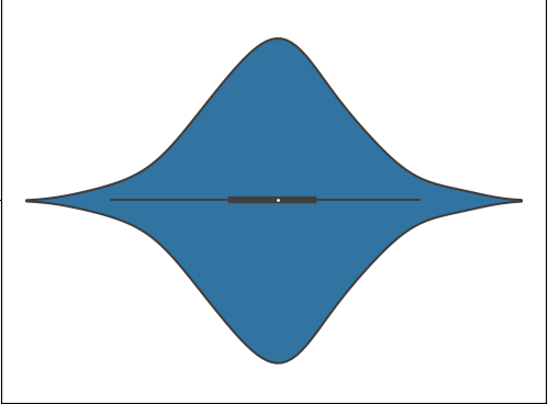
- The white dot refers to the median.
- The end points of the bold line represent the iqr1 and iqr3.
- The end points of the thin line represent the min and max similar to the box plot.
- The distribution above 1.5x interquartile(min, max end points of the thin line) denotes the presence of outliers.
Syntax: violinplot(dataset, positions=None, vert=True, widths=0.5, showmeans=False, showextrema=True, showmedians=False, quantiles=None, points=100,
bw_method=None, *, data=None)
Parameters:
dataset: Array or a sequence of vectors.
The input data.
positions: array-like, default = [1, 2, …, n].
Sets the positions of the violins. The ticks and limits are automatically set to match the positions.
vert: bool, default = True.
If true, creates a vertical violin plot. Otherwise, creates a horizontal violin plot.
widths: array-like, default = 0.5
Either a scalar or a vector that sets the maximal width of each violin. The default is 0.5, which uses about half of the available horizontal space.
showmeans: bool, default = False
If True, will toggle rendering of the means.
showextrema: bool, default = True
If True, will toggle rendering of the extrema.
showmedians: bool, default = False
If True, will toggle rendering of the medians.
quantiles: array-like, default = None
If not None, set a list of floats in interval [0, 1] for each violin, which stands for the quantiles that will be rendered for that violin.
points: scalar, default = 100
Defines the number of points to evaluate each of the gaussian kernel density estimations at.
bw_method: str, scalar or callable, optional
The method used to calculate the estimator bandwidth. This can be ‘scott’, ‘silverman’, a scalar constant or a callable. If a scalar, this will be used directly as kde.factor. If a callable, it should take a GaussianKDE instance as its only parameter and return a scalar. If None (default), ‘scott’ is used.
Example 1:
import numpy as np
import matplotlib.pyplot as plt
uniform = np.arange(-100, 100)
normal = np.random.normal(size = 100)*30
fig, (ax1, ax2) = plt.subplots(nrows = 1,
ncols = 2,
figsize =(9, 4),
sharey = True)
ax1.set_title('Uniform Distribution')
ax1.set_ylabel('Observed values')
ax1.violinplot(uniform)
ax2.set_title('Normal Distribution')
ax2.violinplot(normal)
plt.show()
|
Output:

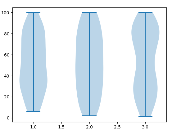
Example 2: Multiple Violin plots
import numpy as np
import matplotlib.pyplot as plt
from random import randint
l1 = []
l2 =[]
l3 =[]
for i in range(100):
n = randint(1, 100)
l1.append(n)
for i in range(100):
n = randint(1, 100)
l2.append(n)
for i in range(100):
n = randint(1, 100)
l3.append(n)
random_collection = [l1, l2, l3]
fig = plt.figure()
ax = fig.gca()
violinplot = ax.violinplot(random_collection)
plt.show()
|
Output:
Share your thoughts in the comments
Please Login to comment...