How to Make a Square Plot With Equal Axes in Matplotlib?
Last Updated :
09 Jan, 2024
In this article, we are going to discuss how to illustrate a square plot with an equal axis using the matplotlib module. We can depict a Square plot using matplotlib.axes.Axes.set_aspect() and matplotlib.pyplot.axis() methods.
Make a Square Plot With Equal Axes in Matplotlib
There are various ways to draw a square in Python using matplotlib. here we are explaining there are some methods with the help of that method we can draw a square in Python using matplotlib those are following.
Using set_aspect() Method
Syntax: matplotlib.axes.Axes.set_aspect()
Parameters:
- aspect : This parameter accepts the following value {‘auto’, ‘equal’} or num.
- adjustable : This defines which parameter will be adjusted to meet the required aspect.
- anchor : This parameter is used to define where the Axes will be drawn if there is extra space due to aspect constraints.
- share: This parameter is used to apply the settings to all shared Axes.
Basic Matplotlib Square Plot
Example 1: We can generate a square plot using matplotlib.axes.Axes.set_aspect() method. We will assign equal as an aspect argument and box as an adjustable argument.
In this example, code uses NumPy and Matplotlib to create a simple plot. It generates a list of coordinates, creates a plot, and ensures the plot is a square by setting equal aspect ratios before displaying it.
Python3
import numpy as np
import matplotlib.pyplot as plt
x = y = [i for i in range(0, 6)]
fig = plt.figure()
ax = fig.add_subplot()
plt.plot(x, y)
ax.set_aspect('equal', adjustable='box')
plt.show()
|
Output:

Example 2: The above example possibly yields a square plot when ranges for the two tomahawks are set to be the equivalent. To produce a square plot in the overall case, we need to physically set the viewpoint proportion utilizing the accompanying order:
axes.set_aspect(1./axes.get_data_ratio())
In this example the code uses NumPy and Matplotlib to create a simple plot with adjusted coordinates. It generates a list of coordinates, creates a square plot, and then displays the illustration. Note: The aspect ratio adjustment is updated in the “square plot” section.
Python3
import numpy as np
import matplotlib.pyplot as plt
x = y = [i for i in range(0, 6)]
fig = plt.figure()
ax = fig.add_subplot()
plt.plot(x, y)
ax.set_aspect(1.0/ax.get_data_ratio(), adjustable='box')
plt.show()
|
Output:
Using axis() Method
Syntax: matplotlib.pyplot.axis()
Parameters:
- xmin, xmax, ymin, ymax:These parameters can be used to set the axis limits on the graph.
- emit:Its a bool value used to notify observers of the axis limit change.
Basic Matplotlib Square Plot
Example 1: In this example, we pass square as an argument to matplotlib.pyplot.axis(), it illustrates a square plot. The code utilizes NumPy and Matplotlib to create a basic plot with adjusted coordinates. It generates a list of coordinates, plots them, ensures the plot is a square, and then displays the illustration.
Python3
import numpy as np
import matplotlib.pyplot as plt
x=y=[i for i in range(0,6)]
plt.plot(x,y)
plt.axis('square')
plt.show()
|
Output:
Example 2: Here is another example to illustrate a square plot using axis() method. In this example code utilizes Matplotlib to visualize the Rectified Linear Unit (ReLU) function. It defines x and computes corresponding y values using ReLU activation. The resulting plot is a square, and it includes axis labels, a green-colored plot, and a title indicating the ReLU function.
Python3
import matplotlib.pyplot as plt
x = [-5, -4, -3, -2, -1, 0, 1, 2, 3, 4, 5]
y = []
for i in range(len(x)):
y.append(max(0, x[i]))
plt.plot(x, y, color='green')
plt.xlabel('X')
plt.ylabel('Y')
plt.axis('square')
plt.title('ReLU Function')
|
Output:

Using add_patch() Method
Syntax : add_patch(p: matplotlib.patches.Patch) -> None
Parameters:
- p: `p` parameter is a `Patch` object (e.g., `Rectangle`, `Circle`) added to the Matplotlib Axes.
Return :
None: The method doesn’t return anything
Basic Matplotlib Square Plot
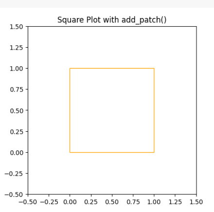
Example 1: In this example code uses Matplotlib to create a square plot with an orange-outlined square using `add_patch()` method. The plot’s x and y-axis limits are set, and the aspect ratio is fixed to ensure the square appears as a square. The resulting plot is titled “Square Plot with add_patch()” and displayed.
Python3
import matplotlib.pyplot as plt
import matplotlib.patches as patches
fig, ax = plt.subplots()
square = patches.Rectangle((0, 0), 1, 1, edgecolor='orange', facecolor='none')
ax.add_patch(square)
plt.xlim(-0.5, 1.5)
plt.ylim(-0.5, 1.5)
plt.gca().set_aspect('equal', adjustable='box')
plt.title('Square Plot with add_patch()')
plt.show()
|
Output:
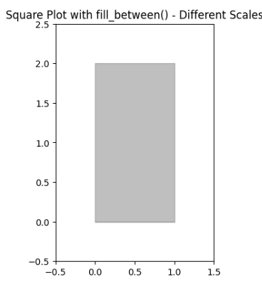
Example 2: In this example code utilizes Matplotlib to generate a rectangular plot with a purple-outlined rectangle using `add_patch()`. The x and y-axis limits are defined to accommodate the rectangle’s shape, and the aspect ratio is fixed for an accurate representation. The resulting plot is titled “Square Plot with add_patch() – Different Scales” and displayed.
Python3
import matplotlib.pyplot as plt
import matplotlib.patches as patches
fig, ax = plt.subplots()
square = patches.Rectangle((0, 0), 1, 2, edgecolor='purple', facecolor='none')
ax.add_patch(square)
plt.xlim(-0.5, 1.5)
plt.ylim(-0.5, 2.5)
plt.gca().set_aspect('equal', adjustable='box')
plt.title('Square Plot with add_patch() - Different Scales')
plt.show()
|
Output:
Like Article
Suggest improvement
Share your thoughts in the comments
Please Login to comment...