HTML Dropdown
Last Updated :
23 Apr, 2024
HTML dropdown, also known as select elements, are a fundamental part of web forms and used to create HTML Dropdowns. They offer a compact and user-friendly method for users to select one or more options from a predefined list. This guide will provide you with everything you need to know about creating and customizing HTML dropdowns.
Syntax:
<select>
  <option value="option1">Option 1</option>
  <option value="option2">Option 2</option>
  <option value="option3">Option 3</option>
  <!-- Add more options as needed -->
</select>
The table below illustrates the tags used for creating HTML dropdowns alongside their description.
| Tags | Description |
|---|
<select> | The main tag defines the dropdown list. |
<option> | Each option within the dropdown provides selectable choices. |
<label>
| It creates a label for a dropdown or input element. It’s linked to the dropdown using the “for” attribute.
|
HTML Dropdown Attributes
HTML dropdowns, created using the <select> tag, can be customized using various attributes. Here are some of the most commonly used attributes:
Attribute
| Description
|
|---|
name
| This attribute is used to identify the dropdown when a selection is submitted in a form.
|
id
| The id attribute is used to associate the dropdown list with a label.
|
autofocus
| This attribute automatically specifies the dropdown list to get focus when the page loads.
|
disabled
| Used to specify that the dropdown list should be disabled
|
form
| This attribute defines which form the dropdown list belongs to.
|
multiple
| Specifies that we can select multiple options once.
|
required
| This attribute specifies that the user has to select a value before submitting the form.
|
size
| This attribute defines the number of visible options in a particular dropdown list.
|
Different HTML Dropdown Examples
1. Creating a Basic HTML Dropdown
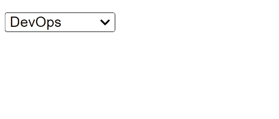
This HTML code creates a basic HTML dropdown menu using the <select> and <option> elements. Each <option> represents an item in the dropdown list. The value attribute of each <option> specifies the value that will be submitted to the server when the form is submitted.
Example: Implementation to create HTML Dropdown.
HTML
<!DOCTYPE html>
<html lang="en">

<head>
    <meta charset="UTF-8">
    <meta name="viewport"
        content="width=device-width, initial-scale=1.0">
    <title>HTML dropdown</title>
</head>

<body>
    <select>
        <option value="volvo">MERN</option>
        <option value="saab" selected>DevOps</option>
        <option value="mercedes">AI/ML</option>
        <option value="audi">Data Science</option>
    </select>
</body>

</html>
Output:
2. Creating a HTML Dropdown with Hover Effect:
To create an eye-catching HTML dropdown with hover effects, start with a “dropdown” container and a trigger element. Nest a “dropdown-content” div inside, initially hidden with display: none;.
Use CSS to reveal the dropdown content on hover (dropdown:hover .dropdown-content {display: block;}). Style the dropdown items for visual appeal, adding hover effects to highlight selections. Finally, populate the “dropdown-content” with links (<a>) for your menu items.
Example: Implementation to create HTML Dropdown with hover effect.
HTML
<!DOCTYPE html>
<html lang="en">

<head>
    <meta charset="UTF-8">
    <meta name="viewport"
        content="width=device-width, initial-scale=1.0">
    <title>Multi-select Dropdown</title>
    <style>
        body {
            display: flex;
            justify-content: center;
            align-items: center;
            flex-direction: column;
        }

        .dropdown {
            position: relative;
            display: inline-block;
        }

        .dropbtn {
            background-color: #f1f1f1;
            color: black;
            padding: 10px 20px;
            font-size: 16px;
            border: none;
            cursor: pointer;
        }

        .dropdown-content {
            display: none;
            position: absolute;
            min-width: 160px;
            border: 1px solid #ddd;
            z-index: 1;
            overflow-y: auto;
        }

        .dropdown:hover .dropdown-content {
            display: block;
        }

        input[type=checkbox] {
            margin-right: 5px;
        }

        label {
            display: block;
            margin-bottom: 5px;
        }

        .submit-btn {
            margin-top: 10px;
        }
    </style>
</head>

<body>

    <div class="dropdown">
        <button class="dropbtn">Select Items</button>
        <div class="dropdown-content">
            <input type="checkbox" id="item1"
                value="HTML"><label for="item1">HTML</label><br>
            <input type="checkbox" id="item2"
                value="CSS"><label for="item2">CSS</label><br>
            <input type="checkbox" id="item3"
                value="JavaScript"><label for="item3">
                JavaScript</label><br>
        </div>
    </div>

    <button onclick="submitSelection()" class="submit-btn">Submit</button>

    <script>
        function submitSelection() {
            let selectedItems = [];
            let checkboxes = document.querySelectorAll(
                'input[type=checkbox]:checked');
            checkboxes.forEach(function (checkbox) {
                selectedItems.push(checkbox.value);
            });
            alert("Selected items: " + selectedItems.join(', '));
        }
    </script>

</body>

</html>
Output:

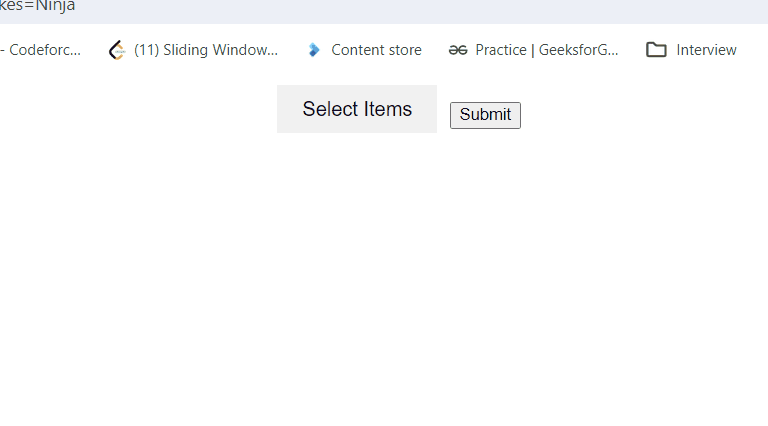
3. Advanced HTML Dropdown with Multiselect and Hover Effect:
Build interactive dropdowns with multi-select functionality and visually appealing hover effects. Employ a “dropdown” container, a trigger button, and a “dropdown-content” div. Utilize CSS to reveal the content on hover (dropdown:hover .dropdown-content {display: block;}) and style the dropdown for a polished look.
Include checkbox inputs (<input type="checkbox">) and labels to enable multiple selections. Use JavaScript to capture user choices and provide feedback (e.g., an alert message).
Example: Implementation to create HTML multiselect Dropdown with hover effect.
HTML
<!DOCTYPE html>
<html lang="en">

<head>
    <meta charset="UTF-8">
    <meta name="viewport"
        content="width=device-width, initial-scale=1.0">
    <title>Multi-select Dropdown</title>
    <style>
        body {
            display: flex;
            justify-content: center;
            align-items: center;
            flex-direction: column;
        }

        .dropdown {
            position: relative;
            display: inline-block;
        }

        .dropbtn {
            background-color: #f1f1f1;
            color: black;
            padding: 10px 20px;
            font-size: 16px;
            border: none;
            cursor: pointer;
        }

        .dropdown-content {
            display: none;
            position: absolute;
            min-width: 160px;
            border: 1px solid #ddd;
            z-index: 1;
            overflow-y: auto;
        }

        .dropdown:hover .dropdown-content {
            display: block;
        }

        input[type=checkbox] {
            margin-right: 5px;
        }

        label {
            display: block;
            margin-bottom: 5px;
        }

        .submit-btn {
            margin-top: 10px;
        }
    </style>
</head>

<body>

    <div class="dropdown">
        <button class="dropbtn">Select Items</button>
        <div class="dropdown-content">
            <input type="checkbox" id="item1"
                value="HTML"><label for="item1">HTML</label><br>
            <input type="checkbox" id="item2"
                value="CSS"><label for="item2">CSS</label><br>
            <input type="checkbox" id="item3"
                value="JavaScript"><label for="item3">
                JavaScript</label><br>
        </div>
    </div>

    <button onclick="submitSelection()" class="submit-btn">Submit</button>

    <script>
        function submitSelection() {
            let selectedItems = [];
            let checkboxes = document.querySelectorAll(
                'input[type=checkbox]:checked');
            checkboxes.forEach(function (checkbox) {
                selectedItems.push(checkbox.value);
            });
            alert("Selected items: " + selectedItems.join(', '));
        }
    </script>

</body>

</html>
Output:
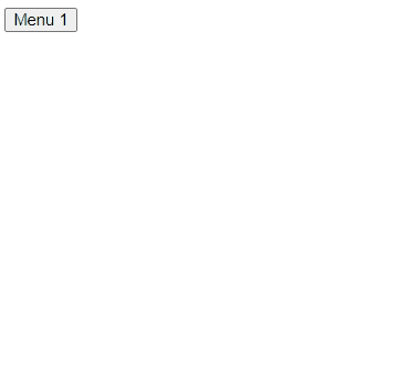
4. Creating a Nested Dropdown:
A nested dropdown menu also known as a hierarchical dropdown menu is a menu structure where each menu item can have a submenu or multiple levels of submenus. for creating nested menus in HTML we can use nested <ul> (unordered list) elements inside <li> (list item) elements. Each top-level menu item will contain a nested <ul> for its submenu items.
Utilize CSS to reveal the dropdown content on hover (dropdown:hover .dropdown-content {display: block;}) and Style the dropdown items to look good and add hover effects to highlight selected option.
Example: Implementation to create HTML Nested Dropdown with hover effect.
HTML
<!DOCTYPE html>
<html lang="en">
    <head>
        <meta charset="UTF-8" />
        <meta
            name="viewport"
            content="width=device-width, initial-scale=1.0"
        />
        <title>Nested Dropdown Menu</title>
        <style>
            /* Style the dropdown menu */
            .dropdown {
                position: relative;
                display: inline-block;
            }

            /* Style the dropdown menu items */
            .dropdown-content {
                display: none;
                position: absolute;
                background-color: #f9f9f9;
                min-width: 160px;
                z-index: 1;
            }

            /* Style the dropdown menu links */
            .dropdown-content a {
                color: black;
                padding: 12px 16px;
                text-decoration: none;
                display: block;
            }

            /* Style the dropdown menu links on hover */
            .dropdown-content a:hover {
                background-color: #f1f1f1;
            }

            /* Show the dropdown menu when hovering over the dropdown */
            .dropdown:hover .dropdown-content {
                display: block;
            }

            /* Style the nested dropdown menu */
            .nested-dropdown {
                position: relative;
            }

            /* Style the nested dropdown menu items */
            .nested-dropdown-content {
                display: none;
                position: absolute;
                background-color: #f9f9f9;
                min-width: 160px;
                left: 100%;
                top: 0;
                z-index: 1;
            }

            /* Show the nested dropdown menu when hovering over the parent item */
            .nested-dropdown:hover
                .nested-dropdown-content {
                display: block;
            }
        </style>
    </head>

    <body>
        <div class="dropdown">
            <button class="dropbtn">
                Menu 1
            </button>
            <div class="dropdown-content">
                <div class="nested-dropdown">
                    <a href="#">Submenu 1</a>
                    <div
                        class="nested-dropdown-content"
                    >
                        <a href="#"
                            >Submenu 1.1</a
                        >
                        <a href="#"
                            >Submenu 1.2</a
                        >
                        <a href="#"
                            >Submenu 1.3</a
                        >
                    </div>
                </div>
                <div class="nested-dropdown">
                    <a href="#">Submenu 2</a>
                    <div
                        class="nested-dropdown-content"
                    >
                        <a href="#"
                            >Submenu 2.1</a
                        >
                        <a href="#"
                            >Submenu 2.2</a
                        >
                        <a href="#"
                            >Submenu 2.3</a
                        >
                    </div>
                </div>
            </div>
        </div>
    </body>
</html>
Output:
Share your thoughts in the comments
Please Login to comment...