How to Make a Tooltip With an Right Arrow ?
Last Updated :
18 Mar, 2024
Tooltips are used to display the additional information along with the links on the web pages. It adds enhancement and increases the overall user experience while using the application.
Below are the approaches to make a tooltip with an right arrow:
Using CSS Pseudo-elements
In this approach, we are using CSS pseudo-elements to create a right-arrow tooltip. The ::before pseudo-element generates a triangular arrow on the right side of the tooltip.
Syntax:
selector::pseudo-element {
     property: value;
}
Example: The below example uses CSS Pseudo-elements to make a Tooltip with a right Arrow.
HTML
<!DOCTYPE html>
<html>
<head>
<title>Using Pseudo-elements</title>
<link rel="stylesheet" href="style.css">
</head>
<body>
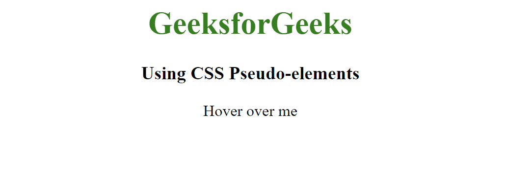
<h1>GeeksforGeeks</h1>
<h3>Using CSS Pseudo-elements</h3>
<center>
<div class="tooltip-container">
Hover over me
<div class="tooltip-content arrow-right">
Visit GeeksforGeeks
</div>
</div>
</center>
</body>
</html>
h1 {
    color: green;
    text-align: center;
}

h3 {
    text-align: center;
}

.tooltip-container {
    position: relative;
    display: inline-block;
}

.tooltip-content {
    visibility: hidden;
    width: 160px;
    background-color: #4caf50;
    color: white;
    text-align: center;
    border-radius: 6px;
    padding: 5px;
    position: absolute;
    z-index: 1;
    right: 120%;
    top: 50%;
    transform: translateY(-50%);
}

.arrow-right::before {
    content: "";
    border-style: solid;
    border-width: 8px 0 8px 10px;
    border-color: transparent transparent transparent #4caf50;
    position: absolute;
    top: 50%;
    right: -10px;
    transform: translateY(-50%);
}

.tooltip-container:hover .tooltip-content {
    visibility: visible;
}
Output:
Using SVG
In this approach, we are using SVG to create a tooltip with a right arrow. The tooltip is displayed below the text “Hover over me” and shows the content “GeeksforGeeks” with a right-pointing arrow when hovered.
Syntax:
<svg width="width" height="height">
    <!-- shape -->
</svg>
Example: The below example uses SVG to make a Tooltip with a right Arrow.
HTML
<!DOCTYPE html>
<html>
<head>
<title>Using SVG</title>
<link rel="stylesheet" href="style.css">
</head>
<body>
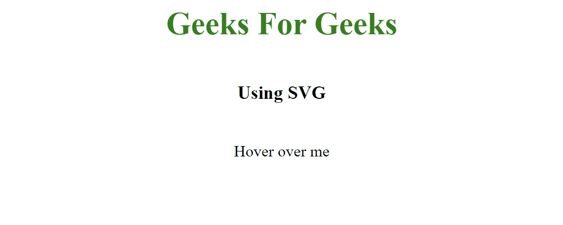
<h1>Geeks For Geeks</h1>
<h3>Using SVG</h3>
<div class="tooltip">
Hover over me
<div class="tooltiptext">
GeeksforGeeks
<svg height="15" width="15">
<polygon
points="0,0 10,7.5 0,15"
fill="#4caf50" />
</svg>
</div>
</div>
</body>
</html>
body {
    display: flex;
    flex-direction: column;
    align-items: center;
    height: 100vh;
    margin: 0;
}

h1 {
    color: green;
    text-align: center;
}

h3 {
    text-align: center;
}

.tooltip {
    position: relative;
    display: inline-block;
    margin-top: 20px;
}

.tooltip .tooltiptext {
    visibility: hidden;
    width: 180px;
    background-color: #4caf50;
    color: #fff;
    text-align: center;
    border-radius: 8px;
    padding: 10px;
    position: absolute;
    z-index: 1;
    left: 50%;
    transform: translate(-50%, -70%);
    opacity: 0;
    transition: opacity 0.3s, visibility 0s linear 0.3s;
    box-shadow: 0 0 10px rgba(0, 0, 0, 0.3);
    left: calc(-130%);
}

.tooltip .tooltiptext svg {
    position: absolute;
    top: 50%;
    left: 100%;
    transform: translateY(-50%);
}

.tooltip:hover .tooltiptext {
    visibility: visible;
    opacity: 1;
    transition: opacity 0.3s, visibility 0s linear 0s;
}
Output:
Share your thoughts in the comments
Please Login to comment...