What is a Tooltip in HTML ?
Last Updated :
07 Mar, 2024
A tooltip in HTML is a small pop-up box or text that appears when a user hovers over an element such as a button, link, or image. Tooltips are often used to provide additional information about the element or to give context to the user.
We can create a tooltip using the below methods:
Creating a Tooltip Using the title attribute
In this approach, we will use the title attribute in HTML that allows us to provide additional information about an element, which is typically displayed as a tooltip when the user hovers over the element with their mouse.
Syntax:
<element title="tooltip text">
Example 1: The below code uses the title attribute to create a tooltip in HTML.
HTML
<!DOCTYPE html>
<html lang="en">
<head>
<meta charset="UTF-8">
<meta name="viewport" content=
"width=device-width, initial-scale=1.0">
<title>
Centered Content
</title>
</head>
<body>
<div style="text-align: center;">
<h1 style="color: green;">
GeeksForGeeks
</h1>
<h2>
Adding tooltip to buttons
</h2>
<button title="Tooltip for submit button">
Submit
</button>
<button title="Tooltip for Reset button">
Reset
</button>
<button title="Tooltip for Cancel button">
Cancel
</button>
</div>
</body>
</html>
|
Output: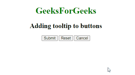
Creating a Tooltip Using CSS hover effect
This approach utilizes CSS hover effect properties to create the tooltip. Here We will create a hidden element that becomes visible when the user hovers over an element. The visibility and opacity properties are used to show and hide the tooltip.
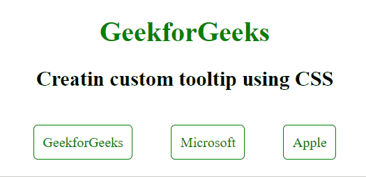
Example: The below code practically implements CSS hover effect to create a custom tooltip for an element.
HTML
<!DOCTYPE html>
<html>
<head>
<title>
Link Tooltip Example
</title>
<style>
.tooltip {
position: relative;
display: inline-block;
text-align: center;
margin: 20px;
padding: 10px;
border: 1px solid green;
border-radius: 5px;
}
.tooltip a {
color: green;
text-decoration: none;
}
.tooltip .tooltiptext {
visibility: hidden;
width: 120px;
background-color: #555;
color: #fff;
text-align: center;
border-radius: 6px;
padding: 5px;
position: absolute;
z-index: 1;
bottom: 125%;
left: 50%;
transform: translateX(-50%);
opacity: 0;
transition: opacity 0.3s;
}
.tooltip:hover{
background-color: green;
}
.tooltip:hover a {
color: #fff;
}
.tooltip:hover .tooltiptext {
visibility: visible;
opacity: 1;
}
</style>
</head>
<body style="text-align: center;">
<h1 style="color: green; text-align: center;">
GeekforGeeks
</h1>
<h2>
Creating custom tooltip using CSS
</h2>
<div class="cont" style="text-align: center;">
<div class="tooltip">
<a href="#" class="link">
GeekforGeeks
</a>
<span class="tooltiptext">
Visit GeekforGeeks
</span>
</div>
<div class="tooltip">
<a href="#" class="link">
Microsoft
</a>
<span class="tooltiptext">
Visit Microsoft
</span>
</div>
<div class="tooltip">
<a href="#" class="link">
Apple
</a>
<span class="tooltiptext">
Visit Apple
</span>
</div>
</div>
</body>
</html>
|
Output:
Creating a Tooltip Using pseudo-elements
A pseudo-element in CSS are used to add extra content either before or after the specified element. These are known as pseudo element because they can add the content without adding an element to the HTML DOM.
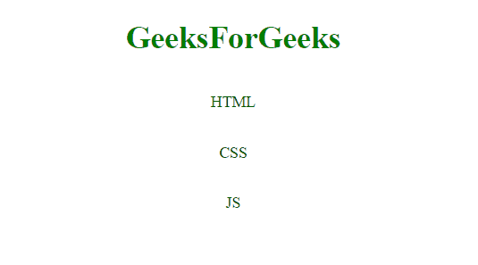
Example: The below code implements the CSS pseudo elements to create a tooltip.
HTML
<!DOCTYPE html>
<html>
<head>
<title>
Abbreviation Tooltip Example
</title>
<style>
.tooltip {
position: relative;
display: inline-block;
color: green;
}
.container {
text-align: center;
}
.tooltip::after {
content: attr(data-tooltip);
visibility: hidden;
width: 150px;
background-color: black;
color: white;
text-align: center;
border-radius: 6px;
padding: 5px 0;
position: absolute;
z-index: 1;
top: 100%;
left: 50%;
transform: translateX(-50%);
opacity: 0;
transition: opacity 0.3s;
}
.tooltip:hover::after {
visibility: visible;
opacity: 1;
}
</style>
</head>
<body>
<div class="container">
<h1 style="color: green">
GeeksForGeeks
</h1>
<h2>
Adding tooltip using pseudo selectors
</h2>
<p class="tooltip"
data-tooltip="HyperText Markup Language">
HTML
</p><br/>
<p class="tooltip"
data-tooltip="Cascading Style Sheets">
CSS
</p><br/>
<p class="tooltip" data-tooltip="JavaScript">
JS
</p>
</div>
</body>
</html>
|
Output:
Share your thoughts in the comments
Please Login to comment...